Android 12 (API Level 31) introduced us to one of the best UI / UX featues to the Android world - Material You
Based out of the beautifully designed Material 3 Design System, Material You has enhanced the Android ecosystem by providing us users and developers with possibly one of the best UI design features - Dynamic Colour Theming
As the name suggests, Dynamic Colour Theming changes the colour of your app components based on one of two sources:
- User-generated colour: The device wallpaper is used to generate system-wide colours which the user can customize
- Content-based colour: Colour is obtained from in-app content
In this gist we are focusing on User-generated colour which is expected to look something like this:
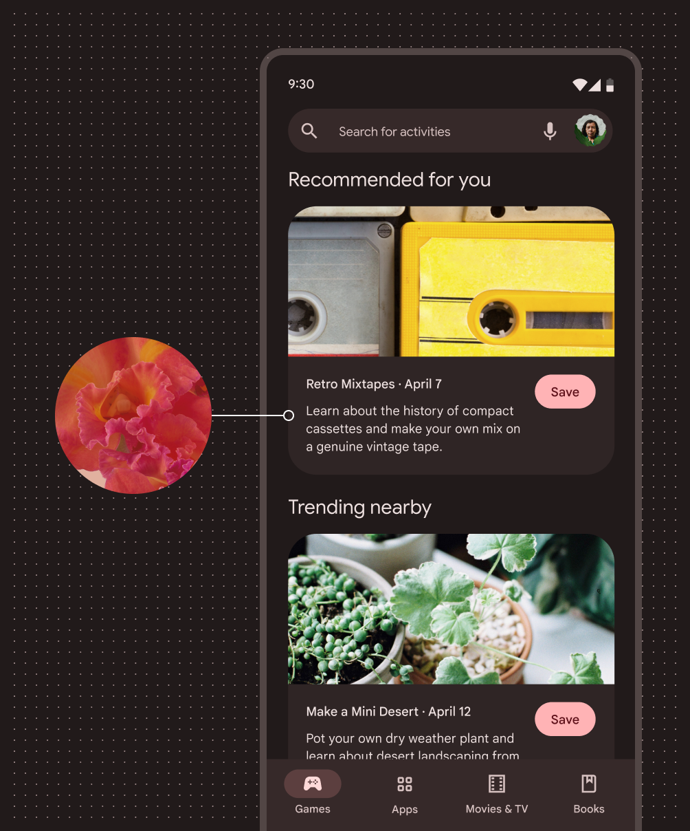

Source: M3 (https://m3.material.io/)
The Material Components Docs show the different colors available on the Material 3 SDK
| Color Role | Android Attribute | Light Baseline | Light Dynamic 31-33 | Light Dynamic 34+ | Dark Baseline | Dark Dynamic 31-33 | Dark Dynamic 34+ |
|---|---|---|---|---|---|---|---|
| Primary | colorPrimary | primary40 | system_accent1_600 | system_primary_light | primary80 | system_accent1_200 | system_primary_dark |
| On Primary | colorOnPrimary | white | system_accent1_0 | system_on_primary_light | primary20 | system_accent1_800 | system_on_primary_dark |
| Primary Container | colorPrimaryContainer | primary90 | system_accent1_100 | system_primary_container_light | primary30 | system_accent1_700 | system_primary_container_dark |
| On Primary Container | colorOnPrimaryContainer | primary10 | system_accent1_900 | system_on_primary_container_light | primary90 | system_accent1_100 | system_on_primary_container_dark |
| Inverse Primary | colorPrimaryInverse | primary80 | system_accent1_200 | system_primary_dark | primary40 | system_accent1_600 | system_primary_light |
| Primary Fixed | colorPrimaryFixed | primary90 | system_accent1_100 | system_primary_fixed | primary90 | system_accent1_100 | system_primary_fixed |
| Primary Fixed Dim | colorPrimaryFixedDim | primary80 | system_accent1_200 | system_primary_fixed_dim | primary80 | system_accent1_200 | system_primary_fixed_dim |
| On Primary Fixed | colorOnPrimaryFixed | primary10 | system_accent1_900 | system_on_primary_fixed | primary10 | system_accent1_900 | system_on_primary_fixed |
| On Primary Fixed Variant | colorOnPrimaryFixedVariant | primary30 | system_accent1_700 | system_on_primary_fixed_variant | primary30 | system_accent1_700 | system_on_primary_fixed_variant |
| Secondary | colorSecondary | secondary40 | system_accent2_600 | system_secondary_light | secondary80 | system_accent2_200 | system_secondary_dark |
| On Secondary | colorOnSecondary | white | system_accent2_0 | system_on_secondary_light | secondary20 | system_accent2_800 | system_on_secondary_dark |
| Secondary Container | colorSecondaryContainer | secondary90 | system_accent2_100 | system_secondary_container_light | secondary30 | system_accent2_700 | system_secondary_container_dark |
| On Secondary Container | colorOnSecondaryContainer | secondary10 | system_accent2_900 | system_on_secondary_container_light | secondary90 | system_accent2_100 | system_on_secondary_container_dark |
| Secondary Fixed | colorSecondaryFixed | secondary90 | system_accent2_100 | system_secondary_fixed | secondary90 | system_accent2_100 | system_secondary_fixed |
| Secondary Fixed Dim | colorSecondaryFixedDim | secondary80 | system_accent2_200 | system_secondary_fixed_dim | secondary80 | system_accent2_200 | system_secondary_fixed_dim |
| On Secondary Fixed | colorOnSecondaryFixed | secondary10 | system_accent2_900 | system_on_secondary_fixed | secondary10 | system_accent2_900 | system_on_secondary_fixed |
| On Secondary Fixed Variant | colorOnSecondaryFixedVariant | secondary30 | system_accent2_700 | system_on_secondary_fixed_variant | secondary30 | system_accent2_700 | system_on_secondary_fixed_variant |
| Tertiary | colorTertiary | tertiary40 | system_accent3_600 | system_tertiary_light | tertiary80 | system_accent3_200 | system_tertiary_dark |
| On Tertiary | colorOnTertiary | white | system_accent3_0 | system_on_tertiary_light | tertiary20 | system_accent3_800 | system_on_tertiary_dark |
| Tertiary Container | colorTertiaryContainer | tertiary90 | system_accent3_100 | system_tertiary_container_light | tertiary30 | system_accent3_700 | system_tertiary_container_dark |
| On Tertiary Container | colorOnTertiaryContainer | tertiary10 | system_accent3_900 | system_on_tertiary_container_light | tertiary90 | system_accent3_100 | system_on_tertiary_container_dark |
| Tertiary Fixed | colorTertiaryFixed | tertiary90 | system_accent3_100 | system_tertiary_fixed | tertiary90 | system_accent3_100 | system_tertiary_fixed |
| Tertiary Fixed Dim | colorTertiaryFixedDim | tertiary80 | system_accent3_200 | system_tertiary_fixed_dim | tertiary80 | system_accent3_200 | system_tertiary_fixed_dim |
| On Tertiary Fixed | colorOnTertiaryFixed | tertiary10 | system_accent3_900 | system_on_tertiary_fixed | tertiary10 | system_accent3_900 | system_on_tertiary_fixed |
| On Tertiary Fixed Variant | colorOnTertiaryFixedVariant | tertiary30 | system_accent3_700 | system_on_tertiary_fixed_variant | tertiary30 | system_accent3_700 | system_on_tertiary_fixed_variant |
The Material Design color theming system provides additional colors which don't represent your brand, but define your UI and ensure accessible color combinations. These additional color attributes are as follows:
| Color Role | Android Attribute | Light Baseline | Light Dynamic 31-33 | Light Dynamic 34+ | Dark Baseline | Dark Dynamic 31-33 | Dark Dynamic 34+ |
|---|---|---|---|---|---|---|---|
| Error | colorError | error40 | error40 | system_error_light | error80 | error80 | system_error_dark |
| On Error | colorOnError | white | white | system_on_error_light | error20 | error20 | system_on_error_dark |
| Error Container | colorErrorContainer | error90 | error90 | system_error_container_light | error30 | error30 | system_error_container_dark |
| On Error Container | colorOnErrorContainer | error10 | error10 | system_on_error_container_light | error90 | error90 | system_on_error_container_dark |
| Outline | colorOutline | neutral_variant50 | system_neutral2_500 | system_outline_light | neutral_variant60 | system_neutral2_400 | system_outline_dark |
| Outline Variant | colorOutlineVariant | neutral_variant80 | system_neutral2_200 | system_outline_variant_light | neutral_variant30 | system_neutral2_700 | system_outline_variant_dark |
| Background | android:colorBackground | neutral98 | m3_ref_palette_dynamic_neutral_variant98 | system_background_light | neutral6 | m3_ref_palette_dynamic_neutral_variant6 | system_background_dark |
| On Background | colorOnBackground | neutral10 | system_neutral1_900 | system_on_background_light | neutral90 | system_neutral1_100 | system_on_background_dark |
| Surface | colorSurface | neutral98 | m3_ref_palette_dynamic_neutral_variant98 | system_surface_light | neutral6 | m3_ref_palette_dynamic_neutral_variant6 | system_surface_dark |
| On Surface | colorOnSurface | neutral10 | system_neutral1_900 | system_on_surface_light | neutral90 | system_neutral1_100 | system_on_surface_dark |
| Surface Variant | colorSurfaceVariant | neutral_variant90 | system_neutral2_100 | system_surface_variant_light | neutral_variant30 | system_neutral2_700 | system_surface_variant_dark |
| On Surface Variant | colorOnSurfaceVariant | neutral_variant30 | system_neutral2_700 | system_on_surface_variant_light | neutral_variant80 | system_neutral2_200 | system_on_surface_variant_dark |
| Inverse Surface | colorSurfaceInverse | neutral20 | system_neutral1_800 | system_surface_dark | neutral90 | system_neutral1_100 | system_surface_light |
| Inverse On Surface | colorOnSurfaceInverse | neutral95 | system_neutral1_50 | system_on_surface_dark | neutral20 | system_neutral1_800 | system_on_surface_light |
| Surface Bright | colorSurfaceBright | neutral98 | m3_ref_palette_dynamic_neutral_variant98 | system_surface_bright_light | neutral24 | m3_ref_palette_dynamic_neutral_variant24 | system_surface_bright_dark |
| Surface Dim | colorSurfaceDim | neutral87 | m3_ref_palette_dynamic_neutral_variant87 | system_surface_dim_light | neutral6 | m3_ref_palette_dynamic_neutral_variant6 | system_surface_dim_dark |
| Surface Container | colorSurfaceContainer | neutral94 | m3_ref_palette_dynamic_neutral_variant94 | system_surface_container_light | neutral12 | m3_ref_palette_dynamic_neutral_variant12 | system_surface_container_dark |
| Surface Container Low | colorSurfaceContainerLow | neutral96 | m3_ref_palette_dynamic_neutral_variant96 | system_surface_container_low_light | neutral10 | system_neutral2_900 | system_surface_container_low_dark |
| Surface Container Lowest | colorSurfaceContainerLowest | white | system_neutral2_0 | system_surface_container_lowest_light | neutral4 | m3_ref_palette_dynamic_neutral_variant4 | system_surface_container_lowest_dark |
| Surface Container High | colorSurfaceContainerHigh | neutral92 | m3_ref_palette_dynamic_neutral_variant92 | system_surface_container_high_light | neutral17 | m3_ref_palette_dynamic_neutral_variant17 | system_surface_container_high_dark |
| Surface Container Highest | colorSurfaceContainerHighest | neutral90 | system_neutral2_100 | system_surface_container_highest_light | neutral22 | m3_ref_palette_dynamic_neutral_variant22 | system_surface_container_highest_dark |
It also suggests the usage of the following theme attributes for elevation overlays:
| Attribute Name | Description | Default Value |
|---|---|---|
elevationOverlayEnabled |
Whether the elevation overlay functionality is enabled. | true |
elevationOverlayColor |
The color used for the elevation overlays, applied at an alpha based on elevation. | colorPrimary |
- Create appropriate resource files: In your Android project resource directory, make the following file structure. In case you want to define different themes for Day (Light Mode) and Night (Dark Mode), retain the
themes.xmlin thevalues-nightfolder. The files required for the setup are attached to this gist.
    app\src\main\res
    │
    .
    .
    .
    |
    ├───values
    │       colors.xml
    │       themes.xml
    |       ...
    │
    ├───values-night
+   │       colors.xml
-   |       themes.xml
    │
+   ├───values-night-v34
+   │       colors.xml
    │
+   ├───values-v34
+   │       colors.xml
    .
    .
.-
Customize your colours: Populate the colour files with the Material defined colours provided above. You can also add any additional colours or modify the material theme to your liking. Due to different resource values in Android 14 (API Level 34), we create seperate
v34resource files. Please note that due to the unavailability of few of these@android:colorresource values (mostly in API Levels 31-33), they have been modified to the closest resource or converted to a static colour. The following colour resource files are provided in this gist:colors.xml: Contents ofvalues/colors.xmlcolors-night.xml: Contents ofvalues-night/colors.xmlcolors-v34.xml: Optional (if you want to provide custom support for API 34), Contents ofvalues-v34/colors.xmlcolors-night-v34.xml: Optional (if you want to provide custom support for API 34), Contents ofvalues-night-v34/colors.xml
-
Create your theme: Update the
themes.xmlfile, applying these colours to your theme. If you wish to use different Day and Night themes, please useTheme.Material3.DynamicColors.Dayinvalues/themes.xmlandTheme.Material3.DynamicColors.Nightinvalues-night/themes.xml. The theme file for a unified theme is provided in this gist. -
All set! Go ahead and design your UI. You can refer to the M3 Components Guide to perfect the different elements of your app