Last active
August 27, 2024 20:08
-
-
Save SylpheM/1da000b0044ff5c60d8537e5f26d7f2d to your computer and use it in GitHub Desktop.
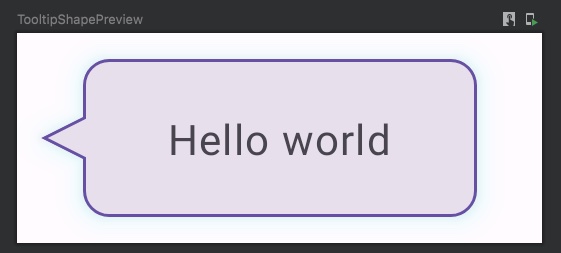
A tooltip shape (a rounded rectangle with an arrow or a tick), that can be used with a shadow. Preview included
This file contains hidden or bidirectional Unicode text that may be interpreted or compiled differently than what appears below. To review, open the file in an editor that reveals hidden Unicode characters.
Learn more about bidirectional Unicode characters
| enum class TickOrientation { | |
| TOP, START, END, BOTTOM | |
| } | |
| class TooltipShape( | |
| private val cornerRadiusDp: Dp, | |
| private val tickHeight: Dp, | |
| private val tickOrientation: TickOrientation | |
| ) : Shape { | |
| override fun createOutline( | |
| size: Size, | |
| layoutDirection: LayoutDirection, | |
| density: Density | |
| ): Outline { | |
| val cornerRadius = with(density) { cornerRadiusDp.toPx() } | |
| val tickHeight = with(density) { tickHeight.toPx() } | |
| return Outline.Generic( | |
| Path().apply { | |
| reset() | |
| //Top left arc | |
| arcTo( | |
| rect = Rect( | |
| left = 0f, | |
| top = 0f, | |
| right = 2 * cornerRadius, | |
| bottom = 2 * cornerRadius | |
| ), | |
| startAngleDegrees = 180f, | |
| sweepAngleDegrees = 90f, | |
| forceMoveTo = false | |
| ) | |
| if (tickOrientation == TickOrientation.TOP) { | |
| lineTo(x = size.width * 0.5f - tickHeight * 0.5f, y = 0f) | |
| lineTo(x = size.width * 0.5f, y = -tickHeight) | |
| lineTo(x = size.width * 0.5f + tickHeight * 0.5f, y = 0f) | |
| } | |
| lineTo(x = size.width - 2 * cornerRadius, y = 0f) | |
| //Top right arc | |
| arcTo( | |
| rect = Rect( | |
| left = size.width - 2 * cornerRadius, | |
| top = 0f, | |
| right = size.width, | |
| bottom = 2 * cornerRadius | |
| ), | |
| startAngleDegrees = 270f, | |
| sweepAngleDegrees = 90f, | |
| forceMoveTo = false | |
| ) | |
| if (tickOrientation == TickOrientation.END && layoutDirection == LayoutDirection.Ltr | |
| || tickOrientation == TickOrientation.START && layoutDirection == LayoutDirection.Rtl | |
| ) { | |
| lineTo(x = size.width, y = (size.height * 0.5f - tickHeight * 0.5f)) | |
| lineTo(x = size.width + tickHeight, y = size.height * 0.5f) | |
| lineTo(x = size.width, y = (size.height * 0.5f + tickHeight * 0.5f)) | |
| } | |
| lineTo(x = size.width, y = size.height - 2 * cornerRadius) | |
| // Bottom right arc | |
| arcTo( | |
| rect = Rect( | |
| left = size.width - 2 * cornerRadius, | |
| top = size.height - 2 * cornerRadius, | |
| right = size.width, | |
| bottom = size.height | |
| ), | |
| startAngleDegrees = 0f, | |
| sweepAngleDegrees = 90.0f, | |
| forceMoveTo = false | |
| ) | |
| if (tickOrientation == TickOrientation.BOTTOM) { | |
| lineTo(x = size.width * 0.5f + tickHeight * 0.5f, y = size.height) | |
| lineTo(x = size.width * 0.5f, y = size.height + tickHeight) | |
| lineTo(x = size.width * 0.5f - tickHeight * 0.5f, y = size.height) | |
| } | |
| lineTo(x = 2 * cornerRadius, y = size.height) | |
| // Bottom left arc | |
| arcTo( | |
| rect = Rect( | |
| left = 0f, | |
| top = size.height - 2 * cornerRadius, | |
| right = 2 * cornerRadius, | |
| bottom = size.height | |
| ), | |
| startAngleDegrees = 90.0f, | |
| sweepAngleDegrees = 90.0f, | |
| forceMoveTo = false | |
| ) | |
| if (tickOrientation == TickOrientation.START && layoutDirection == LayoutDirection.Ltr | |
| || tickOrientation == TickOrientation.END && layoutDirection == LayoutDirection.Rtl | |
| ) { | |
| lineTo(x = 0f, y = (size.height * 0.5f + tickHeight * 0.5f)) | |
| lineTo(x = -tickHeight, y = size.height * 0.5f) | |
| lineTo(x = 0f, y = (size.height * 0.5f - tickHeight * 0.5f)) | |
| } | |
| lineTo(x = 0f, y = cornerRadius) | |
| } | |
| ) | |
| } | |
| } | |
| @OptIn(ExperimentalMaterial3Api::class) | |
| @Preview | |
| @Composable | |
| fun TooltipShapePreview() { | |
| MaterialTheme { | |
| Surface { | |
| Box( | |
| modifier = Modifier | |
| .width(200.dp) | |
| .height(80.dp) | |
| ) { | |
| val shape = TooltipShape( | |
| cornerRadiusDp = 10.dp, | |
| tickHeight = 16.dp, | |
| tickOrientation = TickOrientation.START | |
| ) | |
| Card( | |
| modifier = Modifier | |
| .width(150.dp) | |
| .height(60.dp) | |
| .align(Alignment.Center) | |
| .shadow( | |
| elevation = 8.dp, | |
| shape = shape, | |
| spotColor = Color.Cyan | |
| ), | |
| shape = shape, | |
| border = BorderStroke( | |
| width = 1.dp, | |
| color = MaterialTheme.colorScheme.primary | |
| ) | |
| ) { | |
| Box(modifier = Modifier.fillMaxSize()) { | |
| Text( | |
| modifier = Modifier.align(Alignment.Center), | |
| text = "Hello world" | |
| ) | |
| } | |
| } | |
| } | |
| } | |
| } | |
| } |
Author
Amazing, thanks!
Thank you so much for this. I wrote a bubble wrapper that uses a similar shape (with minor modifications so that the arrow is not drawn outside of bounds) to show bubble tip overlays: https://gist.github.com/Digipom/ffab09bca7c2a61b6fb215f6709fc69b
Thanks this was quite helpful
Amazing, thanks
Sign up for free
to join this conversation on GitHub.
Already have an account?
Sign in to comment
Preview result: