I'm a big fan of the Ops School idea. I've struggled for years about how to "train up" someone coming into this field. So much of our skill set is forged in the fire of outages and troubleshooting.
One of the things that is both good and bad about system administration and operations is that we tend to see patterns. It's good in that we immediately see things that stand out. The downside is we tend to superimpose that pattern recognition in inappropriate ways.
We had an interesting issue happen yesterday at the dayjob. I won't go into exactly what it was here but I had an idea based on some graphs I was looking at. It's part social experiment but it's also part problem solving skills.
Given the following image with no context, what do you think happened? What are some of the key indicator points that jump out and what pattern do they call to mind?
(Since it may not be clear simply from an image resolution perspective, there are 4 metrics in this graph)
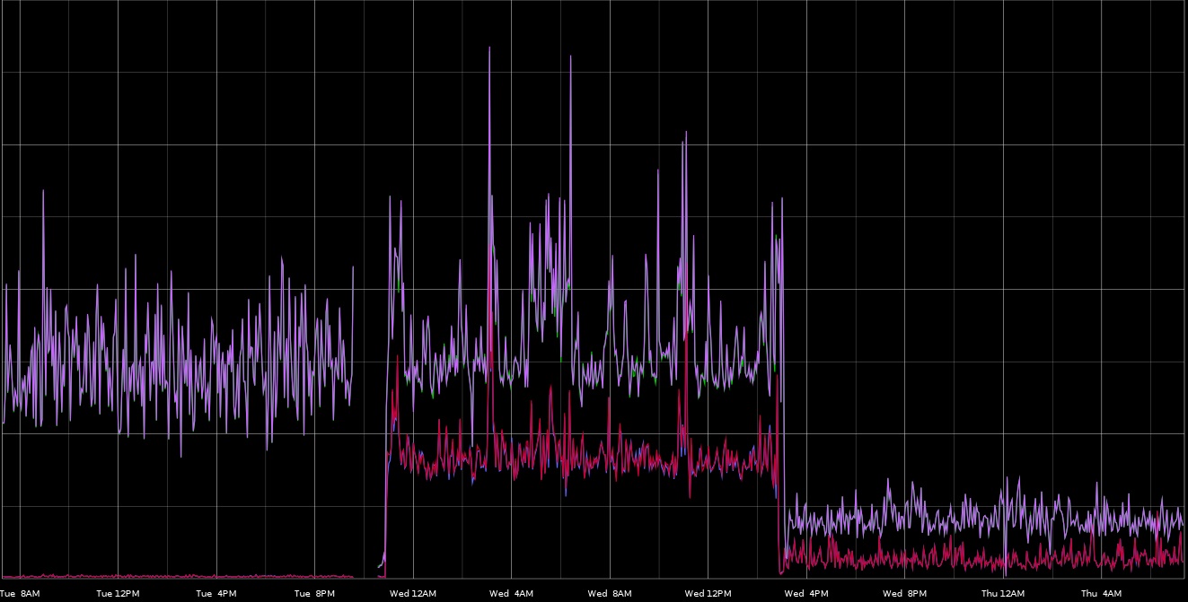
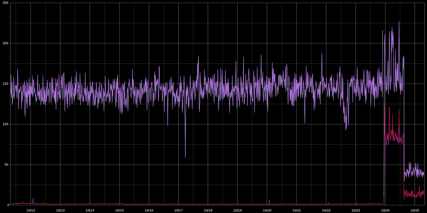
You can probably spot some common patterns in this graph. Here's a bit more historical context:
Guess: EBS got slow and affected top-line response time.