title: Payload Concepts label: Concepts order: 20 desc: Payload is based around a small and intuitive set of concepts. Key concepts include collections, globals, fields and more. keywords: documentation, getting started, guide, Content Management System, cms, headless, javascript, node, react, nextjs
Payload is based around a small and intuitive set of high-level concepts. Before starting to work with Payload, it's a good idea to familiarize yourself with these concepts in order to establish a common language and understanding when discussing Payload.
The Payload Config is central to everything that Payload does. It allows for the deep configuration of your application through a simple and intuitive API. The Payload Config is a fully-typed JavaScript object that can be infinitely extended upon. More details.
Payload is database agnostic, meaning you can use any type of database behind Payload's familiar APIs through what is known as a Database Adapter. More details.
A Collection is a group of records, called Documents, that all share a common schema. Each Collection is stored in the Database based on the Fields that you define. More details.
Globals are in many ways similar to Collections, except they correspond to only a single Document. Each Global is stored in the Database based on the Fields that you define. More details.
Fields are the building blocks of Payload. They define the schema of the Documents that will be stored in the Database, as well as automatically generate the corresponding UI within the Admin Panel. More details.
Hooks allow you to execute your own side effects during specific events of the Document lifecycle, such as before read, after create, etc. More details.
Payload provides a secure, portable way to manage user accounts out of the box. Payload Authentication is designed to be used in both the Admin Panel, as well as your own external applications. More details.
Access Control determines what a user can and cannot do with any given Document, such as read, update, etc., as well as what they can and cannot see within the Admin Panel. More details.
Payload dynamically generates a beautiful, fully type-safe interface to manage your users and data. The Admin Panel is a React application built using the Next.js App Router. More details.
Everything Payload does (create, read, update, delete, login, logout, etc.) is exposed to you via three APIs:
- Local API - Extremely fast, direct-to-database access
- REST API - Standard HTTP endpoints for querying and mutating data
- GraphQL - A full GraphQL API with a GraphQL Playground
By far one of the most powerful aspects of Payload is the fact that it gives you direct-to-database access to your data through the Local API. It's extremely fast and does not incur any typical HTTP overhead—you query your database directly in Node.js.
The Local API is written in TypeScript, and so it is strongly typed and extremely nice to use. It works anywhere on the server, including custom Next.js Routes, Payload Hooks, Payload Access Control, and React Server Components.
Here's a quick example of a React Server Component fetching data using the Local API:
import React from 'react'
import config from '@payload-config'
import { getPayload } from 'payload'

const MyServerComponent: React.FC = () => {
  const payload = await getPayload({ config })

  // The `findResult` here will be fully typed as `PaginatedDocs<Page>`,
  // where you will have the `docs` that are returned as well as
  // information about how many items are returned / are available in total / etc
  const findResult = await payload.find({ collection: 'pages' })

  return (
    <ul>
      {findResult.docs.map((page) => {
        // Render whatever here!
        // The `page` is fully typed as your Pages collection!
      })}
    </ul>
  )
}By default, the Payload REST API is mounted automatically for you at the /api path of your app.
For example, if you have a Collection called pages:
fetch('https://localhost:3000/api/pages') // highlight-line
  .then((res) => res.json())
.then((data) => console.log(data))Payload automatically exposes GraphQL queries and mutations through a dedicated GraphQL API. By default, the GraphQL route handler is mounted at the /api/graphql path of your app. You'll also find a full GraphQL Playground which can be accessible at the /api/graphql-playground path of your app.
You can use any GraphQL client with Payload's GraphQL endpoint. Here are a few packages:
graphql-request- a very lightweight GraphQL client@apollo/client- an industry-standard GraphQL client with lots of nice features
Payload is abstracted into a set of dedicated packages to keep the core payload package as lightweight as possible. This allows you to only install the parts of Payload based on your unique project requirements.
payload
The payload package is where core business logic for Payload lives. You can think of Payload as an ORM with superpowers—it contains the logic for all Payload "operations" like find, create, update, and delete and exposes a Local API. It executes Access Control, Hooks, Validation, and more.
Payload itself is extremely compact, and can be used in any Node environment. As long as you have payload installed and you have access to your Payload Config, you can query and mutate your database directly without going through an unnecessary HTTP layer.
Payload also contains all TypeScript definitions, which can be imported from payload directly.
Here's how to import some common Payload types:
import { Config, CollectionConfig, GlobalConfig, Field } from 'payload'@payloadcms/next
Whereas Payload itself is responsible for direct database access, and control over Payload business logic, the @payloadcms/next package is responsible for the Admin Panel and the entire HTTP layer that Payload exposes, including the REST API and GraphQL API.
@payloadcms/graphql
All of Payload's GraphQL functionality is abstracted into a separate package. Payload, its Admin UI, and REST API have absolutely no overlap with GraphQL, and you will incur no performance overhead from GraphQL if you are not using it. However, it's installed within the @payloadcms/next package so you don't have to install it manually. You do, however, need to have GraphQL installed separately in your package.json if you are using GraphQL.
@payloadcms/ui
This is the UI library that Payload's Admin Panel uses. All components are exported from this package and can be re-used as you build extensions to the Payload admin UI, or want to use Payload components in your own React apps. Some exports are server components and some are client components.
@payloadcms/db-postgres, @payloadcms/db-vercel-postgres, @payloadcms/db-mongodb, @payloadcms/db-sqlite
You can choose which Database Adapter you'd like to use for your project, and no matter which you choose, the entire data layer for Payload is contained within these packages. You can only use one at a time for any given project.
@payloadcms/richtext-lexical, @payloadcms/richtext-slate
Payload's Rich Text functionality is abstracted into separate packages and if you want to enable Rich Text in your project, you'll need to install one of these packages. We recommend Lexical for all new projects, and this is where Payload will focus its efforts on from this point, but Slate is still supported if you have already built with it.
**Note:** Rich Text is entirely optional and you may not need it for your project.title: Installation label: Installation order: 30 desc: To quickly get started with Payload, simply run npx create-payload-app or install from scratch. keywords: documentation, getting started, guide, Content Management System, cms, headless, javascript, node, react, nextjs
Payload requires the following software:
- Any JavaScript package manager (pnpm, npm, or yarn - pnpm is preferred)
- Node.js version 20.9.0+
- Any compatible database (MongoDB, Postgres or SQLite)
To quickly scaffold a new Payload app in the fastest way possible, you can use create-payload-app. To do so, run the following command:
npx create-payload-app
Then just follow the prompts! You'll get set up with a new folder and a functioning Payload app inside. You can then start configuring your application.
Adding Payload to an existing Next.js app is super straightforward. You can either run the npx create-payload-app command inside your Next.js project's folder, or manually install Payload by following the steps below.
If you don't have a Next.js app already, but you still want to start a project from a blank Next.js app, you can create a new Next.js app using npx create-next-app - and then just follow the steps below to install Payload.
First, you'll want to add the required Payload packages to your project and can do so by running the command below:
pnpm i payload @payloadcms/next @payloadcms/richtext-lexical sharp graphqlNext, install a Database Adapter. Payload requires a Database Adapter to establish a database connection. Payload works with all types of databases, but the most common are MongoDB and Postgres.
To install a Database Adapter, you can run one of the following commands:
-
To install the MongoDB Adapter, run:
pnpm i @payloadcms/db-mongodb
-
To install the Postgres Adapter, run:
pnpm i @payloadcms/db-postgres
Payload installs directly in your Next.js /app folder, and you'll need to place some files into that folder for Payload to run. You can copy these files from the Blank Template on GitHub. Once you have the required Payload files in place in your /app folder, you should have something like this:
app/
├─ (payload)/
├── // Payload files
├─ (my-app)/
├── // Your app files
For an exact reference of the (payload) directory, see Project Structure.
The files that Payload needs to have in your /app folder do not regenerate, and will never change. Once you slot them in, you never have to revisit them. They are not meant to be edited and simply import Payload dependencies from @payloadcms/next for the REST / GraphQL API and Admin Panel.
You can name the (my-app) folder anything you want. The name does not matter and will just be used to clarify your directory structure for yourself. Common names might be (frontend), (app), or similar. More details.
Payload has a Next.js plugin that it uses to ensure compatibility with some of the packages Payload relies on, like mongodb or drizzle-kit.
To add the Payload Plugin, use withPayload in your next.config.js:
import { withPayload } from '@payloadcms/next/withPayload'

/** @type {import('next').NextConfig} */
const nextConfig = {
  // Your Next.js config here
  experimental: {
    reactCompiler: false
  }
}

// Make sure you wrap your `nextConfig`
// with the `withPayload` plugin
export default withPayload(nextConfig) // highlight-lineTo import the Payload Plugin, you need to make sure your next.config file is set up to use ESM.
You can do this in one of two ways:
- Set your own project to use ESM, by adding
"type": "module"to yourpackage.jsonfile - Give your Next.js config the
.mjsfile extension
In either case, all requires and exports in your next.config file will need to be converted to import / export if they are not set up that way already.
Finally, you need to create a Payload Config. Generally the Payload Config is located at the root of your repository, or next to your /app folder, and is named payload.config.ts.
Here's what Payload needs at a bare minimum:
import sharp from 'sharp'
import { lexicalEditor } from '@payloadcms/richtext-lexical'
import { mongooseAdapter } from '@payloadcms/db-mongodb'
import { buildConfig } from 'payload'

export default buildConfig({
  // If you'd like to use Rich Text, pass your editor here
  editor: lexicalEditor(),

  // Define and configure your collections in this array
  collections: [],

  // Your Payload secret - should be a complex and secure string, unguessable
  secret: process.env.PAYLOAD_SECRET || '',
  // Whichever Database Adapter you're using should go here
  // Mongoose is shown as an example, but you can also use Postgres
  db: mongooseAdapter({
    url: process.env.DATABASE_URI || '',
  }),
  // If you want to resize images, crop, set focal point, etc.
  // make sure to install it and pass it to the config.
  // This is optional - if you don't need to do these things,
  // you don't need it!
  sharp,
})
Although this is just the bare minimum config, there are many more options that you can control here. To reference the full config and all of its options, click here.
Once you have a Payload Config, update your tsconfig to include a path that points to it:
{
  "compilerOptions": {
    "paths": {
      "@payload-config": [
        "./payload.config.ts"
      ]
    }
  },
}After you've reached this point, it's time to boot up Payload. Start your project in your application's folder to get going. By default, the Next.js dev script is pnpm dev (or npm run dev if using npm).
After it starts, you can go to http://localhost:3000/admin to create your first Payload user!
title: What is Payload? label: What is Payload? order: 10 desc: Payload is a next-gen application framework that can be used as a Content Management System, enterprise tool framework, headless commerce platform, or digital asset management tool. keywords: documentation, getting started, guide, Content Management System, cms, headless, javascript, node, react
Payload is the Next.js fullstack framework. Write a Payload Config and instantly get:
- A full Admin Panel using React server / client components, matching the shape of your data and completely extensible with your own React components
- Automatic database schema, including direct DB access and ownership, with migrations, transactions, proper indexing, and more
- Instant REST, GraphQL, and straight-to-DB Node.js APIs
- Authentication which can be used in your own apps
- A deeply customizable access control pattern
- File storage and image management tools like cropping / focal point selection
- Live preview - see your frontend render content changes in realtime as you update
- Lots more
No matter what you're building, Payload will give you backend superpowers. Your entire Payload config can be installed in one line into any existing Next.js app, and is designed to catapult your development process. Payload takes the most complex and time-consuming parts of any modern web app and makes them simple.
It's fully open source with an MIT license and you can self-host anywhere that you can run a Node.js app. You can also deploy serverless to hosts like Vercel, right inside your existing Next.js application.
In Payload, there are no "click ops" - as in clicking around in an Admin Panel to define your schema. In Payload, everything is done the right way—code-first and version controlled like a proper backend. But once developers define how Payload should work, non-technical users can independently make use of its Admin Panel to manage whatever they need to without having to know code whatsoever.
Even in spite of how much you get out of the box, you still have full control over every aspect of your app - be it database, admin UI, or anything else. Every part of Payload has been designed to be extensible and customizable with modern TypeScript / React. And you'll fully understand the code that you write.
Payload started as a headless Content Management System (CMS), but since, we've seen our community leverage Payload in ways far outside of simply managing pages and blog posts. It's grown into a full-stack TypeScript app framework.
Large enterprises use Payload to power significant internal tools, retailers power their entire storefronts without the need for headless Shopify, and massive amounts of digital assets are stored + managed within Payload. Of course, websites large and small still use Payload for content management as well.
The biggest barrier in large web projects cited by marketers is engineering. On the flip side, engineers say the opposite. This is a big problem that has yet to be solved even though we have countless CMS options.
Payload has restored a little love back into the dev / marketer equation with features like Live Preview, redirects, form builders, visual editing, static A/B testing, and more. But even with all this focus on marketing efficiency, we aren't compromising on the developer experience. That way engineers and marketers alike can be proud of the products they build.
If you're building a website and your frontend is on Next.js, then Payload is a no-brainer.
Instead of going out and signing up for a SaaS vendor that makes it so you have to manage two completely separate concerns, with little to no native connection back and forth, just install Payload in your existing Next.js repo and instantly get a full CMS.Get started with Payload as a CMS using our official Website template:
npx create-payload-app@latest -t website
When a large organization starts up a new software initiative, there's a lot of plumbing to take care of.
- Scaffold the data layer with an ORM or an app framework like Ruby on Rails or Laravel
- Implement their SSO provider for authentication
- Design an access control pattern for authorization
- Open up any REST endpoints required or implement GraphQL queries / mutations
- Implement a migrations workflow for the database as it changes over time
- Integrate with other third party solutions by crafting a system of webhooks or similar
And then there's the Admin Panel. Most enterprise tools require an admin UI, and building one from scratch can be the most time-consuming aspect of any new enterprise tool. There are off-the-shelf packages for app frameworks like Rails, but often the customization is so involved that using Material UI or similar from scratch might be better.
Then there are no-code admin builders that could be used. However, wiring up access control and the connection to the data layer, with proper version control, makes this a challenging task as well.
That's where Payload comes in. Payload instantly provides all of this out of the box, making complex internal tools extremely simple to both spin up and maintain over time. The only custom code that will need to be written is any custom business logic. That means Payload can expedite timelines, keep budgets low, and allow engineers to focus on their specific requirements rather than complex backend / admin UI plumbing.
Generally, the best place to start for a new enterprise tool is with a blank canvas, where you can define your own functionality:
npx create-payload-app@latest -t blank
Companies who prioritize UX generally run into frontend constraints with traditional commerce vendors. These companies will then opt for frontend frameworks like Next.js which allow them to fine-tune their user experience as much as possible—promoting conversions, personalizing experiences, and optimizing for SEO.
But the challenge with using something like Next.js for headless commerce is that in order for non-technical users to manage the storefront, you instantly need to pair a headless commerce product with a headless CMS. Then, your editors need to bounce back and forth between different admin UIs for different functionality. The code required to seamlessly glue them together on the frontend becomes overly complex.
Payload can integrate with any payment processor like Stripe and its content authoring capabilities allow it to manage every aspect of a storefront—all in one place.
If you can build your storefront with a single backend, and only offload things like payment processing, the code will be simpler and the editing experience will be significantly streamlined. Manage products, catalogs, page content, media, and more—all in one spot.
Payload's API-first tagging, sorting, and querying engine lends itself perfectly to all types of content that a CMS might ordinarily store, but these strong fundamentals also make it a formidable Digital Asset Management (DAM) tool as well.
Similarly to the Ecommerce use case above, if an organization uses a CMS for its content but a separate DAM for its digital assets, administrators of both tools will need to juggle completely different services for tasks that are closely related. Two subscriptions will need to be managed, two sets of infrastructure will need to be provisioned, and two admin UIs need to be used / learned.
Payload flattens CMS and DAM into a single tool that makes no compromises on either side. Powerful features like folder-based organization, file versioning, bulk upload, and media access control allow Payload to simultaneously function as a full Digital Asset Management platform as well as a Content Management System at the same time.
Click here for more information on how to get started with Payload as a DAM.
Payload is a great choice for applications of all sizes and types, but it might not be the right choice for every project. Here are some guidelines to help you decide if Payload is the right choice for your project.
- If data ownership and privacy are important to you, and you don't want to allow another proprietary SaaS vendor to host and own your data
- If you're building a Next.js site that needs a CMS
- If you need to re-use your data outside of a SaaS API
- If what you're building has custom business logic requirements outside of a typical headless CMS
- You want to deploy serverless on platforms like Vercel
- If you can manage your project fully with code, and don't need an admin UI
- If you are building a website that fits within the limits of a tool like Webflow or Framer
- If you already have a full database and just need to visualize the data somehow
- If you are confident that you won't need code / data ownership at any point in the future
Ready to get started? First, let's review some high-level concepts that are used in Payload.
title: Collection Access Control label: Collections order: 20 desc: With Collection-level Access Control you can define which users can create, read, update or delete Collections. keywords: collections, access control, permissions, documentation, Content Management System, cms, headless, javascript, node, react, nextjs
Collection Access Control is Access Control used to restrict access to Documents within a Collection, as well as what they can and cannot see within the Admin Panel as it relates to that Collection.
To add Access Control to a Collection, use the access property in your Collection Config:
import type { CollectionConfig } from 'payload';

export const CollectionWithAccessControl: CollectionConfig = {
  // ...
  access: { // highlight-line
    // ...
  },
}Access Control is specific to the operation of the request.
To add Access Control to a Collection, use the access property in your Collection Config:
import type { CollectionConfig } from 'payload';

export const CollectionWithAccessControl: CollectionConfig = {
  // ...
  // highlight-start
  access: {
    create: () => {...},
    read: () => {...},
    update: () => {...},
    delete: () => {...},

    // Auth-enabled Collections only
    admin: () => {...},
    unlock: () => {...},

    // Version-enabled Collections only
    readVersions: () => {...},
  },
  // highlight-end
}
The following options are available:
| Function | Allows/Denies Access |
|---|---|
create |
Used in the create operation. More details. |
read |
Used in the find and findByID operations. More details. |
update |
Used in the update operation. More details. |
delete |
Used in the delete operation. More details. |
If a Collection supports Authentication, the following additional options are available:
| Function | Allows/Denies Access |
|---|---|
admin |
Used to restrict access to the Admin Panel. More details. |
unlock |
Used to restrict which users can access the unlock operation. More details. |
If a Collection supports Versions, the following additional options are available:
| Function | Allows/Denies Access |
|---|---|
readVersions |
Used to control who can read versions, and who can't. Will automatically restrict the Admin UI version viewing access. More details. |
Returns a boolean which allows/denies access to the create request.
To add create Access Control to a Collection, use the create property in the Collection Config:
import type { CollectionConfig } from 'payload'

export const CollectionWithCreateAccess: CollectionConfig = {
  // ...
  access: {
    // highlight-start
    create: ({ req: { user }, data }) => {
      return Boolean(user)
    },
    // highlight-end
  },
}
The following arguments are provided to the create function:
| Option | Description |
|---|---|
req |
The Request object containing the currently authenticated user. |
data |
The data passed to create the document with. |
Returns a boolean which allows/denies access to the read request.
To add read Access Control to a Collection, use the read property in the Collection Config:
import type { CollectionConfig } from 'payload'

export const CollectionWithReadAccess: CollectionConfig = {
  // ...
  access: {
    // highlight-start
    read: ({ req: { user } }) => {
      return Boolean(user)
    },
    // highlight-end
  },
}As your application becomes more complex, you may want to define your function in a separate file and import them into your Collection Config:
import type { Access } from 'payload'

export const canReadPage: Access = ({ req: { user } }) => {
  // Allow authenticated users
  if (user) {
    return true
  }

  // By returning a Query, guest users can read public Documents
  // Note: this assumes you have a `isPublic` checkbox field on your Collection
  return {
    isPublic: {
      equals: true,
    },
  }
}
The following arguments are provided to the read function:
| Option | Description |
|---|---|
req |
The Request object containing the currently authenticated user. |
id |
id of document requested, if within findByID. |
Returns a boolean which allows/denies access to the update request.
To add update Access Control to a Collection, use the update property in the Collection Config:
import type { CollectionConfig } from 'payload'

export const CollectionWithUpdateAccess: CollectionConfig = {
  // ...
  access: {
    // highlight-start
    update: ({ req: { user }}) => {
      return Boolean(user)
    },
    // highlight-end
  },
}As your application becomes more complex, you may want to define your function in a separate file and import them into your Collection Config:
import type { Access } from 'payload'

export const canUpdateUser: Access = ({ req: { user }, id }) => {
  // Allow users with a role of 'admin'
  if (user.roles && user.roles.some((role) => role === 'admin')) {
    return true
  }

  // allow any other users to update only oneself
  return user.id === id
}
The following arguments are provided to the update function:
| Option | Description |
|---|---|
req |
The Request object containing the currently authenticated user. |
id |
id of document requested to update. |
data |
The data passed to update the document with. |
Similarly to the Update function, returns a boolean or a query constraint to limit which documents can be deleted by which users.
To add delete Access Control to a Collection, use the delete property in the Collection Config:
import type { CollectionConfig } from 'payload'

export const CollectionWithDeleteAccess: CollectionConfig = {
  // ...
  access: {
    // highlight-start
    delete: ({ req: { user }}) => {
      return Boolean(user)
    },
    // highlight-end
  },
}
As your application becomes more complex, you may want to define your function in a separate file and import them into your Collection Config:
import type { Access } from 'payload'

export const canDeleteCustomer: Access = async ({ req, id }) => {
  if (!id) {
    // allow the admin UI to show controls to delete since it is indeterminate without the `id`
    return true
  }

  // Query another Collection using the `id`
  const result = await req.payload.find({
    collection: 'contracts',
    limit: 0,
    depth: 0,
    where: {
      customer: { equals: id },
    },
  })

  return result.totalDocs === 0
}
The following arguments are provided to the delete function:
| Option | Description |
|---|---|
req |
The Request object with additional user property, which is the currently logged in user. |
id |
id of document requested to delete. |
If the Collection is used to access the Admin Panel, the Admin Access Control function determines whether or not the currently logged in user can access the admin UI.
To add Admin Access Control to a Collection, use the admin property in the Collection Config:
import type { CollectionConfig } from 'payload'

export const CollectionWithAdminAccess: CollectionConfig = {
  // ...
  access: {
    // highlight-start
    admin: ({ req: { user }}) => {
      return Boolean(user)
    },
    // highlight-end
  },
}
The following arguments are provided to the admin function:
| Option | Description |
|---|---|
req |
The Request object containing the currently authenticated user. |
Determines which users can unlock other users who may be blocked from authenticating successfully due to failing too many login attempts.
To add Unlock Access Control to a Collection, use the unlock property in the Collection Config:
import type { CollectionConfig } from 'payload'

export const CollectionWithUnlockAccess: CollectionConfig = {
  // ...
  access: {
    // highlight-start
    unlock: ({ req: { user }}) => {
      return Boolean(user)
    },
    // highlight-end
  },
}
The following arguments are provided to the unlock function:
| Option | Description |
|---|---|
req |
The Request object containing the currently authenticated user. |
If the Collection has Versions enabled, the readVersions Access Control function determines whether or not the currently logged in user can access the version history of a Document.
To add Read Versions Access Control to a Collection, use the readVersions property in the Collection Config:
import type { CollectionConfig } from 'payload'

export const CollectionWithVersionsAccess: CollectionConfig = {
  // ...
  access: {
    // highlight-start
    readVersions: ({ req: { user }}) => {
      return Boolean(user)
    },
    // highlight-end
  },
}
The following arguments are provided to the readVersions function:
| Option | Description |
|---|---|
req |
The Request object containing the currently authenticated user. |
title: Field-level Access Control label: Fields order: 40 desc: Field-level Access Control is specified within a field's config, and allows you to define which users can create, read or update Fields. keywords: fields, access control, permissions, documentation, Content Management System, cms, headless, javascript, node, react, nextjs
Field Access Control is Access Control used to restrict access to specific Fields within a Document.
To add Access Control to a Field, use the access property in your Field Config:
import type { Field } from 'payload';

export const FieldWithAccessControl: Field = {
  // ...
  access: { // highlight-line
    // ...
  },
}Access Control is specific to the operation of the request.
To add Access Control to a Field, use the access property in the Field Config:
import type { CollectionConfig } from 'payload';

export const Posts: CollectionConfig = {
  slug: 'posts',
  fields: [
    {
      name: 'title',
      type: 'text',
      // highlight-start
      access: {
        create: ({ req: { user } }) => { ... },
        read: ({ req: { user } }) => { ... },
        update: ({ req: { user } }) => { ... },
      },
      // highlight-end
    };
  ],
};
The following options are available:
| Function | Purpose |
|---|---|
create |
Allows or denies the ability to set a field's value when creating a new document. More details. |
read |
Allows or denies the ability to read a field's value. More details. |
update |
Allows or denies the ability to update a field's value More details. |
Returns a boolean which allows or denies the ability to set a field's value when creating a new document. If false is returned, any passed values will be discarded.
Available argument properties:
| Option | Description |
|---|---|
req |
The Request object containing the currently authenticated user |
data |
The full data passed to create the document. |
siblingData |
Immediately adjacent field data passed to create the document. |
Returns a boolean which allows or denies the ability to read a field's value. If false, the entire property is omitted from the resulting document.
Available argument properties:
| Option | Description |
|---|---|
req |
The Request object containing the currently authenticated user |
id |
id of the document being read |
doc |
The full document data. |
siblingData |
Immediately adjacent field data of the document being read. |
Returns a boolean which allows or denies the ability to update a field's value. If false is returned, any passed values will be discarded.
If false is returned and you attempt to update the field's value, the operation will not throw an error however the field will be omitted from the update operation and the value will remain unchanged.
Available argument properties:
| Option | Description |
|---|---|
req |
The Request object containing the currently authenticated user |
id |
id of the document being updated |
data |
The full data passed to update the document. |
siblingData |
Immediately adjacent field data passed to update the document with. |
doc |
The full document data, before the update is applied. |
title: Globals Access Control
label: Globals
order: 30
desc: Global-level Access Control is specified within each Global's access property and allows you to define which users can read or update Globals.
keywords: globals, access control, permissions, documentation, Content Management System, cms, headless, javascript, node, react, nextjs
Global Access Control is Access Control used to restrict access to Global Documents, as well as what they can and cannot see within the Admin Panel as it relates to that Global.
To add Access Control to a Global, use the access property in your Global Config:
import type { GlobalConfig } from 'payload';

export const GlobalWithAccessControl: GlobalConfig = {
  // ...
  access: { // highlight-line
    // ...
  },
}Access Control is specific to the operation of the request.
To add Access Control to a Global, use the access property in the Global Config:
import { GlobalConfig } from 'payload'

const GlobalWithAccessControl: GlobalConfig = {
  // ...
  // highlight-start
  access: {
    read: ({ req: { user } }) => {...},
    update: ({ req: { user } }) => {...},

    // Version-enabled Globals only
    readVersion: () => {...},
  },
  // highlight-end
}

export default Header
The following options are available:
| Function | Allows/Denies Access |
|---|---|
read |
Used in the findOne Global operation. More details. |
update |
Used in the update Global operation. More details. |
If a Global supports Versions, the following additional options are available:
| Function | Allows/Denies Access |
|---|---|
readVersions |
Used to control who can read versions, and who can't. Will automatically restrict the Admin UI version viewing access. More details. |
Returns a boolean result or optionally a query constraint which limits who can read this global based on its current properties.
To add read Access Control to a Global, use the read property in the Global Config:
import { GlobalConfig } from 'payload'

const Header: GlobalConfig = {
  // ...
  // highlight-start
  read: {
    read: ({ req: { user } }) => {
      return Boolean(user)
    },
  }
  // highlight-end
}
The following arguments are provided to the read function:
| Option | Description |
|---|---|
req |
The Request object containing the currently authenticated user. |
Returns a boolean result or optionally a query constraint which limits who can update this global based on its current properties.
To add update Access Control to a Global, use the access property in the Global Config:
import { GlobalConfig } from 'payload'

const Header: GlobalConfig = {
  // ...
  // highlight-start
  access: {
    update: ({ req: { user }, data }) => {
      return Boolean(user)
    },
  }
  // highlight-end
}
The following arguments are provided to the update function:
| Option | Description |
|---|---|
req |
The Request object containing the currently authenticated user. |
data |
The data passed to update the global with. |
If the Global has Versions enabled, the readVersions Access Control function determines whether or not the currently logged in user can access the version history of a Document.
To add Read Versions Access Control to a Collection, use the readVersions property in the Global Config:
import type { GlobalConfig } from 'payload'

export const GlobalWithVersionsAccess: GlobalConfig = {
  // ...
  access: {
    // highlight-start
    readVersions: ({ req: { user }}) => {
      return Boolean(user)
    },
    // highlight-end
  },
}
The following arguments are provided to the readVersions function:
| Option | Description |
|---|---|
req |
The Request object containing the currently authenticated user. |
title: Access Control label: Overview order: 10 desc: Payload makes it simple to define and manage Access Control. By declaring roles, you can set permissions and restrict what your users can interact with. keywords: overview, access control, permissions, documentation, Content Management System, cms, headless, javascript, node, react, nextjs
Access Control determines what a user can and cannot do with any given Document, as well as what they can and cannot see within the Admin Panel. By implementing Access Control, you can define granular restrictions based on the user, their roles (RBAC), Document data, or any other criteria your application requires.
Access Control functions are scoped to the operation, meaning you can have different rules for create, read, update, delete, etc. Access Control functions are executed before any changes are made and before any operations are completed. This allows you to determine if the user has the necessary permissions before fulfilling the request.
There are many use cases for Access Control, including:
- Allowing anyone
readaccess to all posts - Only allowing public access to posts where a
statusfield is equal topublished - Giving only users with a
rolefield equal toadminthe ability to delete posts - Allowing anyone to submit contact forms, but only logged in users to
read,updateordeletethem - Restricting a user to only be able to see their own orders, but no-one else's
- Allowing users that belong to a certain organization to access only that organization's resources
There are three main types of Access Control in Payload:
Payload provides default Access Control so that your data is secured behind Authentication without additional configuration. To do this, Payload sets a default function that simply checks if a user is present on the request. You can override this default behavior by defining your own Access Control functions as needed.
Here is the default Access Control that Payload provides:
const defaultPayloadAccess = ({ req: { user } }) => {
  // Return `true` if a user is found
  // and `false` if it is undefined or null
  return Boolean(user) // highlight-line
}The Admin Panel responds dynamically to your changes to Access Control. For example, if you restrict editing ExampleCollection to only users that feature an "admin" role, Payload will hide that Collection from the Admin Panel entirely. This is super powerful and allows you to control who can do what within your Admin Panel using the same functions that secure your APIs.
To accomplish this, Payload exposes the Access Operation. Upon login, Payload executes each Access Control function at the top level, across all Collections, Globals, and Fields, and returns a response that contains a reflection of what the currently authenticated user can do within your application.
**Important:** When your access control functions are executed via the [Access Operation](../authentication/operations#access), the `id` and `data` arguments will be `undefined`. This is because Payload is executing your functions without referencing a specific Document.If you use id or data within your access control functions, make sure to check that they are defined first. If they are not, then you can assume that your Access Control is being executed via the Access Operation to determine solely what the user can do within the Admin Panel.
To implement locale-specific access control, you can use the req.locale argument in your access control functions. This argument allows you to evaluate the current locale of the request and determine access permissions accordingly.
Here is an example:
const access = ({ req }) => {
  // Grant access if the locale is 'en'
  if (req.locale === 'en') {
    return true;
  }

  // Deny access for all other locales
  return false;
}title: Swap in your own React components label: Custom Components order: 40 desc: Fully customize your Admin Panel by swapping in your own React components. Add fields, remove views, update routes and change functions to sculpt your perfect Dashboard. keywords: admin, components, custom, documentation, Content Management System, cms, headless, javascript, node, react, nextjs
The Payload Admin Panel is designed to be as minimal and straightforward as possible to allow for easy customization and full control over the UI. In order for Payload to support this level of customization, Payload provides a pattern for you to supply your own React components through your Payload Config.
All Custom Components in Payload are React Server Components by default. This enables the use of the Local API directly on the front-end. Custom Components are available for nearly every part of the Admin Panel for extreme granularity and control.
**Note:** Client Components continue to be fully supported. To use Client Components in your app, simply include the `use client` directive. Payload will automatically detect and remove all default, [non-serializable props](https://react.dev/reference/rsc/use-client#serializable-types) before rendering your component. [More details](#client-components).There are four main types of Custom Components in Payload:
To swap in your own Custom Component, first consult the list of available components, determine the scope that corresponds to what you are trying to accomplish, then author your React component(s) accordingly.
As Payload compiles the Admin Panel, it checks your config for Custom Components. When detected, Payload either replaces its own default component with yours, or if none exists by default, renders yours outright. While are many places where Custom Components are supported in Payload, each is defined in the same way using Component Paths.
To add a Custom Component, point to its file path in your Payload Config:
import { buildConfig } from 'payload'

const config = buildConfig({
  // ...
  admin: {
    components: {
      logout: {
        Button: '/src/components/Logout#MyComponent' // highlight-line
      }
    }
  },
})In order to ensure the Payload Config is fully Node.js compatible and as lightweight as possible, components are not directly imported into your config. Instead, they are identified by their file path for the Admin Panel to resolve on its own.
Component Paths, by default, are relative to your project's base directory. This is either your current working directory, or the directory specified in config.admin.baseDir. To simplify Component Paths, you can also configure the base directory using the admin.importMap.baseDir property.
Components using named exports are identified either by appending # followed by the export name, or using the exportName property. If the component is the default export, this can be omitted.
import { buildConfig } from 'payload'
import { fileURLToPath } from 'node:url'
import path from 'path'
const filename = fileURLToPath(import.meta.url)
const dirname = path.dirname(filename)

const config = buildConfig({
  // ...
  admin: {
    importMap: {
      baseDir: path.resolve(dirname, 'src'), // highlight-line
    },
    components: {
      logout: {
        Button: '/components/Logout#MyComponent' // highlight-line
      }
    }
  },
})
In this example, we set the base directory to the src directory, and omit the /src/ part of our component path string.
While Custom Components are usually defined as a string, you can also pass in an object with additional options:
import { buildConfig } from 'payload'

const config = buildConfig({
  // ...
  admin: {
    components: {
      logout: {
        // highlight-start
        Button: {
          path: '/src/components/Logout',
          exportName: 'MyComponent',
        }
        // highlight-end
      }
    }
  },
})
The following options are available:
| Property | Description |
|---|---|
clientProps |
Props to be passed to the Custom Components if it's a Client Component. More details. |
exportName |
Instead of declaring named exports using # in the component path, you can also omit them from path and pass them in here. |
path |
File path to the Custom Component. Named exports can be appended to the end of the path, separated by a #. |
serverProps |
Props to be passed to the Custom Component if it's a Server Component. More details. |
For more details on how to build Custom Components, see Building Custom Components.
In order for Payload to make use of Component Paths, an "Import Map" is automatically generated at app/(payload)/admin/importMap.js. This file contains every Custom Component in your config, keyed to their respective paths. When Payload needs to lookup a component, it uses this file to find the correct import.
The Import Map is automatically regenerated at startup and whenever Hot Module Replacement (HMR) runs, or you can run payload generate:importmap to manually regenerate it.
If needed, custom items can be appended onto the Import Map. This is mostly only relevant for plugin authors who need to add a custom import that is not referenced in a known location.
To add a custom import to the Import Map, use the admin.dependencies property in your Payload Config:
import { buildConfig } from 'payload'

export default buildConfig({
  // ...
  admin: {
    // ...
    dependencies: {
      myTestComponent: { // myTestComponent is the key - can be anything
        path: '/components/TestComponent.js#TestComponent',
        type: 'component',
        clientProps: {
          test: 'hello',
        },
      },
    },
  }
}All Custom Components in Payload are React Server Components by default. This enables the use of the Local API directly on the front-end, among other things.
To make building Custom Components as easy as possible, Payload automatically provides common props, such as the payload class and the i18n object. This means that when building Custom Components within the Admin Panel, you do not have to get these yourself.
Here is an example:
import React from 'react'

const MyServerComponent = async ({
  payload // highlight-line
}) => {
  const page = await payload.findByID({
    collection: 'pages',
    id: '123',
  })

  return (
    <p>{page.title}</p>
  )
}
Each Custom Component receives the following props by default:
| Prop | Description |
|---|---|
payload |
The Payload class. |
i18n |
The i18n object. |
To pass in custom props from the config, you can use either the clientProps or serverProps properties depending on whether your prop is serializable, and whether your component is a Server or Client Component.
import { buildConfig } from 'payload'

const config = buildConfig({
  // ...
  admin: { // highlight-line
    components: {
      logout: {
        Button: {
          path: '/src/components/Logout#MyComponent',
          clientProps: {
            myCustomProp: 'Hello, World!' // highlight-line
          },
        }
      }
    }
  },
})
'use client'
import React from 'react'
export const MyComponent = ({ myCustomProp }: { myCustomProp: string }) => {
return (
<button>{myCustomProp}</button>
)
}When Building Custom Components, it's still possible to use client-side code such as useState or the window object. To do this, simply add the use client directive at the top of your file. Payload will automatically detect and remove all default, non-serializable props before rendering your component.
'use client' // highlight-line
import React, { useState } from 'react'

export const MyClientComponent: React.FC = () => {
  const [count, setCount] = useState(0)

  return (
    <button onClick={() => setCount(count + 1)}>
      Clicked {count} times
    </button>
  )
}From any Server Component, the Payload Config can be accessed directly from the payload prop:
import React from 'react'

export default async function MyServerComponent({
  payload: {
    config // highlight-line
  }
}) {
  return (
    <Link href={config.serverURL}>
      Go Home
    </Link>
  )
}
But, the Payload Config is non-serializable by design. It is full of custom validation functions, React components, etc. This means that the Payload Config, in its entirety, cannot be passed directly to Client Components.
For this reason, Payload creates a Client Config and passes it into the Config Provider. This is a serializable version of the Payload Config that can be accessed from any Client Component via the useConfig hook:
'use client'
import React from 'react'
import { useConfig } from '@payloadcms/ui'

export const MyClientComponent: React.FC = () => {
  const { config: { serverURL } } = useConfig() // highlight-line

  return (
    <Link href={serverURL}>
      Go Home
    </Link>
  )
}All Field Components automatically receive their respective Field Config through props.
import React from 'react'
import type { TextFieldServerComponent } from 'payload'

export const MyClientFieldComponent: TextFieldServerComponent = ({ field: { name } }) => {
  return (
    <p>
      {`This field's name is ${name}`}
    </p>
  )
}All Custom Components can support multiple languages to be consistent with Payload's Internationalization. To do this, first add your translation resources to the I18n Config.
From any Server Component, you can translate resources using the getTranslation function from @payloadcms/translations. All Server Components automatically receive the i18n object as a prop by default.
import React from 'react'
import { getTranslation } from '@payloadcms/translations'

export default async function MyServerComponent({ i18n }) {
  const translatedTitle = getTranslation(myTranslation, i18n) // highlight-line

  return (
    <p>{translatedTitle}</p>
  )
}
The best way to do this within a Client Component is to import the useTranslation hook from @payloadcms/ui:
'use client'
import React from 'react'
import { useTranslation } from '@payloadcms/ui'

export const MyClientComponent: React.FC = () => {
  const { t, i18n } = useTranslation() // highlight-line

  return (
    <ul>
      <li>{t('namespace1:key', { variable: 'value' })}</li>
      <li>{t('namespace2:key', { variable: 'value' })}</li>
      <li>{i18n.language}</li>
    </ul>
  )
}All Custom Views can support multiple locales to be consistent with Payload's Localization. They automatically receive the locale object as a prop by default. This can be used to scope API requests, etc.:
import React from 'react'

export default async function MyServerComponent({ payload, locale }) {
  const localizedPage = await payload.findByID({
    collection: 'pages',
    id: '123',
    locale,
  })

  return (
    <p>{localizedPage.title}</p>
  )
}
The best way to do this within a Client Component is to import the useLocale hook from @payloadcms/ui:
'use client'
import React from 'react'
import { useLocale } from '@payloadcms/ui'

const Greeting: React.FC = () => {
  const locale = useLocale() // highlight-line

  const trans = {
    en: 'Hello',
    es: 'Hola',
  }

  return (
    <span>{trans[locale.code]}</span>
  )
}To make it easier to build your Custom Components, you can use Payload's built-in React Hooks in any Client Component. For example, you might want to interact with one of Payload's many React Contexts. To do this, you can one of the many hooks available depending on your needs.
'use client'
import React from 'react'
import { useDocumentInfo } from '@payloadcms/ui'

export const MyClientComponent: React.FC = () => {
  const { slug } = useDocumentInfo() // highlight-line

  return (
    <p>{`Entity slug: ${slug}`}</p>
  )
}Payload has a robust CSS Library that you can use to style your Custom Components similarly to Payload's built-in styling. This will ensure that your Custom Components match the existing design system, and so that they automatically adapt to any theme changes that might occur.
To apply custom styles, simply import your own .css or .scss file into your Custom Component:
import './index.scss'

export const MyComponent: React.FC = () => {
  return (
    <div className="my-component">
      My Custom Component
    </div>
  )
}
Then to colorize your Custom Component's background, for example, you can use the following CSS:
.my-component {
  background-color: var(--theme-elevation-500);
}
Payload also exports its SCSS library for reuse which includes mixins, etc. To use this, simply import it as follows into your .scss file:
@import '~@payloadcms/ui/scss';

.my-component {
  @include mid-break {
    background-color: var(--theme-elevation-900);
  }
}Root Components are those that affect the Admin Panel generally, such as the logo or the main nav.
To override Root Components, use the admin.components property in your Payload Config:
import { buildConfig } from 'payload'

export default buildConfig({
  // ...
  admin: {
    // highlight-start
    components: {
      // ...
    },
    // highlight-end
  },
})
For details on how to build Custom Components, see Building Custom Components.
The following options are available:
| Path | Description |
|---|---|
Nav |
Contains the sidebar / mobile menu in its entirety. |
beforeNavLinks |
An array of Custom Components to inject into the built-in Nav, before the links themselves. |
afterNavLinks |
An array of Custom Components to inject into the built-in Nav, after the links. |
beforeDashboard |
An array of Custom Components to inject into the built-in Dashboard, before the default dashboard contents. |
afterDashboard |
An array of Custom Components to inject into the built-in Dashboard, after the default dashboard contents. |
beforeLogin |
An array of Custom Components to inject into the built-in Login, before the default login form. |
afterLogin |
An array of Custom Components to inject into the built-in Login, after the default login form. |
logout.Button |
The button displayed in the sidebar that logs the user out. |
graphics.Icon |
The simplified logo used in contexts like the the Nav component. |
graphics.Logo |
The full logo used in contexts like the Login view. |
providers |
Custom React Context providers that will wrap the entire Admin Panel. More details. |
actions |
An array of Custom Components to be rendered within the header of the Admin Panel, providing additional interactivity and functionality. |
header |
An array of Custom Components to be injected above the Payload header. |
views |
Override or create new views within the Admin Panel. More details. |
As you add more and more Custom Components to your Admin Panel, you may find it helpful to add additional React Context(s). Payload allows you to inject your own context providers in your app so you can export your own custom hooks, etc.
To add a Custom Provider, use the admin.components.providers property in your Payload Config:
import { buildConfig } from 'payload'

export default buildConfig({
  // ...
  admin: {
    components: {
      providers: ['/path/to/MyProvider'], // highlight-line
    },
  },
})
Then build your Custom Provider as follows:
'use client'
import React, { createContext, useContext } from 'react'

const MyCustomContext = React.createContext(myCustomValue)

export const MyProvider: React.FC = ({ children }) => {
  return (
    <MyCustomContext.Provider value={myCustomValue}>
      {children}
    </MyCustomContext.Provider>
  )
}

export const useMyCustomContext = () => useContext(MyCustomContext)title: Customizing CSS & SCSS label: Customizing CSS order: 80 desc: Customize the Payload Admin Panel further by adding your own CSS or SCSS style sheet to the configuration, powerful theme and design options are waiting for you. keywords: admin, css, scss, documentation, Content Management System, cms, headless, javascript, node, react, nextjs
Customizing the Payload Admin Panel through CSS alone is one of the easiest and most powerful ways to customize the look and feel of the dashboard. To allow for this level of customization, Payload:
- Exposes a root-level stylesheet for you to inject custom selectors
- Provides a CSS library that can be easily overridden or extended
- Uses BEM naming conventions so that class names are globally accessible
To customize the CSS within the Admin UI, determine scope and change you'd like to make, and then add your own CSS or SCSS to the configuration as needed.
Global CSS refers to the CSS that is applied to the entire Admin Panel. This is where you can have a significant impact to the look and feel of the Admin UI through just a few lines of code.
You can add your own global CSS through the root custom.scss file of your app. This file is loaded into the root of the Admin Panel and can be used to inject custom selectors or styles however needed.
Here is an example of how you might target the Dashboard View and change the background color:
.dashboard {
  background-color: red; // highlight-line
}All Payload CSS is encapsulated inside CSS layers under @layer payload-default. Any custom css will now have the highest possible specificity.
We have also provided a layer @layer payload if you want to use layers and ensure that your styles are applied after payload.
To override existing styles in a way that the previous rules of specificity would be respected you can use the default layer like so
@layer payload-default {
  // my styles within the payload specificity
}You can re-use Payload's SCSS variables and utilities in your own stylesheets by importing it from the UI package.
@import '~@payloadcms/ui/scss';To make it as easy as possible for you to override default styles, Payload uses BEM naming conventions for all CSS within the Admin UI. If you provide your own CSS, you can override any built-in styles easily, including targeting nested components and their various component states.
You can also override Payload's built-in CSS Variables. These variables are widely consumed by the Admin Panel, so modifying them has a significant impact on the look and feel of the Admin UI.
The following variables are defined and can be overridden:
- Breakpoints
- Colors
- Base color shades (white to black by default)
- Success / warning / error color shades
- Theme-specific colors (background, input background, text color, etc.)
- Elevation colors (used to determine how "bright" something should be when compared to the background)
- Sizing
- Horizontal gutter
- Transition speeds
- Font sizes
- Etc.
For an up-to-date, comprehensive list of all available variables, please refer to the Source Code.
**Warning:** If you're overriding colors or theme elevations, make sure to consider how [your changes will affect dark mode](#dark-mode).Colors are designed to automatically adapt to theme of the Admin Panel. By default, Payload automatically overrides all --theme-elevation colors and inverts all success / warning / error shades to suit dark mode. We also update some base theme variables like --theme-bg, --theme-text, etc.
title: React Hooks label: React Hooks order: 70 desc: Make use of all of the powerful React hooks that Payload provides. keywords: admin, components, custom, documentation, Content Management System, cms, headless, javascript, node, react, nextjs
Payload provides a variety of powerful React Hooks that can be used within your own Custom Components, such as Custom Fields. With them, you can interface with Payload itself to build just about any type of complex customization you can think of.
**Reminder:** All Custom Components are [React Server Components](https://react.dev/reference/rsc/server-components) by default. Hooks, on the other hand, are only available in client-side environments. To use hooks, [ensure your component is a client component](./components#client-components).The useField hook is used internally within all field components. It manages sending and receiving a field's state from its parent form. When you build a Custom Field Component, you will be responsible for sending and receiving the field's value to and from the form yourself.
To do so, import the useField hook as follows:
'use client'
import type { TextFieldClientComponent } from 'payload'
import { useField } from '@payloadcms/ui'

export const CustomTextField: TextFieldClientComponent = ({ path }) => {
  const { value, setValue } = useField({ path }) // highlight-line

  return (
    <div>
      <p>
        {path}
      </p>
      <input
        onChange={(e) => { setValue(e.target.value) }}
        value={value}
      />
    </div>
  )
}
The useField hook accepts the following arguments:
| Property | Description |
|---|---|
path |
If you do not provide a path, name will be used instead. This is the path to the field in the form data. |
validate |
A validation function executed client-side before submitting the form to the server. Different than Field-level Validation which runs strictly on the server. |
disableFormData |
If true, the field will not be included in the form data when the form is submitted. |
hasRows |
If true, the field will be treated as a field with rows. This is useful for fields like array and blocks. |
The useField hook returns the following object:
type FieldType<T> = {
  errorMessage?: string
  errorPaths?: string[]
  filterOptions?: FilterOptionsResult
  formInitializing: boolean
  formProcessing: boolean
  formSubmitted: boolean
  initialValue?: T
  path: string
  permissions: FieldPermissions
  readOnly?: boolean
  rows?: Row[]
  schemaPath: string
  setValue: (val: unknown, disableModifyingForm?: boolean) => void
  showError: boolean
  valid?: boolean
  value: T
}There are times when a custom field component needs to have access to data from other fields, and you have a few options to do so. The useFormFields hook is a powerful and highly performant way to retrieve a form's field state, as well as to retrieve the dispatchFields method, which can be helpful for setting other fields' form states from anywhere within a form.
Thanks to the awesome package use-context-selector, you can retrieve a specific field's state easily. This is ideal because you can ensure you have an up-to-date field state, and your component will only re-render when that field's state changes.
You can pass a Redux-like selector into the hook, which will ensure that you retrieve only the field that you want. The selector takes an argument with type of [fields: Fields, dispatch: React.Dispatch<Action>]].
'use client'
import { useFormFields } from '@payloadcms/ui'

const MyComponent: React.FC = () => {
  // Get only the `amount` field state, and only cause a rerender when that field changes
  const amount = useFormFields(([fields, dispatch]) => fields.amount)

  // Do the same thing as above, but to the `feePercentage` field
  const feePercentage = useFormFields(([fields, dispatch]) => fields.feePercentage)

  if (typeof amount?.value !== 'undefined' && typeof feePercentage?.value !== 'undefined') {
    return <span>The fee is ${(amount.value * feePercentage.value) / 100}</span>
  }
}To retrieve more than one field, you can use the useAllFormFields hook. Your component will re-render when any field changes, so use this hook only if you absolutely need to. Unlike the useFormFields hook, this hook does not accept a "selector", and it always returns an array with type of [fields: Fields, dispatch: React.Dispatch<Action>]].
You can do lots of powerful stuff by retrieving the full form state, like using built-in helper functions to reduce field state to values only, or to retrieve sibling data by path.
'use client'
import { useAllFormFields } from '@payloadcms/ui'
import { reduceFieldsToValues, getSiblingData } from 'payload/shared'

const ExampleComponent: React.FC = () => {
  // the `fields` const will be equal to all fields' state,
  // and the `dispatchFields` method is usable to send field state up to the form
  const [fields, dispatchFields] = useAllFormFields();

  // Pass in fields, and indicate if you'd like to "unflatten" field data.
  // The result below will reflect the data stored in the form at the given time
  const formData = reduceFieldsToValues(fields, true);

  // Pass in field state and a path,
  // and you will be sent all sibling data of the path that you've specified
  const siblingData = getSiblingData(fields, 'someFieldName');

  return (
    // return some JSX here if necessary
  )
};If you are building a Custom Component, then you should use setValue which is returned from the useField hook to programmatically set your field's value. But if you're looking to update another field's value, you can use dispatchFields returned from useFormFields.
You can send the following actions to the dispatchFields function.
| Action | Description |
|---|---|
ADD_ROW |
Adds a row of data (useful in array / block field data) |
DUPLICATE_ROW |
Duplicates a row of data (useful in array / block field data) |
MODIFY_CONDITION |
Updates a field's conditional logic result (true / false) |
MOVE_ROW |
Moves a row of data (useful in array / block field data) |
REMOVE |
Removes a field from form state |
REMOVE_ROW |
Removes a row of data from form state (useful in array / block field data) |
REPLACE_STATE |
Completely replaces form state |
UPDATE |
Update any property of a specific field's state |
To see types for each action supported within the dispatchFields hook, check out the Form types here.
The useForm hook can be used to interact with the form itself, and sends back many methods that can be used to reactively fetch form state without causing rerenders within your components each time a field is changed. This is useful if you have action-based callbacks that your components fire, and need to interact with form state based on a user action.
This hook is optimized to avoid causing rerenders when fields change, and as such, its fields
property will be out of date. You should only leverage this hook if you need to perform actions
against the form in response to your users' actions. Do not rely on its returned "fields" as being
up-to-date. They will be removed from this hook's response in an upcoming version.
The useForm hook returns an object with the following properties:
<TableWithDrawers
columns={[
'Action',
'Description',
'Example',
]}
rows={[
[
{
value: "fields",
},
{
value: "Deprecated. This property cannot be relied on as up-to-date.",
},
{
value: ''
}
],
[
{
value: "submit",
},
{
value: "Method to trigger the form to submit",
},
{
value: ''
}
],
[
{
value: "dispatchFields",
},
{
value: "Dispatch actions to the form field state",
},
{
value: ''
}
],
[
{
value: "validateForm",
},
{
value: "Trigger a validation of the form state",
},
{
value: ''
}
],
[
{
value: "createFormData",
},
{
value: "Create a multipart/form-data object from the current form's state",
},
{
value: ''
}
],
[
{
value: "disabled",
},
{
value: "Boolean denoting whether or not the form is disabled",
},
{
value: ''
}
],
[
{
value: "getFields",
},
{
value: 'Gets all fields from state',
},
{
value: '',
}
],
[
{
value: "getField",
},
{
value: 'Gets a single field from state by path',
},
{
value: '',
},
],
[
{
value: "getData",
},
{
value: 'Returns the data stored in the form',
},
{
value: '',
},
],
[
{
value: "getSiblingData",
},
{
value: 'Returns form sibling data for the given field path',
},
{
value: '',
},
],
[
{
value: "setModified",
},
{
value: "Set the form's modified state",
},
{
value: '',
},
],
[
{
value: "setProcessing",
},
{
value: "Set the form's processing state",
},
{
value: '',
},
],
[
{
value: "setSubmitted",
},
{
value: "Set the form's submitted state",
},
{
value: '',
},
],
[
{
value: "formRef",
},
{
value: 'The ref from the form HTML element',
},
{
value: '',
},
],
[
{
value: "reset",
},
{
value: 'Method to reset the form to its initial state',
},
{
value: '',
},
],
[
{
value: "addFieldRow",
},
{
value: "Method to add a row on an array or block field",
},
{
drawerTitle: 'addFieldRow',
drawerDescription: 'A useful method to programmatically add a row to an array or block field.',
drawerSlug: 'addFieldRow',
drawerContent: <TableWithDrawers columns={[ 'Prop', 'Description', ]} rows={[ [ { value: "**\\\path\`",
},
{
value: "The path to the array or block field",
},
],
[
{
value: "\`rowIndex\`",
},
{
value: "The index of the row to add. If omitted, the row will be added to the end of the array.",
},
],
[
{
value: "\`data\`**",
},
{
value: "The data to add to the row",
},
],
]}
/>
```tsx import { useForm } from "@payloadcms/ui"
export const CustomArrayManager = () => { const { addFieldRow } = useForm()
return ( <button type="button" onClick={() => { addFieldRow({ path: "arrayField", schemaPath: "arrayField", rowIndex: 0, // optionally specify the index to add the row at subFieldState: { textField: { initialValue: 'New row text', valid: true, value: 'New row text', }, }, // blockType: "yourBlockSlug", // ^ if managing a block array, you need to specify the block type }) }} > Add Row ) } ```
An example config to go along with the Custom Component
```tsx
const ExampleCollection = {
slug: "example-collection",
fields: [
{
name: "arrayField",
type: "array",
fields: [
{
name: "textField",
type: "text",
},
],
},
{
type: "ui",
name: "customArrayManager",
admin: {
components: {
Field: '/path/to/CustomArrayManagerField',
},
},
},
],
}
```
} ], [ { value: "**removeFieldRow**", }, { value: "Method to remove a row from an array or block field", }, { drawerTitle: 'removeFieldRow', drawerDescription: 'A useful method to programmatically remove a row from an array or block field.', drawerSlug: 'removeFieldRow', drawerContent:
<TableWithDrawers
columns={[
'Prop',
'Description',
]}
rows={[
[
{
value: "\`path\`",
},
{
value: "The path to the array or block field",
},
],
[
{
value: "\`rowIndex\`",
},
{
value: "The index of the row to remove",
},
],
]}
/>
```tsx import { useForm } from "@payloadcms/ui"
export const CustomArrayManager = () => { const { removeFieldRow } = useForm()
return ( <button type="button" onClick={() => { removeFieldRow({ path: "arrayField", rowIndex: 0, }) }} > Remove Row ) } ```
An example config to go along with the Custom Component
```tsx
const ExampleCollection = {
slug: "example-collection",
fields: [
{
name: "arrayField",
type: "array",
fields: [
{
name: "textField",
type: "text",
},
],
},
{
type: "ui",
name: "customArrayManager",
admin: {
components: {
Field: '/path/to/CustomArrayManagerField',
},
},
},
],
}
```
} ], [ { value: "**replaceFieldRow**", }, { value: "Method to replace a row from an array or block field", }, { drawerTitle: 'replaceFieldRow', drawerDescription: 'A useful method to programmatically replace a row from an array or block field.', drawerSlug: 'replaceFieldRow', drawerContent:
<TableWithDrawers
columns={[
'Prop',
'Description',
]}
rows={[
[
{
value: "\`path\`",
},
{
value: "The path to the array or block field",
},
],
[
{
value: "\`rowIndex\`",
},
{
value: "The index of the row to replace",
},
],
[
{
value: "\`data\`",
},
{
value: "The data to replace within the row",
},
],
]}
/>
```tsx import { useForm } from "@payloadcms/ui"
export const CustomArrayManager = () => { const { replaceFieldRow } = useForm()
return ( <button type="button" onClick={() => { replaceFieldRow({ path: "arrayField", schemaPath: "arrayField", rowIndex: 0, // optionally specify the index to add the row at subFieldState: { textField: { initialValue: 'Updated text', valid: true, value: 'Upddated text', }, }, // blockType: "yourBlockSlug", // ^ if managing a block array, you need to specify the block type }) }} > Replace Row ) } ```
An example config to go along with the Custom Component
```tsx const ExampleCollection = { slug: "example-collection", fields: [ { name: "arrayField", type: "array", fields: [ { name: "textField", type: "text", }, ], }, { type: "ui", name: "customArrayManager", admin: { components: { Field: '/path/to/CustomArrayManagerField', }, }, }, ], } ``` ` } ], ]} />
The useCollapsible hook allows you to control parent collapsibles:
| Property | Description |
|---|---|
isCollapsed |
State of the collapsible. true if open, false if collapsed. |
isVisible |
If nested, determine if the nearest collapsible is visible. true if no parent is closed, false otherwise. |
toggle |
Toggles the state of the nearest collapsible. |
isWithinCollapsible |
Determine when you are within another collapsible. |
Example:
'use client'
import React from 'react'

import { useCollapsible } from '@payloadcms/ui'

const CustomComponent: React.FC = () => {
  const { isCollapsed, toggle } = useCollapsible()

  return (
    <div>
      <p className="field-type">I am {isCollapsed ? 'closed' : 'open'}</p>
      <button onClick={toggle} type="button">
        Toggle
      </button>
    </div>
  )
}The useDocumentInfo hook provides information about the current document being edited, including the following:
| Property | Description |
|---|---|
currentEditor |
The user currently editing the document. |
docConfig |
Either the Collection or Global config of the document, depending on what is being edited. |
documentIsLocked |
Whether the document is currently locked by another user. |
id |
If the doc is a collection, its ID will be returned |
getDocPermissions |
Method to retrieve document-level user preferences. |
getDocPreferences |
Method to retrieve document-level user preferences. |
hasPublishedDoc |
Whether the document has a published version. |
incrementVersionCount |
Method to increment the version count of the document. |
preferencesKey |
The preferences key to use when interacting with document-level user preferences. |
versions |
Versions of the current doc. |
unpublishedVersions |
Unpublished versions of the current doc. |
publishedDoc |
The currently published version of the doc being edited. |
getVersions |
Method to retrieve document versions. |
docPermissions |
The current documents permissions. Collection document permissions fallback when no id is present (i.e. on create). |
versionCount |
The current version count of the document. |
Example:
'use client'
import { useDocumentInfo } from '@payloadcms/ui'

const LinkFromCategoryToPosts: React.FC = () => {
  // highlight-start
  const { id } = useDocumentInfo()
  // highlight-end

  // id will be undefined on the create form
  if (!id) {
    return null
  }

  return (
    <a href={`/admin/collections/posts?where[or][0][and][0][category][in][0]=[${id}]`}>
      View posts
    </a>
  )
}The useListQuery hook is used to subscribe to the data, current query, and other properties used within the List View. You can use this hook within any Custom Component rendered within the List View.
'use client'
import { useListQuery } from '@payloadcms/ui'

const MyComponent: React.FC = () => {
  // highlight-start
  const { data, query } = useListQuery()
  // highlight-end

  // ...
}
The useListQuery hook returns an object with the following properties:
| Property | Description |
|---|---|
data |
The data that is being displayed in the List View. |
defaultLimit |
The default limit of items to display in the List View. |
defaultSort |
The default sort order of items in the List View. |
handlePageChange |
A method to handle page changes in the List View. |
handlePerPageChange |
A method to handle per page changes in the List View. |
handleSearchChange |
A method to handle search changes in the List View. |
handleSortChange |
A method to handle sort changes in the List View. |
handleWhereChange |
A method to handle where changes in the List View. |
query |
The current query that is being used to fetch the data in the List View. |
The useSelection hook provides information on the selected rows in the List view as well as helper methods to simplify selection. The useSelection hook returns an object with the following properties:
| Property | Description |
|---|---|
count |
The number of currently selected rows. |
getQueryParams |
A function that generates a query string based on the current selection state and optional additional filtering parameters. |
selectAll |
An enum value representing the selection range: 'allAvailable', 'allInPage', 'none', and 'some'. The enum, SelectAllStatus, is exported for easier comparisons. |
selected |
A map of document id keys and boolean values representing their selection status. |
setSelection |
A function that toggles the selection status of a document row. |
toggleAll |
A function that toggles selection for all documents on the current page or selects all available documents when passed true. |
totalDocs |
The number of total documents in the collection. |
Example:
'use client'
import { useSelection } from '@payloadcms/ui'

const MyComponent: React.FC = () => {
  // highlight-start
  const { count, toggleAll, totalDocs } = useSelection()
  // highlight-end

  return (
    <>
      <span>Selected {count} out of {totalDocs} docs!</span>
      <button
        type="button"
        onClick={() => toggleAll(true)}
      >
        Toggle All Selections
      </button>
    </>
  )
}In any Custom Component you can get the selected locale object with the useLocale hook. useLocale gives you the full locale object, consisting of a label, rtl(right-to-left) property, and then code. Here is a simple example:
'use client'
import { useLocale } from '@payloadcms/ui'

const Greeting: React.FC = () => {
  // highlight-start
  const locale = useLocale()
  // highlight-end

  const trans = {
    en: 'Hello',
    es: 'Hola',
  }

  return <span> {trans[locale.code]} </span>
}Useful to retrieve info about the currently logged in user as well as methods for interacting with it. It sends back an object with the following properties:
| Property | Description |
|---|---|
user |
The currently logged in user |
logOut |
A method to log out the currently logged in user |
refreshCookie |
A method to trigger the silent refreshing of a user's auth token |
setToken |
Set the token of the user, to be decoded and used to reset the user and token in memory |
token |
The logged in user's token (useful for creating preview links, etc.) |
refreshPermissions |
Load new permissions (useful when content that effects permissions has been changed) |
permissions |
The permissions of the current user |
'use client'
import { useAuth } from '@payloadcms/ui'
import type { User } from '../payload-types.ts'

const Greeting: React.FC = () => {
  // highlight-start
  const { user } = useAuth<User>()
  // highlight-end

  return <span>Hi, {user.email}!</span>
}Used to retrieve the Payload Client Config.
'use client'
import { useConfig } from '@payloadcms/ui'

const MyComponent: React.FC = () => {
  // highlight-start
  const { config } = useConfig()
  // highlight-end

  return <span>{config.serverURL}</span>
}
If you need to retrieve a specific collection or global config by its slug, getEntityConfig is the most efficient way to do so:
'use client'
import { useConfig } from '@payloadcms/ui'

const MyComponent: React.FC = () => {
  // highlight-start
  const { getEntityConfig } = useConfig()
  const mediaConfig = getEntityConfig({ collectionSlug: 'media'})
  // highlight-end

  return <span>The media collection has {mediaConfig.fields.length} fields.</span>
}Sends back how many editing levels "deep" the current component is. Edit depth is relevant while adding new documents / editing documents in modal windows and other cases.
'use client'
import { useEditDepth } from '@payloadcms/ui'

const MyComponent: React.FC = () => {
  // highlight-start
  const editDepth = useEditDepth()
  // highlight-end

  return <span>My component is {editDepth} levels deep</span>
}Returns methods to set and get user preferences. More info can be found here.
Returns the currently selected theme (light, dark or auto), a set function to update it and a boolean autoMode, used to determine if the theme value should be set automatically based on the user's device preferences.
'use client'
import { useTheme } from '@payloadcms/ui'

const MyComponent: React.FC = () => {
  // highlight-start
  const { autoMode, setTheme, theme } = useTheme()
  // highlight-end

  return (
    <>
      <span>
        The current theme is {theme} and autoMode is {autoMode}
      </span>
      <button
        type="button"
        onClick={() => setTheme((prev) => (prev === 'light' ? 'dark' : 'light'))}
      >
        Toggle theme
      </button>
    </>
  )
}Returns methods to manipulate table columns
'use client'
import { useTableColumns } from '@payloadcms/ui'

const MyComponent: React.FC = () => {
  // highlight-start
  const { setActiveColumns } = useTableColumns()

  const resetColumns = () => {
    setActiveColumns(['id', 'createdAt', 'updatedAt'])
  }
  // highlight-end

  return (
    <button type="button" onClick={resetColumns}>
      Reset columns
    </button>
  )
}The useDocumentEvents hook provides a way of subscribing to cross-document events, such as updates made to nested documents within a drawer. This hook will report document events that are outside the scope of the document currently being edited. This hook provides the following:
| Property | Description |
|---|---|
mostRecentUpdate |
An object containing the most recently updated document. It contains the entitySlug, id (if collection), and updatedAt properties |
reportUpdate |
A method used to report updates to documents. It accepts the same arguments as the mostRecentUpdate property. |
Example:
'use client'
import { useDocumentEvents } from '@payloadcms/ui'

const ListenForUpdates: React.FC = () => {
  const { mostRecentUpdate } = useDocumentEvents()

  return <span>{JSON.stringify(mostRecentUpdate)}</span>
}The useStepNav hook provides a way to change the step-nav breadcrumb links in the app header.
| Property | Description |
|---|---|
setStepNav |
A state setter function which sets the stepNav array. |
stepNav |
A StepNavItem array where each StepNavItem has a label and optionally a url. |
Example:
'use client'
import { type StepNavItem, useStepNav } from '@payloadcms/ui'
import { useEffect } from 'react'

export const MySetStepNavComponent: React.FC<{
  nav: StepNavItem[]
}> = ({ nav }) => {
  const { setStepNav } = useStepNav()

  useEffect(() => {
    setStepNav(nav)
  }, [setStepNav, nav])

  return null
}title: Document Locking label: Document Locking order: 90 desc: Ensure your documents are locked during editing to prevent concurrent changes from multiple users and maintain data integrity. keywords: locking, document locking, edit locking, document, concurrency, Payload, headless, Content Management System, cms, javascript, react, node, nextjs
Document locking in Payload ensures that only one user at a time can edit a document, preventing data conflicts and accidental overwrites. When a document is locked, other users are prevented from making changes until the lock is released, ensuring data integrity in collaborative environments.
The lock is automatically triggered when a user begins editing a document within the Admin Panel and remains in place until the user exits the editing view or the lock expires due to inactivity.
When a user starts editing a document, Payload locks it for that user. If another user attempts to access the same document, they will be notified that it is currently being edited. They can then choose one of the following options:
- View in Read-Only: View the document without the ability to make any changes.
- Take Over: Take over editing from the current user, which locks the document for the new editor and notifies the original user.
- Return to Dashboard: Navigate away from the locked document and continue with other tasks.
The lock will automatically expire after a set period of inactivity, configurable using the duration property in the lockDocuments configuration, after which others can resume editing.
Note: If your application does not require document locking, you can disable this feature for any collection or global by setting the lockDocuments property to false.
The lockDocuments property exists on both the Collection Config and the Global Config. Document locking is enabled by default, but you can customize the lock duration or turn off the feature for any collection or global.
Here's an example configuration for document locking:
import type { CollectionConfig } from 'payload'

export const Posts: CollectionConfig = {
  slug: 'posts',
  fields: [
    {
      name: 'title',
      type: 'text',
    },
    // other fields...
  ],
  lockDocuments: {
    duration: 600, // Duration in seconds
  },
}| Option | Description |
|---|---|
lockDocuments |
Enables or disables document locking for the collection or global. By default, document locking is enabled. Set to an object to configure, or set to false to disable locking. |
duration |
Specifies the duration (in seconds) for how long a document remains locked without user interaction. The default is 300 seconds (5 minutes). |
Document locking affects both the Local and REST APIs, ensuring that if a document is locked, concurrent users will not be able to perform updates or deletes on that document (including globals). If a user attempts to update or delete a locked document, they will receive an error.
Once the document is unlocked or the lock duration has expired, other users can proceed with updates or deletes as normal.
For operations like update and delete, Payload includes an overrideLock option. This boolean flag, when set to false, enforces document locks, ensuring that the operation will not proceed if another user currently holds the lock.
By default, overrideLock is set to true, which means that document locks are ignored, and the operation will proceed even if the document is locked. To enforce locks and prevent updates or deletes on locked documents, set overrideLock: false.
const result = await payload.update({
  collection: 'posts',
  id: '123',
  data: {
    title: 'New title',
  },
  overrideLock: false, // Enforces the document lock, preventing updates if the document is locked
})
This option is particularly useful in scenarios where administrative privileges or specific workflows require you to override the lock and ensure the operation is completed.
title: Page Metadata label: Metadata order: 70 desc: Customize the metadata of your pages within the Admin Panel keywords: admin, components, custom, documentation, Content Management System, cms, headless, javascript, node, react, nextjs
Every page within the Admin Panel automatically receives dynamic, auto-generated metadata derived from live document data, the user's current locale, and more, without any additional configuration. This includes the page title, description, og:image and everything in between. Metadata is fully configurable at the root level and cascades down to individual collections, documents, and custom views, allowing for the ability to control metadata on any page with high precision.
Within the Admin Panel, metadata can be customized at the following levels:
All of these types of metadata share a similar structure, with a few key differences on the Root level. To customize metadata, consult the list of available scopes. Determine the scope that corresponds to what you are trying to accomplish, then author your metadata within the Payload Config accordingly.
Root Metadata is the metadata that is applied to all pages within the Admin Panel. This is where you can control things like the suffix appended onto each page's title, the favicon displayed in the browser's tab, and the Open Graph data that is used when sharing the Admin Panel on social media.
To customize Root Metadata, use the admin.meta key in your Payload Config:
{
  // ...
  admin: {
    // highlight-start
    meta: {
    // highlight-end
      title: 'My Admin Panel',
      description: 'The best admin panel in the world',
      icons: [
        {
          rel: 'icon',
          type: 'image/png',
          url: '/favicon.png',
        },
      ],
    },
  },
}
The following options are available for Root Metadata:
| Key | Type | Description |
|---|---|---|
title |
string |
The title of the Admin Panel. |
description |
string |
The description of the Admin Panel. |
defaultOGImageType |
dynamic (default), static, or off |
The type of default OG image to use. If set to dynamic, Payload will use Next.js image generation to create an image with the title of the page. If set to static, Payload will use the defaultOGImage URL. If set to off, Payload will not generate an OG image. |
icons |
IconConfig[] |
An array of icon objects. More details |
keywords |
string |
A comma-separated list of keywords to include in the metadata of the Admin Panel. |
openGraph |
OpenGraphConfig |
An object containing Open Graph metadata. More details |
titleSuffix |
string |
A suffix to append to the end of the title of every page. Defaults to "- Payload". |
The Icons Config corresponds to the <link> tags that are used to specify icons for the Admin Panel. The icons key is an array of objects, each of which represents an individual icon. Icons are differentiated from one another by their rel attribute, which specifies the relationship between the document and the icon.
The most common icon type is the favicon, which is displayed in the browser tab. This is specified by the rel attribute icon. Other common icon types include apple-touch-icon, which is used by Apple devices when the Admin Panel is saved to the home screen, and mask-icon, which is used by Safari to mask the Admin Panel icon.
To customize icons, use the icons key within the admin.meta object in your Payload Config:
{
  // ...
  admin: {
    meta: {
      // highlight-start
      icons: [
      // highlight-end
        {
          rel: 'icon',
          type: 'image/png',
          url: '/favicon.png',
        },
        {
          rel: 'apple-touch-icon',
          type: 'image/png',
          url: '/apple-touch-icon.png',
        },
      ],
    },
  },
}
The following options are available for Icons:
| Key | Type | Description |
|---|---|---|
rel |
string |
The HTML rel attribute of the icon. |
type |
string |
The MIME type of the icon. |
color |
string |
The color of the icon. |
fetchPriority |
string |
The fetch priority of the icon. |
media |
string |
The media query of the icon. |
sizes |
string |
The sizes of the icon. |
url |
string |
The URL pointing the resource of the icon. |
Open Graph metadata is a set of tags that are used to control how URLs are displayed when shared on social media platforms. Open Graph metadata is automatically generated by Payload, but can be customized at the Root level.
To customize Open Graph metadata, use the openGraph key within the admin.meta object in your Payload Config:
{
  // ...
  admin: {
    meta: {
      // highlight-start
      openGraph: {
      // highlight-end
        description: 'The best admin panel in the world',
        images: [
          {
            url: 'https://example.com/image.jpg',
            width: 800,
            height: 600,
          },
        ],
        siteName: 'Payload',
        title: 'My Admin Panel',
      },
    },
  },
}
The following options are available for Open Graph Metadata:
| Key | Type | Description |
|---|---|---|
description |
string |
The description of the Admin Panel. |
images |
OGImageConfig or OGImageConfig[] |
An array of image objects. |
siteName |
string |
The name of the site. |
title |
string |
The title of the Admin Panel. |
Collection Metadata is the metadata that is applied to all pages within any given Collection within the Admin Panel. This metadata is used to customize the title and description of all views within any given Collection, unless overridden by the view itself.
To customize Collection Metadata, use the admin.meta key within your Collection Config:
import type { CollectionConfig } from 'payload'

export const MyCollection: CollectionConfig = {
  // ...
  admin: {
    // highlight-start
    meta: {
    // highlight-end
      title: 'My Collection',
      description: 'The best collection in the world',
    },
  },
}
The Collection Meta config has the same options as the Root Metadata config.
Global Metadata is the metadata that is applied to all pages within any given Global within the Admin Panel. This metadata is used to customize the title and description of all views within any given Global, unless overridden by the view itself.
To customize Global Metadata, use the admin.meta key within your Global Config:
import { GlobalConfig } from 'payload'

export const MyGlobal: GlobalConfig = {
  // ...
  admin: {
    // highlight-start
    meta: {
    // highlight-end
      title: 'My Global',
      description: 'The best admin panel in the world',
    },
  },
}
The Global Meta config has the same options as the Root Metadata config.
View Metadata is the metadata that is applied to specific Views within the Admin Panel. This metadata is used to customize the title and description of a specific view, overriding any metadata set at the Root, Collection, or Global level.
To customize View Metadata, use the meta key within your View Config:
{
  // ...
  admin: {
    views: {
      dashboard: {
        // highlight-start
        meta: {
        // highlight-end
          title: 'My Dashboard',
          description: 'The best dashboard in the world',
        }
      },
    },
  },
}


DOCS FILE: admin/overview.mdx:
---
title: The Admin Panel
label: Overview
order: 10
desc: Manage your data and customize the Payload Admin Panel by swapping in your own React components. Create, modify or remove views, fields, styles and much more.
keywords: admin, components, custom, customize, documentation, Content Management System, cms, headless, javascript, node, react, nextjs
---

Payload dynamically generates a beautiful, [fully type-safe](../typescript/overview) Admin Panel to manage your users and data. It is highly performant, even with 100+ fields, and is translated in over 30 languages. Within the Admin Panel you can manage content, [render your site](../live-preview/overview), preview drafts, [diff versions](../versions/overview), and so much more.

The Admin Panel is designed to [white-label your brand](https://payloadcms.com/blog/white-label-admin-ui). You can endlessly customize and extend the Admin UI by swapping in your own [Custom Components](./components)—everything from simple field labels to entire views can be modified or replaced to perfectly tailor the interface for your editors.

The Admin Panel is written in [TypeScript](https://www.typescriptlang.org) and built with [React](https://react.dev) using the [Next.js App Router](https://nextjs.org/docs/app). It supports [React Server Components](https://react.dev/reference/rsc/server-components), enabling the use of the [Local API](/docs/local-api/overview) on the front-end. You can install Payload into any [existing Next.js app in just one line](../getting-started/installation) and [deploy it anywhere](../production/deployment).

<Banner type="success">
  The Payload Admin Panel is designed to be as minimal and straightforward as possible to allow easy customization and control. [Learn more](./components).
</Banner>

<LightDarkImage
  srcLight="https://payloadcms.com/images/docs/admin.jpg"
  srcDark="https://payloadcms.com/images/docs/admin-dark.jpg"
  alt="Admin Panel with collapsible sidebar"
  caption="Redesigned Admin Panel with a collapsible sidebar that's open by default, providing greater extensibility and enhanced horizontal real estate."
/>

## Project Structure

The Admin Panel serves as the entire HTTP layer for Payload, providing a full CRUD interface for your app. This means that both the [REST](../rest-api/overview) and [GraphQL](../graphql/overview) APIs are simply [Next.js Routes](https://nextjs.org/docs/app/building-your-application/routing) that exist directly alongside your front-end application.

Once you [install Payload](../getting-started/installation), the following files and directories will be created in your app:

```plaintext
app/
├─ (payload)/
├── admin/
├─── [[...segments]]/
├──── page.tsx
├──── not-found.tsx
├── api/
├─── [...slug]/
├──── route.ts
├── graphql/
├──── route.ts
├── graphql-playground/
├──── route.ts
├── custom.scss
├── layout.tsxAs shown above, all Payload routes are nested within the (payload) route group. This creates a boundary between the Admin Panel and the rest of your application by scoping all layouts and styles. The layout.tsx file within this directory, for example, is where Payload manages the html tag of the document to set proper lang and dir attributes, etc.
The admin directory contains all the pages related to the interface itself, whereas the api and graphql directories contains all the routes related to the REST API and GraphQL API. All admin routes are easily configurable to meet your application's exact requirements.
Finally, the custom.scss file is where you can add or override globally-oriented styles in the Admin Panel, such as modify the color palette. Customizing the look and feel through CSS alone is a powerful feature of the Admin Panel, more on that here.
All auto-generated files will contain the following comments at the top of each file:
/* THIS FILE WAS GENERATED AUTOMATICALLY BY PAYLOAD. */,
/* DO NOT MODIFY IT BECAUSE IT COULD BE REWRITTEN AT ANY TIME. */All options for the Admin Panel are defined in your Payload Config under the admin property:
import { buildConfig } from 'payload'

const config = buildConfig({
  // ...
  admin: { // highlight-line
    // ...
  },
})
The following options are available:
| Option | Description |
|---|---|
avatar |
Set account profile picture. Options: gravatar, default or a custom React component. |
autoLogin |
Used to automate log-in for dev and demonstration convenience. More details. |
buildPath |
Specify an absolute path for where to store the built Admin bundle used in production. Defaults to path.resolve(process.cwd(), 'build'). |
components |
Component overrides that affect the entirety of the Admin Panel. More details. |
custom |
Any custom properties you wish to pass to the Admin Panel. |
dateFormat |
The date format that will be used for all dates within the Admin Panel. Any valid date-fns format pattern can be used. |
livePreview |
Enable real-time editing for instant visual feedback of your front-end application. More details. |
meta |
Base metadata to use for the Admin Panel. More details. |
routes |
Replace built-in Admin Panel routes with your own custom routes. More details. |
suppressHydrationWarning |
If set to true, suppresses React hydration mismatch warnings during the hydration of the root <html> tag. Defaults to false. |
theme |
Restrict the Admin Panel theme to use only one of your choice. Default is all. |
user |
The slug of the Collection that you want to allow to login to the Admin Panel. More details. |
To specify which Collection to allow to login to the Admin Panel, pass the admin.user key equal to the slug of any auth-enabled Collection:
import { buildConfig } from 'payload'

const config = buildConfig({
  // ...
  admin: {
    user: 'admins', // highlight-line
  },
})The Admin Panel can only be used by a single auth-enabled Collection. To enable authentication for a Collection, simply set auth: true in the Collection's configuration. See Authentication for more information.
By default, if you have not specified a Collection, Payload will automatically provide a User Collection with access to the Admin Panel. You can customize or override the fields and settings of the default User Collection by adding your own Collection with slug: 'users'. Doing this will force Payload to use your provided User Collection instead of its default version.
You can use whatever Collection you'd like to access the Admin Panel as long as the Collection supports Authentication. It doesn't need to be called users. For example, you may wish to have two Collections that both support authentication:
admins- meant to have a higher level of permissions to manage your data and access the Admin Panelcustomers- meant for end users of your app that should not be allowed to log into the Admin Panel
To do this, specify admin: { user: 'admins' } in your config. This will provide access to the Admin Panel to only admins. Any users authenticated as customers will be prevented from accessing the Admin Panel. See Access Control for full details.
It is also possible to allow multiple user types into the Admin Panel with limited permissions, known as role-based access control (RBAC). For example, you may wish to have two roles within the admins Collection:
super-admin- full access to the Admin Panel to perform any actioneditor- limited access to the Admin Panel to only manage content
To do this, add a roles or similar field to your auth-enabled Collection, then use the access.admin property to grant or deny access based on the value of that field. See Access Control for full details. For a complete, working example of role-based access control, check out the official Auth Example.
You have full control over the routes that Payload binds itself to. This includes both Root-level Routes such as the REST API, and Admin-level Routes such as the user's account page. You can customize these routes to meet the needs of your application simply by specifying the desired paths in your config.
Root-level routes are those that are not behind the /admin path, such as the REST API and GraphQL API, or the root path of the Admin Panel itself.
To customize root-level routes, use the routes property in your Payload Config:
import { buildConfig } from 'payload'

const config = buildConfig({
  // ...
  routes: {
    admin: '/custom-admin-route' // highlight-line
  }
})
The following options are available:
| Option | Default route | Description |
|---|---|---|
admin |
/admin |
The Admin Panel itself. |
api |
/api |
The REST API base path. |
graphQL |
/graphql |
The GraphQL API base path. |
graphQLPlayground |
/graphql-playground |
The GraphQL Playground. |
You can change the Root-level Routes as needed, such as to mount the Admin Panel at the root of your application.
Changing Root-level Routes also requires a change to Project Structure to match the new route. For example, if you set routes.admin to /, you would need to completely remove the admin directory from the project structure:
app/
├─ (payload)/
├── [[...segments]]/
├──── ...
Admin-level routes are those behind the /admin path. These are the routes that are part of the Admin Panel itself, such as the user's account page, the login page, etc.
To customize admin-level routes, use the admin.routes property in your Payload Config:
import { buildConfig } from 'payload'

const config = buildConfig({
  // ...
  admin: {
    routes: {
      account: '/my-account' // highlight-line
    }
  },
})
The following options are available:
| Option | Default route | Description |
|---|---|---|
account |
/account |
The user's account page. |
createFirstUser |
/create-first-user |
The page to create the first user. |
forgot |
/forgot |
The password reset page. |
inactivity |
/logout-inactivity |
The page to redirect to after inactivity. |
login |
/login |
The login page. |
logout |
/logout |
The logout page. |
reset |
/reset |
The password reset page. |
unauthorized |
/unauthorized |
The unauthorized page. |
The Payload Admin Panel is translated in over 30 languages and counting. Languages are automatically detected based on the user's browser and used by the Admin Panel to display all text in that language. If no language was detected, or if the user's language is not yet supported, English will be chosen. Users can easily specify their language by selecting one from their account page. See I18n for more information.
Users in the Admin Panel have the ability to choose between light mode and dark mode for their editing experience. Users can select their preferred theme from their account page. Once selected, it is saved to their user's preferences and persisted across sessions and devices. If no theme was selected, the Admin Panel will automatically detect the operation system's theme and use that as the default.
title: Managing User Preferences label: Preferences order: 70 desc: Store the preferences of your users as they interact with the Admin Panel. keywords: admin, preferences, custom, customize, documentation, Content Management System, cms, headless, javascript, node, react, nextjs
As your users interact with the Admin Panel, you might want to store their preferences in a persistent manner, so that when they revisit the Admin Panel in a different session or from a different device, they can pick right back up where they left off.
Out of the box, Payload handles the persistence of your users' preferences in a handful of ways, including:
- Columns in the Collection List View: their active state and order
- The user's last active Locale
- The "collapsed" state of
blocks,array, andcollapsiblefields - The last-known state of the
Navcomponent, etc.
All preferences are stored on an individual user basis. Payload automatically recognizes the user that is reading or setting a preference via all provided authentication methods.
This API is used significantly for internal operations of the Admin Panel, as mentioned above. But, if you're building your own React components for use in the Admin Panel, you can allow users to set their own preferences in correspondence to their usage of your components. For example:
- If you have built a "color picker", you could "remember" the last used colors that the user has set for easy access next time
- If you've built a custom
Navcomponent, and you've built in an "accordion-style" UI, you might want to store thecollapsedstate of each Nav collapsible item. This way, if an editor returns to the panel, theirNavstate is persisted automatically - You might want to store
recentlyAccesseddocuments to give admin editors an easy shortcut back to their recently accessed documents on theDashboardor similar - Many other use cases exist. Invent your own! Give your editors an intelligent and persistent editing experience.
Payload automatically creates an internally used payload-preferences Collection that stores user preferences. Each document in the payload-preferences Collection contains the following shape:
| Key | Value |
|---|---|
id |
A unique ID for each preference stored. |
key |
A unique key that corresponds to the preference. |
user.value |
The ID of the user that is storing its preference. |
user.relationTo |
The slug of the Collection that the user is logged in as. |
value |
The value of the preference. Can be any data shape that you need. |
createdAt |
A timestamp of when the preference was created. |
updatedAt |
A timestamp set to the last time the preference was updated. |
Preferences are available to both GraphQL and REST APIs.
The Payload Admin Panel offers a usePreferences hook. The hook is only meant for use within the Admin Panel itself. It provides you with two methods:
This async method provides an easy way to retrieve a user's preferences by key. It will return a promise containing the resulting preference value.
Arguments
key: thekeyof your preference to retrieve.
Also async, this method provides you with an easy way to set a user preference. It returns void.
Arguments:
key: thekeyof your preference to set.value: thevalueof your preference that you're looking to set.
Here is an example for how you can utilize usePreferences within your custom Admin Panel components. Note - this example is not fully useful and is more just a reference for how to utilize the Preferences API. In this case, we are demonstrating how to set and retrieve a user's last used colors history within a ColorPicker or similar type component.
'use client'
import React, { Fragment, useState, useEffect, useCallback } from 'react';
import { usePreferences } from '@payloadcms/ui'

const lastUsedColorsPreferenceKey = 'last-used-colors';

const CustomComponent = (props) => {
  const { getPreference, setPreference } = usePreferences();

  // Store the last used colors in local state
  const [lastUsedColors, setLastUsedColors] = useState([]);

  // Callback to add a color to the last used colors
  const updateLastUsedColors = useCallback((color) => {
    // First, check if color already exists in last used colors.
    // If it already exists, there is no need to update preferences
    const colorAlreadyExists = lastUsedColors.indexOf(color) > -1;

    if (!colorAlreadyExists) {
      const newLastUsedColors = [
        ...lastUsedColors,
        color,
      ];

      setLastUsedColors(newLastUsedColors);
      setPreference(lastUsedColorsPreferenceKey, newLastUsedColors);
    }
  }, [lastUsedColors, setPreference]);

  // Retrieve preferences on component mount
  // This will only be run one time, because the `getPreference` method never changes
  useEffect(() => {
    const asyncGetPreference = async () => {
      const lastUsedColorsFromPreferences = await getPreference(lastUsedColorsPreferenceKey);
      setLastUsedColors(lastUsedColorsFromPreferences);
    };

    asyncGetPreference();
  }, [getPreference]);

  return (
    <div>
      <button
        type="button"
        onClick={() => updateLastUsedColors('red')}
      >
        Use red
      </button>
      <button
        type="button"
        onClick={() => updateLastUsedColors('blue')}
      >
        Use blue
      </button>
      <button
        type="button"
        onClick={() => updateLastUsedColors('purple')}
      >
        Use purple
      </button>
      <button
        type="button"
        onClick={() => updateLastUsedColors('yellow')}
      >
        Use yellow
      </button>
      {lastUsedColors && (
        <Fragment>
          <h5>Last used colors:</h5>
          <ul>
            {lastUsedColors?.map((color) => (
              <li key={color}>
                {color}
              </li>
            ))}
          </ul>
        </Fragment>
      )}
    </div>
  );
};

export default CustomComponent;Views are the individual pages that make up the Admin Panel, such as the Dashboard, List, and Edit views. One of the most powerful ways to customize the Admin Panel is to create Custom Views. These are Custom Components that can either replace built-in views or can be entirely new.
There are four types of views within the Admin Panel:
To swap in your own Custom View, first consult the list of available components, determine the scope that corresponds to what you are trying to accomplish, then author your React component(s) accordingly.
Root Views are the main views of the Admin Panel. These are views that are scoped directly under the /admin route, such as the Dashboard or Account views.
To swap Root Views with your own, or to create entirely new ones, use the admin.components.views property of your root Payload Config:
import { buildConfig } from 'payload'

const config = buildConfig({
  // ...
  admin: {
    components: {
      views: {
        customView: {
          Component: '/path/to/MyCustomView#MyCustomView', // highlight-line
          path: '/my-custom-view',
        }
      },
    },
  },
})
Your Custom Root Views can optionally use one of the templates that Payload provides. The most common of these is the Default Template which provides the basic layout and navigation. Here is an example of what that might look like:
import type { AdminViewProps } from 'payload'

import { DefaultTemplate } from '@payloadcms/next/templates'
import { Gutter } from '@payloadcms/ui'
import React from 'react'

export const MyCustomView: React.FC<AdminViewProps> = ({
  initPageResult,
  params,
  searchParams,
}) => {
  return (
    <DefaultTemplate
      i18n={initPageResult.req.i18n}
      locale={initPageResult.locale}
      params={params}
      payload={initPageResult.req.payload}
      permissions={initPageResult.permissions}
      searchParams={searchParams}
      user={initPageResult.req.user || undefined}
      visibleEntities={initPageResult.visibleEntities}
    >
      <Gutter>
        <h1>Custom Default Root View</h1>

        <p>This view uses the Default Template.</p>
      </Gutter>
    </DefaultTemplate>
  )
}
For details on how to build Custom Views, including all available props, see Building Custom Views.
The following options are available:
| Property | Description |
|---|---|
account |
The Account view is used to show the currently logged in user's Account page. |
dashboard |
The main landing page of the Admin Panel. |
For more granular control, pass a configuration object instead. Payload exposes the following properties for each view:
| Property | Description |
|---|---|
Component * |
Pass in the component path that should be rendered when a user navigates to this route. |
path * |
Any valid URL path or array of paths that path-to-regexp understands. |
exact |
Boolean. When true, will only match if the path matches the usePathname() exactly. |
strict |
When true, a path that has a trailing slash will only match a location.pathname with a trailing slash. This has no effect when there are additional URL segments in the pathname. |
sensitive |
When true, will match if the path is case sensitive. |
meta |
Page metadata overrides to apply to this view within the Admin Panel. More details. |
* An asterisk denotes that a property is required.
To add a new views to the Admin Panel, simply add your own key to the views object with at least a path and Component property. For example:
import { buildConfig } from 'payload'

const config = buildConfig({
  // ...
  admin: {
    components: {
      views: {
        // highlight-start
        myCustomView: {
        // highlight-end
          Component: '/path/to/MyCustomView#MyCustomViewComponent',
          path: '/my-custom-view',
        },
      },
    },
  },
})
The above example shows how to add a new Root View, but the pattern is the same for Collection Views, Global Views, and Document Views. For help on how to build your own Custom Views, see Building Custom Views.
**Note:**Routes are cascading, so unless explicitly given the exact property, they will
match on URLs that simply start with the route's path. This is helpful when creating catch-all
routes in your application. Alternatively, define your nested route before your parent
route.
Custom views are public by default. If your view requires a user to be logged in or to have certain access rights, you should handle that within your view component yourself.
Collection Views are views that are scoped under the /collections route, such as the Collection List and Document Edit views.
To swap out Collection Views with your own, or to create entirely new ones, use the admin.components.views property of your Collection Config:
import type { SanitizedCollectionConfig } from 'payload'

export const MyCollectionConfig: SanitizedCollectionConfig = {
  // ...
  admin: {
    components: {
      views: {
        edit: {
          root: {
            Component: '/path/to/MyCustomEditView', // highlight-line
          }
          // other options include:
          // default
          // versions
          // version
          // api
          // livePreview
          // [key: string]
          // See "Document Views" for more details
        },
        list: {
          Component: '/path/to/MyCustomListView',
        }
      },
    },
  },
}
For details on how to build Custom Views, including all available props, see Building Custom Views.
**Note:** The `root` property will replace the _entire_ Edit View, including the title, tabs, etc., _as well as all nested [Document Views](#document-views)_, such as the API, Live Preview, and Version views. To replace only the Edit View precisely, use the `edit.default` key instead.The following options are available:
| Property | Description |
|---|---|
edit |
The Edit View is used to edit a single document for any given Collection. More details. |
list |
The List View is used to show a list of documents for any given Collection. |
Global Views are views that are scoped under the /globals route, such as the Document Edit View.
To swap out Global Views with your own or create entirely new ones, use the admin.components.views property in your Global Config:
import type { SanitizedGlobalConfig } from 'payload'

export const MyGlobalConfig: SanitizedGlobalConfig = {
  // ...
  admin: {
    components: {
      views: {
        edit: {
          root: {
            Component: '/path/to/MyCustomEditView', // highlight-line
          }
          // other options include:
          // default
          // versions
          // version
          // api
          // livePreview
          // [key: string]
        },
      },
    },
  },
}
For details on how to build Custom Views, including all available props, see Building Custom Views.
**Note:** The `root` property will replace the _entire_ Edit View, including the title, tabs, etc., _as well as all nested [Document Views](#document-views)_, such as the API, Live Preview, and Version views. To replace only the Edit View precisely, use the `edit.default` key instead.The following options are available:
| Property | Description |
|---|---|
edit |
The Edit View is used to edit a single document for any given Global. More details. |
Document Views are views that are scoped under the /collections/:collectionSlug/:id or the /globals/:globalSlug route, such as the Edit View or the API View. All Document Views keep their overall structure across navigation changes, such as their title and tabs, and replace only the content below.
To swap out Document Views with your own, or to create entirely new ones, use the admin.components.views.Edit[key] property in your Collection Config or Global Config:
import type { SanitizedCollectionConfig } from 'payload'

export const MyCollectionOrGlobalConfig: SanitizedCollectionConfig = {
  // ...
  admin: {
    components: {
      views: {
        edit: {
          api: {
            Component: '/path/to/MyCustomAPIViewComponent', // highlight-line
          },
        },
      },
    },
  },
}
For details on how to build Custom Views, including all available props, see Building Custom Views.
**Note:** If you need to replace the _entire_ Edit View, including _all_ nested Document Views, use the `root` key. See [Custom Collection Views](#collection-views) or [Custom Global Views](#global-views) for more information.The following options are available:
| Property | Description |
|---|---|
root |
The Root View overrides all other nested views and routes. No document controls or tabs are rendered when this key is set. |
default |
The Default View is the primary view in which your document is edited. It is rendered within the "Edit" tab. |
versions |
The Versions View is used to navigate the version history of a single document. It is rendered within the "Versions" tab. More details. |
version |
The Version View is used to edit a single version of a document. It is rendered within the "Version" tab. More details. |
api |
The API View is used to display the REST API JSON response for a given document. It is rendered within the "API" tab. |
livePreview |
The LivePreview view is used to display the Live Preview interface. It is rendered within the "Live Preview" tab. More details. |
Each Document View can be given a new tab in the Edit View, if desired. Tabs are highly configurable, from as simple as changing the label to swapping out the entire component, they can be modified in any way. To add or customize tabs in the Edit View, use the tab key:
import type { SanitizedCollectionConfig } from 'payload'

export const MyCollection: SanitizedCollectionConfig = {
  slug: 'my-collection',
  admin: {
    components: {
      views: {
        edit: {
          myCustomTab: {
            Component: '/path/to/MyCustomTab',
            path: '/my-custom-tab',
            tab: {
              Component: '/path/to/MyCustomTabComponent' // highlight-line
            }
          },
          anotherCustomTab: {
            Component: '/path/to/AnotherCustomView',
            path: '/another-custom-view',
            // highlight-start
            tab: {
              label: 'Another Custom View',
              href: '/another-custom-view',
            }
            // highlight-end
          },
        },
      },
    },
  },
}Custom Views are just Custom Components rendered at the page-level. To understand how to build Custom Views, first review the Building Custom Components guide. Once you have a Custom Component ready, you can use it as a Custom View.
import type { SanitizedCollectionConfig } from 'payload'

export const MyCollectionConfig: SanitizedCollectionConfig = {
  // ...
  admin: {
    components: {
      views: {
        edit: {
          Component: '/path/to/MyCustomView' // highlight-line
        }
      },
    },
  },
}Your Custom Views will be provided with the following props:
| Prop | Description |
|---|---|
initPageResult |
An object containing req, payload, permissions, etc. |
clientConfig |
The Client Config object. More details. |
importMap |
The import map object. |
params |
An object containing the Dynamic Route Parameters. |
searchParams |
An object containing the Search Parameters. |
doc |
The document being edited. Only available in Document Views. More details. |
title: API Key Strategy label: API Key Strategy order: 50 desc: Enable API key based authentication to interface with Payload. keywords: authentication, config, configuration, documentation, Content Management System, cms, headless, javascript, node, react, nextjs
To integrate with third-party APIs or services, you might need the ability to generate API keys that can be used to identify as a certain user within Payload. API keys are generated on a user-by-user basis, similar to email and passwords, and are meant to represent a single user.
For example, if you have a third-party service or external app that needs to be able to perform protected actions against Payload, first you need to create a user within Payload, i.e. dev@thirdparty.com. From your external application you will need to authenticate with that user, you have two options:
- Log in each time with that user and receive an expiring token to request with.
- Generate a non-expiring API key for that user to request with.
This is particularly useful as you can create a "user" that reflects an integration with a specific external service and assign a "role" or specific access only needed by that service/integration.
Technically, both of these options will work for third-party integrations but the second option with API key is simpler, because it reduces the amount of work that your integrations need to do to be authenticated properly.
To enable API keys on a collection, set the useAPIKey auth option to true. From there, a new interface will appear in the Admin Panel for each document within the collection that allows you to generate an API key for each user in the Collection.
import type { CollectionConfig } from 'payload'

export const ThirdPartyAccess: CollectionConfig = {
  slug: 'third-party-access',
  auth: {
    useAPIKey: true, // highlight-line
  },
  fields: [],
}
User API keys are encrypted within the database, meaning that if your database is compromised, your API keys will not be.
**Important:** If you change your `PAYLOAD_SECRET`, you will need to regenerate your API keys.The secret key is used to encrypt the API keys, so if you change the secret, existing API keys will no longer be valid.
To authenticate REST or GraphQL API requests using an API key, set the Authorization header. The header is case-sensitive and needs the slug of the auth.useAPIKey enabled collection, then " API-Key ", followed by the apiKey that has been assigned. Payload's built-in middleware will then assign the user document to req.user and handle requests with the proper Access Control. By doing this, Payload recognizes the request being made as a request by the user associated with that API key.
For example, using Fetch:
import Users from '../collections/Users'

const response = await fetch('http://localhost:3000/api/pages', {
  headers: {
    Authorization: `${Users.slug} API-Key ${YOUR_API_KEY}`,
  },
})
Payload ensures that the same, uniform Access Control is used across all authentication strategies. This enables you to utilize your existing Access Control configurations with both API keys and the standard email/password authentication. This consistency can aid in maintaining granular control over your API keys.
If you want to use API keys as the only authentication method for a collection, you can disable the default local strategy by setting disableLocalStrategy to true on the collection's auth property. This will disable the ability to authenticate with email and password, and will only allow for authentication via API key.
import type { CollectionConfig } from 'payload'

export const ThirdPartyAccess: CollectionConfig = {
  slug: 'third-party-access',
  auth: {
    useAPIKey: true,
    disableLocalStrategy: true, // highlight-line
  },
}title: Cookie Strategy label: Cookie Strategy order: 40 desc: Enable HTTP Cookie based authentication to interface with Payload. keywords: authentication, config, configuration, documentation, Content Management System, cms, headless, javascript, node, react, nextjs
Payload offers the ability to Authenticate via HTTP-only cookies. These can be read from the responses of login, logout, refresh, and me auth operations.
Modern browsers automatically include http-only cookies when making requests directly to URLs—meaning that if you are running your API on https://example.com, and you have logged in and visit https://example.com/test-page, your browser will automatically include the Payload authentication cookie for you.
However, if you use fetch or similar APIs to retrieve Payload resources from its REST or GraphQL API, you must specify to include credentials (cookies).
Fetch example, including credentials:
const response = await fetch('http://localhost:3000/api/pages', {
  credentials: 'include',
})

const pages = await response.json()
For more about including cookies in requests from your app to your Payload API, read the MDN docs.
**Tip:** To make sure you have a Payload cookie set properly in your browser after logging in, you can use the browsers Developer Tools > Application > Cookies > [your-domain-here]. The Developer tools will still show HTTP-only cookies.CSRF (cross-site request forgery) attacks are common and dangerous. By using an HTTP-only cookie, Payload removes many XSS vulnerabilities, however, CSRF attacks can still be possible.
For example, let's say you have a popular app https://payload-finances.com that allows users to manage finances, send and receive money. As Payload is using HTTP-only cookies, that means that browsers automatically will include cookies when sending requests to your domain - no matter what page created the request.
So, if a user of https://payload-finances.com is logged in and is browsing around on the internet, they might stumble onto a page with malicious intent. Let's look at an example:
// malicious-intent.com
// makes an authenticated request as on your behalf

const maliciousRequest = await fetch(`https://payload-finances.com/api/me`, {
  credentials: 'include'
}).then(res => await res.json())
In this scenario, if your cookie was still valid, malicious-intent.com would be able to make requests like the one above on your behalf. This is a CSRF attack.
Define domains that your trust and are willing to accept Payload HTTP-only cookie based requests from. Use the csrf option on the base Payload Config to do this:
// payload.config.ts

import { buildConfig } from 'payload'

const config = buildConfig({
  serverURL: 'https://my-payload-instance.com',
  // highlight-start
  csrf: [
    // whitelist of domains to allow cookie auth from
    'https://your-frontend-app.com',
    'https://your-other-frontend-app.com',
    // `config.serverURL` is added by default if defined
  ],
  // highlight-end
  collections: [
    // collections here
  ],
})

export default configIf your frontend is on a different domain than your Payload API then you will not be able to use HTTP-only cookies for authentication by default as they will be considered third-party cookies by the browser. There are a few strategies to get around this:
Cookies can cross subdomains without being considered third party cookies, for example if your API is at api.example.com then you can authenticate from example.com.
If option 1 isn't possible, then you can get around this limitation by configuring your cookies on your authentication collection to achieve the following setup:
SameSite: None // allows the cookie to cross domains
Secure: true // ensures its sent over HTTPS only
HttpOnly: true // ensures its not accessible via client side JavaScript
Configuration example:
{
  slug: 'users',
  auth: {
    cookies: {
      sameSite: 'None',
      secure: true,
    }
  },
  fields: [
    // your auth fields here
  ]
},
If you're configuring cors in your Payload config, you won't be able to use a wildcard anymore, you'll need to specify the list of allowed domains.
**Good to know:** Setting up `secure: true` will not work if you're developing on `http://localhost` or any non-https domain. For local development you should conditionally set this to `false` based on the environment.title: Custom Strategies label: Custom Strategies order: 60 desc: Create custom authentication strategies to handle everything auth in Payload. keywords: authentication, config, configuration, overview, documentation, Content Management System, cms, headless, javascript, node, react, nextjs
At the core, a strategy is a way to authenticate a user making a request. As of 3.0 we moved away from Passport in favor of pulling back the curtain and putting you in full control.
A strategy is made up of the following:
| Parameter | Description |
|---|---|
name * |
The name of your strategy |
authenticate * |
A function that takes in the parameters below and returns a user or null. |
The authenticate function is passed the following arguments:
| Argument | Description |
|---|---|
headers * |
The headers on the incoming request. Useful for retrieving identifiable information on a request. |
payload * |
The Payload class. Useful for authenticating the identifiable information against Payload. |
isGraphQL |
Whether or not the request was made from a GraphQL endpoint. Default is false. |
At its core a strategy simply takes information from the incoming request and returns a user. This is exactly how Payload's built-in strategies function.
Your authenticate method should return an object containing a Payload user document and any optional headers that you'd like Payload to set for you when we return a response.
import type { CollectionConfig } from 'payload'

export const Users: CollectionConfig = {
  slug: 'users',
  auth: {
    disableLocalStrategy: true,
    // highlight-start
    strategies: [
      {
        name: 'custom-strategy',
        authenticate: ({ payload, headers }) => {
          const usersQuery = await payload.find({
            collection: 'users',
            where: {
              code: {
                equals: headers.get('code'),
              },
              secret: {
                equals: headers.get('secret'),
              },
            },
          })

          return {
            // Send the user back to authenticate,
            // or send null if no user should be authenticated
            user: usersQuery.docs[0] || null,

            // Optionally, you can return headers
            // that you'd like Payload to set here when
            // it returns the response
            responseHeaders: new Headers({
              'some-header': 'my header value'
            })
          }
        }
      }
    ]
    // highlight-end
  },
  fields: [
    {
      name: 'code',
      type: 'text',
      index: true,
      unique: true,
    },
    {
      name: 'secret',
      type: 'text',
    },
  ]
}title: Authentication Emails label: Email Verification order: 30 desc: Email Verification allows users to verify their email address before they're account is fully activated. Email Verification ties directly into the Email functionality that Payload provides. keywords: authentication, email, config, configuration, documentation, Content Management System, cms, headless, javascript, node, react, nextjs
Authentication ties directly into the Email functionality that Payload provides. This allows you to send emails to users for verification, password resets, and more. While Payload provides default email templates for these actions, you can customize them to fit your brand.
Email Verification forces users to prove they have access to the email address they can authenticate. This will help to reduce spam accounts and ensure that users are who they say they are.
To enable Email Verification, use the auth.verify property on your Collection Config:
import type { CollectionConfig } from 'payload'

export const Customers: CollectionConfig = {
  // ...
  auth: {
    verify: true // highlight-line
  },
}The following options are available:
| Option | Description |
|---|---|
generateEmailHTML |
Allows for overriding the HTML within emails that are sent to users indicating how to validate their account. More details. |
generateEmailSubject |
Allows for overriding the subject of the email that is sent to users indicating how to validate their account. More details. |
Function that accepts one argument, containing { req, token, user }, that allows for overriding the HTML within emails that are sent to users indicating how to validate their account. The function should return a string that supports HTML, which can optionally be a full HTML email.
import type { CollectionConfig } from 'payload'

export const Customers: CollectionConfig = {
  // ...
  auth: {
    verify: {
      // highlight-start
      generateEmailHTML: ({ req, token, user }) => {
        // Use the token provided to allow your user to verify their account
        const url = `https://yourfrontend.com/verify?token=${token}`

        return `Hey ${user.email}, verify your email by clicking here: ${url}`
      },
      // highlight-end
    },
  },
}Similarly to the above generateEmailHTML, you can also customize the subject of the email. The function argument are the same but you can only return a string - not HTML.
import type { CollectionConfig } from 'payload'

export const Customers: CollectionConfig = {
  // ...
  auth: {
    verify: {
      // highlight-start
      generateEmailSubject: ({ req, user }) => {
        return `Hey ${user.email}, reset your password!`;
      }
      // highlight-end
    }
  }
}You can customize how the Forgot Password workflow operates with the following options on the auth.forgotPassword property:
import type { CollectionConfig } from 'payload'

export const Customers: CollectionConfig = {
  // ...
  auth: {
    forgotPassword: { // highlight-line
      // ...
    },
  },
}
The following options are available:
| Option | Description |
|---|---|
expiration |
Configure how long password reset tokens remain valid, specified in milliseconds. |
generateEmailHTML |
Allows for overriding the HTML within emails that are sent to users attempting to reset their password. More details. |
generateEmailSubject |
Allows for overriding the subject of the email that is sent to users attempting to reset their password. More details. |
This function allows for overriding the HTML within emails that are sent to users attempting to reset their password. The function should return a string that supports HTML, which can be a full HTML email.
import type { CollectionConfig } from 'payload'

export const Customers: CollectionConfig = {
  // ...
  auth: {
    forgotPassword: {
      // highlight-start
      generateEmailHTML: ({ req, token, user }) => {
        // Use the token provided to allow your user to reset their password
        const resetPasswordURL = `https://yourfrontend.com/reset-password?token=${token}`

        return `
          <!doctype html>
          <html>
            <body>
              <h1>Here is my custom email template!</h1>
              <p>Hello, ${user.email}!</p>
              <p>Click below to reset your password.</p>
              <p>
                <a href="${resetPasswordURL}">${resetPasswordURL}</a>
              </p>
            </body>
          </html>
        `
      },
      // highlight-end
    },
  },
}The following arguments are passed to the generateEmailHTML function:
| Argument | Description |
|---|---|
req |
The request object. |
token |
The token that is generated for the user to reset their password. |
user |
The user document that is attempting to reset their password. |
Similarly to the above generateEmailHTML, you can also customize the subject of the email. The function argument are the same but you can only return a string - not HTML.
import type { CollectionConfig } from 'payload'

export const Customers: CollectionConfig = {
  // ...
  auth: {
    forgotPassword: {
      // highlight-start
      generateEmailSubject: ({ req, user }) => {
        return `Hey ${user.email}, reset your password!`;
      }
      // highlight-end
    }
  }
}
The following arguments are passed to the generateEmailSubject function:
| Argument | Description |
|---|---|
req |
The request object. |
user |
The user document that is attempting to reset their password. |
title: JWT Strategy label: JWT Strategy order: 40 desc: Enable JSON Web Token based authentication to interface with Payload. keywords: authentication, config, configuration, documentation, Content Management System, cms, headless, javascript, node, react, nextjs
Payload offers the ability to Authenticate via JSON Web Tokens (JWT). These can be read from the responses of login, logout, refresh, and me auth operations.
In addition to authenticating via an HTTP-only cookie, you can also identify users via the Authorization header on an HTTP request.
Example:
const user = await fetch('http://localhost:3000/api/users/login', {
  method: 'POST',
  body: JSON.stringify({
    email: 'dev@payloadcms.com',
    password: 'password',
  })
}).then(req => await req.json())

const request = await fetch('http://localhost:3000', {
  headers: {
    Authorization: `JWT ${user.token}`,
  },
})In some cases you may want to prevent the token from being returned from the auth operations. You can do that by setting removeTokenFromResponse to true like so:
import type { CollectionConfig } from 'payload'

export const UsersWithoutJWTs: CollectionConfig = {
  slug: 'users-without-jwts',
  auth: {
    removeTokenFromResponse: true, // highlight-line
  },
}title: Authentication Operations label: Operations order: 20 desc: Enabling Authentication automatically makes key operations available such as Login, Logout, Verify, Unlock, Reset Password and more. keywords: authentication, config, configuration, documentation, Content Management System, cms, headless, javascript, node, react, nextjs
Enabling Authentication on a Collection automatically exposes additional auth-based operations in the Local API, REST API, and GraphQL API.
The Access operation returns what a logged in user can and can't do with the collections and globals that are registered via your config. This data can be immensely helpful if your app needs to show and hide certain features based on Access Control, just as the Admin Panel does.
REST API endpoint:
GET http://localhost:3000/api/access
Example response:
{
  canAccessAdmin: true,
  collections: {
    pages: {
      create: {
        permission: true,
      },
      read: {
        permission: true,
      },
      update: {
        permission: true,
      },
      delete: {
        permission: true,
      },
      fields: {
        title: {
          create: {
            permission: true,
          },
          read: {
            permission: true,
          },
          update: {
            permission: true,
          },
        }
      }
    }
  }
}
Example GraphQL Query:
query {
  Access {
    pages {
      read {
        permission
      }
    }
  }
}
Document access can also be queried on a collection/global basis. Access on a global can queried like http://localhost:3000/api/global-slug/access, Collection document access can be queried like http://localhost:3000/api/collection-slug/access/:id.
Returns either a logged in user with token or null when there is no logged in user.
REST API endpoint:
GET http://localhost:3000/api/[collection-slug]/me
Example response:
{
  user: { // The JWT "payload" ;) from the logged in user
    email: 'dev@payloadcms.com',
    createdAt: "2020-12-27T21:16:45.645Z",
    updatedAt: "2021-01-02T18:37:41.588Z",
    id: "5ae8f9bde69e394e717c8832"
  },
  token: '34o4345324...', // The token that can be used to authenticate the user
  exp: 1609619861, // Unix timestamp representing when the user's token will expire
}
Example GraphQL Query:
query {
  me[collection-singular-label] {
    user {
      email
    }
    exp
  }
}Accepts an email and password. On success, it will return the logged in user as well as a token that can be used to authenticate. In the GraphQL and REST APIs, this operation also automatically sets an HTTP-only cookie including the user's token. If you pass a res to the Local API operation, Payload will set a cookie there as well.
Example REST API login:
const res = await fetch('http://localhost:3000/api/[collection-slug]/login', {
  method: 'POST',
  headers: {
    'Content-Type': 'application/json',
  },
  body: JSON.stringify({
    email: 'dev@payloadcms.com',
    password: 'this-is-not-our-password...or-is-it?',
  }),
})

const json = await res.json()

// JSON will be equal to the following:
/*
{
  user: {
    email: 'dev@payloadcms.com',
    createdAt: "2020-12-27T21:16:45.645Z",
    updatedAt: "2021-01-02T18:37:41.588Z",
    id: "5ae8f9bde69e394e717c8832"
  },
  token: '34o4345324...',
  exp: 1609619861
}
*/
Example GraphQL Mutation:
mutation {
  login[collection-singular-label](email: "dev@payloadcms.com", password: "yikes") {
    user {
      email
    }
    exp
    token
  }
}
Example Local API login:
const result = await payload.login({
  collection: '[collection-slug]',
  data: {
    email: 'dev@payloadcms.com',
    password: 'get-out',
  },
})As Payload sets HTTP-only cookies, logging out cannot be done by just removing a cookie in JavaScript, as HTTP-only cookies are inaccessible by JS within the browser. So, Payload exposes a logout operation to delete the token in a safe way.
Example REST API logout:
const res = await fetch('http://localhost:3000/api/[collection-slug]/logout', {
  method: 'POST',
  headers: {
    'Content-Type': 'application/json',
  },
})
Example GraphQL Mutation:
mutation {
  logout[collection-singular-label]
}
Allows for "refreshing" JWTs. If your user has a token that is about to expire, but the user is still active and using the app, you might want to use the refresh operation to receive a new token by executing this operation via the authenticated user.
This operation requires a non-expired token to send back a new one. If the user's token has already expired, you will need to allow them to log in again to retrieve a new token.
If successful, this operation will automatically renew the user's HTTP-only cookie and will send back the updated token in JSON.
Example REST API token refresh:
const res = await fetch('http://localhost:3000/api/[collection-slug]/refresh-token', {
  method: 'POST',
  headers: {
    'Content-Type': 'application/json',
  },
})

const json = await res.json()

// JSON will be equal to the following:
/*
{
  user: {
    email: 'dev@payloadcms.com',
    createdAt: "2020-12-27T21:16:45.645Z",
    updatedAt: "2021-01-02T18:37:41.588Z",
    id: "5ae8f9bde69e394e717c8832"
  },
  refreshedToken: '34o4345324...',
  exp: 1609619861
}
*/
Example GraphQL Mutation:
mutation {
  refreshToken[collection-singular-label] {
    user {
      email
    }
    refreshedToken
  }
}
If your collection supports email verification, the Verify operation will be exposed which accepts a verification token and sets the user's _verified property to true, thereby allowing the user to authenticate with the Payload API.
Example REST API user verification:
const res = await fetch(`http://localhost:3000/api/[collection-slug]/verify/${TOKEN_HERE}`, {
  method: 'POST',
  headers: {
    'Content-Type': 'application/json',
  },
})
Example GraphQL Mutation:
mutation {
  verifyEmail[collection-singular-label](token: "TOKEN_HERE")
}
Example Local API verification:
const result = await payload.verifyEmail({
  collection: '[collection-slug]',
  token: 'TOKEN_HERE',
})
Note: the token you need to pass to the verifyEmail function is unique to verification and is not the same as the token that you can retrieve from the forgotPassword operation. It can be found on the user document, as a hidden _verificationToken field. If you'd like to retrieve this token, you can use the Local API's find or findByID methods, setting showHiddenFields: true.
Note: if you do not have a config.serverURL set, Payload will attempt to create one for you if the user was created via REST or GraphQL by looking at the incoming req. But this is not supported if you are creating the user via the Local API's payload.create() method. If this applies to you, and you do not have a serverURL set, you may want to override your verify.generateEmailHTML function to provide a full URL to link the user to a proper verification page.
If a user locks themselves out and you wish to deliberately unlock them, you can utilize the Unlock operation. The Admin Panel features an Unlock control automatically for all collections that feature max login attempts, but you can programmatically unlock users as well by using the Unlock operation.
To restrict who is allowed to unlock users, you can utilize the unlock access control function.
Example REST API unlock:
const res = await fetch(`http://localhost:3000/api/[collection-slug]/unlock`, {
  method: 'POST',
  headers: {
    'Content-Type': 'application/json',
  },
})
Example GraphQL Mutation:
mutation {
  unlock[collection-singular-label]
}
Example Local API unlock:
const result = await payload.unlock({
  collection: '[collection-slug]',
})Payload comes with built-in forgot password functionality. Submitting an email address to the Forgot Password operation will generate an email and send it to the respective email address with a link to reset their password.
The link to reset the user's password contains a token which is what allows the user to securely reset their password.
By default, the Forgot Password operations send users to the Admin Panel to reset their password, but you can customize the generated email to send users to the frontend of your app instead by overriding the email HTML.
Example REST API Forgot Password:
const res = await fetch(`http://localhost:3000/api/[collection-slug]/forgot-password`, {
  method: 'POST',
  headers: {
    'Content-Type': 'application/json',
  },
  body: JSON.stringify({
    email: 'dev@payloadcms.com',
  }),
})
Example GraphQL Mutation:
mutation {
  forgotPassword[collection-singular-label](email: "dev@payloadcms.com")
}
Example Local API forgot password:
const token = await payload.forgotPassword({
  collection: '[collection-slug]',
  data: {
    email: 'dev@payloadcms.com',
  },
  disableEmail: false, // you can disable the auto-generation of email via local API
})You can stop the reset-password email from being sent via using the local API. This is helpful if you need to create user accounts programmatically, but not set their password for them. This effectively generates a reset password token which you can then use to send to a page you create, allowing a user to "complete" their account by setting their password. In the background, you'd use the token to "reset" their password.
After a user has "forgotten" their password and a token is generated, that token can be used to send to the reset password operation along with a new password which will allow the user to reset their password securely.
Example REST API Reset Password:
const res = await fetch(`http://localhost:3000/api/[collection-slug]/reset-password`, {
  method: 'POST',
  headers: {
    'Content-Type': 'application/json',
  },
  body: JSON.stringify({
    token: 'TOKEN_GOES_HERE'
    password: 'not-today',
  }),
});

const json = await res.json();

// JSON will be equal to the following:
/*
{
  user: {
    email: 'dev@payloadcms.com',
    createdAt: "2020-12-27T21:16:45.645Z",
    updatedAt: "2021-01-02T18:37:41.588Z",
    id: "5ae8f9bde69e394e717c8832"
  },
  token: '34o4345324...',
  exp: 1609619861
}
*/
Example GraphQL Mutation:
mutation {
  resetPassword[collection-singular-label](token: "TOKEN_GOES_HERE", password: "not-today")
}title: Authentication Overview label: Overview order: 10 desc: Payload provides highly secure user Authentication out of the box, and you can fully customize, override, or remove the default Authentication support. keywords: authentication, config, configuration, overview, documentation, Content Management System, cms, headless, javascript, node, react, nextjs
Authentication is a critical part of any application. Payload provides a secure, portable way to manage user accounts out of the box. Payload Authentication is designed to be used in both the Admin Panel, all well as your own external applications, completely eliminating the need for paid, third-party platforms and services.
Here are some common use cases of Authentication in your own applications:
- Customer accounts for an e-commerce app
- User accounts for a SaaS product
- P2P apps or social sites where users need to log in and manage their profiles
- Online games where players need to track their progress over time
When Authentication is enabled on a Collection, Payload injects all necessary functionality to support the entire user flow. This includes all auth-related operations like account creation, logging in and out, and resetting passwords, all auth-related emails like email verification and password reset, as well as any necessary UI to manage users from the Admin Panel.
To enable Authentication on a Collection, use the auth property in the Collection Config:
import type { CollectionConfig } from 'payload'

export const Users: CollectionConfig = {
  // ...
  auth: true, // highlight-line
}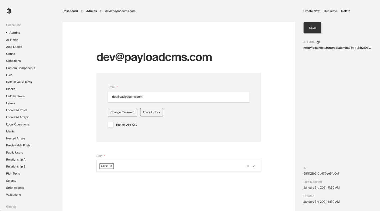
Any Collection can opt-in to supporting Authentication. Once enabled, each Document that is created within the Collection can be thought of as a "user". This enables a complete authentication workflow on your Collection, such as logging in and out, resetting their password, and more.
**Note:** By default, Payload provides an auth-enabled `User` Collection which is used to access the Admin Panel. [More details](../admin/overview#the-admin-user-collection).To enable Authentication on a Collection, use the auth property in the Collection Config:
import type { CollectionConfig } from 'payload'

export const Admins: CollectionConfig = {
  // ...
  // highlight-start
  auth: {
    tokenExpiration: 7200, // How many seconds to keep the user logged in
    verify: true, // Require email verification before being allowed to authenticate
    maxLoginAttempts: 5, // Automatically lock a user out after X amount of failed logins
    lockTime: 600 * 1000, // Time period to allow the max login attempts
    // More options are available
  },
  // highlight-end
}The following options are available:
| Option | Description |
|---|---|
cookies |
Set cookie options, including secure, sameSite, and domain. For advanced users. |
depth |
How many levels deep a user document should be populated when creating the JWT and binding the user to the req. Defaults to 0 and should only be modified if absolutely necessary, as this will affect performance. |
disableLocalStrategy |
Advanced - disable Payload's built-in local auth strategy. Only use this property if you have replaced Payload's auth mechanisms with your own. |
forgotPassword |
Customize the way that the forgotPassword operation functions. More details. |
lockTime |
Set the time (in milliseconds) that a user should be locked out if they fail authentication more times than maxLoginAttempts allows for. |
loginWithUsername |
Ability to allow users to login with username/password. More |
maxLoginAttempts |
Only allow a user to attempt logging in X amount of times. Automatically locks out a user from authenticating if this limit is passed. Set to 0 to disable. |
removeTokenFromResponses |
Set to true if you want to remove the token from the returned authentication API responses such as login or refresh. |
strategies |
Advanced - an array of custom authentication strategies to extend this collection's authentication with. More details. |
tokenExpiration |
How long (in seconds) to keep the user logged in. JWTs and HTTP-only cookies will both expire at the same time. |
useAPIKey |
Payload Authentication provides for API keys to be set on each user within an Authentication-enabled Collection. More details. |
verify |
Set to true or pass an object with verification options to require users to verify by email before they are allowed to log into your app. More details. |
You can allow users to login with their username instead of their email address by setting the loginWithUsername property to true.
Example:
{
  slug: 'customers',
  auth: {
    loginWithUsername: true,
  },
}
Or, you can pass an object with additional options:
{
  slug: 'customers',
  auth: {
    loginWithUsername: {
      allowEmailLogin: true, // default: false
      requireEmail: false, // default: false
    },
  },
}
allowEmailLogin
If set to true, users can log in with either their username or email address. If set to false, users can only log in with their username.
requireEmail
If set to true, an email address is required when creating a new user. If set to false, email is not required upon creation.
For testing and demo purposes you may want to skip forcing the user to login in order to access your application. Typically, all users should be required to login, however, you can speed up local development time by enabling auto-login.
To enable auto-login, set the autoLogin property in the Payload Config:
import { buildConfig } from 'payload'

export default buildConfig({
  // ...
  // highlight-start
  autoLogin:
    process.env.NEXT_PUBLIC_ENABLE_AUTOLOGIN === 'true'
      ? {
          email: 'test@example.com',
          password: 'test',
          prefillOnly: true,
        }
      : false,
  // highlight-end
})The following options are available:
| Option | Description |
|---|---|
username |
The username of the user to login as |
email |
The email address of the user to login as |
password |
The password of the user to login as. This is only needed if prefillOnly is set to true |
prefillOnly |
If set to true, the login credentials will be prefilled but the user will still need to click the login button. |
All auth-related operations are available via Payload's REST, Local, and GraphQL APIs. These operations are automatically added to your Collection when you enable Authentication. More details.
Out of the box Payload ships with a three powerful Authentication strategies:
Each of these strategies can work together or independently. You can also create your own custom strategies to fit your specific needs. More details.
HTTP-only cookies are a highly secure method of storing identifiable data on a user's device so that Payload can automatically recognize a returning user until their cookie expires. They are totally protected from common XSS attacks and cannot be read by JavaScript in the browser, unlike JWT's. More details.
JWT (JSON Web Tokens) can also be utilized to perform authentication. Tokens are generated on login, refresh and me operations and can be attached to future requests to authenticate users. More details.
API Keys can be enabled on auth collections. These are particularly useful when you want to authenticate against Payload from a third party service. More details.
There are cases where these may not be enough for your application. Payload is extendable by design so you can wire up your own strategy when you need to. More details.
title: Token Data label: Token Data order: 70 desc: Storing data for read on the request object. keywords: authentication, config, configuration, documentation, Content Management System, cms, headless, javascript, node, react, nextjs
During the lifecycle of a request you will be able to access the data you have configured to be stored in the JWT by accessing req.user. The user object is automatically appended to the request for you.
You can specify what data gets encoded to the Cookie/JWT-Token by setting saveToJWT property on fields within your auth collection.
import type { CollectionConfig } from 'payload'

export const Users: CollectionConfig = {
  slug: 'users',
  auth: true,
  fields: [
    {
      // will be stored in the JWT
      saveToJWT: true,
      type: 'select',
      name: 'role',
      options: [
        'super-admin',
        'user',
      ]
    },
    {
      // the entire object will be stored in the JWT
      // tab fields can do the same thing!
      saveToJWT: true,
      type: 'group',
      name: 'group1',
      fields: [
        {
          type: 'text',
          name: 'includeField',
        },
        {
          // will be omitted from the JWT
          saveToJWT: false,
          type: 'text',
          name: 'omitField',
        },
      ]
    },
    {
      type: 'group',
      name: 'group2',
      fields: [
        {
          // will be stored in the JWT
          // but stored at the top level
          saveToJWT: true,
          type: 'text',
          name: 'includeField',
        },
        {
          type: 'text',
          name: 'omitField',
        },
      ]
    },
  ]
}If you wish to use a different key other than the field name, you can define saveToJWT as a string.
This is especially helpful when writing Hooks and Access Control that depend on user defined fields.
import type { CollectionConfig } from 'payload'

export const Invoices: CollectionConfig = {
  slug: 'invoices',
  access: {
    read: ({ req, data }) => {
      if (!req?.user) return false
      // highlight-start
      if ({ req.user?.role === 'super-admin'}) {
        return true
      }
      // highlight-end
      return data.owner === req.user.id
    }
  }
  fields: [
    {
      name: 'owner',
      relationTo: 'users'
    },
    // ... other fields
  ],
}title: Project Configuration label: Configuration order: 20 desc: Quickly configure and deploy your Payload Cloud project in a few simple steps. keywords: configuration, config, settings, project, cloud, payload cloud, deploy, deployment
Once you have created a project, you will need to select your plan. This will determine the resources that are allocated to your project and the features that are available to you.
Note: All Payload Cloud teams that deploy a project require a card on file. This helps us prevent fraud and abuse on our platform. If you select a plan with a free trial, you will not be charged until your trial period is over. We’ll remind you 7 days before your trial ends and you can cancel anytime.| Option | Description |
|---|---|
| Region | Select the region closest to your audience. This will ensure the fastest communication between your data and your client. |
| Project Name | A name for your project. You can change this at any time. |
| Project Slug | Choose a unique slug to identify your project. This needs to be unique for your team and you can change it any time. |
| Team | Select the team you want to create the project under. If this is your first project, a personal team will be created for you automatically. You can modify your team settings and invite new members at any time from the Team Settings page. |
If you are deploying a new project from a template, the following settings will be automatically configured for you. If you are using your own repository, you need to make sure your build settings are accurate for your project to deploy correctly.
| Option | Description |
|---|---|
| Root Directory | The folder where your package.json file lives. |
| Install Command | The command used to install your modules, for example: yarn install or npm install |
| Build Command | The command used to build your application, for example: yarn build or npm run build |
| Serve Command | The command used to serve your application, for example: yarn serve or npm run serve |
| Branch to Deploy | Select the branch of your repository that you want to deploy from. This is the branch that will be used to build your project when you commit new changes. |
| Default Domain | Set a default domain for your project. This must be unique and you will not able to change it. You can always add a custom domain later in your project settings. |
Any of the features in Payload Cloud that require environment variables will automatically be provided to your application. If your app requires any custom environment variables, you can set them here.
Note: For security reasons, any variables you wish to provide to the [Admin Panel](../admin/overview) must be prefixed with `NEXT_PUBLIC_`. Learn more [here](../configuration/environment-vars).Payment methods can be set per project and can be updated any time. You can use team’s default payment method, or add a new one. Modify your payment methods in your Project settings / Team settings.
**Note:** All Payload Cloud teams that deploy a project require a card on file. This helps us prevent fraud and abuse on our platform. If you select a plan with a free trial, you will not be charged until your trial period is over. We’ll remind you 7 days before your trial ends and you can cancel anytime.title: Getting Started label: Getting Started order: 10 desc: Get started with Payload Cloud, a deployment solution specifically designed for Node + MongoDB applications. keywords: cloud, hosted, database, storage, email, deployment, serverless, node, mongodb, s3, aws, cloudflare, atlas, resend, payload, cms
A deployment solution specifically designed for Node.js + MongoDB applications, offering seamless deployment of your entire stack in one place. You can get started in minutes with a one-click template or bring your own codebase with you.
Payload Cloud offers various plans tailored to meet your specific needs, including a MongoDB Atlas database, S3 file storage, and email delivery powered by Resend. To see a full breakdown of features and plans, see our Cloud Pricing page.
To get started, you first need to create an account. Head over to the login screen and Register for Free.
To create your first project, you can either select [a template](#starting-from-a-template) or [import an existing project](#importing-from-an-existing-codebase) from GitHub.Templates come preconfigured and provide a one-click solution to quickly deploy a new application.
After creating an account, select your desired template from the Projects page. At this point, you need to connect to authorize the Payload Cloud application with your GitHub account. Click Continue with GitHub and follow the prompts to authorize the app.
Next, select your GitHub Scope. If you belong to multiple organizations, they will show up here. If you do not see the organization you are looking for, you may need to adjust your GitHub app permissions.
After selecting your scope, create a unique repository name and select whether you want your repository to be public or private on GitHub.
Once you are ready, click Create Project. This will clone the selected template to a new repository in your GitHub account, and take you to the configuration page to set up your project for deployment.
Payload Cloud works for any Node.js + MongoDB app. From the New Project page, select import an existing Git codebase. Choose the organization and select the repository you want to import. From here, you will be taken to the configuration page to set up your project for deployment.
title: Cloud Projects label: Projects order: 40 desc: Manage your Payload Cloud projects. keywords: cloud, payload cloud, projects, project, overview, database, file storage, build settings, environment variables, custom domains, email, developing locally
Your Payload Cloud project comes with a MongoDB serverless Atlas DB instance or a Dedicated Atlas cluster, depending on your plan. To interact with your cloud database, you will be provided with a MongoDB connection string. This can be found under the Database tab of your project.
mongodb+srv://your_connection_string
Payload Cloud gives you S3 file storage backed by Cloudflare as a CDN, and this plugin extends Payload so that all of your media will be stored in S3 rather than locally.
AWS Cognito is used for authentication to your S3 bucket. The Payload Cloud Plugin will automatically pick up these values. These values are only if you'd like to access your files directly, outside of Payload Cloud.
If you'd like to access your files outside of Payload Cloud, you'll need to retrieve some values from your project's settings and put them into your environment variables. In Payload Cloud, navigate to the File Storage tab and copy the values using the copy button. Put these values in your .env file. Also copy the Cognito Password value separately and put into your .env file as well.
When you are done, you should have the following values in your .env file:
PAYLOAD_CLOUD=true
PAYLOAD_CLOUD_ENVIRONMENT=prod
PAYLOAD_CLOUD_COGNITO_USER_POOL_CLIENT_ID=
PAYLOAD_CLOUD_COGNITO_USER_POOL_ID=
PAYLOAD_CLOUD_COGNITO_IDENTITY_POOL_ID=
PAYLOAD_CLOUD_PROJECT_ID=
PAYLOAD_CLOUD_BUCKET=
PAYLOAD_CLOUD_BUCKET_REGION=
PAYLOAD_CLOUD_COGNITO_PASSWORD=
The plugin will pick up these values and use them to access your files.
You can update settings from your Project’s Settings tab. Changes to your build settings will trigger a redeployment of your project.
From the Environment Variables page of the Settings tab, you can add, update and delete variables for use in your project. Like build settings, these changes will trigger a redeployment of your project.
Note: For security reasons, any variables you wish to provide to the [Admin Panel](../admin/overview) must be prefixed with `NEXT_PUBLIC_`. [More details](../configuration/environment-vars).With Payload Cloud, you can add custom domain names to your project. To do so, first go to the Domains page of the Settings tab of your project. Here you can see your default domain. To add a new domain, type in the domain name you wish to use.
Note: do not include the protocol (http:// or https://) or any paths (/page). Only include the domain name and extension, and optionally a subdomain. - your-domain.com - backend.your-domain.comOnce you click save, a DNS record will be generated for your domain name to point to your live project. Add this record into your DNS provider’s records, and once the records are resolving properly (this can take 1hr to 48hrs in some cases), your domain will now to point to your live project.
You will also need to configure your Payload project to use your specified domain. In your payload.config.ts file, specify your serverURL with your domain:
export default buildConfig({
  serverURL: 'https://example.com',
  // the rest of your config,
})Powered by Resend, Payload Cloud comes with integrated email support out of the box. No configuration is needed, and you can use payload.sendEmail() to send email right from your Payload app. To learn more about sending email with Payload, checkout the Email Configuration overview.
If you are on the Pro or Enterprise plan, you can add your own custom Email domain name. From the Email page of your project’s Settings, add the domain you wish to use for email delivery. This will generate a set of DNS records. Add these records to your DNS provider and click verify to check that your records are resolving properly. Once verified, your emails will now be sent from your custom domain name.
To make changes to your project, you will need to clone the repository defined in your project settings to your local machine. In order to run your project locally, you will need configure your local environment first. Refer to your repository’s README.md file to see the steps needed for your specific template.
From there, you are ready to make updates to your project. When you are ready to make your changes live, commit your changes to the branch you specified in your Project settings, and your application will automatically trigger a redeploy and build from your latest commit.
Projects generated from a template will come pre-configured with the official Cloud Plugin, but if you are using your own repository you will need to add this into your project. To do so, add the plugin to your Payload Config:
pnpm add @payloadcms/payload-cloud
import { payloadCloudPlugin } from '@payloadcms/payload-cloud'
import { buildConfig } from 'payload'

export default buildConfig({
  plugins: [payloadCloudPlugin()],
  // rest of config
})If you wish to opt-out of any Payload cloud features, the plugin also accepts options to do so.
payloadCloud({
  storage: false, // Disable file storage
  email: false, // Disable email delivery
})title: Cloud Teams label: Teams order: 30 desc: Manage your Payload Cloud team and billing settings. keywords: team, teams, billing, subscription, payment, plan, plans, cloud, payload cloud
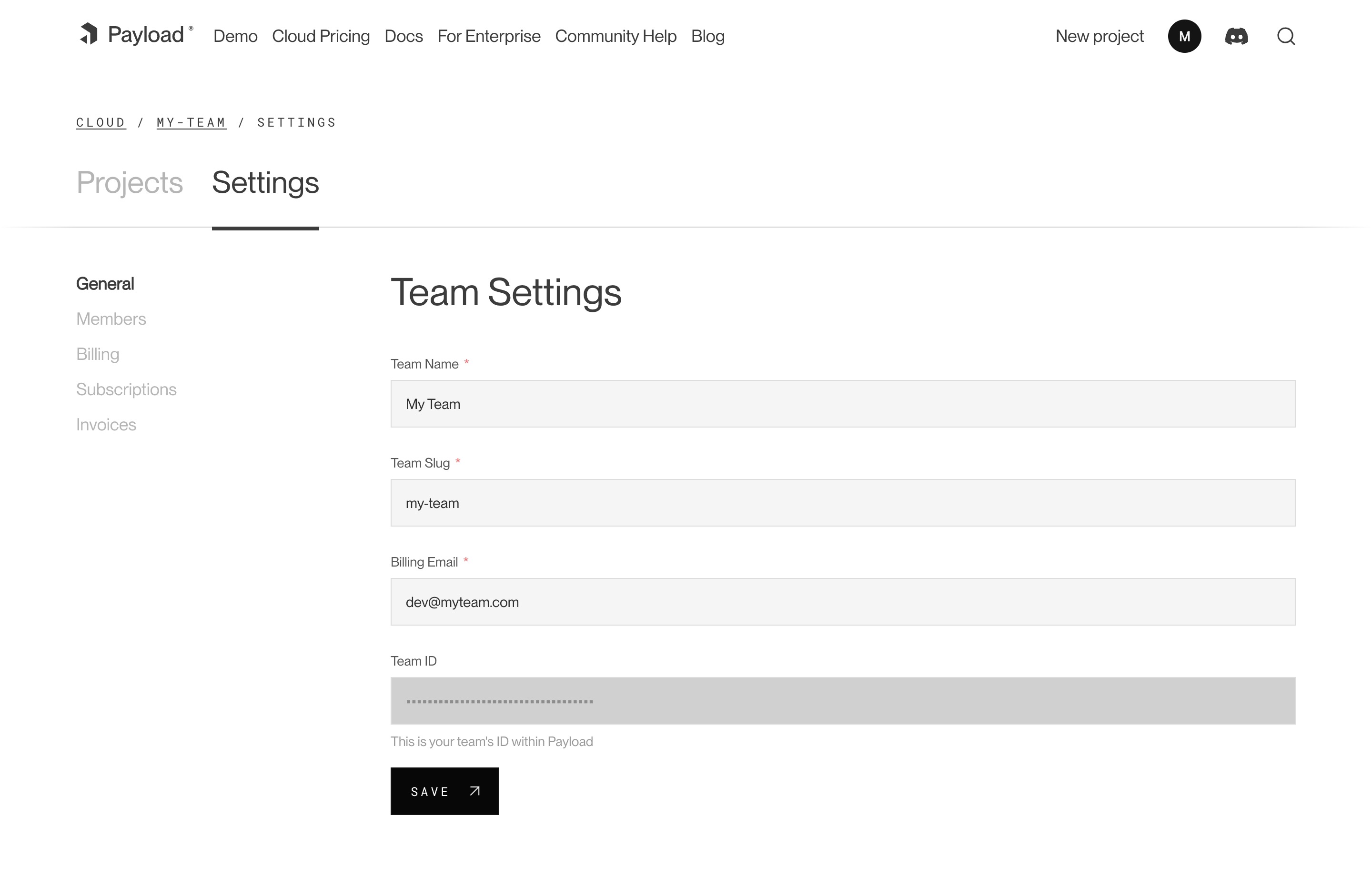
Each team has members that can interact with your projects. You can invite multiple people to your team and each individual can belong to more than one team. You can assign them either owner or user permissions. Owners are able to make admin-only changes, such as deleting projects, and editing billing information.
To add a new member to your team, visit your Team’s Settings page, and click “Invite Teammate”. You can then add their email address, and assign their role. Press “Save” to send the invitations, which will send an email to the invited team member where they can create a new account.
Users can update billing settings and subscriptions for any teams where they are designated as an owner. To make updates to the team’s payment methods, visit the Billing page under the Team Settings tab. You can add new cards, delete cards, and set a payment method as a default. The default payment method will be used in the event that another payment method fails.
From the Subscriptions page, a team owner can see all current plans for their team. From here, you can see the price of each plan, if there is an active trial, and when you will be billed next.
The Invoices page will you show you the invoices for your account, as well as the status on their payment.
title: Collection Configs label: Collections order: 20 desc: Structure your Collections for your needs by defining fields, adding slugs and labels, establishing access control, tying in hooks, setting timestamps and more. keywords: collections, config, configuration, documentation, Content Management System, cms, headless, javascript, node, react, nextjs
A Collection is a group of records, called Documents, that all share a common schema. You can define as many Collections as your application needs. Each Document in a Collection is stored in the Database based on the Fields that you define, and automatically generates a Local API, REST API, and GraphQL API used to manage your Documents.
Collections are also used to achieve Authentication in Payload. By defining a Collection with auth options, that Collection receives additional operations to support user authentication.
Collections are the primary way to structure recurring data in your application, such as users, products, pages, posts, and other types of content that you might want to manage. Each Collection can have its own unique Access Control, Hooks, Admin Options, and more.
To define a Collection Config, use the collection property in your Payload Config:
import { buildConfig } from 'payload'

export default buildConfig({
  // ...
  collections: [ // highlight-line
    // Your Collections go here
  ],
})It's often best practice to write your Collections in separate files and then import them into the main Payload Config.
Here is what a simple Collection Config might look like:
import type { CollectionConfig } from 'payload'

export const Posts: CollectionConfig = {
  slug: 'posts',
  fields: [
    {
      name: 'title',
      type: 'text',
    }
  ]
}The following options are available:
| Option | Description |
|---|---|
admin |
The configuration options for the Admin Panel. More details. |
access |
Provide Access Control functions to define exactly who should be able to do what with Documents in this Collection. More details. |
auth |
Specify options if you would like this Collection to feature authentication. More details. |
custom |
Extension point for adding custom data (e.g. for plugins) |
disableDuplicate |
When true, do not show the "Duplicate" button while editing documents within this Collection and prevent duplicate from all APIs. |
defaultSort |
Pass a top-level field to sort by default in the Collection List View. Prefix the name of the field with a minus symbol ("-") to sort in descending order. Multiple fields can be specified by using a string array. |
dbName |
Custom table or Collection name depending on the Database Adapter. Auto-generated from slug if not defined. |
endpoints |
Add custom routes to the REST API. Set to false to disable routes. More details. |
fields * |
Array of field types that will determine the structure and functionality of the data stored within this Collection. More details. |
graphQL |
Manage GraphQL-related properties for this collection. More |
hooks |
Entry point for Hooks. More details. |
labels |
Singular and plural labels for use in identifying this Collection throughout Payload. Auto-generated from slug if not defined. |
lockDocuments |
Enables or disables document locking. By default, document locking is enabled. Set to an object to configure, or set to false to disable locking. More details. |
slug * |
Unique, URL-friendly string that will act as an identifier for this Collection. |
timestamps |
Set to false to disable documents' automatically generated createdAt and updatedAt timestamps. |
typescript |
An object with property interface as the text used in schema generation. Auto-generated from slug if not defined. |
upload |
Specify options if you would like this Collection to support file uploads. For more, consult the Uploads documentation. |
versions |
Set to true to enable default options, or configure with object properties. More details. |
defaultPopulate |
Specify which fields to select when this Collection is populated from another document. More Details. |
* An asterisk denotes that a property is required.
Fields define the schema of the Documents within a Collection. To learn more, go to the Fields documentation.
Collection Access Control determines what a user can and cannot do with any given Document within a Collection. To learn more, go to the Access Control documentation.
Collection Hooks allow you to tie into the lifecycle of your Documents so you can execute your own logic during specific events. To learn more, go to the Hooks documentation.
The behavior of Collections within the Admin Panel can be fully customized to fit the needs of your application. This includes grouping or hiding their navigation links, adding Custom Components, selecting which fields to display in the List View, and more.
To configure Admin Options for Collections, use the admin property in your Collection Config:
import type { CollectionConfig } from 'payload'

export const MyCollection: CollectionConfig = {
  // ...
  admin: { // highlight-line
    // ...
  },
}
The following options are available:
| Option | Description |
|---|---|
group |
Text or localization object used to group Collection and Global links in the admin navigation. Set to false to hide the link from the navigation while keeping its routes accessible. |
hidden |
Set to true or a function, called with the current user, returning true to exclude this Collection from navigation and admin routing. |
hooks |
Admin-specific hooks for this Collection. More details. |
useAsTitle |
Specify a top-level field to use for a document title throughout the Admin Panel. If no field is defined, the ID of the document is used as the title. A field with virtual: true cannot be used as the title. |
description |
Text to display below the Collection label in the List View to give editors more information. Alternatively, you can use the admin.components.Description to render a React component. More details. |
defaultColumns |
Array of field names that correspond to which columns to show by default in this Collection's List View. |
hideAPIURL |
Hides the "API URL" meta field while editing documents within this Collection. |
enableRichTextLink |
The Rich Text field features a Link element which allows for users to automatically reference related documents within their rich text. Set to true by default. |
enableRichTextRelationship |
The Rich Text field features a Relationship element which allows for users to automatically reference related documents within their rich text. Set to true by default. |
meta |
Page metadata overrides to apply to this Collection within the Admin Panel. More details. |
preview |
Function to generate preview URLs within the Admin Panel that can point to your app. More details. |
livePreview |
Enable real-time editing for instant visual feedback of your front-end application. More details. |
components |
Swap in your own React components to be used within this Collection. More details. |
listSearchableFields |
Specify which fields should be searched in the List search view. More details. |
pagination |
Set pagination-specific options for this Collection. More details. |
baseListFilter |
You can define a default base filter for this collection's List view, which will be merged into any filters that the user performs. |
Collections can set their own Custom Components which only apply to Collection-specific UI within the Admin Panel. This includes elements such as the Save Button, or entire layouts such as the Edit View.
To override Collection Components, use the admin.components property in your Collection Config:
import type { SanitizedCollectionConfig } from 'payload'

export const MyCollection: SanitizedCollectionConfig = {
  // ...
  admin: {
    components: { // highlight-line
      // ...
    },
  },
}
The following options are available:
| Path | Description |
|---|---|
beforeList |
An array of components to inject before the built-in List View |
beforeListTable |
An array of components to inject before the built-in List View's table |
afterList |
An array of components to inject after the built-in List View |
afterListTable |
An array of components to inject after the built-in List View's table |
Description |
A component to render below the Collection label in the List View. An alternative to the admin.description property. |
edit.SaveButton |
Replace the default Save Button with a Custom Component. Drafts must be disabled. |
edit.SaveDraftButton |
Replace the default Save Draft Button with a Custom Component. Drafts must be enabled and autosave must be disabled. |
edit.PublishButton |
Replace the default Publish Button with a Custom Component. Drafts must be enabled. |
edit.PreviewButton |
Replace the default Preview Button with a Custom Component. Preview must be enabled. |
edit.Upload |
Replace the default Upload component with a Custom Component. Upload must be enabled. |
views |
Override or create new views within the Admin Panel. More details. |
It is possible to display a Preview Button within the Edit View of the Admin Panel. This will allow editors to visit the frontend of your app the corresponds to the document they are actively editing. This way they can preview the latest, potentially unpublished changes.
To configure the Preview Button, set the admin.preview property to a function in your Collection Config:
import type { CollectionConfig } from 'payload'

export const Posts: CollectionConfig = {
  // ...
  admin: {
    // highlight-start
    preview: (doc, { locale }) => {
      if (doc?.slug) {
        return `/${doc.slug}?locale=${locale}`
      }

      return null
    },
    // highlight-end
  },
}
The preview property resolves to a string that points to your front-end application with additional URL parameters. This can be an absolute URL or a relative path.
The preview function receives two arguments:
| Argument | Description |
|---|---|
doc |
The Document being edited. |
ctx |
An object containing locale, token, and req properties. The token is the currently logged-in user's JWT. |
If your application requires a fully qualified URL, such as within deploying to Vercel Preview Deployments, you can use the req property to build this URL:
preview: (doc, { req }) => `${req.protocol}//${req.host}/${doc.slug}` // highlight-lineAll Collections receive their own List View which displays a paginated list of documents that can be sorted and filtered. The pagination behavior of the List View can be customized on a per-Collection basis, and uses the same Pagination API that Payload provides.
To configure pagination options, use the admin.pagination property in your Collection Config:
import type { CollectionConfig } from 'payload'

export const Posts: CollectionConfig = {
  // ...
  admin: {
    // highlight-start
    pagination: {
      defaultLimit: 10,
      limits: [10, 20, 50],
    },
    // highlight-end
  },
}
The following options are available:
| Option | Description |
|---|---|
defaultLimit |
Integer that specifies the default per-page limit that should be used. Defaults to 10. |
limits |
Provide an array of integers to use as per-page options for admins to choose from in the List View. |
In the List View, there is a "search" box that allows you to quickly find a document through a simple text search. By default, it searches on the ID field. If defined, the admin.useAsTitle field is used. Or, you can explicitly define which fields to search based on the needs of your application.
To define which fields should be searched, use the admin.listSearchableFields property in your Collection Config:
import type { CollectionConfig } from 'payload'

export const Posts: CollectionConfig = {
  // ...
  admin: {
    // highlight-start
    listSearchableFields: ['title', 'slug'],
    // highlight-end
  },
}You can completely disable GraphQL for this collection by passing graphQL: false to your collection config. This will completely disable all queries, mutations, and types from appearing in your GraphQL schema.
You can also pass an object to the collection's graphQL property, which allows you to define the following properties:
| Option | Description |
|---|---|
singularName |
Override the "singular" name that will be used in GraphQL schema generation. |
pluralName |
Override the "plural" name that will be used in GraphQL schema generation. |
disableQueries |
Disable all GraphQL queries that correspond to this collection by passing true. |
disableMutations |
Disable all GraphQL mutations that correspond to this collection by passing true. |
You can import types from Payload to help make writing your Collection configs easier and type-safe. There are two main types that represent the Collection Config, CollectionConfig and SanitizeCollectionConfig.
The CollectionConfig type represents a raw Collection Config in its full form, where only the bare minimum properties are marked as required. The SanitizedCollectionConfig type represents a Collection Config after it has been fully sanitized. Generally, this is only used internally by Payload.
import type { CollectionConfig, SanitizedCollectionConfig } from 'payload'title: Environment Variables label: Environment Variables order: 100 desc: Learn how to use Environment Variables in your Payload project
Environment Variables are a way to store sensitive information that your application needs to function. This could be anything from API keys to Database credentials. Payload allows you to easily use Environment Variables within your config and throughout your application.
If you are using Next.js, no additional setup is required other than creating your .env file.
To use Environment Variables, add a .env file to the root of your project:
project-name/
├─ .env
├─ package.json
├─ payload.config.ts
Here is an example of what an .env file might look like:
SERVER_URL=localhost:3000
DATABASE_URI=mongodb://localhost:27017/my-database
To use Environment Variables in your Payload Config, you can access them directly from process.env:
import { buildConfig } from 'payload'

export default buildConfig({
  serverURL: process.env.SERVER_URL, // highlight-line
  // ...
})For security and safety reasons, the Admin Panel does not include Environment Variables in its client-side bundle by default. But, Next.js provides a mechanism to expose Environment Variables to the client-side bundle when needed.
If you are building a Custom Component and need to access Environment Variables from the client-side, you can do so by prefixing them with NEXT_PUBLIC_.
For example, if you've got the following Environment Variable:
NEXT_PUBLIC_STRIPE_PUBLISHABLE_KEY=pk_test_XXXXXXXXXXXXXXXXXXThis key will automatically be made available to the client-side Payload bundle and can be referenced in your Custom Component as follows:
'use client'
import React from 'react'

const stripeKey = process.env.NEXT_PUBLIC_STRIPE_PUBLISHABLE_KEY // highlight-line

const MyClientComponent = () => {
  // do something with the key

  return (
    <div>
      My Client Component
    </div>
  )
}
For more information, check out the Next.js Documentation.
If you are using Payload outside of Next.js, we suggest using the dotenv package to handle Environment Variables from .env files. This will automatically load your Environment Variables into process.env.
To do this, import the package as high up in your application as possible:
import dotenv from 'dotenv'
dotenv.config() // highlight-line

import { buildConfig } from 'payload'

export default buildConfig({
  serverURL: process.env.SERVER_URL,
  // ...
})title: Global Configs label: Globals order: 30 desc: Set up your Global config for your needs by defining fields, adding slugs and labels, establishing access control, tying in hooks and more. keywords: globals, config, configuration, documentation, Content Management System, cms, headless, javascript, node, react, nextjs
Globals are in many ways similar to Collections, except that they correspond to only a single Document. You can define as many Globals as your application needs. Each Global Document is stored in the Database based on the Fields that you define, and automatically generates a Local API, REST API, and GraphQL API used to manage your Documents.
Globals are the primary way to structure singletons in Payload, such as a header navigation, site-wide banner alerts, or app-wide localized strings. Each Global can have its own unique Access Control, Hooks, Admin Options, and more.
To define a Global Config, use the globals property in your Payload Config:
import { buildConfig } from 'payload'

export default buildConfig({
  // ...
  globals: [ // highlight-line
    // Your Globals go here
  ],
})It's often best practice to write your Globals in separate files and then import them into the main Payload Config.
Here is what a simple Global Config might look like:
import { GlobalConfig } from 'payload'

export const Nav: GlobalConfig = {
  slug: 'nav',
  fields: [
    {
      name: 'items',
      type: 'array',
      required: true,
      maxRows: 8,
      fields: [
        {
          name: 'page',
          type: 'relationship',
          relationTo: 'pages', // "pages" is the slug of an existing collection
          required: true,
        },
      ],
    },
  ],
}The following options are available:
| Option | Description |
|---|---|
access |
Provide Access Control functions to define exactly who should be able to do what with this Global. More details. |
admin |
The configuration options for the Admin Panel. More details. |
custom |
Extension point for adding custom data (e.g. for plugins) |
dbName |
Custom table or collection name for this Global depending on the Database Adapter. Auto-generated from slug if not defined. |
description |
Text or React component to display below the Global header to give editors more information. |
endpoints |
Add custom routes to the REST API. More details. |
fields * |
Array of field types that will determine the structure and functionality of the data stored within this Global. More details. |
graphQL |
Manage GraphQL-related properties related to this global. More details |
hooks |
Entry point for Hooks. More details. |
label |
Text for the name in the Admin Panel or an object with keys for each language. Auto-generated from slug if not defined. |
lockDocuments |
Enables or disables document locking. By default, document locking is enabled. Set to an object to configure, or set to false to disable locking. More details. |
slug * |
Unique, URL-friendly string that will act as an identifier for this Global. |
typescript |
An object with property interface as the text used in schema generation. Auto-generated from slug if not defined. |
versions |
Set to true to enable default options, or configure with object properties. More details. |
* An asterisk denotes that a property is required.
Fields define the schema of the Global. To learn more, go to the Fields documentation.
Global Access Control determines what a user can and cannot do with any given Global Document. To learn more, go to the Access Control documentation.
Global Hooks allow you to tie into the lifecycle of your Documents so you can execute your own logic during specific events. To learn more, go to the Hooks documentation.
The behavior of Globals within the Admin Panel can be fully customized to fit the needs of your application. This includes grouping or hiding their navigation links, adding Custom Components, setting page metadata, and more.
To configure Admin Options for Globals, use the admin property in your Global Config:
import { GlobalConfig } from 'payload'

export const MyGlobal: GlobalConfig = {
  // ...
  admin: { // highlight-line
    // ...
  },
}
The following options are available:
| Option | Description |
|---|---|
group |
Text or localization object used to group Collection and Global links in the admin navigation. Set to false to hide the link from the navigation while keeping its routes accessible. |
hidden |
Set to true or a function, called with the current user, returning true to exclude this Global from navigation and admin routing. |
components |
Swap in your own React components to be used within this Global. More details. |
preview |
Function to generate a preview URL within the Admin Panel for this Global that can point to your app. More details. |
livePreview |
Enable real-time editing for instant visual feedback of your front-end application. More details. |
hideAPIURL |
Hides the "API URL" meta field while editing documents within this collection. |
meta |
Page metadata overrides to apply to this Global within the Admin Panel. More details. |
Globals can set their own Custom Components which only apply to Global-specific UI within the Admin Panel. This includes elements such as the Save Button, or entire layouts such as the Edit View.
To override Global Components, use the admin.components property in your Global Config:
import type { SanitizedGlobalConfig } from 'payload'

export const MyGlobal: SanitizedGlobalConfig = {
  // ...
  admin: {
    components: { // highlight-line
      // ...
    },
  },
}
The following options are available:
| Path | Description |
|---|---|
elements.SaveButton |
Replace the default Save Button with a Custom Component. Drafts must be disabled. |
elements.SaveDraftButton |
Replace the default Save Draft Button with a Custom Component. Drafts must be enabled and autosave must be disabled. |
elements.PublishButton |
Replace the default Publish Button with a Custom Component. Drafts must be enabled. |
elements.PreviewButton |
Replace the default Preview Button with a Custom Component. Preview must be enabled. |
views |
Override or create new views within the Admin Panel. More details. |
It is possible to display a Preview Button within the Edit View of the Admin Panel. This will allow editors to visit the frontend of your app the corresponds to the document they are actively editing. This way they can preview the latest, potentially unpublished changes.
To configure the Preview Button, set the admin.preview property to a function in your Global Config:
import { GlobalConfig } from 'payload'

export const MainMenu: GlobalConfig = {
  // ...
  admin: {
    // highlight-start
    preview: (doc, { locale }) => {
      if (doc?.slug) {
        return `/${doc.slug}?locale=${locale}`
      }

      return null
    },
    // highlight-end
  },
}
The preview function receives two arguments:
| Argument | Description |
|---|---|
doc |
The Document being edited. |
ctx |
An object containing locale and token properties. The token is the currently logged-in user's JWT. |
You can completely disable GraphQL for this global by passing graphQL: false to your global config. This will completely disable all queries, mutations, and types from appearing in your GraphQL schema.
You can also pass an object to the global's graphQL property, which allows you to define the following properties:
| Option | Description |
|---|---|
name |
Override the name that will be used in GraphQL schema generation. |
disableQueries |
Disable all GraphQL queries that correspond to this global by passing true. |
disableMutations |
Disable all GraphQL mutations that correspond to this global by passing true. |
You can import types from Payload to help make writing your Global configs easier and type-safe. There are two main types that represent the Global Config, GlobalConfig and SanitizeGlobalConfig.
The GlobalConfig type represents a raw Global Config in its full form, where only the bare minimum properties are marked as required. The SanitizedGlobalConfig type represents a Global Config after it has been fully sanitized. Generally, this is only used internally by Payload.
import type { GlobalConfig, SanitizedGlobalConfig } from 'payload'title: I18n label: I18n order: 40 desc: Manage and customize internationalization support in your CMS editor experience keywords: internationalization, i18n, config, configuration, documentation, Content Management System, cms, headless, javascript, node, react, nextjs
The Admin Panel is translated in over 30 languages and counting. With I18n, editors can navigate the interface and read API error messages in their preferred language. This is similar to Localization, but instead of managing translations for the data itself, you are managing translations for your application's interface.
By default, Payload comes preinstalled with English, but you can easily load other languages into your own application. Languages are automatically detected based on the request. If no language is detected, or if the user's language is not yet supported by your application, English will be chosen.
To configure I18n, use the i18n key in your Payload Config:
import { buildConfig } from 'payload'

export default buildConfig({
  // ...
  i18n: { // highlight-line
    // ...
  },
})You can easily customize and override any of the i18n settings that Payload provides by default. Payload will use your custom options and merge them in with its own.
import { buildConfig } from 'payload'

export default buildConfig({
  // ...
  // highlight-start
  i18n: {
    fallbackLanguage: 'en', // default
  }
  // highlight-end
})
The following options are available:
| Option | Description |
|---|---|
fallbackLanguage |
The language to fall back to if the user's preferred language is not supported. Default is 'en'. |
translations |
An object containing the translations. The keys are the language codes and the values are the translations. |
supportedLanguages |
An object containing the supported languages. The keys are the language codes and the values are the translations. |
You can easily add new languages to your Payload app by providing the translations for the new language. Payload maintains a number of built-in translations that can be imported from @payloadcms/translations, but you can also provide your own Custom Translations to support any language.
To add a new language, use the i18n.supportedLanguages key in your Payload Config:
import { buildConfig } from 'payload'
import { en } from '@payloadcms/translations/languages/en'
import { de } from '@payloadcms/translations/languages/de'

export default buildConfig({
  // ...
  // highlight-start
  i18n: {
    supportedLanguages: { en, de },
  },
  // highlight-end
})You can customize Payload's built-in translations either by extending existing languages or by adding new languages entirely. This can be done by injecting new translation strings into existing languages, or by providing an entirely new language keys altogether.
To add Custom Translations, use the i18n.translations key in your Payload Config:
import { buildConfig } from 'payload'

export default buildConfig({
  //...
  i18n: {
    // highlight-start
    translations: {
      en: {
        custom: {
          // namespace can be anything you want
          key1: 'Translation with {{variable}}', // translation
        },
        // override existing translation keys
        general: {
          dashboard: 'Home',
        },
      },
    },
    // highlight-end
  },
  //...
})While Payload's built-in features come fully translated, you may also want to translate parts of your own project. This is possible in places like Collections and Globals, such as on their labels and groups, field labels, descriptions or input placeholder text.
To do this, provide the translations wherever applicable, keyed to the language code:
import type { CollectionConfig } from 'payload'

export const Articles: CollectionConfig = {
  slug: 'articles',
  labels: {
    singular: {
      // highlight-start
      en: 'Article',
      es: 'Artículo',
      // highlight-end
    },
    plural: {
      // highlight-start
      en: 'Articles',
      es: 'Artículos',
      // highlight-end
    },
  },
  admin: {
    group: {
      // highlight-start
      en: 'Content',
      es: 'Contenido',
      // highlight-end
    },
  },
  fields: [
    {
      name: 'title',
      type: 'text',
      label: {
        // highlight-start
        en: 'Title',
        es: 'Título',
        // highlight-end
      },
      admin: {
        placeholder: {
          // highlight-start
          en: 'Enter title',
          es: 'Introduce el título'
          // highlight-end
        },
      },
    },
  ],
}Payload's backend sets the language on incoming requests before they are handled. This allows backend validation to return error messages in the user's own language or system generated emails to be sent using the correct translation. You can make HTTP requests with the accept-language header and Payload will use that language.
Anywhere in your Payload app that you have access to the req object, you can access Payload's extensive internationalization features assigned to req.i18n. To access text translations you can use req.t('namespace:key').
In order to use custom translations in your project, you need to provide the types for the translations.
Here we create a shareable translations object. We will import this in both our custom components and in our Payload config.
// <rootDir>/custom-translations.ts

import type { Config } from 'payload'
import type { NestedKeysStripped } from '@payloadcms/translations'

export const customTranslations: Config['i18n']['translations'] = {
  en: {
    general: {
      myCustomKey: 'My custom english translation',
    },
    fields: {
      addLabel: 'Add!',
    }
  },
}

export type CustomTranslationsObject = typeof customTranslations.en
export type CustomTranslationsKeys = NestedKeysStripped<CustomTranslationsObject>
Import the shared translations object into our Payload config so they are available for use:
// <rootDir>/payload.config.ts

import { buildConfig } from 'payload'

import { customTranslations } from './custom-translations'

export default buildConfig({
  //...
  i18n: {
    translations: customTranslations,
  },
  //...
})
Import the shared translation types to use in your Custom Component:
// <rootDir>/components/MyComponent.tsx

'use client'
import type React from 'react'
import { useTranslation } from '@payloadcms/ui'

import type { CustomTranslationsObject, CustomTranslationsKeys } from '../custom-translations'

export const MyComponent: React.FC = () => {
  const { i18n, t } = useTranslation<CustomTranslationsObject, CustomTranslationsKeys>() // These generics merge your custom translations with the default client translations

  return t('general:myCustomKey')
}
Additionally, Payload exposes the t function in various places, for example in labels. Here is how you would type those:
// <rootDir>/fields/myField.ts

import type { DefaultTranslationKeys, TFunction } from '@payloadcms/translations'
import type { Field } from 'payload'

import { CustomTranslationsKeys } from '../custom-translations'

const field: Field = {
  name: 'myField',
  type: 'text',
  label: (
    { t }: { t: TFunction<CustomTranslationsKeys | DefaultTranslationKeys> }, // The generic passed to TFunction does not automatically merge the custom translations with the default translations. We need to merge them ourselves here
  ) => t('fields:addLabel'),
}title: Localization label: Localization order: 50 desc: Add and maintain as many locales as you need by adding Localization to your Payload Config, set options for default locale, fallbacks, fields and more. keywords: localization, internationalization, i18n, config, configuration, documentation, Content Management System, cms, headless, javascript, node, react, nextjs
Localization is one of the most important features of a modern CMS. It allows you to manage content in multiple languages, then serve it to your users based on their requested language. This is similar to I18n, but instead of managing translations for your application's interface, you are managing translations for the data itself.
With Localization, you can begin to serve personalized content to your users based on their specific language preferences, such as a multilingual website or multi-site application. There are no limits to the number of locales you can add to your Payload project.
To configure Localization, use the localization key in your Payload Config:
import { buildConfig } from 'payload'

export default buildConfig({
  // ...
  localization: { // highlight-line
    // ...
  },
})Add the localization property to your Payload Config to enable Localization project-wide. You'll need to provide a list of all locales that you'd like to support as well as set a few other options.
To configure locales, use the localization.locales property in your Payload Config:
import { buildConfig } from 'payload'

export default buildConfig({
  // ...
  localization: {
    locales: ['en', 'es', 'de'], // required
    defaultLocale: 'en', // required
  },
})
You can also define locales using full configuration objects:
import { buildConfig } from 'payload'

export default buildConfig({
  collections: [
    // collections go here
  ],
  localization: {
    locales: [
      {
        label: 'English',
        code: 'en',
      },
      {
        label: 'Arabic',
        code: 'ar',
        // opt-in to setting default text-alignment on Input fields to rtl (right-to-left)
        // when current locale is rtl
        rtl: true,
      },
    ],
    defaultLocale: 'en', // required
    fallback: true, // defaults to true
  },
})The following options are available:
| Option | Description |
|---|---|
locales |
Array of all the languages that you would like to support. More details |
defaultLocale |
Required string that matches one of the locale codes from the array provided. By default, if no locale is specified, documents will be returned in this locale. |
fallback |
Boolean enabling "fallback" locale functionality. If a document is requested in a locale, but a field does not have a localized value corresponding to the requested locale, then if this property is enabled, the document will automatically fall back to the fallback locale value. If this property is not enabled, the value will not be populated unless a fallback is explicitly provided in the request. True by default. |
The locales array is a list of all the languages that you would like to support. This can be strings for each language code, or full configuration objects for more advanced options.
The locale codes do not need to be in any specific format. It's up to you to define how to represent your locales. Common patterns are to use two-letter ISO 639 language codes or four-letter language and country codes (ISO 3166‑1) such as en-US, en-UK, es-MX, etc.
| Option | Description |
|---|---|
code * |
Unique code to identify the language throughout the APIs for locale and fallbackLocale |
label |
A string to use for the selector when choosing a language, or an object keyed on the i18n keys for different languages in use. |
rtl |
A boolean that when true will make the admin UI display in Right-To-Left. |
fallbackLocale |
The code for this language to fallback to when properties of a document are not present. |
* An asterisk denotes that a property is required.
Payload Localization works on a field level—not a document level. In addition to configuring the base Payload Config to support Localization, you need to specify each field that you would like to localize.
Here is an example of how to enable Localization for a field:
{
  name: 'title',
  type: 'text',
  // highlight-start
  localized: true,
  // highlight-end
}
With the above configuration, the title field will now be saved in the database as an object of all locales instead of a single string.
All field types with a name property support the localized property—even the more complex field types like arrays and blocks.
When retrieving documents, you can specify which locale you'd like to receive as well as which fallback locale should be used.
REST API locale functionality relies on URL query parameters.
?locale=
Specify your desired locale by providing the locale query parameter directly in the endpoint URL.
?fallback-locale=
Specify fallback locale to be used by providing the fallback-locale query parameter. This can be provided as either a
valid locale as provided to your base Payload Config, or 'null', 'false', or 'none' to disable falling back.
Example:
fetch('https://localhost:3000/api/pages?locale=es&fallback-locale=none');
In the GraphQL API, you can specify locale and fallbackLocale args to all relevant queries and mutations.
The locale arg will only accept valid locales, but locales will be formatted automatically as valid GraphQL enum
values (dashes or special characters will be converted to underscores, spaces will be removed, etc.). If you are curious
to see how locales are auto-formatted, you can use the GraphQL playground.
The fallbackLocale arg will accept valid locales as well as none to disable falling back.
Example:
query {
  Posts(locale: de, fallbackLocale: none) {
    docs {
      title
    }
  }
}You can specify locale as well as fallbackLocale within the Local API as well as properties on the options
argument. The locale property will accept any valid locale, and the fallbackLocale property will accept any valid
locale as well as 'null', 'false', false, and 'none'.
Example:
const posts = await payload.find({
  collection: 'posts',
  locale: 'es',
  fallbackLocale: false,
})title: The Payload Config label: Overview order: 10 desc: The Payload Config is central to everything that Payload does, from adding custom React components, to modifying collections, controlling localization and much more. keywords: overview, config, configuration, documentation, Content Management System, cms, headless, javascript, node, react, nextjs
Payload is a config-based, code-first CMS and application framework. The Payload Config is central to everything that Payload does, allowing for deep configuration of your application through a simple and intuitive API. The Payload Config is a fully-typed JavaScript object that can be infinitely extended upon.
Everything from your Database choice to the appearance of the Admin Panel is fully controlled through the Payload Config. From here you can define Fields, add Localization, enable Authentication, configure Access Control, and so much more.
The Payload Config is a payload.config.ts file typically located in the root of your project:
import { buildConfig } from 'payload'

export default buildConfig({
  // Your config goes here
})
The Payload Config is strongly typed and ties directly into Payload's TypeScript codebase. This means your IDE (such as VSCode) will provide helpful information like type-ahead suggestions while you write your config.
**Tip:** The location of your Payload Config can be customized. [More details](#customizing-the-config-location).To author your Payload Config, first determine which Database you'd like to use, then use Collections or Globals to define the schema of your data through Fields.
Here is one of the simplest possible Payload configs:
import { buildConfig } from 'payload'
import { mongooseAdapter } from '@payloadcms/db-mongodb'

export default buildConfig({
  secret: process.env.PAYLOAD_SECRET,
  db: mongooseAdapter({
    url: process.env.DATABASE_URI,
  }),
  collections: [
    {
      slug: 'pages',
      fields: [
        {
          name: 'title',
          type: 'text'
        }
      ]
    }
  ],
})The following options are available:
| Option | Description |
|---|---|
admin |
The configuration options for the Admin Panel, including Custom Components, Live Preview, etc. More details. |
bin |
Register custom bin scripts for Payload to execute. |
editor |
The Rich Text Editor which will be used by richText fields. More details. |
db * |
The Database Adapter which will be used by Payload. More details. |
serverURL |
A string used to define the absolute URL of your app. This includes the protocol, for example https://example.com. No paths allowed, only protocol, domain and (optionally) port. |
collections |
An array of Collections for Payload to manage. More details. |
compatibility |
Compatibility flags for earlier versions of Payload. More details. |
globals |
An array of Globals for Payload to manage. More details. |
cors |
Cross-origin resource sharing (CORS) is a mechanism that accept incoming requests from given domains. You can also customize the Access-Control-Allow-Headers header. More details. |
localization |
Opt-in to translate your content into multiple locales. More details. |
logger |
Logger options, logger options with a destination stream, or an instantiated logger instance. More details. |
loggingLevels |
An object to override the level to use in the logger for Payload's errors. |
graphQL |
Manage GraphQL-specific functionality, including custom queries and mutations, query complexity limits, etc. More details. |
cookiePrefix |
A string that will be prefixed to all cookies that Payload sets. |
csrf |
A whitelist array of URLs to allow Payload to accept cookies from. More details. |
defaultDepth |
If a user does not specify depth while requesting a resource, this depth will be used. More details. |
defaultMaxTextLength |
The maximum allowed string length to be permitted application-wide. Helps to prevent malicious public document creation. |
maxDepth |
The maximum allowed depth to be permitted application-wide. This setting helps prevent against malicious queries. Defaults to 10. More details. |
indexSortableFields |
Automatically index all sortable top-level fields in the database to improve sort performance and add database compatibility for Azure Cosmos and similar. |
upload |
Base Payload upload configuration. More details. |
routes |
Control the routing structure that Payload binds itself to. More details. |
email |
Configure the Email Adapter for Payload to use. More details. |
debug |
Enable to expose more detailed error information. |
telemetry |
Disable Payload telemetry by passing false. More details. |
rateLimit |
Control IP-based rate limiting for all Payload resources. Used to prevent DDoS attacks, etc. More details. |
hooks |
An array of Root Hooks. More details. |
plugins |
An array of Plugins. More details. |
endpoints |
An array of Custom Endpoints added to the Payload router. More details. |
custom |
Extension point for adding custom data (e.g. for plugins). |
i18n |
Internationalization configuration. Pass all i18n languages you'd like the admin UI to support. Defaults to English-only. More details. |
secret * |
A secure, unguessable string that Payload will use for any encryption workflows - for example, password salt / hashing. |
sharp |
If you would like Payload to offer cropping, focal point selection, and automatic media resizing, install and pass the Sharp module to the config here. |
typescript |
Configure TypeScript settings here. More details. |
* An asterisk denotes that a property is required.
**Note:** Some properties are removed from the client-side bundle. [More details](../admin/components#accessing-the-payload-config).Payload exposes a variety of TypeScript settings that you can leverage. These settings are used to auto-generate TypeScript interfaces for your Collections and Globals, and to ensure that Payload uses your Generated Types for all Local API methods.
To customize the TypeScript settings, use the typescript property in your Payload Config:
import { buildConfig } from 'payload'

export default buildConfig({
  // ...
  typescript: { // highlight-line
    // ...
  }
})
The following options are available:
| Option | Description |
|---|---|
autoGenerate |
By default, Payload will auto-generate TypeScript interfaces for all collections and globals that your config defines. Opt out by setting typescript.autoGenerate: false. More details. |
declare |
By default, Payload adds a declare block to your generated types, which makes sure that Payload uses your generated types for all Local API methods. Opt out by setting typescript.declare: false. |
outputFile |
Control the output path and filename of Payload's auto-generated types by defining the typescript.outputFile property to a full, absolute path. |
For Payload command-line scripts, we need to be able to locate your Payload Config. We'll check a variety of locations for the presence of payload.config.ts by default, including:
- The root current working directory
- The
compilerOptionsin yourtsconfig* - The
distdirectory*
* Config location detection is different between development and production environments. See below for more details.
**Important:** Ensure your `tsconfig.json` is properly configured for Payload to auto-detect your config location. If if does not exist, or does not specify the proper `compilerOptions`, Payload will default to the current working directory.Development Mode
In development mode, if the configuration file is not found at the root, Payload will attempt to read your tsconfig.json, and attempt to find the config file specified in the rootDir:
{
  // ...
  // highlight-start
  "compilerOptions": {
    "rootDir": "src"
  }
  // highlight-end
}
Production Mode
In production mode, Payload will first attempt to find the config file in the outDir of your tsconfig.json, and if not found, will fallback to the rootDir directory:
{
  // ...
  // highlight-start
  "compilerOptions": {
    "outDir": "dist",
    "rootDir": "src"
  }
  // highlight-end
}
If none was in either location, Payload will finally check the dist directory.
In addition to the above automated detection, you can specify your own location for the Payload Config. This can be useful in situations where your config is not in a standard location, or you wish to switch between multiple configurations. To do this, Payload exposes an Environment Variable to bypass all automatic config detection.
To use a custom config location, set the PAYLOAD_CONFIG_PATH environment variable:
{
  "scripts": {
    "payload": "PAYLOAD_CONFIG_PATH=/path/to/custom-config.ts payload"
  }
}Payload collects completely anonymous telemetry data about general usage. This data is super important to us and helps us accurately understand how we're growing and what we can do to build the software into everything that it can possibly be. The telemetry that we collect also help us demonstrate our growth in an accurate manner, which helps us as we seek investment to build and scale our team. If we can accurately demonstrate our growth, we can more effectively continue to support Payload as free and open-source software. To opt out of telemetry, you can pass telemetry: false within your Payload Config.
For more information about what we track, take a look at our privacy policy.
Cross-origin resource sharing (CORS) can be configured with either a whitelist array of URLS to allow CORS requests from, a wildcard string (*) to accept incoming requests from any domain, or a object with the following properties:
| Option | Description |
|---|---|
origins |
Either a whitelist array of URLS to allow CORS requests from, or a wildcard string ('*') to accept incoming requests from any domain. |
headers |
A list of allowed headers that will be appended in Access-Control-Allow-Headers. |
Here's an example showing how to allow incoming requests from any domain:
import { buildConfig } from 'payload'

export default buildConfig({
  // ...
  cors: '*' // highlight-line
})
Here's an example showing how to append a new header (x-custom-header) in Access-Control-Allow-Headers:
import { buildConfig } from 'payload'

export default buildConfig({
  // ...
  // highlight-start
  cors: {
    origins: ['http://localhost:3000']
    headers: ['x-custom-header']
  }
  // highlight-end
})You can import types from Payload to help make writing your config easier and type-safe. There are two main types that represent the Payload Config, Config and SanitizedConfig.
The Config type represents a raw Payload Config in its full form. Only the bare minimum properties are marked as required. The SanitizedConfig type represents a Payload Config after it has been fully sanitized. Generally, this is only used internally by Payload.
import type { Config, SanitizedConfig } from 'payload'The Payload Config only lives on the server and is not allowed to contain any client-side code. That way, you can load up the Payload Config in any server environment or standalone script, without having to use Bundlers or Node.js loaders to handle importing client-only modules (e.g. scss files or React Components) without any errors.
Behind the curtains, the Next.js-based Admin Panel generates a ClientConfig, which strips away any server-only code and enriches the config with React Components.
The Payload Config can accept compatibility flags for running the newest versions but with older databases. You should only use these flags if you need to, and should confirm that you need to prior to enabling these flags.
allowLocalizedWithinLocalized
Payload localization works on a field-by-field basis. As you can nest fields within other fields, you could potentially nest a localized field within a localized field—but this would be redundant and unnecessary. There would be no reason to define a localized field within a localized parent field, given that the entire data structure from the parent field onward would be localized.
By default, Payload will remove the localized: true property from sub-fields if a parent field is localized. Set this compatibility flag to true only if you have an existing Payload MongoDB database from pre-3.0, and you have nested localized fields that you would like to maintain without migrating.
title: Migrations label: Migrations order: 20 keywords: database, migrations, ddl, sql, mongodb, postgres, documentation, Content Management System, cms, headless, typescript, node, react, nextjs desc: Payload features first-party database migrations all done in TypeScript.
Payload exposes a full suite of migration controls available for your use. Migration commands are accessible via
the npm run payload command in your project directory.
Ensure you have an npm script called "payload" in your package.json file.
{
  "scripts": {
    "payload": "cross-env PAYLOAD_CONFIG_PATH=src/payload.config.ts payload"
  }
}Payload stores all created migrations in a folder that you can specify. By default, migrations are stored
in ./src/migrations.
A migration file has two exports - an up function, which is called when a migration is executed, and a down function
that will be called if for some reason the migration fails to complete successfully. The up function should contain
all changes that you attempt to make within the migration, and the down should ideally revert any changes you make.
Here is an example migration file:
import { MigrateUpArgs, MigrateDownArgs } from '@payloadcms/your-db-adapter'

export async function up({ payload, req }: MigrateUpArgs): Promise<void> {
  // Perform changes to your database here.
  // You have access to `payload` as an argument, and
  // everything is done in TypeScript.
}

export async function down({ payload, req }: MigrateDownArgs): Promise<void> {
  // Do whatever you need to revert changes if the `up` function fails
}When migrations are run, each migration is performed in a new transaction for you. All
you need to do is pass the req object to any local API or direct database calls, such as
payload.db.updateMany(), to make database changes inside the transaction. Assuming no errors were thrown, the transaction is committed
after your up or down function runs. If the migration errors at any point or fails to commit, it is caught and the
transaction gets aborted. This way no change is made to the database if the migration fails.
Additionally, you can bypass Payload's layer entirely and perform operations directly on your underlying database within the active transaction:
import { type MigrateUpArgs } from '@payloadcms/db-mongodb'

export async function up({ session, payload, req }: MigrateUpArgs): Promise<void> {
  const posts = await payload.db.collections.posts.collection.find({ session }).toArray()
}import { type MigrateUpArgs, sql } from '@payloadcms/db-postgres'
export async function up({ db, payload, req }: MigrateUpArgs): Promise<void> {
const { rows: posts } = await db.execute(sql`SELECT * from posts`)
}In SQLite, transactions are disabled by default. More.
import { type MigrateUpArgs, sql } from '@payloadcms/db-sqlite'

export async function up({ db, payload, req }: MigrateUpArgs): Promise<void> {
  const { rows: posts } = await db.run(sql`SELECT * from posts`)
}Each DB adapter has an optional property migrationDir where you can override where you want your migrations to be
stored/read. If this is not specified, Payload will check the default and possibly make a best effort to find your
migrations directory by searching in common locations ie. ./src/migrations, ./dist/migrations, ./migrations, etc.
All database adapters should implement similar migration patterns, but there will be small differences based on the adapter and its specific needs. Below is a list of all migration commands that should be supported by your database adapter.
The migrate command will run any migrations that have not yet been run.
npm run payload migrate
Create a new migration file in the migrations directory. You can optionally name the migration that will be created. By default, migrations will be named using a timestamp.
npm run payload migrate:create optional-name-here
The migrate:status command will check the status of migrations and output a table of which migrations have been run,
and which migrations have not yet run.
payload migrate:status
npm run payload migrate:status
Roll back the last batch of migrations.
npm run payload migrate:down
Roll back all migrations that have been run, and run them again.
npm run payload migrate:refresh
Roll back all migrations.
npm run payload migrate:reset
Drops all entities from the database and re-runs all migrations from scratch.
npm run payload migrate:fresh
Depending on which Database Adapter you use, your migration workflow might differ subtly.
In relational databases, migrations will be required for non-development database environments. But with MongoDB, you might only need to run migrations once in a while (or never even need them).
In MongoDB, you'll only ever really need to run migrations for times where you change your database shape, and you have lots of existing data that you'd like to transform from Shape A to Shape B.
In this case, you can create a migration by running pnpm payload migrate:create, and then write the logic that you need to perform to migrate your documents to their new shape. You can then either run your migrations in CI before you build / deploy, or you can run them locally, against your production database, by using your production database connection string on your local computer and running the pnpm payload migrate command.
In relational databases like Postgres, migrations are a bit more important, because each time you add a new field or a new collection, you'll need to update the shape of your database to match your Payload Config (otherwise you'll see errors upon trying to read / write your data).
That means that Postgres users of Payload should become familiar with the entire migration workflow from top to bottom.
Here is an overview of a common workflow for working locally against a development database, creating migrations, and then running migrations against your production database before deploying.
1 - work locally using push mode
Payload uses Drizzle ORM's powerful push mode to automatically sync data changes to your database for you while in development mode. By default, this is enabled and is the suggested workflow to using Postgres and Payload while doing local development.
You can disable this setting and solely use migrations to manage your local development database (pass push: false to your Postgres adapter), but if you do disable it, you may see frequent errors while running development mode. This is because Payload will have updated to your new data shape, but your local database will not have updated.
For this reason, we suggest that you leave push as its default setting and treat your local dev database as a sandbox.
For more information about push mode and prototyping in development, click here.
The typical workflow in Payload is to build out your Payload configs, install plugins, and make progress in development mode - allowing Drizzle to push your changes to your local database for you. Once you're finished, you can create a migration.
But importantly, you do not need to run migrations against your development database, because Drizzle will have already pushed your changes to your database for you.
Warning: do not mix "push" and migrations with your local development database. If you use "push" locally, and then try to migrate, Payload will throw a warning, telling you that these two methods are not meant to be used interchangeably.2 - create a migration
Once you're done with working in your Payload Config, you can create a migration. It's best practice to try and complete a specific task or fully build out a feature before you create a migration.
But once you're ready, you can run pnpm payload migrate:create, which will perform the following steps for you:
- We will look for any existing migrations, and automatically generate SQL changes necessary to convert your schema from its prior state to the new state of your Payload Config
- We will then create a new migration file in your
/migrationsfolder that contains all the SQL necessary to be run
We won't immediately run this migration for you, however.
Tip: migrations created by Payload are relatively programmatic in nature, so there should not be any surprises, but before you check in the created migration it's a good idea to always double-check the contents of the migration files.3 - set up your build process to run migrations
Generally, you want to run migrations before you build Payload for production. This typically happens in your CI pipeline and can usually be configured on platforms like Payload Cloud, Vercel, or Netlify by specifying your build script.
A common set of scripts in a package.json, set up to run migrations in CI, might look like this:
  "scripts": {
    // For running in dev mode
    "dev": "next dev --turbo",

    // To build your Next + Payload app for production
    "build": "next build",

    // A "tie-in" to Payload's CLI for convenience
    // this helps you run `pnpm payload migrate:create` and similar
    "payload": "cross-env NODE_OPTIONS=--no-deprecation payload",

    // This command is what you'd set your `build script` to.
    // Notice how it runs `payload migrate` and then `pnpm build`?
    // This will run all migrations for you before building, in your CI,
    // against your production database
    "ci": "payload migrate && pnpm build",
  },
In the example above, we've specified a ci script which we can use as our "build script" in the platform that we are deploying to production with.
This will require that your build pipeline can connect to your database, and it will simply run the payload migrate command prior to starting the build process. By calling payload migrate, Payload will automatically execute any migrations in your /migrations folder that have not yet been executed against your production database, in the order that they were created.
If it fails, the deployment will be rejected. But now, with your build script set up to run your migrations, you will be all set! Next time you deploy, your CI will execute the required migrations for you, and your database will be caught up with the shape that your Payload Config requires.
In certain cases, you might want to run migrations at runtime when the server starts. Running them during build time may be impossible due to not having access to your database connection while building or similar reasoning.
If you're using a long-running server or container where your Node server starts up one time and then stays initialized, you might prefer to run migrations on server startup instead of within your CI.
In order to run migrations at runtime, on initialization, you can pass your migrations to your database adapter under the prodMigrations key as follows:
// Import your migrations from the `index.ts` file
// that Payload generates for you
import { migrations } from './migrations'
import { buildConfig } from 'payload'

export default buildConfig({
  // your config here
  db: postgresAdapter({
    //  your adapter config here
    prodMigrations: migrations
  })
})
Passing your migrations as shown above will tell Payload, in production only, to execute any migrations that need to be run prior to completing the initialization of Payload. This is ideal for long-running services where Payload will only be initialized at startup.
**Warning:** if Payload is instructed to run migrations in production, this may slow down serverless cold starts on platforms such as Vercel. Generally, this option should only be used for long-running servers / containers.title: MongoDB label: MongoDB order: 40 desc: Payload has supported MongoDB natively since we started. The flexible nature of MongoDB lends itself well to Payload's powerful fields. keywords: MongoDB, documentation, typescript, Content Management System, cms, headless, javascript, node, react, nextjs
To use Payload with MongoDB, install the package @payloadcms/db-mongodb. It will come with everything you need to
store your Payload data in MongoDB.
Then from there, pass it to your Payload Config as follows:
import { mongooseAdapter } from '@payloadcms/db-mongodb'

export default buildConfig({
  // Your config goes here
  collections: [
    // Collections go here
  ],
  // Configure the Mongoose adapter here
  db: mongooseAdapter({
    // Mongoose-specific arguments go here.
    // URL is required.
    url: process.env.DATABASE_URI,
  }),
})| Option | Description |
|---|---|
autoPluralization |
Tell Mongoose to auto-pluralize any collection names if it encounters any singular words used as collection slugs. |
connectOptions |
Customize MongoDB connection options. Payload will connect to your MongoDB database using default options which you can override and extend to include all the options available to mongoose. |
collectionsSchemaOptions |
Customize Mongoose schema options for collections. |
disableIndexHints |
Set to true to disable hinting to MongoDB to use 'id' as index. This is currently done when counting documents for pagination, as it increases the speed of the count function used in that query. Disabling this optimization might fix some problems with AWS DocumentDB. Defaults to false |
migrationDir |
Customize the directory that migrations are stored. |
transactionOptions |
An object with configuration properties used in transactions or false which will disable the use of transactions. |
collation |
Enable language-specific string comparison with customizable options. Available on MongoDB 3.4+. Defaults locale to "en". Example: { strength: 3 }. For a full list of collation options and their definitions, see the MongoDB documentation. |
After Payload is initialized, this adapter exposes all of your Mongoose models and they are available for you to work with directly.
You can access Mongoose models as follows:
- Collection models -
payload.db.collections[myCollectionSlug] - Globals model -
payload.db.globals - Versions model (both collections and globals) -
payload.db.versions[myEntitySlug]
title: Database label: Overview order: 10 keywords: database, mongodb, postgres, documentation, Content Management System, cms, headless, typescript, node, react, nextjs desc: With Payload, you bring your own database and own your data. You have full control.
Payload is database agnostic, meaning you can use any type of database behind Payload's familiar APIs. Payload is designed to interact with your database through a Database Adapter, which is a thin layer that translates Payload's internal data structures into your database's native data structures.
Currently, Payload officially supports the following Database Adapters:
To configure a Database Adapter, use the db property in your Payload Config:
import { buildConfig } from 'payload'
import { mongooseAdapter } from '@payloadcms/db-mongodb'

export default buildConfig({
  // ...
  // highlight-start
  db: mongooseAdapter({
    url: process.env.DATABASE_URI,
  }),
  // highlight-end
})There are several factors to consider when choosing which database technology and hosting option is right for your project and workload. Payload can theoretically support any database, but it's up to you to decide which database to use.
There are two main categories of databases to choose from:
If your project has a lot of dynamic fields, and you are comfortable with allowing Payload to enforce data integrity across your documents, MongoDB is a great choice. With it, your Payload documents are stored as one document in your database—no matter if you have localization enabled, how many block or array fields you have, etc. This means that the shape of your data in your database will very closely reflect your field schema, and there is minimal complexity involved in storing or retrieving your data.
You should prefer MongoDB if:
- You prefer simplicity within your database
- You don't want to deal with keeping production / staging databases in sync via DDL changes
- Most (or everything) in your project is Localized
- You leverage a lot of Arrays, Blocks, or
hasManySelect fields
Many projects might call for more rigid database architecture where the shape of your data is strongly enforced at the database level. For example, if you know the shape of your data and it's relatively "flat", and you don't anticipate it to change often, your workload might suit relational databases like Postgres very well.
You should prefer a relational DB like Postgres or SQLite if:
- You are comfortable with Migrations
- You require enforced data consistency at the database level
- You have a lot of relationships between collections and require relationships to be enforced
It's important to note that nearly every Payload feature is available in all of our officially supported Database Adapters, including Localization, Arrays, Blocks, etc. The only thing that is not supported in SQLite yet is the Point Field, but that should be added soon.
It's up to you to choose which database you would like to use based on the requirements of your project. Payload has no opinion on which database you should ultimately choose.
title: Postgres label: Postgres order: 50 desc: Payload supports Postgres through an officially supported Drizzle Database Adapter. keywords: Postgres, documentation, typescript, Content Management System, cms, headless, javascript, node, react, nextjs
To use Payload with Postgres, install the package @payloadcms/db-postgres. It leverages Drizzle ORM and node-postgres to interact with a Postgres database that you provide.
Alternatively, the @payloadcms/db-vercel-postgres package is also available and is optimized for use with Vercel.
It automatically manages changes to your database for you in development mode, and exposes a full suite of migration controls for you to leverage in order to keep other database environments in sync with your schema. DDL transformations are automatically generated.
To configure Payload to use Postgres, pass the postgresAdapter to your Payload Config as follows:
@payloadcms/db-postgres:
import { postgresAdapter } from '@payloadcms/db-postgres'

export default buildConfig({
  // Configure the Postgres adapter here
  db: postgresAdapter({
    // Postgres-specific arguments go here.
    // `pool` is required.
    pool: {
      connectionString: process.env.DATABASE_URI,
    },
  }),
})@payloadcms/db-vercel-postgres:
import { vercelPostgresAdapter } from '@payloadcms/db-vercel-postgres'

export default buildConfig({
  // Automatically uses proces.env.POSTGRES_URL if no options are provided.
  db: vercelPostgresAdapter(),
  // Optionally, can accept the same options as the @vercel/postgres package.
  db: vercelPostgresAdapter({
    pool: {
      connectionString: process.env.DATABASE_URL
    },
  }),
})| Option | Description |
|---|---|
pool * |
Pool connection options that will be passed to Drizzle and node-postgres or to @vercel/postgres |
push |
Disable Drizzle's db push in development mode. By default, push is enabled for development mode only. |
migrationDir |
Customize the directory that migrations are stored. |
schemaName (experimental) |
A string for the postgres schema to use, defaults to 'public'. |
idType |
A string of 'serial', or 'uuid' that is used for the data type given to id columns. |
transactionOptions |
A PgTransactionConfig object for transactions, or set to false to disable using transactions. More details |
disableCreateDatabase |
Pass true to disable auto database creation if it doesn't exist. Defaults to false. |
localesSuffix |
A string appended to the end of table names for storing localized fields. Default is '_locales'. |
relationshipsSuffix |
A string appended to the end of table names for storing relationships. Default is '_rels'. |
versionsSuffix |
A string appended to the end of table names for storing versions. Defaults to '_v'. |
beforeSchemaInit |
Drizzle schema hook. Runs before the schema is built. More Details |
afterSchemaInit |
Drizzle schema hook. Runs after the schema is built. More Details |
generateSchemaOutputFile |
Override generated schema from payload generate:db-schema file path. Defaults to {CWD}/src/payload-generated.schema.ts |
After Payload is initialized, this adapter will expose the full power of Drizzle to you for use if you need it.
To ensure type-safety, you need to generate Drizzle schema first with:
npx payload generate:db-schemaThen, you can access Drizzle as follows:
import { posts } from './payload-generated-schema'
// To avoid installing Drizzle, you can import everything that drizzle has from our re-export path.
import { eq, sql, and } from '@payloadcms/db-postgres/drizzle'

// Drizzle's Querying API: https://orm.drizzle.team/docs/rqb
const posts = await payload.db.drizzle.query.posts.findMany()
// Drizzle's Select API https://orm.drizzle.team/docs/select
const result = await payload.db.drizzle.select().from(posts).where(and(eq(posts.id, 50), sql`lower(${posts.title}) = 'example post title'`))In addition to exposing Drizzle directly, all of the tables, Drizzle relations, and enum configs are exposed for you via the payload.db property as well.
- Tables -
payload.db.tables - Enums -
payload.db.enums - Relations -
payload.db.relations
Drizzle exposes two ways to work locally in development mode.
The first is db push, which automatically pushes changes you make to your Payload Config (and therefore, Drizzle schema) to your database so you don't have to manually migrate every time you change your Payload Config. This only works in development mode, and should not be mixed with manually running migrate commands.
You will be warned if any changes that you make will entail data loss while in development mode. Push is enabled by default, but you can opt out if you'd like.
Alternatively, you can disable push and rely solely on migrations to keep your local database in sync with your Payload Config.
In Postgres, migrations are a fundamental aspect of working with Payload and you should become familiar with how they work.
For more information about migrations, click here.
Runs before the schema is built. You can use this hook to extend your database structure with tables that won't be managed by Payload.
import { postgresAdapter } from '@payloadcms/db-postgres'
import { integer, pgTable, serial } from '@payloadcms/db-postgres/drizzle/pg-core'

postgresAdapter({
  beforeSchemaInit: [
    ({ schema, adapter }) => {
      return {
        ...schema,
        tables: {
          ...schema.tables,
          addedTable: pgTable('added_table', {
            id: serial('id').notNull(),
          }),
        },
      }
    },
  ],
})
One use case is preserving your existing database structure when migrating to Payload. By default, Payload drops the current database schema, which may not be desirable in this scenario.
To quickly generate the Drizzle schema from your database you can use Drizzle Introspection
You should get the schema.ts file which may look like this:
import { pgTable, uniqueIndex, serial, varchar, text } from 'drizzle-orm/pg-core'

export const users = pgTable('users', {
  id: serial('id').primaryKey(),
  fullName: text('full_name'),
  phone: varchar('phone', { length: 256 }),
})

export const countries = pgTable(
  'countries',
  {
    id: serial('id').primaryKey(),
    name: varchar('name', { length: 256 }),
  },
  (countries) => {
    return {
      nameIndex: uniqueIndex('name_idx').on(countries.name),
    }
  },
)
You can import them into your config and append to the schema with the beforeSchemaInit hook like this:
import { postgresAdapter } from '@payloadcms/db-postgres'
import { users, countries } from '../drizzle/schema'

postgresAdapter({
  beforeSchemaInit: [
    ({ schema, adapter }) => {
      return {
        ...schema,
        tables: {
          ...schema.tables,
          users,
          countries
        },
      }
    },
  ],
})
Make sure Payload doesn't overlap table names with its collections. For example, if you already have a collection with slug "users", you should either change the slug or dbName to change the table name for this collection.
Runs after the Drizzle schema is built. You can use this hook to modify the schema with features that aren't supported by Payload, or if you want to add a column that you don't want to be in the Payload config.
To extend a table, Payload exposes extendTable utillity to the args. You can refer to the Drizzle documentation.
The following example adds the extra_integer_column column and a composite index on country and city columns.
import { postgresAdapter } from '@payloadcms/db-postgres'
import { index, integer } from '@payloadcms/db-postgres/drizzle/pg-core'
import { buildConfig } from 'payload'

export default buildConfig({
  collections: [
    {
      slug: 'places',
      fields: [
        {
          name: 'country',
          type: 'text',
        },
        {
          name: 'city',
          type: 'text',
        },
      ],
    },
  ],
  db: postgresAdapter({
    afterSchemaInit: [
      ({ schema, extendTable, adapter }) => {
        extendTable({
          table: schema.tables.places,
          columns: {
            extraIntegerColumn: integer('extra_integer_column'),
          },
          extraConfig: (table) => ({
            country_city_composite_index: index('country_city_composite_index').on(
              table.country,
              table.city,
            ),
          }),
        })

        return schema
      },
    ],
  }),
})Columns and tables, added in schema hooks won't be added to the generated via payload generate:db-schema Drizzle schema.
If you want them to be there, you either have to edit this file manually or mutate the internal Payload "raw" SQL schema in the beforeSchemaInit:
import { postgresAdapter } from '@payloadcms/db-postgres'

postgresAdapter({
  beforeSchemaInit: [
    ({ schema, adapter }) => {
      // Add a new table
      adapter.rawTables.myTable = {
        name: 'my_table',
        columns: {
          my_id: {
            name: 'my_id',
            type: 'serial',
            primaryKey: true
          }
        }
      }

      // Add a new column to generated by Payload table:
      adapter.rawTables.posts.columns.customColumn = {
        name: 'custom_column',
        // Note that Payload SQL doesn't support everything that Drizzle does.
        type: 'integer',
        notNull: true
      }
      // Add a new index to generated by Payload table:
      adapter.rawTables.posts.indexes.customColumnIdx = {
        name: 'custom_column_idx',
        unique: true,
        on: ['custom_column']
      }

      return schema
    },
  ],
})title: SQLite label: SQLite order: 60 desc: Payload supports SQLite through an officially supported Drizzle Database Adapter. keywords: SQLite, documentation, typescript, Content Management System, cms, headless, javascript, node, react, nextjs
To use Payload with SQLite, install the package @payloadcms/db-sqlite. It leverages Drizzle ORM and libSQL to interact with a SQLite database that you provide.
It automatically manages changes to your database for you in development mode, and exposes a full suite of migration controls for you to leverage in order to keep other database environments in sync with your schema. DDL transformations are automatically generated.
To configure Payload to use SQLite, pass the sqliteAdapter to your Payload Config as follows:
import { sqliteAdapter } from '@payloadcms/db-sqlite'

export default buildConfig({
  // Your config goes here
  collections: [
    // Collections go here
  ],
  // Configure the SQLite adapter here
  db: sqliteAdapter({
    // SQLite-specific arguments go here.
    // `client.url` is required.
    client: {
      url: process.env.DATABASE_URL,
      authToken: process.env.DATABASE_AUTH_TOKEN,
    }
  }),
})| Option | Description |
|---|---|
client * |
Client connection options that will be passed to createClient from @libsql/client. |
push |
Disable Drizzle's db push in development mode. By default, push is enabled for development mode only. |
migrationDir |
Customize the directory that migrations are stored. |
logger |
The instance of the logger to be passed to drizzle. By default Payload's will be used. |
idType |
A string of 'number', or 'uuid' that is used for the data type given to id columns. |
transactionOptions |
A SQLiteTransactionConfig object for transactions, or set to false to disable using transactions. More details |
localesSuffix |
A string appended to the end of table names for storing localized fields. Default is '_locales'. |
relationshipsSuffix |
A string appended to the end of table names for storing relationships. Default is '_rels'. |
versionsSuffix |
A string appended to the end of table names for storing versions. Defaults to '_v'. |
beforeSchemaInit |
Drizzle schema hook. Runs before the schema is built. More Details |
afterSchemaInit |
Drizzle schema hook. Runs after the schema is built. More Details |
generateSchemaOutputFile |
Override generated schema from payload generate:db-schema file path. Defaults to {CWD}/src/payload-generated.schema.ts |
autoIncrement |
Pass true to enable SQLite AUTOINCREMENT for primary keys to ensure the same ID cannot be reused from deleted rows |
After Payload is initialized, this adapter will expose the full power of Drizzle to you for use if you need it.
To ensure type-safety, you need to generate Drizzle schema first with:
npx payload generate:db-schemaThen, you can access Drizzle as follows:
// Import table from the generated file
import { posts } from './payload-generated-schema'
// To avoid installing Drizzle, you can import everything that drizzle has from our re-export path.
import { eq, sql, and } from '@payloadcms/db-sqlite/drizzle'

// Drizzle's Querying API: https://orm.drizzle.team/docs/rqb
const posts = await payload.db.drizzle.query.posts.findMany()
// Drizzle's Select API https://orm.drizzle.team/docs/select
const result = await payload.db.drizzle.select().from(posts).where(and(eq(posts.id, 50), sql`lower(${posts.title}) = 'example post title'`))In addition to exposing Drizzle directly, all of the tables and Drizzle relations are exposed for you via the payload.db property as well.
- Tables -
payload.db.tables - Relations -
payload.db.relations
Drizzle exposes two ways to work locally in development mode.
The first is db push, which automatically pushes changes you make to your Payload Config (and therefore, Drizzle schema) to your database so you don't have to manually migrate every time you change your Payload Config. This only works in development mode, and should not be mixed with manually running migrate commands.
You will be warned if any changes that you make will entail data loss while in development mode. Push is enabled by default, but you can opt out if you'd like.
Alternatively, you can disable push and rely solely on migrations to keep your local database in sync with your Payload Config.
In SQLite, migrations are a fundamental aspect of working with Payload and you should become familiar with how they work.
For more information about migrations, click here.
Runs before the schema is built. You can use this hook to extend your database structure with tables that won't be managed by Payload.
import { sqliteAdapter } from '@payloadcms/db-sqlite'
import { integer, sqliteTable } from '@payloadcms/db-sqlite/drizzle/sqlite-core'
sqliteAdapter({
beforeSchemaInit: [
({ schema, adapter }) => {
return {
...schema,
tables: {
...schema.tables,
addedTable: sqliteTable('added_table', {
id: integer('id').primaryKey({ autoIncrement: true }),
}),
},
}
},
],
})One use case is preserving your existing database structure when migrating to Payload. By default, Payload drops the current database schema, which may not be desirable in this scenario.
To quickly generate the Drizzle schema from your database you can use Drizzle Introspection
You should get the schema.ts file which may look like this:
import { sqliteTable, text, uniqueIndex, integer } from 'drizzle-orm/sqlite-core'
export const users = sqliteTable('users', {
id: integer('id').primaryKey({ autoIncrement: true }),
fullName: text('full_name'),
phone: text('phone', {length: 256}),
})
export const countries = sqliteTable(
'countries',
{
id: integer('id').primaryKey({ autoIncrement: true }),
name: text('name', { length: 256 }),
},
(countries) => {
return {
nameIndex: uniqueIndex('name_idx').on(countries.name),
}
},
)You can import them into your config and append to the schema with the beforeSchemaInit hook like this:
import { sqliteAdapter } from '@payloadcms/db-sqlite'
import { users, countries } from '../drizzle/schema'
sqliteAdapter({
beforeSchemaInit: [
({ schema, adapter }) => {
return {
...schema,
tables: {
...schema.tables,
users,
countries
},
}
},
],
})Make sure Payload doesn't overlap table names with its collections. For example, if you already have a collection with slug "users", you should either change the slug or dbName to change the table name for this collection.
Runs after the Drizzle schema is built. You can use this hook to modify the schema with features that aren't supported by Payload, or if you want to add a column that you don't want to be in the Payload config.
To extend a table, Payload exposes extendTable utillity to the args. You can refer to the Drizzle documentation.
The following example adds the extra_integer_column column and a composite index on country and city columns.
import { sqliteAdapter } from '@payloadcms/db-sqlite'
import { index, integer } from '@payloadcms/db-sqlite/drizzle/sqlite-core'
import { buildConfig } from 'payload'
export default buildConfig({
collections: [
{
slug: 'places',
fields: [
{
name: 'country',
type: 'text',
},
{
name: 'city',
type: 'text',
},
],
},
],
db: sqliteAdapter({
afterSchemaInit: [
({ schema, extendTable, adapter }) => {
extendTable({
table: schema.tables.places,
columns: {
extraIntegerColumn: integer('extra_integer_column'),
},
extraConfig: (table) => ({
country_city_composite_index: index('country_city_composite_index').on(
table.country,
table.city,
),
}),
})
return schema
},
],
}),
})Columns and tables, added in schema hooks won't be added to the generated via payload generate:db-schema Drizzle schema.
If you want them to be there, you either have to edit this file manually or mutate the internal Payload "raw" SQL schema in the beforeSchemaInit:
import { sqliteAdapter } from '@payloadcms/db-sqlite'
sqliteAdapter({
beforeSchemaInit: [
({ schema, adapter }) => {
// Add a new table
adapter.rawTables.myTable = {
name: 'my_table',
columns: {
my_id: {
name: 'my_id',
type: 'integer',
primaryKey: true
}
}
}
// Add a new column to generated by Payload table:
adapter.rawTables.posts.columns.customColumn = {
name: 'custom_column',
// Note that Payload SQL doesn't support everything that Drizzle does.
type: 'integer',
notNull: true
}
// Add a new index to generated by Payload table:
adapter.rawTables.posts.indexes.customColumnIdx = {
name: 'custom_column_idx',
unique: true,
on: ['custom_column']
}
return schema
},
],
})title: Transactions label: Transactions order: 30 keywords: database, transactions, sql, mongodb, postgres, documentation, Content Management System, cms, headless, typescript, node, react, nextjs desc: Database transactions are fully supported within Payload.
Database transactions allow your application to make a series of database changes in an all-or-nothing commit. Consider an HTTP request that creates a new Order and has an afterChange hook to update the stock count of related Items. If an error occurs when updating an Item and an HTTP error is returned to the user, you would not want the new Order to be persisted or any other items to be changed either. This kind of interaction with the database is handled seamlessly with transactions.
By default, Payload will use transactions for all data changing operations, as long as it is supported by the configured database. Database changes are contained within all Payload operations and any errors thrown will result in all changes being rolled back without being committed. When transactions are not supported by the database, Payload will continue to operate as expected without them.
**Note:**MongoDB requires a connection to a replicaset in order to make use of transactions.
**Note:**Transactions in SQLite are disabled by default. You need to pass transactionOptions: {} to enable them.
The initial request made to Payload will begin a new transaction and attach it to the req.transactionID. If you have a hook that interacts with the database, you can opt in to using the same transaction by passing the req in the arguments. For example:
const afterChange: CollectionAfterChangeHook = async ({ req }) => {
// because req.transactionID is assigned from Payload and passed through,
// my-slug will only persist if the entire request is successful
await req.payload.create({
req,
collection: 'my-slug',
data: {
some: 'data',
},
})
}Since Payload hooks can be async and be written to not await the result, it is possible to have an incorrect success response returned on a request that is rolled back. If you have a hook where you do not await the result, then you should not pass the req.transactionID.
const afterChange: CollectionAfterChangeHook = async ({ req }) => {
// WARNING: an async call made with the same req, but NOT awaited,
// may fail resulting in an OK response being returned with response data that is not committed
const dangerouslyIgnoreAsync = req.payload.create({
req,
collection: 'my-slug',
data: {
some: 'other data',
},
})
// Should this call fail, it will not rollback other changes
// because the req (and its transactionID) is not passed through
const safelyIgnoredAsync = req.payload.create({
collection: 'my-slug',
data: {
some: 'other data',
},
})
}When writing your own scripts or custom endpoints, you may wish to have direct control over transactions. This is useful for interacting with your database outside of Payload's local API.
The following functions can be used for managing transactions:
payload.db.beginTransaction- Starts a new session and returns a transaction ID for use in other Payload Local API calls.payload.db.commitTransaction- Takes the identifier for the transaction, finalizes any changes.payload.db.rollbackTransaction- Takes the identifier for the transaction, discards any changes.
Payload uses the req object to pass the transaction ID through to the database adapter. If you are not using the req object, you can make a new object to pass the transaction ID directly to database adapter methods and local API calls.
Example:
import payload from 'payload'
import config from './payload.config'
const standalonePayloadScript = async () => {
// initialize Payload
await payload.init({ config })
const transactionID = await payload.db.beginTransaction()
try {
// Make an update using the local API
await payload.update({
collection: 'posts',
data: {
some: 'data',
},
where: {
slug: { equals: 'my-slug' }
},
req: { transactionID },
})
/*
You can make additional db changes or run other functions
that need to be committed on an all or nothing basis
*/
// Commit the transaction
await payload.db.commitTransaction(transactionID)
} catch (error) {
// Rollback the transaction
await payload.db.rollbackTransaction(transactionID)
}
}
standalonePayloadScript()If you wish to disable transactions entirely, you can do so by passing false as the transactionOptions in your database adapter configuration. All the official Payload database adapters support this option.
In addition to allowing database transactions to be disabled at the adapter level. You can prevent Payload from using a transaction in direct calls to the local API by adding disableTransaction: true to the args. For example:
await payload.update({
collection: 'posts',
data: {
some: 'data',
},
where: {
slug: { equals: 'my-slug' }
},
disableTransaction: true,
})title: Email Functionality label: Overview order: 10 desc: Payload uses an adapter pattern to enable email functionality. Set up email functions such as password resets, order confirmations and more. keywords: email, overview, config, configuration, documentation, Content Management System, cms, headless, javascript, node, react, nextjs
Payload has a few email adapters that can be imported to enable email functionality. The @payloadcms/email-nodemailer package will be the package most will want to install. This package provides an easy way to use Nodemailer for email and won't get in your way for those already familiar.
The email adapter should be passed into the email property of the Payload Config. This will allow Payload to send auth-related emails for things like password resets, new user verification, and any other email sending needs you may have.
When email is not needed or desired, Payload will log a warning on startup notifying that email is not configured. A warning message will also be logged on any attempt to send an email.
An email adapter will require at least the following fields:
| Option | Description |
|---|---|
defaultFromName * |
The name part of the From field that will be seen on the delivered email |
defaultFromAddress * |
The email address part of the From field that will be used when delivering email |
| Name | Package | Description |
|---|---|---|
| Nodemailer | @payloadcms/email-nodemailer | Use any Nodemailer transport, including SMTP, Resend, SendGrid, and more. This was provided by default in Payload 2.x. This is the easiest migration path. |
| Resend | @payloadcms/email-resend | Resend email via their REST API. This is preferred for serverless platforms such as Vercel because it is much more lightweight than the nodemailer adapter. |
| Option | Description |
|---|---|
transport |
The Nodemailer transport object for when you want to do it yourself, not needed when transportOptions is set |
transportOptions |
An object that configures the transporter that Payload will create. For all the available options see the Nodemailer documentation or see the examples below |
Simple Mail Transfer Protocol (SMTP) options can be passed in using the transportOptions object on the email options. See the Nodemailer SMTP documentation for more information, including details on when secure should and should not be set to true.
Example email options using SMTP:
import { buildConfig } from 'payload'
import { nodemailerAdapter } from '@payloadcms/email-nodemailer'
export default buildConfig({
email: nodemailerAdapter({
defaultFromAddress: 'info@payloadcms.com',
defaultFromName: 'Payload',
// Nodemailer transportOptions
transportOptions: {
host: process.env.SMTP_HOST,
port: 587,
auth: {
user: process.env.SMTP_USER,
pass: process.env.SMTP_PASS,
},
},
}),
})Example email options using nodemailer.createTransport:
import { buildConfig } from 'payload'
import { nodemailerAdapter } from '@payloadcms/email-nodemailer'
import nodemailer from 'nodemailer'
export default buildConfig({
email: nodemailerAdapter({
defaultFromAddress: 'info@payloadcms.com',
defaultFromName: 'Payload',
// Any Nodemailer transport can be used
transport: nodemailer.createTransport({
host: process.env.SMTP_HOST,
port: 587,
auth: {
user: process.env.SMTP_USER,
pass: process.env.SMTP_PASS,
},
}),
}),
})Custom Transport:
You also have the ability to bring your own nodemailer transport. This is an example of using the SendGrid nodemailer transport.
import { buildConfig } from 'payload'
import { nodemailerAdapter } from '@payloadcms/email-nodemailer'
import nodemailerSendgrid from 'nodemailer-sendgrid'
export default buildConfig({
email: nodemailerAdapter({
defaultFromAddress: 'info@payloadcms.com',
defaultFromName: 'Payload',
transportOptions: nodemailerSendgrid({
apiKey: process.env.SENDGRID_API_KEY,
}),
}),
})During development, if you pass nothing to nodemailerAdapter, it will use the ethereal.email service.
This will log the ethereal.email details to console on startup.
import { nodemailerAdapter } from '@payloadcms/email-nodemailer'
export default buildConfig({
email: nodemailerAdapter(),
})The Resend adapter requires an API key to be passed in the options. This can be found in the Resend dashboard. This is the preferred package if you are deploying on Vercel because this is much more lightweight than the Nodemailer adapter.
| Option | Description |
|---|---|
| apiKey | The API key for the Resend service. |
import { buildConfig } from 'payload'
import { resendAdapter } from '@payloadcms/email-resend'
export default buildConfig({
email: resendAdapter({
defaultFromAddress: 'dev@payloadcms.com',
defaultFromName: 'Payload CMS',
apiKey: process.env.RESEND_API_KEY || '',
}),
})With a working transport you can call it anywhere you have access to Payload by calling payload.sendEmail(message). The message will contain the to, subject and html or text for the email being sent. Other options are also available and can be seen in the sendEmail args. Support for these will depend on the adapter being used.
// Example of sending an email
const email = await payload.sendEmail({
to: 'test@example.com',
subject: 'This is a test email',
text: 'This is my message body',
})Payload supports the use of a single transporter of email, but there is nothing stopping you from having more. Consider a use case where sending bulk email is handled differently than transactional email and could be done using a hook.
title: Examples label: Overview order: 10 desc: keywords: example, examples, starter, boilerplate, template, templates
Payload provides a vast array of examples to help you get started with your project no matter what you are working on. These examples are designed to be easy to get up and running, and to be easy to understand. They showcase nothing more than the specific features being demonstrated so you can easily decipher precisely what is going on.
- Auth
- Custom Components
- Draft Preview
- Form Builder
- Live Preview
- Multi-tenant
- Tailwind / Shadcn-ui
- White-label Admin UI
If you'd like to run the examples, you can use create-payload-app to create a project from one:
npx create-payload-app --example example_nameWe are adding new examples every day, so if your particular use case is not demonstrated in any existing example, please feel free to start a new Discussion or open a new PR to add it yourself.
title: Array Field label: Array order: 20 desc: Array Fields are intended for sets of repeating fields, that you define. Learn how to use Array Fields, see examples and options. keywords: array, fields, config, configuration, documentation, Content Management System, cms, headless, javascript, node, react, nextjs
The Array Field is used when you need to have a set of "repeating" Fields. It stores an array of objects containing fields that you define. These fields can be of any type, including other arrays, to achieve infinitely nested data structures.
Arrays are useful for many different types of content from simple to complex, such as:
- A "slider" with an image (upload field) and a caption (text field)
- Navigational structures where editors can specify nav items containing pages (relationship field), an "open in new tab" checkbox field
- Event agenda "timeslots" where you need to specify start & end time (date field), label (text field), and Learn More page relationship
To create an Array Field, set the type to array in your Field Config:
import type { Field } from 'payload'
export const MyArrayField: Field = {
// ...
// highlight-start
type: 'array',
fields: [
// ...
],
// highlight-end
}| Option | Description |
|---|---|
name * |
To be used as the property name when stored and retrieved from the database. More |
label |
Text used as the heading in the Admin Panel or an object with keys for each language. Auto-generated from name if not defined. |
fields * |
Array of field types to correspond to each row of the Array. |
validate |
Provide a custom validation function that will be executed on both the Admin Panel and the backend. More |
minRows |
A number for the fewest allowed items during validation when a value is present. |
maxRows |
A number for the most allowed items during validation when a value is present. |
saveToJWT |
If this field is top-level and nested in a config supporting Authentication, include its data in the user JWT. |
hooks |
Provide Field Hooks to control logic for this field. More details. |
access |
Provide Field Access Control to denote what users can see and do with this field's data. More details. |
hidden |
Restrict this field's visibility from all APIs entirely. Will still be saved to the database, but will not appear in any API or the Admin Panel. |
defaultValue |
Provide an array of row data to be used for this field's default value. More |
localized |
Enable localization for this field. Requires localization to be enabled in the Base config. If enabled, a separate, localized set of all data within this Array will be kept, so there is no need to specify each nested field as localized. |
required |
Require this field to have a value. |
labels |
Customize the row labels appearing in the Admin dashboard. |
admin |
Admin-specific configuration. More details. |
custom |
Extension point for adding custom data (e.g. for plugins) |
interfaceName |
Create a top level, reusable Typescript interface & GraphQL type. |
dbName |
Custom table name for the field when using SQL Database Adapter (Postgres). Auto-generated from name if not defined. |
typescriptSchema |
Override field type generation with providing a JSON schema |
virtual |
Provide true to disable field in the database. See Virtual Fields |
* An asterisk denotes that a property is required.
To customize the appearance and behavior of the Array Field in the Admin Panel, you can use the admin option:
import type { Field } from 'payload'
export const MyArrayField: Field = {
// ...
admin: { // highlight-line
// ...
},
}The Array Field inherits all of the default options from the base Field Admin Config, plus the following additional options:
| Option | Description |
|---|---|
initCollapsed |
Set the initial collapsed state |
components.RowLabel |
React component to be rendered as the label on the array row. Example |
isSortable |
Disable order sorting by setting this value to false |
In this example, we have an Array Field called slider that contains a set of fields for a simple image slider. Each row in the array has a title, image, and caption. We also customize the row label to display the title if it exists, or a default label if it doesn't.
import type { CollectionConfig } from 'payload'
export const ExampleCollection: CollectionConfig = {
slug: 'example-collection',
fields: [
{
name: 'slider', // required
type: 'array', // required
label: 'Image Slider',
minRows: 2,
maxRows: 10,
interfaceName: 'CardSlider', // optional
labels: {
singular: 'Slide',
plural: 'Slides',
},
fields: [
// required
{
name: 'title',
type: 'text',
},
{
name: 'image',
type: 'upload',
relationTo: 'media',
required: true,
},
{
name: 'caption',
type: 'text',
},
],
},
],
}import type React from 'react'
import { ArrayField } from '@payloadcms/ui'
import type { ArrayFieldServerComponent } from 'payload'
export const CustomArrayFieldServer: ArrayFieldServerComponent = ({
clientField,
path,
schemaPath,
permissions
}) => {
return (
<ArrayField
field={clientField}
path={path}
schemaPath={schemaPath}
permissions={permissions}
/>
)
}'use client'
import React from 'react'
import { ArrayField } from '@payloadcms/ui'
import type { ArrayFieldClientComponent } from 'payload'
export const CustomArrayFieldClient: ArrayFieldClientComponent = (props) => {
return <ArrayField {...props} />
}import React from 'react'
import { FieldLabel } from '@payloadcms/ui'
import type { ArrayFieldLabelServerComponent } from 'payload'
export const CustomArrayFieldLabelServer: ArrayFieldLabelServerComponent = ({
clientField,
path,
}) => {
return (
<FieldLabel
label={clientField?.label || clientField?.name}
path={path}
required={clientField?.required}
/>
)
}'use client'
import type { ArrayFieldLabelClientComponent } from 'payload'
import { FieldLabel } from '@payloadcms/ui'
import React from 'react'
export const CustomArrayFieldLabelClient: ArrayFieldLabelClientComponent = ({
field,
path
}) => {
return (
<FieldLabel
label={field?.label || field?.name}
path={path}
required={field?.required}
/>
)
}'use client'
import { useRowLabel } from '@payloadcms/ui'
export const ArrayRowLabel = () => {
const { data, rowNumber } = useRowLabel<{ title?: string }>()
const customLabel = `${data.title || 'Slide'} ${String(rowNumber).padStart(2, '0')} `
return <div>Custom Label: {customLabel}</div>
}title: Blocks Field label: Blocks order: 30 desc: The Blocks Field is a great layout build and can be used to construct any flexible content model. Learn how to use Block Fields, see examples and options. keywords: blocks, fields, config, configuration, documentation, Content Management System, cms, headless, javascript, node, react, nextjs
The Blocks Field is incredibly powerful storing an array of objects based on the fields that your define, where each item in the array is a "block" with its own unique schema.
Blocks are a great way to create a flexible content model that can be used to build a wide variety of content types, including:
- A layout builder tool that grants editors to design highly customizable page or post layouts. Blocks could include configs such as
Quote,CallToAction,Slider,Content,Gallery, or others. - A form builder tool where available block configs might be
Text,Select, orCheckbox. - Virtual event agenda "timeslots" where a timeslot could either be a
Break, aPresentation, or aBreakoutSession.
To add a Blocks Field, set the type to blocks in your Field Config:
import type { Field } from 'payload'
export const MyBlocksField: Field = {
// ...
// highlight-start
type: 'blocks',
blocks: [
// ...
],
// highlight-end
}| Option | Description |
|---|---|
name * |
To be used as the property name when stored and retrieved from the database. More |
label |
Text used as the heading in the Admin Panel or an object with keys for each language. Auto-generated from name if not defined. |
blocks * |
Array of block configs to be made available to this field. |
validate |
Provide a custom validation function that will be executed on both the Admin Panel and the backend. More |
minRows |
A number for the fewest allowed items during validation when a value is present. |
maxRows |
A number for the most allowed items during validation when a value is present. |
saveToJWT |
If this field is top-level and nested in a config supporting Authentication, include its data in the user JWT. |
hooks |
Provide Field Hooks to control logic for this field. More details. |
access |
Provide Field Access Control to denote what users can see and do with this field's data. More details. |
hidden |
Restrict this field's visibility from all APIs entirely. Will still be saved to the database, but will not appear in any API response or the Admin Panel. |
defaultValue |
Provide an array of block data to be used for this field's default value. More |
localized |
Enable localization for this field. Requires localization to be enabled in the Base config. If enabled, a separate, localized set of all data within this field will be kept, so there is no need to specify each nested field as localized. |
unique |
Enforce that each entry in the Collection has a unique value for this field. |
labels |
Customize the block row labels appearing in the Admin dashboard. |
admin |
Admin-specific configuration. More details. |
custom |
Extension point for adding custom data (e.g. for plugins) |
typescriptSchema |
Override field type generation with providing a JSON schema |
virtual |
Provide true to disable field in the database. See Virtual Fields |
* An asterisk denotes that a property is required.
The customize the appearance and behavior of the Blocks Field in the Admin Panel, you can use the admin option:
import type { Field } from 'payload'
export const MyBlocksField: Field = {
// ...
admin: { // highlight-line
// ...
},
}The Blocks Field inherits all of the default options from the base Field Admin Config, plus the following additional options:
| Option | Description |
|---|---|
initCollapsed |
Set the initial collapsed state |
isSortable |
Disable order sorting by setting this value to false |
If you're using this block within the Lexical editor, you can also customize how the block is rendered in the Lexical editor itself by specifying custom components.
admin.components.Label- pass a custom React component here to customize the way that the label is rendered for this blockadmin.components.Block- pass a component here to completely override the way the block is rendered in Lexical with your own component
This is super handy if you'd like to present your editors with a very deliberate and nicely designed block "preview" right in your rich text.
For example, if you have a gallery block, you might want to actually render the gallery of images directly in your Lexical block. With the admin.components.Block property, you can do exactly that!
To import these utility components for one of your custom blocks, you can import the following:
import {
// Edit block buttons (choose the one that corresponds to your usage)
// When clicked, this will open a drawer with your block's fields
// so your editors can edit them
InlineBlockEditButton,
BlockEditButton,
// Buttons that will remove this block from Lexical
// (choose the one that corresponds to your usage)
InlineBlockRemoveButton,
BlockRemoveButton,
// The label that should be rendered for an inline block
InlineBlockLabel,
// The default "container" that is rendered for an inline block
// if you want to re-use it
InlineBlockContainer,
// The default "collapsible" UI that is rendered for a regular block
// if you want to re-use it
BlockCollapsible,
} from '@payloadcms/richtext-lexical/client'Blocks are defined as separate configs of their own.
**Tip:** Best practice is to define each block config in its own file, and then import them into your Blocks field as necessary. This way each block config can be easily shared between fields. For instance, using the "layout builder" example, you might want to feature a few of the same blocks in a Post collection as well as a Page collection. Abstracting into their own files trivializes their reusability.| Option | Description |
|---|---|
slug * |
Identifier for this block type. Will be saved on each block as the blockType property. |
fields * |
Array of fields to be stored in this block. |
labels |
Customize the block labels that appear in the Admin dashboard. Auto-generated from slug if not defined. |
imageURL |
Provide a custom image thumbnail to help editors identify this block in the Admin UI. |
imageAltText |
Customize this block's image thumbnail alt text. |
interfaceName |
Create a top level, reusable Typescript interface & GraphQL type. |
graphQL.singularName |
Text to use for the GraphQL schema name. Auto-generated from slug if not defined. NOTE: this is set for deprecation, prefer interfaceName. |
dbName |
Custom table name for this block type when using SQL Database Adapter (Postgres). Auto-generated from slug if not defined. |
custom |
Extension point for adding custom data (e.g. for plugins) |
In addition to the field data that you define on each block, Payload will store two additional properties on each block:
blockType
The blockType is saved as the slug of the block that has been selected.
blockName
The Admin Panel provides each block with a blockName field which optionally allows editors to label their blocks for better editability and readability.
collections/ExampleCollection.js
import { Block, CollectionConfig } from 'payload'
const QuoteBlock: Block = {
slug: 'Quote', // required
imageURL: 'https://google.com/path/to/image.jpg',
imageAltText: 'A nice thumbnail image to show what this block looks like',
interfaceName: 'QuoteBlock', // optional
fields: [
// required
{
name: 'quoteHeader',
type: 'text',
required: true,
},
{
name: 'quoteText',
type: 'text',
},
],
}
export const ExampleCollection: CollectionConfig = {
slug: 'example-collection',
fields: [
{
name: 'layout', // required
type: 'blocks', // required
minRows: 1,
maxRows: 20,
blocks: [
// required
QuoteBlock,
],
},
],
}import type React from 'react'
import { BlocksField } from '@payloadcms/ui'
import type { BlocksFieldServerComponent } from 'payload'
export const CustomBlocksFieldServer: BlocksFieldServerComponent = ({
clientField,
path,
schemaPath,
permissions
}) => {
return (
<BlocksField field={clientField}
path={path}
schemaPath={schemaPath}
permissions={permissions}
/>
)
}'use client'
import React from 'react'
import { BlocksField } from '@payloadcms/ui'
import type { BlocksFieldClientComponent } from 'payload'
export const CustomBlocksFieldClient: BlocksFieldClientComponent = (props) => {
return <BlocksField {...props} />
}import React from 'react'
import { FieldLabel } from '@payloadcms/ui'
import type { BlocksFieldLabelServerComponent } from 'payload'
export const CustomBlocksFieldLabelServer: BlocksFieldLabelServerComponent = ({
clientField,
path,
}) => {
return (
<FieldLabel
label={clientField?.label || clientField?.name}
path={path}
required={clientField?.required}
/>
)
}'use client'
import React from 'react'
import { FieldLabel } from '@payloadcms/ui'
import type { BlocksFieldLabelClientComponent } from 'payload'
export const CustomBlocksFieldLabelClient: BlocksFieldLabelClientComponent = ({
label,
path,
required,
}) => {
return (
<FieldLabel
label={field?.label || field?.name}
path={path}
required={field?.required}
/>
)
}As you build your own Block configs, you might want to store them in separate files but retain typing accordingly. To do so, you can import and use Payload's Block type:
import type { Block } from 'payload'title: Checkbox Field label: Checkbox order: 40 desc: Checkbox field types allow the developer to save a boolean value in the database. Learn how to use Checkbox fields, see examples and options. keywords: checkbox, fields, config, configuration, documentation, Content Management System, cms, headless, javascript, node, react, nextjs
The Checkbox Field saves a boolean in the database.
To add a Checkbox Field, set the type to checkbox in your Field Config:
import type { Field } from 'payload'
export const MyCheckboxField: Field = {
// ...
type: 'checkbox', // highlight-line
}| Option | Description |
|---|---|
name * |
To be used as the property name when stored and retrieved from the database. More |
label |
Text used as a field label in the Admin Panel or an object with keys for each language. |
validate |
Provide a custom validation function that will be executed on both the Admin Panel and the backend. More |
index |
Build an index for this field to produce faster queries. Set this field to true if your users will perform queries on this field's data often. |
saveToJWT |
If this field is top-level and nested in a config supporting Authentication, include its data in the user JWT. |
hooks |
Provide Field Hooks to control logic for this field. More details. |
access |
Provide Field Access Control to denote what users can see and do with this field's data. More details. |
hidden |
Restrict this field's visibility from all APIs entirely. Will still be saved to the database, but will not appear in any API or the Admin Panel. |
defaultValue |
Provide data to be used for this field's default value, will default to false if field is also required. More |
localized |
Enable localization for this field. Requires localization to be enabled in the Base config. |
required |
Require this field to have a value. |
admin |
Admin-specific configuration. More details. |
custom |
Extension point for adding custom data (e.g. for plugins) |
typescriptSchema |
Override field type generation with providing a JSON schema |
virtual |
Provide true to disable field in the database. See Virtual Fields |
* An asterisk denotes that a property is required.
Here is an example of a Checkbox Field in a Collection:
import type { CollectionConfig } from 'payload'
export const ExampleCollection: CollectionConfig = {
slug: 'example-collection',
fields: [
{
name: 'enableCoolStuff', // required
type: 'checkbox', // required
label: 'Click me to see fanciness',
defaultValue: false,
},
],
}import type React from 'react'
import { CheckboxField } from '@payloadcms/ui'
import type { CheckboxFieldServerComponent } from 'payload'
export const CustomCheckboxFieldServer: CheckboxFieldServerComponent = ({
clientField,
path,
schemaPath,
permissions,
}) => {
return (
<CheckboxField
field={clientField}
path={path}
schemaPath={schemaPath}
permissions={permissions}
/>
)
}'use client'
import React from 'react'
import { CheckboxField } from '@payloadcms/ui'
import type { CheckboxFieldClientComponent } from 'payload'
export const CustomCheckboxFieldClient: CheckboxFieldClientComponent = (props) => {
return <CheckboxField {...props} />
}import React from 'react'
import { FieldLabel } from '@payloadcms/ui'
import type { CheckboxFieldLabelServerComponent } from 'payload'
export const CustomCheckboxFieldLabelServer: CheckboxFieldLabelServerComponent = ({
clientField,
path,
}) => {
return (
<FieldLabel
label={clientField?.label || clientField?.name}
path={path}
required={clientField?.required}
/>
)
}'use client'
import React from 'react'
import { FieldLabel } from '@payloadcms/ui'
import type { CheckboxFieldLabelClientComponent } from 'payload'
export const CustomCheckboxFieldLabelClient: CheckboxFieldLabelClientComponent = ({
label,
path,
required,
}) => {
return (
<FieldLabel
label={field?.label || field?.name}
path={path}
required={field?.required}
/>
)
}title: Code Field label: Code order: 50 desc: The Code field type will store any string in the Database. Learn how to use Code fields, see examples and options.
keywords: code, fields, config, configuration, documentation, Content Management System, cms, headless, javascript, node, react, nextjs
The Code Field saves a string in the database, but provides the Admin Panel with a code editor styled interface.
To add a Code Field, set the type to code in your Field Config:
import type { Field } from 'payload'
export const MyBlocksField: Field = {
// ...
type: 'code', // highlight-line
}| Option | Description |
|---|---|
name * |
To be used as the property name when stored and retrieved from the database. More |
label |
Text used as a field label in the Admin Panel or an object with keys for each language. |
unique |
Enforce that each entry in the Collection has a unique value for this field. |
index |
Build an index for this field to produce faster queries. Set this field to true if your users will perform queries on this field's data often. |
minLength |
Used by the default validation function to ensure values are of a minimum character length. |
maxLength |
Used by the default validation function to ensure values are of a maximum character length. |
validate |
Provide a custom validation function that will be executed on both the Admin Panel and the backend. More |
saveToJWT |
If this field is top-level and nested in a config supporting Authentication, include its data in the user JWT. |
hooks |
Provide Field Hooks to control logic for this field. More details. |
access |
Provide Field Access Control to denote what users can see and do with this field's data. More details. |
hidden |
Restrict this field's visibility from all APIs entirely. Will still be saved to the database, but will not appear in any API or the Admin Panel. |
defaultValue |
Provide data to be used for this field's default value. More |
localized |
Enable localization for this field. Requires localization to be enabled in the Base config. |
required |
Require this field to have a value. |
admin |
Admin-specific configuration. See below for more detail. |
custom |
Extension point for adding custom data (e.g. for plugins) |
typescriptSchema |
Override field type generation with providing a JSON schema |
virtual |
Provide true to disable field in the database. See Virtual Fields |
* An asterisk denotes that a property is required.
The customize the appearance and behavior of the Code Field in the Admin Panel, you can use the admin option:
import type { Field } from 'payload'
export const MyCodeField: Field = {
// ...
admin: { // highlight-line
// ...
},
}The Code Field inherits all of the default options from the base Field Admin Config, plus the following additional options:
| Option | Description |
|---|---|
language |
This property can be set to any language listed here. |
editorOptions |
Options that can be passed to the monaco editor, view the full list. |
`collections/ExampleCollection.ts
import type { CollectionConfig } from 'payload'
export const ExampleCollection: CollectionConfig = {
slug: 'example-collection',
fields: [
{
name: 'trackingCode', // required
type: 'code', // required
required: true,
admin: {
language: 'javascript',
},
},
],
}import type React from 'react'
import { CodeField } from '@payloadcms/ui'
import type { CodeFieldServerComponent } from 'payload'
export const CustomCodeFieldServer: CodeFieldServerComponent = ({
clientField,
path,
schemaPath,
permissions,
}) => {
return (
<CodeField field={clientField} path={path} schemaPath={schemaPath} permissions={permissions} />
)
}'use client'
import React from 'react'
import { CodeField } from '@payloadcms/ui'
import type { CodeFieldClientComponent } from 'payload'
export const CustomCodeFieldClient: CodeFieldClientComponent = (props) => {
return <CodeField {...props} />
}import React from 'react'
import { FieldLabel } from '@payloadcms/ui'
import type { CodeFieldLabelServerComponent } from 'payload'
export const CustomCodeFieldLabelServer: CodeFieldLabelServerComponent = ({
clientField,
path,
}) => {
return (
<FieldLabel
label={clientField?.label || clientField?.name}
path={path}
required={clientField?.required}
/>
)
}'use client'
import React from 'react'
import { FieldLabel } from '@payloadcms/ui'
import type { CodeFieldLabelClientComponent } from 'payload'
export const CustomCodeFieldLabelClient: CodeFieldLabelClientComponent = ({
field,
path,
}) => {
return (
<FieldLabel
label={field?.label || field?.name}
path={path}
required={field?.required}
/>
)
}title: Collapsible Field label: Collapsible order: 60 desc: With the Collapsible field, you can place fields within a collapsible layout component that can be collapsed / expanded. keywords: row, fields, config, configuration, documentation, Content Management System, cms, headless, javascript, node, react, nextjs
The Collapsible Field is presentational-only and only affects the Admin Panel. By using it, you can place fields within a nice layout component that can be collapsed / expanded.
To add a Collapsible Field, set the type to collapsible in your Field Config:
import type { Field } from 'payload'
export const MyCollapsibleField: Field = {
// ...
// highlight-start
type: 'collapsible',
fields: [
// ...
],
// highlight-end
}| Option | Description |
|---|---|
label * |
A label to render within the header of the collapsible component. This can be a string, function or react component. Function/components receive ({ data, path }) as args. |
fields * |
Array of field types to nest within this Collapsible. |
admin |
Admin-specific configuration. More details. |
custom |
Extension point for adding custom data (e.g. for plugins) |
* An asterisk denotes that a property is required.
The customize the appearance and behavior of the Collapsible Field in the Admin Panel, you can use the admin option:
import type { Field } from 'payload'
export const MyCollapsibleField: Field = {
// ...
admin: { // highlight-line
// ...
},
}The Collapsible Field inherits all of the default options from the base Field Admin Config, plus the following additional options:
| Option | Description |
|---|---|
initCollapsed |
Set the initial collapsed state |
collections/ExampleCollection.ts
import type { CollectionConfig } from 'payload'
export const ExampleCollection: CollectionConfig = {
slug: 'example-collection',
fields: [
{
label: ({ data }) => data?.title || 'Untitled',
type: 'collapsible', // required
fields: [
// required
{
name: 'title',
type: 'text',
required: true,
},
{
name: 'someTextField',
type: 'text',
required: true,
},
],
},
],
}title: Date Field label: Date order: 70 desc: The Date field type stores a Date in the database. Learn how to use and customize the Date field, see examples and options. keywords: date, fields, config, configuration, documentation, Content Management System, cms, headless, javascript, node, react, nextjs
The Date Field saves a Date in the database and provides the Admin Panel with a customizable time picker interface.
To add a Date Field, set the type to date in your Field Config:
import type { Field } from 'payload'
export const MyDateField: Field = {
// ...
type: 'date', // highlight-line
}| Option | Description |
|---|---|
name * |
To be used as the property name when stored and retrieved from the database. More |
label |
Text used as a field label in the Admin Panel or an object with keys for each language. |
index |
Build an index for this field to produce faster queries. Set this field to true if your users will perform queries on this field's data often. |
validate |
Provide a custom validation function that will be executed on both the Admin Panel and the backend. More |
saveToJWT |
If this field is top-level and nested in a config supporting Authentication, include its data in the user JWT. |
hooks |
Provide Field Hooks to control logic for this field. More details. |
access |
Provide Field Access Control to denote what users can see and do with this field's data. More details. |
hidden |
Restrict this field's visibility from all APIs entirely. Will still be saved to the database, but will not appear in any API or the Admin Panel. |
defaultValue |
Provide data to be used for this field's default value. More |
localized |
Enable localization for this field. Requires localization to be enabled in the Base config. |
required |
Require this field to have a value. |
admin |
Admin-specific configuration. More details. |
custom |
Extension point for adding custom data (e.g. for plugins) |
typescriptSchema |
Override field type generation with providing a JSON schema |
virtual |
Provide true to disable field in the database. See Virtual Fields |
* An asterisk denotes that a property is required.
The customize the appearance and behavior of the Date Field in the Admin Panel, you can use the admin option:
import type { Field } from 'payload'
export const MyDateField: Field = {
// ...
admin: { // highlight-line
// ...
},
}The Date Field inherits all of the default options from the base Field Admin Config, plus the following additional options:
| Property | Description |
|---|---|
placeholder |
Placeholder text for the field. |
date |
Pass options to customize date field appearance. |
date.displayFormat |
Format date to be shown in field cell. |
date.pickerAppearance * |
Determines the appearance of the datepicker: dayAndTime timeOnly dayOnly monthOnly. |
date.monthsToShow * |
Number of months to display max is 2. Defaults to 1. |
date.minDate * |
Min date value to allow. |
date.maxDate * |
Max date value to allow. |
date.minTime * |
Min time value to allow. |
date.maxTime * |
Max date value to allow. |
date.overrides * |
Pass any valid props directly to the react-datepicker |
date.timeIntervals * |
Time intervals to display. Defaults to 30 minutes. |
date.timeFormat * |
Determines time format. Defaults to 'h:mm aa'. |
* This property is passed directly to react-datepicker.
These properties only affect how the date is displayed in the UI. The full date is always stored in the format YYYY-MM-DDTHH:mm:ss.SSSZ (e.g. 1999-01-01T8:00:00.000+05:00).
displayFormat determines how the date is presented in the field cell, you can pass any valid unicode date format.
pickerAppearance sets the appearance of the react datepicker, the options available are dayAndTime, dayOnly, timeOnly, and monthOnly. By default, the datepicker will display dayOnly.
When only pickerAppearance is set, an equivalent format will be rendered in the date field cell. To overwrite this format, set displayFormat.
collections/ExampleCollection.ts
import type { CollectionConfig } from 'payload'
export const ExampleCollection: CollectionConfig = {
slug: 'example-collection',
fields: [
{
name: 'dateOnly',
type: 'date',
admin: {
date: {
pickerAppearance: 'dayOnly',
displayFormat: 'd MMM yyy',
},
},
},
{
name: 'timeOnly',
type: 'date',
admin: {
date: {
pickerAppearance: 'timeOnly',
displayFormat: 'h:mm:ss a',
},
},
},
{
name: 'monthOnly',
type: 'date',
admin: {
date: {
pickerAppearance: 'monthOnly',
displayFormat: 'MMMM yyyy',
},
},
},
],
}import type React from 'react'
import { DateTimeField } from '@payloadcms/ui'
import type { DateFieldServerComponent } from 'payload'
export const CustomDateFieldServer: DateFieldServerComponent = ({
clientField,
path,
schemaPath,
permissions,
}) => {
return (
<DateTimeField
field={clientField}
path={path}
schemaPath={schemaPath}
permissions={permissions}
/>
)
}'use client'
import React from 'react'
import { DateTimeField } from '@payloadcms/ui'
import type { DateFieldClientComponent } from 'payload'
export const CustomDateFieldClient: DateFieldClientComponent = (props) => {
return <DateTimeField {...props} />
}import React from 'react'
import { FieldLabel } from '@payloadcms/ui'
import type { DateFieldLabelServerComponent } from 'payload'
export const CustomDateFieldLabelServer: DateFieldLabelServerComponent = ({
clientField,
path,
}) => {
return (
<FieldLabel
label={clientField?.label || clientField?.name}
path={path}
required={clientField?.required}
/>
)
}'use client'
import React from 'react'
import { FieldLabel } from '@payloadcms/ui'
import type { DateFieldLabelClientComponent } from 'payload'
export const CustomDateFieldLabelClient: DateFieldLabelClientComponent = ({
field,
path,
}) => {
return (
<FieldLabel
label={field?.label || field?.name}
path={path}
required={field?.required}
/>
)
}title: Email Field label: Email order: 80 desc: The Email field enforces that the value provided is a valid email address. Learn how to use Email fields, see examples and options. keywords: email, fields, config, configuration, documentation, Content Management System, cms, headless, javascript, node, react, nextjs
The Email Field enforces that the value provided is a valid email address.
To create an Email Field, set the type to email in your Field Config:
import type { Field } from 'payload'
export const MyEmailField: Field = {
// ...
type: 'email', // highlight-line
}| Option | Description |
|---|---|
name * |
To be used as the property name when stored and retrieved from the database. More |
label |
Text used as a field label in the Admin Panel or an object with keys for each language. |
unique |
Enforce that each entry in the Collection has a unique value for this field. |
index |
Build an index for this field to produce faster queries. Set this field to true if your users will perform queries on this field's data often. |
validate |
Provide a custom validation function that will be executed on both the Admin Panel and the backend. More |
saveToJWT |
If this field is top-level and nested in a config supporting Authentication, include its data in the user JWT. |
hooks |
Provide Field Hooks to control logic for this field. More details. |
access |
Provide Field Access Control to denote what users can see and do with this field's data. More details. |
hidden |
Restrict this field's visibility from all APIs entirely. Will still be saved to the database, but will not appear in any API or the Admin Panel. |
defaultValue |
Provide data to be used for this field's default value. More |
localized |
Enable localization for this field. Requires localization to be enabled in the Base config. |
required |
Require this field to have a value. |
admin |
Admin-specific configuration. More details. |
custom |
Extension point for adding custom data (e.g. for plugins) |
typescriptSchema |
Override field type generation with providing a JSON schema |
virtual |
Provide true to disable field in the database. See Virtual Fields |
* An asterisk denotes that a property is required.
The customize the appearance and behavior of the Email Field in the Admin Panel, you can use the admin option:
import type { Field } from 'payload'
export const MyEmailField: Field = {
// ...
admin: { // highlight-line
// ...
},
}The Email Field inherits all of the default options from the base Field Admin Config, plus the following additional options:
| Property | Description |
|---|---|
placeholder |
Set this property to define a placeholder string for the field. |
autoComplete |
Set this property to a string that will be used for browser autocomplete. |
collections/ExampleCollection.ts
import type { CollectionConfig } from 'payload'
export const ExampleCollection: CollectionConfig = {
slug: 'example-collection',
fields: [
{
name: 'contact', // required
type: 'email', // required
label: 'Contact Email Address',
required: true,
},
],
}import type React from 'react'
import { EmailField } from '@payloadcms/ui'
import type { EmailFieldServerComponent } from 'payload'
export const CustomEmailFieldServer: EmailFieldServerComponent = ({
clientField,
path,
schemaPath,
permissions,
}) => {
return (
<EmailField field={clientField} path={path} schemaPath={schemaPath} permissions={permissions} />
)
}'use client'
import React from 'react'
import { EmailField } from '@payloadcms/ui'
import type { EmailFieldClientComponent } from 'payload'
export const CustomEmailFieldClient: EmailFieldClientComponent = (props) => {
return <EmailField {...props} />
}import React from 'react'
import { FieldLabel } from '@payloadcms/ui'
import type { EmailFieldLabelServerComponent } from 'payload'
export const CustomEmailFieldLabelServer: EmailFieldLabelServerComponent = ({
clientField,
path,
}) => {
return (
<FieldLabel
label={clientField?.label || clientField?.name}
path={path}
required={clientField?.required}
/>
)
}'use client'
import React from 'react'
import { FieldLabel } from '@payloadcms/ui'
import type { EmailFieldLabelClientComponent } from 'payload'
export const CustomEmailFieldLabelClient: EmailFieldLabelClientComponent = ({
field,
path,
}) => {
return (
<FieldLabel
label={field?.label || field?.name}
path={path}
required={field?.required}
/>
)}title: Group Field label: Group order: 90 desc: The Group field allows other fields to be nested under a common property. Learn how to use Group fields, see examples and options. keywords: group, fields, config, configuration, documentation, Content Management System, cms, headless, javascript, node, react, nextjs
The Group Field allows Fields to be nested under a common property name. It also groups fields together visually in the Admin Panel.
To add a Group Field, set the type to group in your Field Config:
import type { Field } from 'payload'
export const MyGroupField: Field = {
// ...
// highlight-start
type: 'group',
fields: [
// ...
],
// highlight-end
}| Option | Description |
|---|---|
name * |
To be used as the property name when stored and retrieved from the database. More |
fields * |
Array of field types to nest within this Group. |
label |
Used as a heading in the Admin Panel and to name the generated GraphQL type. |
validate |
Provide a custom validation function that will be executed on both the Admin Panel and the backend. More |
saveToJWT |
If this field is top-level and nested in a config supporting Authentication, include its data in the user JWT. |
hooks |
Provide Field Hooks to control logic for this field. More details. |
access |
Provide Field Access Control to denote what users can see and do with this field's data. More details. |
hidden |
Restrict this field's visibility from all APIs entirely. Will still be saved to the database, but will not appear in any API or the Admin Panel. |
defaultValue |
Provide an object of data to be used for this field's default value. More |
localized |
Enable localization for this field. Requires localization to be enabled in the Base config. If enabled, a separate, localized set of all data within this Group will be kept, so there is no need to specify each nested field as localized. |
admin |
Admin-specific configuration. More details. |
custom |
Extension point for adding custom data (e.g. for plugins) |
interfaceName |
Create a top level, reusable Typescript interface & GraphQL type. |
typescriptSchema |
Override field type generation with providing a JSON schema |
virtual |
Provide true to disable field in the database. See Virtual Fields |
* An asterisk denotes that a property is required.
The customize the appearance and behavior of the Group Field in the Admin Panel, you can use the admin option:
import type { Field } from 'payload'
export const MyGroupField: Field = {
// ...
admin: { // highlight-line
// ...
},
}The Group Field inherits all of the default options from the base Field Admin Config, plus the following additional options:
| Option | Description |
|---|---|
hideGutter |
Set this property to true to hide this field's gutter within the Admin Panel. The field gutter is rendered as a vertical line and padding, but often if this field is nested within a Group, Block, or Array, you may want to hide the gutter. |
collections/ExampleCollection.ts
import type { CollectionConfig } from 'payload'
export const ExampleCollection: CollectionConfig = {
slug: 'example-collection',
fields: [
{
name: 'pageMeta', // required
type: 'group', // required
interfaceName: 'Meta', // optional
fields: [
// required
{
name: 'title',
type: 'text',
required: true,
minLength: 20,
maxLength: 100,
},
{
name: 'description',
type: 'textarea',
required: true,
minLength: 40,
maxLength: 160,
},
],
},
],
}title: Join Field label: Join order: 140 desc: The Join field provides the ability to work on related documents. Learn how to use Join field, see examples and options. keywords: join, relationship, junction, fields, config, configuration, documentation, Content Management System, cms, headless, javascript, node, react, nextjs
The Join Field is used to make Relationship and Upload fields available in the opposite direction. With a Join you can edit and view collections having reference to a specific collection document. The field itself acts as a virtual field, in that no new data is stored on the collection with a Join field. Instead, the Admin UI surfaces the related documents for a better editing experience and is surfaced by Payload's APIs.
The Join field is useful in scenarios including:
- To surface
Ordersfor a givenProduct - To view and edit
Postsbelonging to aCategory - To work with any bi-directional relationship data
- Displaying where a document or upload is used in other documents
For the Join field to work, you must have an existing relationship or upload field in the
collection you are joining. This will reference the collection and path of the field of the related documents.
To add a Relationship Field, set the type to join in your Field Config:
import type { Field } from 'payload'
export const MyJoinField: Field = {
// highlight-start
name: 'relatedPosts',
type: 'join',
collection: 'posts',
on: 'category',
// highlight-end
}
// relationship field in another collection:
export const MyRelationshipField: Field = {
name: 'category',
type: 'relationship',
relationTo: 'categories',
}In this example, the field is defined to show the related posts when added to a category collection. The on
property is used to specify the relationship field name of the field that relates to the collection document.
With this example, if you navigate to a Category in the Admin UI or an API response, you'll now see that the Posts which are related to the Category are populated for you. This is extremely powerful and can be used to define a wide variety of relationship types in an easy manner.
The Join field is extremely performant and does not add additional query overhead to your API responses until you add depth of 1 or above. It works in all database adapters. In MongoDB, we use **aggregations** to automatically join in related documents, and in relational databases, we use joins.When modeling your database, you might come across many places where you'd like to feature bi-directional relationships. But here's an important consideration—you generally only want to store information about a given relationship in one place.
Let's take the Posts and Categories example. It makes sense to define which category a post belongs to while editing the post.
It would generally not be necessary to have a list of post IDs stored directly on the category as well, for a few reasons:
- You want to have a "single source of truth" for relationships, and not worry about keeping two sources in sync with one another
- If you have hundreds, thousands, or even millions of posts, you would not want to store all of those post IDs on a given category
- Etc.
This is where the join field is especially powerful. With it, you only need to store the category_id on the post,
and Payload will automatically join in related posts for you when you query for categories. The related category is only
stored on the post itself - and is not duplicated on both sides. However, the join field is what enables
bi-directional APIs and UI for you.
For typical polymorphic / many relationships, if you're using Postgres or SQLite, Payload will automatically create
a posts_rels table, which acts as a junction table to store all of a given document's relationships.
However, this might not be appropriate for your use case if you'd like to have more control over your database
architecture. You might not want to have that _rels table, and would prefer to maintain / control your own junction
table design.
The join field can be used in conjunction with any collection - and if you wanted to define your own "junction"
collection, which, say, is called categories_posts and has a post_id and a category_id column, you can achieve
complete control over the shape of that junction table.
You could go a step further and leverage the admin.hidden property of the categories_posts collection to hide the
collection from appearing in the Admin UI navigation.
Another very powerful use case of the join field is to be able to define "context" fields on your relationships. Let's
say that you have Posts and Categories, and use join fields on both your Posts and Categories collection to join in
related docs from a new pseudo-junction collection called categories_posts. Now, the relations are stored in this
third junction collection, and can be surfaced on both Posts and Categories. But, importantly, you could add
additional "context" fields to this shared junction collection.
For example, on this categories_posts collection, in addition to having the category and post fields, we could add
custom "context" fields like featured or spotlight,
which would allow you to store additional information directly on relationships.
The join field gives you complete control over any type of relational architecture in Payload, all wrapped up in a
powerful Admin UI.
| Option | Description |
|---|---|
name * |
To be used as the property name when retrieved from the database. More |
collection * |
The slugs having the relationship field. |
on * |
The name of the relationship or upload field that relates to the collection document. Use dot notation for nested paths, like 'myGroup.relationName'. |
where |
A Where query to hide related documents from appearing. Will be merged with any where specified in the request. |
maxDepth |
Default is 1, Sets a maximum population depth for this field, regardless of the remaining depth when this field is reached. Max Depth. |
label |
Text used as a field label in the Admin Panel or an object with keys for each language. |
hooks |
Provide Field Hooks to control logic for this field. More details. |
access |
Provide Field Access Control to denote what users can see and do with this field's data. More details. |
defaultLimit |
The number of documents to return. Set to 0 to return all related documents. |
defaultSort |
The field name used to specify the order the joined documents are returned. |
admin |
Admin-specific configuration. More details. |
custom |
Extension point for adding custom data (e.g. for plugins). |
typescriptSchema |
Override field type generation with providing a JSON schema. |
graphQL |
Custom graphQL configuration for the field. More details |
* An asterisk denotes that a property is required.
You can control the user experience of the join field using the admin config properties. The following options are supported:
| Option | Description |
|---|---|
defaultColumns |
Array of field names that correspond to which columns to show in the relationship table. Default is the collection config. |
allowCreate |
Set to false to remove the controls for making new related documents from this field. |
components.Label |
Override the default Label of the Field Component. More details |
When a document is returned that for a Join field is populated with related documents. The structure returned is an object with:
docsan array of related documents or only IDs if the depth is reachedhasNextPagea boolean indicating if there are additional documents
{
"id": "66e3431a3f23e684075aae9c",
"relatedPosts": {
"docs": [
{
"id": "66e3431a3f23e684075aaeb9",
// other fields...
"category": "66e3431a3f23e684075aae9c"
}
// { ... }
],
"hasNextPage": false
}
// other fields...
}The Join Field supports custom queries to filter, sort, and limit the related documents that will be returned. In
addition to the specific query options for each Join Field, you can pass joins: false to disable all Join Field from
returning. This is useful for performance reasons when you don't need the related documents.
The following query options are supported:
| Property | Description |
|---|---|
limit |
The maximum related documents to be returned, default is 10. |
where |
An optional Where query to filter joined documents. Will be merged with the field where object. |
sort |
A string used to order related results |
These can be applied to the local API, GraphQL, and REST API.
By adding joins to the local API you can customize the request for each join field by the name of the field.
const result = await db.findOne('categories', {
where: {
title: {
equals: 'My Category'
}
},
joins: {
relatedPosts: {
limit: 5,
where: {
title: {
equals: 'My Post'
}
},
sort: 'title'
}
}
})The rest API supports the same query options as the local API. You can use the joins query parameter to customize the
request for each join field by the name of the field. For example, an API call to get a document with the related
posts limited to 5 and sorted by title:
/api/categories/${id}?joins[relatedPosts][limit]=5&joins[relatedPosts][sort]=title
You can specify as many joins parameters as needed for the same or different join fields for a single request.
The GraphQL API supports the same query options as the local and REST APIs. You can specify the query options for each join field in your query.
Example:
query {
Categories {
docs {
relatedPosts(
sort: "createdAt"
limit: 5
where: {
author: {
equals: "66e3431a3f23e684075aaeb9"
}
}
) {
docs {
title
}
hasNextPage
}
}
}
}title: JSON Field label: JSON order: 50 desc: The JSON field type will store any string in the Database. Learn how to use JSON fields, see examples and options.
keywords: json, jsonSchema, schema, validation, fields, config, configuration, documentation, Content Management System, cms, headless, javascript, node, react, nextjs
The JSON Field saves raw JSON to the database and provides the Admin Panel with a code editor styled interface. This is different from the Code Field which saves the value as a string in the database.
To add a JSON Field, set the type to json in your Field Config:
import type { Field } from 'payload'
export const MyJSONField: Field = {
// ...
type: 'json', // highlight-line
}| Option | Description |
|---|---|
name * |
To be used as the property name when stored and retrieved from the database. More |
label |
Text used as a field label in the Admin Panel or an object with keys for each language. |
unique |
Enforce that each entry in the Collection has a unique value for this field. |
index |
Build an index for this field to produce faster queries. Set this field to true if your users will perform queries on this field's data often. |
validate |
Provide a custom validation function that will be executed on both the Admin Panel and the backend. More |
jsonSchema |
Provide a JSON schema that will be used for validation. JSON schemas |
saveToJWT |
If this field is top-level and nested in a config supporting Authentication, include its data in the user JWT. |
hooks |
Provide Field Hooks to control logic for this field. More details. |
access |
Provide Field Access Control to denote what users can see and do with this field's data. More details. |
hidden |
Restrict this field's visibility from all APIs entirely. Will still be saved to the database, but will not appear in any API or the Admin Panel. |
defaultValue |
Provide data to be used for this field's default value. More |
localized |
Enable localization for this field. Requires localization to be enabled in the Base config. |
required |
Require this field to have a value. |
admin |
Admin-specific configuration. More details. |
custom |
Extension point for adding custom data (e.g. for plugins) |
typescriptSchema |
Override field type generation with providing a JSON schema |
virtual |
Provide true to disable field in the database. See Virtual Fields |
* An asterisk denotes that a property is required.
The customize the appearance and behavior of the JSON Field in the Admin Panel, you can use the admin option:
import type { Field } from 'payload'
export const MyJSONField: Field = {
// ...
admin: { // highlight-line
// ...
},
}The JSON Field inherits all of the default options from the base Field Admin Config, plus the following additional options:
| Option | Description |
|---|---|
editorOptions |
Options that can be passed to the monaco editor, view the full list. |
collections/ExampleCollection.ts
import type { CollectionConfig } from 'payload'
export const ExampleCollection: CollectionConfig = {
slug: 'example-collection',
fields: [
{
name: 'customerJSON', // required
type: 'json', // required
required: true,
},
],
}Payload JSON fields fully support the JSON schema standard. By providing a schema in your field config, the editor will be guided in the admin UI, getting typeahead for properties and their formats automatically. When the document is saved, the default validation will prevent saving any invalid data in the field according to the schema in your config.
If you only provide a URL to a schema, Payload will fetch the desired schema if it is publicly available. If not, it is recommended to add the schema directly to your config or import it from another file so that it can be implemented consistently in your project.
collections/ExampleCollection.ts
import type { CollectionConfig } from 'payload'
export const ExampleCollection: CollectionConfig = {
slug: 'example-collection',
fields: [
{
name: 'customerJSON', // required
type: 'json', // required
jsonSchema: {
uri: 'a://b/foo.json', // required
fileMatch: ['a://b/foo.json'], // required
schema: {
type: 'object',
properties: {
foo: {
enum: ['bar', 'foobar'],
}
},
},
},
},
],
}
// {"foo": "bar"} or {"foo": "foobar"} - ok
// Attempting to create {"foo": "not-bar"} will throw an errorcollections/ExampleCollection.ts
import type { CollectionConfig } from 'payload'
export const ExampleCollection: CollectionConfig = {
slug: 'example-collection',
fields: [
{
name: 'customerJSON', // required
type: 'json', // required
jsonSchema: {
uri: 'https://example.com/customer.schema.json', // required
fileMatch: ['https://example.com/customer.schema.json'], // required
},
},
],
}
// If 'https://example.com/customer.schema.json' has a JSON schema
// {"foo": "bar"} or {"foo": "foobar"} - ok
// Attempting to create {"foo": "not-bar"} will throw an errorimport type React from 'react'
import { JSONField } from '@payloadcms/ui'
import type { JSONFieldServerComponent } from 'payload'
export const CustomJSONFieldServer: JSONFieldServerComponent = ({
clientField,
path,
schemaPath,
permissions,
}) => {
return (
<JSONField
field={clientField}
path={path}
schemaPath={schemaPath}
permissions={permissions}
/>
)
}'use client'
import React from 'react'
import { JSONField } from '@payloadcms/ui'
import type { JSONFieldClientComponent } from 'payload'
export const CustomJSONFieldClient: JSONFieldClientComponent = (props) => {
return <JSONField {...props} />
}import React from 'react'
import { FieldLabel } from '@payloadcms/ui'
import type { JSONFieldLabelServerComponent } from 'payload'
export const CustomJSONFieldLabelServer: JSONFieldLabelServerComponent = ({
clientField,
path,
}) => {
return (
<FieldLabel
label={clientField?.label || clientField?.name}
path={path}
required={clientField?.required}
/>
)
}'use client'
import React from 'react'
import { FieldLabel } from '@payloadcms/ui'
import type { JSONFieldLabelClientComponent } from 'payload'
export const CustomJSONFieldLabelClient: JSONFieldLabelClientComponent = ({
field,
path,
}) => {
return (
<FieldLabel
label={field?.label || field?.name}
path={path}
required={field?.required}
/>
)
}title: Number Field label: Number order: 100 desc: Number fields store and validate numeric data. Learn how to use and format Number fields, see examples and Number field options. keywords: number, fields, config, configuration, documentation, Content Management System, cms, headless, javascript, node, react, nextjs
The Number Field stores and validates numeric entry and supports additional numerical validation and formatting features.
To add a Number Field, set the type to number in your Field Config:
import type { Field } from 'payload'
export const MyNumberField: Field = {
// ...
type: 'number', // highlight-line
}| Option | Description |
|---|---|
name * |
To be used as the property name when stored and retrieved from the database. More |
label |
Text used as a field label in the Admin Panel or an object with keys for each language. |
min |
Minimum value accepted. Used in the default validation function. |
max |
Maximum value accepted. Used in the default validation function. |
hasMany |
Makes this field an ordered array of numbers instead of just a single number. |
minRows |
Minimum number of numbers in the numbers array, if hasMany is set to true. |
maxRows |
Maximum number of numbers in the numbers array, if hasMany is set to true. |
unique |
Enforce that each entry in the Collection has a unique value for this field. |
index |
Build an index for this field to produce faster queries. Set this field to true if your users will perform queries on this field's data often. |
validate |
Provide a custom validation function that will be executed on both the Admin Panel and the backend. More |
saveToJWT |
If this field is top-level and nested in a config supporting Authentication, include its data in the user JWT. |
hooks |
Provide Field Hooks to control logic for this field. More details. |
access |
Provide Field Access Control to denote what users can see and do with this field's data. More details. |
hidden |
Restrict this field's visibility from all APIs entirely. Will still be saved to the database, but will not appear in any API or the Admin Panel. |
defaultValue |
Provide data to be used for this field's default value. More |
localized |
Enable localization for this field. Requires localization to be enabled in the Base config. |
required |
Require this field to have a value. |
admin |
Admin-specific configuration. More details. |
custom |
Extension point for adding custom data (e.g. for plugins) |
typescriptSchema |
Override field type generation with providing a JSON schema |
virtual |
Provide true to disable field in the database. See Virtual Fields |
* An asterisk denotes that a property is required.
The customize the appearance and behavior of the Number Field in the Admin Panel, you can use the admin option:
import type { Field } from 'payload'
export const MyNumberField: Field = {
// ...
admin: { // highlight-line
// ...
},
}The Number Field inherits all of the default options from the base Field Admin Config, plus the following additional options:
| Property | Description |
|---|---|
step |
Set a value for the number field to increment / decrement using browser controls. |
placeholder |
Set this property to define a placeholder string for the field. |
autoComplete |
Set this property to a string that will be used for browser autocomplete. |
collections/ExampleCollection.ts
import type { CollectionConfig } from 'payload'
export const ExampleCollection: CollectionConfig = {
slug: 'example-collection',
fields: [
{
name: 'age', // required
type: 'number', // required
required: true,
admin: {
step: 1,
},
},
],
}import type React from 'react'
import { NumberField } from '@payloadcms/ui'
import type { NumberFieldServerComponent } from 'payload'
export const CustomNumberFieldServer: NumberFieldServerComponent = ({
clientField,
path,
schemaPath,
permissions,
}) => {
return (
<NumberField
field={clientField}
path={path}
schemaPath={schemaPath}
permissions={permissions}
/>
)
}'use client'
import React from 'react'
import { NumberField } from '@payloadcms/ui'
import type { NumberFieldClientComponent } from 'payload'
export const CustomNumberFieldClient: NumberFieldClientComponent = (props) => {
return <NumberField {...props} />
}import React from 'react'
import { FieldLabel } from '@payloadcms/ui'
import type { NumberFieldLabelServerComponent } from 'payload'
export const CustomNumberFieldLabelServer: NumberFieldLabelServerComponent = ({
clientField,
path,
}) => {
return (
<FieldLabel
label={clientField?.label || clientField?.name}
path={path}
required={clientField?.required}
/>
)
}'use client'
import React from 'react'
import { FieldLabel } from '@payloadcms/ui'
import type { NumberFieldLabelClientComponent } from 'payload'
export const CustomNumberFieldLabelClient: NumberFieldLabelClientComponent = ({
field,
path,
}) => {
return (
<FieldLabel
label={field?.label || field?.name}
path={path}
required={field?.required}
/>
)
}title: Fields Overview label: Overview order: 10 desc: Fields are the building blocks of Payload, find out how to add or remove a field, change field type, add hooks, define Access Control and Validation. keywords: overview, fields, config, configuration, documentation, Content Management System, cms, headless, javascript, node, react, nextjs
Fields are the building blocks of Payload. They define the schema of the Documents that will be stored in the Database, as well as automatically generate the corresponding UI within the Admin Panel.
There are many Field Types to choose from, ranging anywhere from simple text strings to nested arrays and blocks. Most fields save data to the database, while others are strictly presentational. Fields can have Custom Validations, Conditional Logic, Access Control, Hooks, and so much more.
Fields can be endlessly customized in their appearance and behavior without affecting their underlying data structure. Fields are designed to withstand heavy modification or even complete replacement through the use of Custom Field Components.
To configure fields, use the fields property in your Collection or Global config:
import type { CollectionConfig } from 'payload'
export const Page: CollectionConfig = {
// ...
fields: [ // highlight-line
// ...
]
}Payload provides a wide variety of built-in Field Types, each with its own unique properties and behaviors that determine which values it can accept, how it is presented in the API, and how it will be rendered in the Admin Panel.
To configure fields, use the fields property in your Collection or Global config:
import type { CollectionConfig } from 'payload'
export const Page: CollectionConfig = {
slug: 'pages',
// highlight-start
fields: [
{
name: 'field',
type: 'text',
}
]
// highlight-end
}There are three main categories of fields in Payload:
To begin writing fields, first determine which Field Type best supports your application. Then to author your field accordingly using the Field Options for your chosen field type.
Data Fields are used to store data in the Database. All Data Fields have a name property. This is the key that will be used to store the field's value.
Here are the available Data Fields:
- Array - for repeating content, supports nested fields
- Blocks - for block-based content, supports nested fields
- Checkbox - saves boolean true / false values
- Code - renders a code editor interface that saves a string
- Date - renders a date picker and saves a timestamp
- Email - ensures the value is a properly formatted email address
- Group - nests fields within a keyed object
- JSON - renders a JSON editor interface that saves a JSON object
- Number - saves numeric values
- Point - for location data, saves geometric coordinates
- Radio - renders a radio button group that allows only one value to be selected
- Relationship - assign relationships to other collections
- Rich Text - renders a fully extensible rich text editor
- Select - renders a dropdown / picklist style value selector
- Tabs (Named) - similar to group, but renders nested fields within a tabbed layout
- Text - simple text input that saves a string
- Textarea - similar to text, but allows for multi-line input
- Upload - allows local file and image upload
Presentational Fields do not store data in the database. Instead, they are used to organize and present other fields in the Admin Panel, or to add custom UI components.
Here are the available Presentational Fields:
- Collapsible - nests fields within a collapsible component
- Row - aligns fields horizontally
- Tabs (Unnamed) - nests fields within a tabbed layout
- UI - blank field for custom UI components
Virtual fields are used to display data that is not stored in the database. They are useful for displaying computed values that populate within the APi response through hooks, etc.
Here are the available Virtual Fields:
- Join - achieves two-way data binding between fields
All fields require at least the type property. This matches the field to its corresponding Field Type to determine its appearance and behavior within the Admin Panel. Each Field Type has its own unique set of options based on its own type.
To set a field's type, use the type property in your Field Config:
import type { Field } from 'payload'
export const MyField: Field = {
type: 'text', // highlight-line
name: 'myField',
}All Data Fields require a name property. This is the key that will be used to store and retrieve the field's value in the database. This property must be unique amongst this field's siblings.
To set a field's name, use the name property in your Field Config:
import type { Field } from 'payload'
export const MyField: Field = {
type: 'text',
name: 'myField', // highlight-line
}Payload reserves various field names for internal use. Using reserved field names will result in your field being sanitized from the config.
The following field names are forbidden and cannot be used:
__vsalthashfile
In addition to being able to define Hooks on a document-level, you can define extremely granular logic field-by-field.
To define Field-level Hooks, use the hooks property in your Field Config:
import type { Field } from 'payload'
export const MyField: Field = {
type: 'text',
name: 'myField',
// highlight-start
hooks: {
// ...
}
// highlight-end
}For full details on Field-level Hooks, see the Field Hooks documentation.
In addition to being able to define Access Control on a document-level, you can define extremely granular permissions field-by-field.
To define Field-level Access Control, use the access property in your Field Config:
import type { Field } from 'payload'
export const MyField: Field = {
type: 'text',
name: 'myField',
// highlight-start
access: {
// ...
}
// highlight-end
}For full details on Field-level Access Control, see the Field Access Control documentation.
Fields can be optionally prefilled with initial values. This is used in both the Admin Panel as well as API requests to populate missing or undefined field values during the create or update operations.
To set a field's default value, use the defaultValue property in your Field Config:
import type { Field } from 'payload'
export const MyField: Field = {
type: 'text',
name: 'myField',
defaultValue: 'Hello, World!', // highlight-line
}Default values can be defined as a static value or a function that returns a value. When a defaultValue is defined statically, Payload's Database Adapters will apply it to the database schema or models.
Functions can be written to make use of the following argument properties:
user- the authenticated user objectlocale- the currently selected locale stringreq- thePayloadRequestobject
Here is an example of a defaultValue function:
import type { Field } from 'payload'
const translation: {
en: 'Written by'
es: 'Escrito por'
}
export const myField: Field = {
name: 'attribution',
type: 'text',
// highlight-start
defaultValue: ({ user, locale, req }) =>
`${translation[locale]} ${user.name}`,
// highlight-end
}Fields are automatically validated based on their Field Type and other Field Options such as required or min and max value constraints. If needed, however, field validations can be customized or entirely replaced by providing your own custom validation functions.
To set a custom field validation function, use the validate property in your Field Config:
import type { Field } from 'payload'
export const MyField: Field = {
type: 'text',
name: 'myField',
validate: value => Boolean(value) || 'This field is required' // highlight-line
}Custom validation functions should return either true or a string representing the error message to display in API responses.
The following arguments are provided to the validate function:
| Argument | Description |
|---|---|
value |
The value of the field being validated. |
ctx |
An object with additional data and context. More details |
The ctx argument contains full document data, sibling field data, the current operation, and other useful information such as currently authenticated user:
import type { Field } from 'payload'
export const MyField: Field = {
type: 'text',
name: 'myField',
// highlight-start
validate: (val, { user }) =>
Boolean(user) || 'You must be logged in to save this field',
// highlight-end
}The following additional properties are provided in the ctx object:
| Property | Description |
|---|---|
data |
An object containing the full collection or global document currently being edited. |
siblingData |
An object containing document data that is scoped to only fields within the same parent of this field. |
operation |
Will be create or update depending on the UI action or API call. |
id |
The id of the current document being edited. id is undefined during the create operation. |
req |
The current HTTP request object. Contains payload, user, etc. |
event |
Either onChange or submit depending on the current action. Used as a performance opt-in. More details. |
When using custom validation functions, Payload will use yours in place of the default. However, you might want to simply augment the default validation with your own custom logic.
To reuse default field validations, call them from within your custom validation function:
import { text } from 'payload/shared'
const field: Field = {
name: 'notBad',
type: 'text',
validate: (val, args) => {
if (val === 'bad') return 'This cannot be "bad"'
return text(val, args) // highlight-line
},
}Here is a list of all default field validation functions:
import {
array,
blocks,
checkbox,
code,
date,
email,
group,
json,
number,
point,
radio,
relationship,
richText,
select,
tabs,
text,
textarea,
upload,
} from 'payload/shared'Custom validation functions can also be asynchronous depending on your needs. This makes it possible to make requests to external services or perform other miscellaneous asynchronous logic.
When writing async validation functions, it is important to consider the performance implications. Validations are executed on every change to the field, so they should be as lightweight as possible. If you need to perform expensive validations, such as querying the database, consider using the event property in the ctx object to only run the validation on form submission.
To write asynchronous validation functions, use the async keyword to define your function:
import type { CollectionConfig } from 'payload'
export const Orders: CollectionConfig = {
slug: 'orders',
fields: [
{
name: 'customerNumber',
type: 'text',
// highlight-start
validate: async (val, { event }) => {
if (event === 'onChange') {
return true
}
// only perform expensive validation when the form is submitted
const response = await fetch(`https://your-api.com/customers/${val}`)
if (response.ok) {
return true
}
return 'The customer number provided does not match any customers within our records.'
},
// highlight-end
},
],
}All Collections automatically generate their own ID field. If needed, you can override this behavior by providing an explicit ID field to your config. This field should either be required or have a hook to generate the ID dynamically.
To define a custom ID field, add a top-level field with the name property set to id:
import type { CollectionConfig } from 'payload'
export const MyCollection: CollectionConfig = {
// ...
fields: [
{
name: 'id', // highlight-line
required: true,
type: 'number',
},
],
}You can customize the appearance and behavior of fields within the Admin Panel through the admin property of any Field Config:
import type { CollectionConfig } from 'payload'
export const CollectionConfig: CollectionConfig = {
// ...
fields: [
// ...
{
name: 'myField',
type: 'text',
admin: { // highlight-line
// ...
},
}
]
}The following options are available:
| Option | Description |
|---|---|
condition |
Programmatically show / hide fields based on other fields. More details. |
components |
All Field Components can be swapped out for Custom Components that you define. |
description |
Helper text to display alongside the field to provide more information for the editor. More details. |
position |
Specify if the field should be rendered in the sidebar by defining position: 'sidebar'. |
width |
Restrict the width of a field. You can pass any string-based value here, be it pixels, percentages, etc. This property is especially useful when fields are nested within a Row type where they can be organized horizontally. |
style |
CSS Properties to inject into the root element of the field. |
className |
Attach a CSS class attribute to the root DOM element of a field. |
readOnly |
Setting a field to readOnly has no effect on the API whatsoever but disables the admin component's editability to prevent editors from modifying the field's value. |
disabled |
If a field is disabled, it is completely omitted from the Admin Panel entirely. |
disableBulkEdit |
Set disableBulkEdit to true to prevent fields from appearing in the select options when making edits for multiple documents. Defaults to true for UI fields. |
disableListColumn |
Set disableListColumn to true to prevent fields from appearing in the list view column selector. |
disableListFilter |
Set disableListFilter to true to prevent fields from appearing in the list view filter options. |
hidden |
Will transform the field into a hidden input type. Its value will still submit with requests in the Admin Panel, but the field itself will not be visible to editors. |
Field Descriptions are used to provide additional information to the editor about a field, such as special instructions. Their placement varies from field to field, but typically are displayed with subtle style differences beneath the field inputs.
A description can be configured in three ways:
- As a string.
- As a function which returns a string. More details.
- As a React component. More details.
To add a Custom Description to a field, use the admin.description property in your Field Config:
import type { SanitizedCollectionConfig } from 'payload'
export const MyCollectionConfig: SanitizedCollectionConfig = {
// ...
fields: [
// ...
{
name: 'myField',
type: 'text',
admin: {
description: 'Hello, world!' // highlight-line
},
},
]
}Custom Descriptions can also be defined as a function. Description Functions are executed on the server and can be used to format simple descriptions based on the user's current Locale.
To add a Description Function to a field, set the admin.description property to a function in your Field Config:
import type { SanitizedCollectionConfig } from 'payload'
export const MyCollectionConfig: SanitizedCollectionConfig = {
// ...
fields: [
// ...
{
name: 'myField',
type: 'text',
admin: {
description: ({ t }) => `${t('Hello, world!')}` // highlight-line
},
},
]
}All Description Functions receive the following arguments:
| Argument | Description |
|---|---|
t |
The t function used to internationalize the Admin Panel. More details |
You can show and hide fields based on what other fields are doing by utilizing conditional logic on a field by field basis. The condition property on a field's admin config accepts a function which takes three arguments:
data- the entire document's data that is currently being editedsiblingData- only the fields that are direct siblings to the field with the condition{ user }- the final argument is an object containing the currently authenticated user
The condition function should return a boolean that will control if the field should be displayed or not.
Example:
{
fields: [
{
name: 'enableGreeting',
type: 'checkbox',
defaultValue: false,
},
{
name: 'greeting',
type: 'text',
admin: {
// highlight-start
condition: (data, siblingData, { user }) => {
if (data.enableGreeting) {
return true
} else {
return false
}
},
// highlight-end
},
},
]
}Within the Admin Panel, fields are represented in three distinct places:
- Field - The actual form field rendered in the Edit View.
- Cell - The table cell component rendered in the List View.
- Filter - The filter component rendered in the List View.
To swap in Field Components with your own, use the admin.components property in your Field Config:
import type { CollectionConfig } from 'payload'
export const CollectionConfig: CollectionConfig = {
// ...
fields: [
// ...
{
// ...
admin: {
components: { // highlight-line
// ...
},
},
}
]
}The following options are available:
| Component | Description |
|---|---|
Field |
The form field rendered of the Edit View. More details. |
Cell |
The table cell rendered of the List View. More details. |
Filter |
The filter component rendered in the List View. More details. |
Label |
Override the default Label of the Field Component. More details. |
Error |
Override the default Error of the Field Component. More details. |
Description |
Override the default Description of the Field Component. More details. |
beforeInput |
An array of elements that will be added before the input of the Field Component. More details. |
afterInput |
An array of elements that will be added after the input of the Field Component. More details. |
The Field Component is the actual form field rendered in the Edit View. This is the input that user's will interact with when editing a document.
To swap in your own Field Component, use the admin.components.Field property in your Field Config:
import type { CollectionConfig } from 'payload'
export const CollectionConfig: CollectionConfig = {
// ...
fields: [
// ...
{
// ...
admin: {
components: {
Field: '/path/to/MyFieldComponent', // highlight-line
},
},
}
]
}For details on how to build Custom Components, see Building Custom Components.
Instead of replacing the entire Field Component, you can alternately replace or slot-in only specific parts by using the [`Label`](#label), [`Error`](#error), [`beforeInput`](#afterinput-and-beforinput), and [`afterInput`](#afterinput-and-beforinput) properties.All Field Components receive the following props by default:
| Property | Description |
|---|---|
docPreferences |
An object that contains the Preferences for the document. |
field |
In Client Components, this is the sanitized Client Field Config. In Server Components, this is the original Field Config. Server Components will also receive the sanitized field config through theclientField prop (see below). |
locale |
The locale of the field. More details. |
readOnly |
A boolean value that represents if the field is read-only or not. |
user |
The currently authenticated user. More details. |
validate |
A function that can be used to validate the field. |
path |
A string representing the direct, dynamic path to the field at runtime, i.e. myGroup.myArray.0.myField. |
schemaPath |
A string representing the direct, static path to the Field Config, i.e. posts.myGroup.myArray.myField. |
indexPath |
A hyphen-notated string representing the path to the field within the nearest named ancestor field, i.e. 0-0 |
In addition to the above props, all Server Components will also receive the following props:
| Property | Description |
|---|---|
clientField |
The serializable Client Field Config. |
field |
The Field Config. |
data |
The current document being edited. |
i18n |
The i18n object. |
payload |
The Payload class. |
permissions |
The field permissions based on the currently authenticated user. |
siblingData |
The data of the field's siblings. |
user |
The currently authenticated user. More details. |
value |
The value of the field at render-time. |
When swapping out the Field component, you are responsible for sending and receiving the field's value from the form itself.
To do so, import the useField hook from @payloadcms/ui and use it to manage the field's value:
'use client'
import { useField } from '@payloadcms/ui'
export const CustomTextField: React.FC = () => {
const { value, setValue } = useField() // highlight-line
return (
<input
onChange={(e) => setValue(e.target.value)}
value={value}
/>
)
}When building Custom Field Components, you can import the client field props to ensure type safety in your component. There is an explicit type for the Field Component, one for every Field Type and server/client environment. The convention is to prepend the field type onto the target type, i.e. TextFieldClientComponent:
import type {
TextFieldClientComponent,
TextFieldServerComponent,
TextFieldClientProps,
TextFieldServerProps,
// ...and so on for each Field Type
} from 'payload'See each individual Field Type for exact type imports.
The Cell Component is rendered in the table of the List View. It represents the value of the field when displayed in a table cell.
To swap in your own Cell Component, use the admin.components.Cell property in your Field Config:
import type { Field } from 'payload'
export const myField: Field = {
name: 'myField',
type: 'text',
admin: {
components: {
Cell: '/path/to/MyCustomCellComponent', // highlight-line
},
},
}All Cell Components receive the same Default Field Component Props, plus the following:
| Property | Description |
|---|---|
link |
A boolean representing whether this cell should be wrapped in a link. |
onClick |
A function that is called when the cell is clicked. |
For details on how to build Custom Components themselves, see Building Custom Components.
The Filter Component is the actual input element rendered within the "Filter By" dropdown of the List View used to represent this field when building filters.
To swap in your own Filter Component, use the admin.components.Filter property in your Field Config:
import type { Field } from 'payload'
export const myField: Field = {
name: 'myField',
type: 'text',
admin: {
components: {
Filter: '/path/to/MyCustomFilterComponent', // highlight-line
},
},
}All Custom Filter Components receive the same Default Field Component Props.
For details on how to build Custom Components themselves, see Building Custom Components.
The Label Component is rendered anywhere a field needs to be represented by a label. This is typically used in the Edit View, but can also be used in the List View and elsewhere.
To swap in your own Label Component, use the admin.components.Label property in your Field Config:
import type { Field } from 'payload'
export const myField: Field = {
name: 'myField',
type: 'text',
admin: {
components: {
Label: '/path/to/MyCustomLabelComponent', // highlight-line
},
},
}All Custom Label Components receive the same Default Field Component Props.
For details on how to build Custom Components themselves, see Building Custom Components.
When building Custom Label Components, you can import the component types to ensure type safety in your component. There is an explicit type for the Label Component, one for every Field Type and server/client environment. The convention is to append LabelServerComponent or LabelClientComponent to the type of field, i.e. TextFieldLabelClientComponent.
import type {
TextFieldLabelServerComponent,
TextFieldLabelClientComponent,
// ...and so on for each Field Type
} from 'payload'Alternatively to the Description Property, you can also use a Custom Component as the Field Description. This can be useful when you need to provide more complex feedback to the user, such as rendering dynamic field values or other interactive elements.
To add a Description Component to a field, use the admin.components.Description property in your Field Config:
import type { SanitizedCollectionConfig } from 'payload'
export const MyCollectionConfig: SanitizedCollectionConfig = {
// ...
fields: [
// ...
{
name: 'myField',
type: 'text',
admin: {
components: {
Description: '/path/to/MyCustomDescriptionComponent', // highlight-line
}
}
}
]
}All Custom Description Components receive the same Default Field Component Props.
For details on how to build a Custom Components themselves, see Building Custom Components.
When building Custom Description Components, you can import the component props to ensure type safety in your component. There is an explicit type for the Description Component, one for every Field Type and server/client environment. The convention is to append DescriptionServerComponent or DescriptionClientComponent to the type of field, i.e. TextFieldDescriptionClientComponent.
import type {
TextFieldDescriptionServerComponent,
TextFieldDescriptionClientComponent,
// And so on for each Field Type
} from 'payload'The Error Component is rendered when a field fails validation. It is typically displayed beneath the field input in a visually-compelling style.
To swap in your own Error Component, use the admin.components.Error property in your Field Config:
import type { Field } from 'payload'
export const myField: Field = {
name: 'myField',
type: 'text',
admin: {
components: {
Error: '/path/to/MyCustomErrorComponent', // highlight-line
},
},
}All Error Components receive the Default Field Component Props.
For details on how to build Custom Components themselves, see Building Custom Components.
When building Custom Error Components, you can import the component types to ensure type safety in your component. There is an explicit type for the Error Component, one for every Field Type and server/client environment. The convention is to append ErrorServerComponent or ErrorClientComponent to the type of field, i.e. TextFieldErrorClientComponent.
import type {
TextFieldErrorServerComponent,
TextFieldErrorClientComponent,
// And so on for each Field Type
} from 'payload'With these properties you can add multiple components before and after the input element, as their name suggests. This is useful when you need to render additional elements alongside the field without replacing the entire field component.
To add components before and after the input element, use the admin.components.beforeInput and admin.components.afterInput properties in your Field Config:
import type { SanitizedCollectionConfig } from 'payload'
export const MyCollectionConfig: SanitizedCollectionConfig = {
// ...
fields: [
// ...
{
name: 'myField',
type: 'text',
admin: {
components: {
// highlight-start
beforeInput: ['/path/to/MyCustomComponent'],
afterInput: ['/path/to/MyOtherCustomComponent'],
// highlight-end
}
}
}
]
}All afterInput and beforeInput Components receive the same Default Field Component Props.
For details on how to build Custom Components, see Building Custom Components.
You can import the Payload Field type as well as other common types from the payload package. More details.
import type { Field } from 'payload'title: Point Field label: Point order: 110 desc: The Point field type stores coordinates in the database. Learn how to use Point field for geolocation and geometry. keywords: point, geolocation, geospatial, geojson, 2dsphere, config, configuration, documentation, Content Management System, cms, headless, javascript, node, react, nextjs
The Point Field saves a pair of coordinates in the database and assigns an index for location related queries. The data structure in the database matches the GeoJSON structure to represent point. The Payload APIs simplifies the object data to only the [longitude, latitude] location.
To add a Point Field, set the type to point in your Field Config:
import type { Field } from 'payload'
export const MyPointField: Field = {
// ...
type: 'point', // highlight-line
}| Option | Description |
|---|---|
name * |
To be used as the property name when stored and retrieved from the database. More |
label |
Used as a field label in the Admin Panel and to name the generated GraphQL type. |
unique |
Enforce that each entry in the Collection has a unique value for this field. |
index |
Build an index for this field to produce faster queries. To support location queries, point index defaults to 2dsphere, to disable the index set to false. |
validate |
Provide a custom validation function that will be executed on both the Admin Panel and the backend. More |
saveToJWT |
If this field is top-level and nested in a config supporting Authentication, include its data in the user JWT. |
hooks |
Provide Field Hooks to control logic for this field. More details. |
access |
Provide Field Access Control to denote what users can see and do with this field's data. More details. |
hidden |
Restrict this field's visibility from all APIs entirely. Will still be saved to the database, but will not appear in any API or the Admin Panel. |
defaultValue |
Provide data to be used for this field's default value. More |
localized |
Enable localization for this field. Requires localization to be enabled in the Base config. |
required |
Require this field to have a value. |
admin |
Admin-specific configuration. More details. |
custom |
Extension point for adding custom data (e.g. for plugins) |
typescriptSchema |
Override field type generation with providing a JSON schema |
virtual |
Provide true to disable field in the database. See Virtual Fields |
* An asterisk denotes that a property is required.
collections/ExampleCollection.ts
import type { CollectionConfig } from 'payload'
export const ExampleCollection: CollectionConfig = {
slug: 'example-collection',
fields: [
{
name: 'location',
type: 'point',
label: 'Location',
},
],
}In order to do query based on the distance to another point, you can use the near operator. When querying using the near operator, the returned documents will be sorted by nearest first.
In order to do query based on whether points are within a specific area defined in GeoJSON, you can use the within operator.
Example:
const polygon: Point[] = [
[9.0, 19.0], // bottom-left
[9.0, 21.0], // top-left
[11.0, 21.0], // top-right
[11.0, 19.0], // bottom-right
[9.0, 19.0], // back to starting point to close the polygon
]
payload.find({
collection: "points",
where: {
point: {
within: {
type: 'Polygon',
coordinates: [polygon],
},
},
},
})In order to do query based on whether points intersect a specific area defined in GeoJSON, you can use the intersects operator.
Example:
const polygon: Point[] = [
[9.0, 19.0], // bottom-left
[9.0, 21.0], // top-left
[11.0, 21.0], // top-right
[11.0, 19.0], // bottom-right
[9.0, 19.0], // back to starting point to close the polygon
]
payload.find({
collection: "points",
where: {
point: {
intersects: {
type: 'Polygon',
coordinates: [polygon],
},
},
},
})import type React from 'react'
import { PointField } from '@payloadcms/ui'
import type { PointFieldServerComponent } from 'payload'
export const CustomPointFieldServer: PointFieldServerComponent = ({
clientField,
path,
schemaPath,
permissions,
}) => {
return (
<PointField field={clientField} path={path} schemaPath={schemaPath} permissions={permissions} />
)
}'use client'
import React from 'react'
import { PointField } from '@payloadcms/ui'
import type { PointFieldClientComponent } from 'payload'
export const CustomPointFieldClient: PointFieldClientComponent = (props) => {
return <PointField {...props} />
}import React from 'react'
import { FieldLabel } from '@payloadcms/ui'
import type { PointFieldLabelServerComponent } from 'payload'
export const CustomPointFieldLabelServer: PointFieldLabelServerComponent = ({
clientField,
path,
}) => {
return (
<FieldLabel
label={clientField?.label || clientField?.name}
path={path}
required={clientField?.required}
/>
)
}'use client'
import React from 'react'
import { FieldLabel } from '@payloadcms/ui'
import type { PointFieldLabelClientComponent } from 'payload'
export const CustomPointFieldLabelClient: PointFieldLabelClientComponent = ({
field,
path,
}) => {
return (
<FieldLabel
label={field?.label || field?.name}
path={path}
required={field?.required}
/>
)
}title: Radio Group Field label: Radio Group order: 120 desc: The Radio field type allows for the selection of one value from a predefined set of possible values. Learn how to use Radio fields, see examples and options. keywords: radio, fields, config, configuration, documentation, Content Management System, cms, headless, javascript, node, react, nextjs
The Radio Field allows for the selection of one value from a predefined set of possible values and presents a radio group-style set of inputs to the Admin Panel.
To add a Radio Field, set the type to radio in your Field Config:
import type { Field } from 'payload'
export const MyRadioField: Field = {
// ...
// highlight-start
type: 'radio',
options: [
// ...
]
// highlight-end
}| Option | Description |
|---|---|
name * |
To be used as the property name when stored and retrieved from the database. More |
options * |
Array of options to allow the field to store. Can either be an array of strings, or an array of objects containing an label string and a value string. |
label |
Text used as a field label in the Admin Panel or an object with keys for each language. |
validate |
Provide a custom validation function that will be executed on both the Admin Panel and the backend. More |
index |
Build an index for this field to produce faster queries. Set this field to true if your users will perform queries on this field's data often. |
saveToJWT |
If this field is top-level and nested in a config supporting Authentication, include its data in the user JWT. |
hooks |
Provide Field Hooks to control logic for this field. More details. |
access |
Provide Field Access Control to denote what users can see and do with this field's data. More details. |
hidden |
Restrict this field's visibility from all APIs entirely. Will still be saved to the database, but will not appear in any API or the Admin Panel. |
defaultValue |
Provide data to be used for this field's default value. The default value must exist within provided values in options. More |
localized |
Enable localization for this field. Requires localization to be enabled in the Base config. |
required |
Require this field to have a value. |
admin |
Admin-specific configuration. More details. |
custom |
Extension point for adding custom data (e.g. for plugins) |
enumName |
Custom enum name for this field when using SQL Database Adapter (Postgres). Auto-generated from name if not defined. |
typescriptSchema |
Override field type generation with providing a JSON schema |
virtual |
Provide true to disable field in the database. See Virtual Fields |
* An asterisk denotes that a property is required.
**Important:**Option values should be strings that do not contain hyphens or special characters due to GraphQL enumeration naming constraints. Underscores are allowed. If you determine you need your option values to be non-strings or contain special characters, they will be formatted accordingly before being used as a GraphQL enum.
The customize the appearance and behavior of the Radio Field in the Admin Panel, you can use the admin option:
import type { Field } from 'payload'
export const MyRadioField: Field = {
// ...
admin: { // highlight-line
// ...
},
}The Radio Field inherits all of the default options from the base Field Admin Config, plus the following additional options:
| Property | Description |
|---|---|
layout |
Allows for the radio group to be styled as a horizontally or vertically distributed list. The default value is horizontal. |
collections/ExampleCollection.ts
import type { CollectionConfig } from 'payload'
export const ExampleCollection: CollectionConfig = {
slug: 'example-collection',
fields: [
{
name: 'color', // required
type: 'radio', // required
options: [
// required
{
label: 'Mint',
value: 'mint',
},
{
label: 'Dark Gray',
value: 'dark_gray',
},
],
defaultValue: 'mint', // The first value in options.
admin: {
layout: 'horizontal',
},
},
],
}import type React from 'react'
import { RadioGroupField } from '@payloadcms/ui'
import type { RadioFieldServerComponent } from 'payload'
export const CustomRadioFieldServer: RadioFieldServerComponent = ({
clientField,
path,
schemaPath,
permissions,
}) => {
return (
<RadioGroupField
field={clientField}
path={path}
schemaPath={schemaPath}
permissions={permissions}
/>
)
}'use client'
import React from 'react'
import { RadioGroupField } from '@payloadcms/ui'
import type { RadioFieldClientComponent } from 'payload'
export const CustomRadioFieldClient: RadioFieldClientComponent = (props) => {
return <RadioGroupField {...props} />
}import React from 'react'
import { FieldLabel } from '@payloadcms/ui'
import type { RadioFieldLabelServerComponent } from 'payload'
export const CustomRadioFieldLabelServer: RadioFieldLabelServerComponent = ({
clientField,
path,
required,
}) => {
return (
<FieldLabel
label={clientField?.label || clientField?.name}
path={path}
required={clientField?.required}
/>
)
}'use client'
import React from 'react'
import { FieldLabel } from '@payloadcms/ui'
import type { RadioFieldLabelClientComponent } from 'payload'
export const CustomRadioFieldLabelClient: RadioFieldLabelClientComponent = ({
field,
path,
}) => {
return (
<FieldLabel
label={field?.label || field?.name}
path={path}
required={field?.required}
/>
)
}title: Relationship Field label: Relationship order: 130 desc: The Relationship field provides the ability to relate documents together. Learn how to use Relationship fields, see examples and options. keywords: relationship, fields, config, configuration, documentation, Content Management System, cms, headless, javascript, node, react, nextjs
The Relationship Field is one of the most powerful fields Payload features. It provides for the ability to easily relate documents together.
The Relationship field is used in a variety of ways, including:
- To add
Productdocuments to anOrderdocument - To allow for an
Orderto feature aplacedByrelationship to either anOrganizationorUsercollection - To assign
Categorydocuments toPostdocuments
To add a Relationship Field, set the type to relationship in your Field Config:
import type { Field } from 'payload'
export const MyRelationshipField: Field = {
// ...
// highlight-start
type: 'relationship',
relationTo: 'products',
// highlight-end
}| Option | Description |
|---|---|
name * |
To be used as the property name when stored and retrieved from the database. More |
relationTo * |
Provide one or many collection slugs to be able to assign relationships to. |
filterOptions |
A query to filter which options appear in the UI and validate against. More. |
hasMany |
Boolean when, if set to true, allows this field to have many relations instead of only one. |
minRows |
A number for the fewest allowed items during validation when a value is present. Used with hasMany. |
maxRows |
A number for the most allowed items during validation when a value is present. Used with hasMany. |
maxDepth |
Sets a maximum population depth for this field, regardless of the remaining depth when this field is reached. Max Depth |
label |
Text used as a field label in the Admin Panel or an object with keys for each language. |
unique |
Enforce that each entry in the Collection has a unique value for this field. |
validate |
Provide a custom validation function that will be executed on both the Admin Panel and the backend. More |
index |
Build an index for this field to produce faster queries. Set this field to true if your users will perform queries on this field's data often. |
saveToJWT |
If this field is top-level and nested in a config supporting Authentication, include its data in the user JWT. |
hooks |
Provide Field Hooks to control logic for this field. More details. |
access |
Provide Field Access Control to denote what users can see and do with this field's data. More details. |
hidden |
Restrict this field's visibility from all APIs entirely. Will still be saved to the database, but will not appear in any API or the Admin Panel. |
defaultValue |
Provide data to be used for this field's default value. More |
localized |
Enable localization for this field. Requires localization to be enabled in the Base config. |
required |
Require this field to have a value. |
admin |
Admin-specific configuration. More details. |
custom |
Extension point for adding custom data (e.g. for plugins) |
typescriptSchema |
Override field type generation with providing a JSON schema |
virtual |
Provide true to disable field in the database. See Virtual Fields |
graphQL |
Custom graphQL configuration for the field. More details |
* An asterisk denotes that a property is required.
**Tip:** The [Depth](../queries/depth) parameter can be used to automatically populate related documents that are returned by the API.The customize the appearance and behavior of the Relationship Field in the Admin Panel, you can use the admin option:
import type { Field } from 'payload'
export const MyRelationshipField: Field = {
// ...
admin: { // highlight-line
// ...
},
}The Relationship Field inherits all of the default options from the base Field Admin Config, plus the following additional options:
| Property | Description |
|---|---|
isSortable |
Set to true if you'd like this field to be sortable within the Admin UI using drag and drop (only works when hasMany is set to true). |
allowCreate |
Set to false if you'd like to disable the ability to create new documents from within the relationship field. |
allowEdit |
Set to false if you'd like to disable the ability to edit documents from within the relationship field. |
sortOptions |
Define a default sorting order for the options within a Relationship field's dropdown. More |
You can specify sortOptions in two ways:
As a string:
Provide a string to define a global default sort field for all relationship field dropdowns across different collections. You can prefix the field name with a minus symbol ("-") to sort in descending order.
Example:
sortOptions: 'fieldName',This configuration will sort all relationship field dropdowns by "fieldName" in ascending order.
As an object :
Specify an object where keys are collection slugs and values are strings representing the field names to sort by. This allows for different sorting fields for each collection's relationship dropdown.
Example:
sortOptions: {
"pages": "fieldName1",
"posts": "-fieldName2",
"categories": "fieldName3"
}In this configuration:
- Dropdowns related to
pageswill be sorted by"fieldName1"in ascending order. - Dropdowns for
postswill use"fieldName2"for sorting in descending order (noted by the "-" prefix). - Dropdowns associated with
categorieswill sort based on"fieldName3"in ascending order.
Note: If sortOptions is not defined, the default sorting behavior of the Relationship field dropdown will be used.
Options can be dynamically limited by supplying a query constraint, which will be used both for validating input and filtering available relationships in the UI.
The filterOptions property can either be a Where query, or a function returning true to not filter, false to
prevent all, or a Where query. When using a function, it will be
called with an argument object with the following properties:
| Property | Description |
|---|---|
relationTo |
The collection slug to filter against, limited to this field's relationTo property |
data |
An object containing the full collection or global document currently being edited |
siblingData |
An object containing document data that is scoped to only fields within the same parent of this field |
id |
The id of the current document being edited. id is undefined during the create operation |
user |
An object containing the currently authenticated user |
req |
The Payload Request, which contains references to payload, user, locale, and more. |
import type { CollectionConfig } from 'payload'
export const ExampleCollection: CollectionConfig = {
slug: 'example-collection',
fields: [
{
name: 'purchase',
type: 'relationship',
relationTo: ['products', 'services'],
filterOptions: ({ relationTo, siblingData }) => {
// returns a Where query dynamically by the type of relationship
if (relationTo === 'products') {
return {
stock: { greater_than: siblingData.quantity },
}
}
if (relationTo === 'services') {
return {
isAvailable: { equals: true },
}
}
},
},
],
}You can learn more about writing queries here.
**Note:**When a relationship field has both filterOptions and a custom validate function, the api will not validate filterOptions unless you call the default relationship field validation function imported from payload/shared in your validate function.
The relationship field on its own is used to define relationships for the document that contains the relationship field, and this can be considered as a "one-way" relationship. For example, if you have a Post that has a category relationship field on it, the related category itself will not surface any information about the posts that have the category set.
However, the relationship field can be used in conjunction with the Join field to produce powerful bi-directional relationship authoring capabilities. If you're interested in bi-directional relationships, check out the documentation for the Join field.
Given the variety of options possible within the relationship field type, the shape of the data needed for creating
and updating these fields can vary. The following sections will describe the variety of data shapes that can arise from
this field.
The most simple pattern of a relationship is to use hasMany: false with a relationTo that allows for only one type
of collection.
{
slug: 'example-collection',
fields: [
{
name: 'owner', // required
type: 'relationship', // required
relationTo: 'users', // required
hasMany: false,
}
]
}The shape of the data to save for a document with the field configured this way would be:
{
// ObjectID of the related user
"owner": "6031ac9e1289176380734024"
}When querying documents in this collection via REST API, you could query as follows:
?where[owner][equals]=6031ac9e1289176380734024.
Also known as dynamic references, in this configuration, the relationTo field is an array of Collection slugs that
tells Payload which Collections are valid to reference.
{
slug: 'example-collection',
fields: [
{
name: 'owner', // required
type: 'relationship', // required
relationTo: ['users', 'organizations'], // required
hasMany: false,
}
]
}The shape of the data to save for a document with more than one relationship type would be:
{
"owner": {
"relationTo": "organizations",
"value": "6031ac9e1289176380734024"
}
}Here is an example for how to query documents by this data (note the difference in referencing the owner.value):
?where[owner.value][equals]=6031ac9e1289176380734024.
You can also query for documents where a field has a relationship to a specific Collection:
?where[owners.relationTo][equals]=organizations.
This query would return only documents that have an owner relationship to organizations.
The hasMany tells Payload that there may be more than one collection saved to the field.
{
slug: 'example-collection',
fields: [
{
name: 'owners', // required
type: 'relationship', // required
relationTo: 'users', // required
hasMany: true,
}
]
}To save the to hasMany relationship field we need to send an array of IDs:
{
"owners": ["6031ac9e1289176380734024", "602c3c327b811235943ee12b"]
}When querying documents, the format does not change for arrays:
?where[owners][equals]=6031ac9e1289176380734024.
{
slug: 'example-collection',
fields: [
{
name: 'owners', // required
type: 'relationship', // required
relationTo: ['users', 'organizations'], // required
hasMany: true,
required: true,
}
]
}Relationship fields with hasMany set to more than one kind of collections save their data as an array of objects—each
containing the Collection slug as the relationTo value, and the related document id for the value:
{
"owners": [
{
"relationTo": "users",
"value": "6031ac9e1289176380734024"
},
{
"relationTo": "organizations",
"value": "602c3c327b811235943ee12b"
}
]
}Querying is done in the same way as the earlier Polymorphic example:
?where[owners.value][equals]=6031ac9e1289176380734024.
Polymorphic and non-polymorphic relationships must be queried differently because of how the related data is stored and
may be inconsistent across different collections. Because of this, filtering polymorphic relationship fields from the
Collection List admin UI is limited to the id value.
For a polymorphic relationship, the response will always be an array of objects. Each object will contain
the relationTo and value properties.
The data can be queried by the related document ID:
?where[field.value][equals]=6031ac9e1289176380734024.
Or by the related document Collection slug:
?where[field.relationTo][equals]=your-collection-slug.
However, you cannot query on any field values within the related document. Since we are referencing multiple collections, the field you are querying on may not exist and break the query.
**Note:**You cannot query on a field within a polymorphic relationship as you would with a non-polymorphic relationship.
import type React from 'react'
import { RelationshipField } from '@payloadcms/ui'
import type { RelationshipFieldServerComponent } from 'payload'
export const CustomRelationshipFieldServer: RelationshipFieldServerComponent = ({
clientField,
path,
schemaPath,
permissions,
}) => {
return (
<RelationshipField
field={clientField}
path={path}
schemaPath={schemaPath}
permissions={permissions}
/>
)
}'use client'
import React from 'react'
import { RelationshipField } from '@payloadcms/ui'
import type { RelationshipFieldClientComponent } from 'payload'
export const CustomRelationshipFieldClient: RelationshipFieldClientComponent = (props) => {
return <RelationshipField {...props} />
}import React from 'react'
import { FieldLabel } from '@payloadcms/ui'
import type { RelationshipFieldLabelServerComponent } from 'payload'
export const CustomRelationshipFieldLabelServer: RelationshipFieldLabelServerComponent = (
clientField,
path
) => {
return (
<FieldLabel
label={clientField?.label || clientField?.name}
path={path}
required={clientField?.required}
/>
)
}'use client'
import React from 'react'
import { FieldLabel } from '@payloadcms/ui'
import type { RelationshipFieldLabelClientComponent } from 'payload'
export const CustomRelationshipFieldLabelClient: RelationshipFieldLabelClientComponent = ({
field,
path,
}) => {
return (
<FieldLabel
label={field?.label || field?.name}
path={path}
required={field?.required}
/>
)
}description: The Rich Text field allows dynamic content to be written through the Admin Panel. Learn how to use Rich Text fields, see examples and options. keywords: rich text, fields, config, configuration, documentation, Content Management System, cms, headless, javascript, node, react, nextjs label: Rich Text order: 140 title: Rich Text Field
The Rich Text Field lets editors write and format dynamic content in a familiar interface. The content is saved as JSON in the database and can be converted to HTML or any other format needed.
Consistent with Payload's goal of making you learn as little of Payload as possible, customizing and using the Rich Text Editor does not involve learning how to develop for a Payload rich text editor.
Instead, you can invest your time and effort into learning the underlying open-source tools that will allow you to apply your learnings elsewhere as well.
| Option | Description |
|---|---|
name * |
To be used as the property name when stored and retrieved from the database. More |
label |
Text used as a field label in the Admin Panel or an object with keys for each language. |
validate |
Provide a custom validation function that will be executed on both the Admin Panel and the backend. More |
saveToJWT |
If this field is top-level and nested in a config supporting Authentication, include its data in the user JWT. |
hooks |
Provide Field Hooks to control logic for this field. More details. |
access |
Provide Field Access Control to denote what users can see and do with this field's data. More details. |
hidden |
Restrict this field's visibility from all APIs entirely. Will still be saved to the database, but will not appear in any API or the Admin Panel. |
defaultValue |
Provide data to be used for this field's default value. More |
localized |
Enable localization for this field. Requires localization to be enabled in the Base config. |
required |
Require this field to have a value. |
admin |
Admin-specific configuration. More details. |
editor |
Customize or override the rich text editor. More details. |
custom |
Extension point for adding custom data (e.g. for plugins) |
typescriptSchema |
Override field type generation with providing a JSON schema |
virtual |
Provide true to disable field in the database. See Virtual Fields |
** An asterisk denotes that a property is required.*
To customize the appearance and behavior of the Rich Text Field in the Admin Panel, you can use the admin option. The Rich Text Field inherits all the default options from the base Field Admin Config.
import type { Field } from 'payload'
export const MyRichTextField: Field = {
// ...
admin: { // highlight-line
// ...
},
}Further customization can be done with editor-specific options.
For a ton more editor-specific options, including how to build custom rich text elements directly into your editor, take a look at the rich text editor documentation.
title: Row Field label: Row order: 150 desc: With the Row field you can arrange fields next to each other in the Admin Panel to help you customize your Dashboard. keywords: row, fields, config, configuration, documentation, Content Management System, cms, headless, javascript, node, react, nextjs
The Row Field is presentational-only and only affects the Admin Panel. By using it, you can arrange Fields next to each other horizontally.
To add a Row Field, set the type to row in your Field Config:
import type { Field } from 'payload'
export const MyRowField: Field = {
// ...
// highlight-start
type: 'row',
fields: [
// ...
]
// highlight-end
}| Option | Description |
|---|---|
fields * |
Array of field types to nest within this Row. |
admin |
Admin-specific configuration excluding description, readOnly, and hidden. More details. |
custom |
Extension point for adding custom data (e.g. for plugins) |
* An asterisk denotes that a property is required.
collections/ExampleCollection.ts
import type { CollectionConfig } from 'payload'
export const ExampleCollection: CollectionConfig = {
slug: 'example-collection',
fields: [
{
type: 'row', // required
fields: [
// required
{
name: 'label',
type: 'text',
required: true,
admin: {
width: '50%',
},
},
{
name: 'value',
type: 'text',
required: true,
admin: {
width: '50%',
},
},
],
},
],
}title: Select Field label: Select order: 160 desc: The Select field provides a dropdown-style interface for choosing options from a predefined list. Learn how to use Select fields, see examples and options. keywords: select, multi-select, fields, config, configuration, documentation, Content Management System, cms, headless, javascript, node, react, nextjs
The Select Field provides a dropdown-style interface for choosing options from a predefined list as an enumeration.
To add a Select Field, set the type to select in your Field Config:
import type { Field } from 'payload'
export const MySelectField: Field = {
// ...
// highlight-start
type: 'select',
options: [
// ...
]
// highlight-end
}| Option | Description |
|---|---|
name * |
To be used as the property name when stored and retrieved from the database. More |
options * |
Array of options to allow the field to store. Can either be an array of strings, or an array of objects containing a label string and a value string. |
hasMany |
Boolean when, if set to true, allows this field to have many selections instead of only one. |
label |
Text used as a field label in the Admin Panel or an object with keys for each language. |
unique |
Enforce that each entry in the Collection has a unique value for this field. |
validate |
Provide a custom validation function that will be executed on both the Admin Panel and the backend. More |
index |
Build an index for this field to produce faster queries. Set this field to true if your users will perform queries on this field's data often. |
saveToJWT |
If this field is top-level and nested in a config supporting Authentication, include its data in the user JWT. |
hooks |
Provide Field Hooks to control logic for this field. More details. |
access |
Provide Field Access Control to denote what users can see and do with this field's data. More details. |
hidden |
Restrict this field's visibility from all APIs entirely. Will still be saved to the database, but will not appear in any API or the Admin Panel. |
defaultValue |
Provide data to be used for this field's default value. More |
localized |
Enable localization for this field. Requires localization to be enabled in the Base config. |
required |
Require this field to have a value. |
admin |
Admin-specific configuration. See the default field admin config for more details. |
custom |
Extension point for adding custom data (e.g. for plugins) |
enumName |
Custom enum name for this field when using SQL Database Adapter (Postgres). Auto-generated from name if not defined. |
dbName |
Custom table name (if hasMany set to true) for this field when using SQL Database Adapter (Postgres). Auto-generated from name if not defined. |
typescriptSchema |
Override field type generation with providing a JSON schema |
virtual |
Provide true to disable field in the database. See Virtual Fields |
* An asterisk denotes that a property is required.
**Important:** Option values should be strings that do not contain hyphens or special characters due to GraphQL enumeration naming constraints. Underscores are allowed. If you determine you need your option values to be non-strings or contain special characters, they will be formatted accordingly before being used as a GraphQL enum.The customize the appearance and behavior of the Select Field in the Admin Panel, you can use the admin option:
import type { Field } from 'payload'
export const MySelectField: Field = {
// ...
admin: { // highlight-line
// ...
},
}The Select Field inherits all of the default options from the base Field Admin Config, plus the following additional options:
| Property | Description |
|---|---|
isClearable |
Set to true if you'd like this field to be clearable within the Admin UI. |
isSortable |
Set to true if you'd like this field to be sortable within the Admin UI using drag and drop. (Only works when hasMany is set to true) |
collections/ExampleCollection.ts
import type { CollectionConfig } from 'payload'
export const ExampleCollection: CollectionConfig = {
slug: 'example-collection',
fields: [
{
name: 'selectedFeatures', // required
type: 'select', // required
hasMany: true,
admin: {
isClearable: true,
isSortable: true, // use mouse to drag and drop different values, and sort them according to your choice
},
options: [
{
label: 'Metallic Paint',
value: 'metallic_paint',
},
{
label: 'Alloy Wheels',
value: 'alloy_wheels',
},
{
label: 'Carbon Fiber Dashboard',
value: 'carbon_fiber_dashboard',
},
],
},
],
}import type { SelectFieldServerComponent } from 'payload'
import type React from 'react'
import { SelectField } from '@payloadcms/ui'
export const CustomSelectFieldServer: SelectFieldServerComponent = ({
clientField,
path,
schemaPath,
permissions,
}) => {
return (
<SelectField
field={clientField}
path={path}
schemaPath={schemaPath}
permissions={permissions}
/>
)
}'use client'
import type { SelectFieldClientComponent } from 'payload'
import { SelectField } from '@payloadcms/ui'
import React from 'react'
export const CustomSelectFieldClient: SelectFieldClientComponent = (props) => {
return <SelectField {...props} />
}import React from 'react'
import { FieldLabel } from '@payloadcms/ui'
import type { SelectFieldLabelServerComponent } from 'payload'
export const CustomSelectFieldLabelServer: SelectFieldLabelServerComponent = ({
clientField,
path,
}) => {
return (
<FieldLabel
label={clientField?.label || clientField?.name}
path={path}
required={clientField?.required}
/>
)
}'use client'
import React from 'react'
import { FieldLabel } from '@payloadcms/ui'
import type { SelectFieldLabelClientComponent } from 'payload'
export const CustomSelectFieldLabelClient: SelectFieldLabelClientComponent = ({
field,
path,
}) => {
return (
<FieldLabel
label={field?.label || field?.name}
path={path}
required={field?.required}
/>
)
}title: Tabs Field label: Tabs order: 170 desc: The Tabs field is a great way to organize complex editing experiences into specific tab-based areas. keywords: tabs, fields, config, configuration, documentation, Content Management System, cms, headless, javascript, node, react, nextjs
The Tabs Field is presentational-only and only affects the Admin Panel (unless a tab is named). By using it, you can place fields within a nice layout component that separates certain sub-fields by a tabbed interface.
To add a Tabs Field, set the type to tabs in your Field Config:
import type { Field } from 'payload'
export const MyTabsField: Field = {
// ...
// highlight-start
type: 'tabs',
tabs: [
// ...
]
// highlight-end
}| Option | Description |
|---|---|
tabs * |
Array of tabs to render within this Tabs field. |
admin |
Admin-specific configuration. More details. |
custom |
Extension point for adding custom data (e.g. for plugins) |
Each tab must have either a name or label and the required fields array. You can also optionally pass a description to render within each individual tab.
| Option | Description |
|---|---|
name |
Groups field data into an object when stored and retrieved from the database. More |
label |
The label to render on the tab itself. Required when name is undefined, defaults to name converted to words. |
fields * |
The fields to render within this tab. |
description |
Optionally render a description within this tab to describe the contents of the tab itself. |
interfaceName |
Create a top level, reusable Typescript interface & GraphQL type. (name must be present) |
virtual |
Provide true to disable field in the database (name must be present). See Virtual Fields |
* An asterisk denotes that a property is required.
collections/ExampleCollection.ts
import type { CollectionConfig } from 'payload'
export const ExampleCollection: CollectionConfig = {
slug: 'example-collection',
fields: [
{
type: 'tabs', // required
tabs: [
// required
{
label: 'Tab One Label', // required
description: 'This will appear within the tab above the fields.',
fields: [
// required
{
name: 'someTextField',
type: 'text',
required: true,
},
],
},
{
name: 'tabTwo',
label: 'Tab Two Label', // required
interfaceName: 'TabTwo', // optional (`name` must be present)
fields: [
// required
{
name: 'numberField', // accessible via tabTwo.numberField
type: 'number',
required: true,
},
],
},
],
},
],
}title: Text Field label: Text order: 180 desc: Text field types simply save a string to the database and provide the Admin Panel with a text input. Learn how to use Text fields, see examples and options. keywords: text, fields, config, configuration, documentation, Content Management System, cms, headless, javascript, node, react, nextjs
The Text Field is one of the most commonly used fields. It saves a string to the database and provides the Admin Panel with a simple text input.
To add a Text Field, set the type to text in your Field Config:
import type { Field } from 'payload'
export const MyTextField: Field = {
// ...
type: 'text', // highlight-line
}| Option | Description |
|---|---|
name * |
To be used as the property name when stored and retrieved from the database. More |
label |
Text used as a field label in the Admin Panel or an object with keys for each language. |
unique |
Enforce that each entry in the Collection has a unique value for this field. |
minLength |
Used by the default validation function to ensure values are of a minimum character length. |
maxLength |
Used by the default validation function to ensure values are of a maximum character length. |
validate |
Provide a custom validation function that will be executed on both the Admin Panel and the backend. More |
index |
Build an index for this field to produce faster queries. Set this field to true if your users will perform queries on this field's data often. |
saveToJWT |
If this field is top-level and nested in a config supporting Authentication, include its data in the user JWT. |
hooks |
Provide Field Hooks to control logic for this field. More details. |
access |
Provide Field Access Control to denote what users can see and do with this field's data. More details. |
hidden |
Restrict this field's visibility from all APIs entirely. Will still be saved to the database, but will not appear in any API or the Admin Panel. |
defaultValue |
Provide data to be used for this field's default value. More |
localized |
Enable localization for this field. Requires localization to be enabled in the Base config. |
required |
Require this field to have a value. |
admin |
Admin-specific configuration. More details. |
custom |
Extension point for adding custom data (e.g. for plugins) |
hasMany |
Makes this field an ordered array of text instead of just a single text. |
minRows |
Minimum number of texts in the array, if hasMany is set to true. |
maxRows |
Maximum number of texts in the array, if hasMany is set to true. |
typescriptSchema |
Override field type generation with providing a JSON schema |
virtual |
Provide true to disable field in the database. See Virtual Fields |
* An asterisk denotes that a property is required.
The customize the appearance and behavior of the Text Field in the Admin Panel, you can use the admin option:
import type { Field } from 'payload'
export const MyTextField: Field = {
// ...
admin: { // highlight-line
// ...
},
}The Text Field inherits all of the default options from the base Field Admin Config, plus the following additional options:
| Option | Description |
|---|---|
placeholder |
Set this property to define a placeholder string in the text input. |
autoComplete |
Set this property to a string that will be used for browser autocomplete. |
rtl |
Override the default text direction of the Admin Panel for this field. Set to true to force right-to-left text direction. |
collections/ExampleCollection.ts
import type { CollectionConfig } from 'payload'
export const ExampleCollection: CollectionConfig = {
slug: 'example-collection',
fields: [
{
name: 'pageTitle', // required
type: 'text', // required
required: true,
},
],
}import type React from 'react'
import { TextField } from '@payloadcms/ui'
import type { TextFieldServerComponent } from 'payload'
export const CustomTextFieldServer: TextFieldServerComponent = ({
clientField,
path,
schemaPath,
permissions,
}) => {
return (
<TextField field={clientField} path={path} schemaPath={schemaPath} permissions={permissions} />
)
}'use client'
import React from 'react'
import { TextField } from '@payloadcms/ui'
import type { TextFieldClientComponent } from 'payload'
export const CustomTextFieldClient: TextFieldClientComponent = (props) => {
return <TextField {...props} />
}import React from 'react'
import { FieldLabel } from '@payloadcms/ui'
import type { TextFieldLabelServerComponent } from 'payload'
export const CustomTextFieldLabelServer: TextFieldLabelServerComponent = ({
clientField,
path,
required,
}) => {
return (
<FieldLabel
label={clientField?.label || clientField?.name}
path={path}
required={clientField?.required}
/>
)
}'use client'
import React from 'react'
import { FieldLabel } from '@payloadcms/ui'
import type { TextFieldLabelClientComponent } from 'payload'
export const CustomTextFieldLabelClient: TextFieldLabelClientComponent = ({
field,
path,
}) => {
return (
<FieldLabel
label={field?.label || field?.name}
path={path}
required={field?.required}
/>
)
}title: Textarea Field label: Textarea order: 190 desc: Textarea field types save a string to the database, similar to the Text field type but equipped for longer text. Learn how to use Textarea fields, see examples and options. keywords: textarea, fields, config, configuration, documentation, Content Management System, cms, headless, javascript, node, react, nextjs
The Textarea Field is nearly identical to the Text Field but it features a slightly larger input that is better suited to edit longer text.
To add a Textarea Field, set the type to textarea in your Field Config:
import type { Field } from 'payload'
export const MyTextareaField: Field = {
// ...
type: 'textarea', // highlight-line
}| Option | Description |
|---|---|
name * |
To be used as the property name when stored and retrieved from the database. More |
label |
Text used as a field label in the Admin Panel or an object with keys for each language. |
unique |
Enforce that each entry in the Collection has a unique value for this field. |
minLength |
Used by the default validation function to ensure values are of a minimum character length. |
maxLength |
Used by the default validation function to ensure values are of a maximum character length. |
validate |
Provide a custom validation function that will be executed on both the Admin Panel and the backend. More |
index |
Build an index for this field to produce faster queries. Set this field to true if your users will perform queries on this field's data often. |
saveToJWT |
If this field is top-level and nested in a config supporting Authentication, include its data in the user JWT. |
hooks |
Provide Field Hooks to control logic for this field. More details. |
access |
Provide Field Access Control to denote what users can see and do with this field's data. More details. |
hidden |
Restrict this field's visibility from all APIs entirely. Will still be saved to the database, but will not appear in any API or the Admin Panel. |
defaultValue |
Provide data to be used for this field's default value. More |
localized |
Enable localization for this field. Requires localization to be enabled in the Base config. |
required |
Require this field to have a value. |
admin |
Admin-specific configuration. More details. |
custom |
Extension point for adding custom data (e.g. for plugins) |
typescriptSchema |
Override field type generation with providing a JSON schema |
virtual |
Provide true to disable field in the database. See Virtual Fields |
* An asterisk denotes that a property is required.
The customize the appearance and behavior of the Textarea Field in the Admin Panel, you can use the admin option:
import type { Field } from 'payload'
export const MyTextareaField: Field = {
// ...
admin: { // highlight-line
// ...
},
}The Textarea Field inherits all of the default options from the base Field Admin Config, plus the following additional options:
| Option | Description |
|---|---|
placeholder |
Set this property to define a placeholder string in the textarea. |
autoComplete |
Set this property to a string that will be used for browser autocomplete. |
rows |
Set the number of visible text rows in the textarea. Defaults to 2 if not specified. |
rtl |
Override the default text direction of the Admin Panel for this field. Set to true to force right-to-left text direction. |
collections/ExampleCollection.ts
import type { CollectionConfig } from 'payload'
export const ExampleCollection: CollectionConfig = {
slug: 'example-collection',
fields: [
{
name: 'metaDescription', // required
type: 'textarea', // required
required: true,
},
],
}import type React from 'react'
import { TextareaField } from '@payloadcms/ui'
import type { TextareaFieldServerComponent } from 'payload'
export const CustomTextareaFieldServer: TextareaFieldServerComponent = ({
clientField,
path,
schemaPath,
permissions,
}) => {
return (
<TextareaField
field={clientField}
path={path}
schemaPath={schemaPath}
permissions={permissions}
/>
)
}'use client'
import React from 'react'
import { TextareaField } from '@payloadcms/ui'
import type { TextareaFieldClientComponent } from 'payload'
export const CustomTextareaFieldClient: TextareaFieldClientComponent = (props) => {
return <TextareaField {...props} />
}import React from 'react'
import { FieldLabel } from '@payloadcms/ui'
import type { TextareaFieldLabelServerComponent } from 'payload'
export const CustomTextareaFieldLabelServer: TextareaFieldLabelServerComponent = ({
clientField,
path,
}) => {
return (
<FieldLabel
label={clientField?.label || clientField?.name}
path={path}
required={clientField?.required}
/>
)
}'use client'
import React from 'react'
import { FieldLabel } from '@payloadcms/ui'
import type { TextareaFieldLabelClientComponent } from 'payload'
export const CustomTextareaFieldLabelClient: TextareaFieldLabelClientComponent = ({
field,
path,
}) => {
return (
<FieldLabel
label={field?.label || field?.name}
path={path}
required={field?.required}
/>
)
}title: UI Field label: UI order: 200 desc: UI fields are purely presentational and allow developers to customize the Admin Panel to a very fine degree, including adding actions and other functions. keywords: custom field, react component, fields, config, configuration, documentation, Content Management System, cms, headless, javascript, node, react, nextjs
The UI (user interface) Field gives you a ton of power to add your own React components directly into the Admin Panel, nested directly within your other fields. It has absolutely no effect on the data of your documents. It is presentational-only. Think of it as a way for you to "plug in" your own React components directly within your other fields, so you can provide your editors with new controls exactly where you want them to go.
With the UI Field, you can:
- Add a custom message or block of text within the body of an Edit View to describe the purpose of surrounding fields
- Add a "Refund" button to an Order's Edit View sidebar, which might make a fetch call to a custom
refundendpoint - Add a "view page" button into a Pages List View to give editors a shortcut to view a page on the frontend of the site
- Build a "clear cache" button or similar mechanism to manually clear caches of specific documents
To add a UI Field, set the type to ui in your Field Config:
import type { Field } from 'payload'
export const MyUIField: Field = {
// ...
type: 'ui', // highlight-line
}| Option | Description |
|---|---|
name * |
A unique identifier for this field. |
label |
Human-readable label for this UI field. |
admin.components.Field * |
React component to be rendered for this field within the Edit View. More |
admin.components.Cell |
React component to be rendered as a Cell within collection List views. More |
admin.disableListColumn |
Set disableListColumn to true to prevent the UI field from appearing in the list view column selector. |
custom |
Extension point for adding custom data (e.g. for plugins) |
* An asterisk denotes that a property is required.
collections/ExampleCollection.ts
import type { CollectionConfig } from 'payload'
export const ExampleCollection: CollectionConfig = {
slug: 'example-collection',
fields: [
{
name: 'myCustomUIField', // required
type: 'ui', // required
admin: {
components: {
Field: '/path/to/MyCustomUIField',
Cell: '/path/to/MyCustomUICell',
},
},
},
],
}title: Upload Field label: Upload order: 210 desc: Upload fields will allow a file to be uploaded, only from a collection supporting Uploads. Learn how to use Upload fields, see examples and options. keywords: upload, images media, fields, config, configuration, documentation, Content Management System, cms, headless, javascript, node, react, nextjs
The Upload Field allows for the selection of a Document from a Collection supporting Uploads, and formats the selection as a thumbnail in the Admin Panel.
Upload fields are useful for a variety of use cases, such as:
- To provide a
Pagewith a featured image - To allow for a
Productto deliver a downloadable asset like PDF or MP3 - To give a layout building block the ability to feature a background image
To create an Upload Field, set the type to upload in your Field Config:
import type { Field } from 'payload'
export const MyUploadField: Field = {
// ...
// highlight-start
type: 'upload',
relationTo: 'media',
// highlight-end
}| Option | Description |
|---|---|
name * |
To be used as the property name when stored and retrieved from the database. More |
relationTo * |
Provide a single collection slug to allow this field to accept a relation to. Note: the related collection must be configured to support Uploads. |
filterOptions |
A query to filter which options appear in the UI and validate against. More. |
hasMany |
Boolean which, if set to true, allows this field to have many relations instead of only one. |
minRows |
A number for the fewest allowed items during validation when a value is present. Used with hasMany. |
maxRows |
A number for the most allowed items during validation when a value is present. Used with hasMany. |
maxDepth |
Sets a number limit on iterations of related documents to populate when queried. Depth |
label |
Text used as a field label in the Admin Panel or an object with keys for each language. |
unique |
Enforce that each entry in the Collection has a unique value for this field. |
validate |
Provide a custom validation function that will be executed on both the Admin Panel and the backend. More |
index |
Build an index for this field to produce faster queries. Set this field to true if your users will perform queries on this field's data often. |
saveToJWT |
If this field is top-level and nested in a config supporting Authentication, include its data in the user JWT. |
hooks |
Provide Field Hooks to control logic for this field. More details. |
access |
Provide Field Access Control to denote what users can see and do with this field's data. More details. |
hidden |
Restrict this field's visibility from all APIs entirely. Will still be saved to the database, but will not appear in any API or the Admin Panel. |
defaultValue |
Provide data to be used for this field's default value. More |
displayPreview |
Enable displaying preview of the uploaded file. Overrides related Collection's displayPreview option. More. |
localized |
Enable localization for this field. Requires localization to be enabled in the Base config. |
required |
Require this field to have a value. |
admin |
Admin-specific configuration. Admin Options. |
custom |
Extension point for adding custom data (e.g. for plugins) |
typescriptSchema |
Override field type generation with providing a JSON schema |
virtual |
Provide true to disable field in the database. See Virtual Fields |
graphQL |
Custom graphQL configuration for the field. More details |
* An asterisk denotes that a property is required.
collections/ExampleCollection.ts
import type { CollectionConfig } from 'payload'
export const ExampleCollection: CollectionConfig = {
slug: 'example-collection',
fields: [
{
name: 'backgroundImage', // required
type: 'upload', // required
relationTo: 'media', // required
required: true,
},
],
}Options can be dynamically limited by supplying a query constraint, which will be used both for validating input and filtering available uploads in the UI.
The filterOptions property can either be a Where query, or a function returning true to not filter, false to
prevent all, or a Where query. When using a function, it will be
called with an argument object with the following properties:
| Property | Description |
|---|---|
relationTo |
The collection slug to filter against, limited to this field's relationTo property |
data |
An object containing the full collection or global document currently being edited |
siblingData |
An object containing document data that is scoped to only fields within the same parent of this field |
id |
The id of the current document being edited. id is undefined during the create operation |
user |
An object containing the currently authenticated user |
req |
The Payload Request, which contains references to payload, user, locale, and more. |
const uploadField = {
name: 'image',
type: 'upload',
relationTo: 'media',
filterOptions: {
mimeType: { contains: 'image' },
},
}You can learn more about writing queries here.
**Note:**When an upload field has both filterOptions and a custom validate function, the api will not validate filterOptions unless you call the default upload field validation function imported from payload/shared in your validate function.
The upload field on its own is used to reference documents in an upload collection. This can be considered a "one-way"
relationship. If you wish to allow an editor to visit the upload document and see where it is being used, you may use
the join field in the upload enabled collection. Read more about bi-directional relationships using
the Join field
title: Adding your own Queries and Mutations label: Custom Queries and Mutations order: 20 desc: Payload allows you to add your own GraphQL queries and mutations, simply set up GraphQL in your main Payload Config by following these instructions. keywords: graphql, resolvers, mutations, custom, queries, config, configuration, documentation, Content Management System, cms, headless, javascript, node, react, nextjs
You can add your own GraphQL queries and mutations to Payload, making use of all the types that Payload has defined for you.
To do so, add your queries and mutations to the main Payload Config as follows:
| Config Path | Description |
|---|---|
graphQL.queries |
Function that returns an object containing keys to custom GraphQL queries |
graphQL.mutations |
Function that returns an object containing keys to custom GraphQL mutations |
The above properties each receive a function that is defined with the following arguments:
GraphQL
This is Payload's GraphQL dependency. You should not install your own copy of GraphQL as a dependency due to underlying restrictions based on how GraphQL works. Instead, you can use the Payload-provided copy via this argument.
payload
This is a copy of the currently running Payload instance, which provides you with existing GraphQL types for all of your Collections and Globals - among other things.
Both graphQL.queries and graphQL.mutations functions should return an object with properties equal to your newly written GraphQL queries and mutations.
payload.config.js:
import { buildConfig } from 'payload'
import myCustomQueryResolver from './graphQL/resolvers/myCustomQueryResolver'
export default buildConfig({
graphQL: {
// highlight-start
queries: (GraphQL, payload) => {
return {
MyCustomQuery: {
type: new GraphQL.GraphQLObjectType({
name: 'MyCustomQuery',
fields: {
text: {
type: GraphQL.GraphQLString,
},
someNumberField: {
type: GraphQL.GraphQLFloat,
},
},
}),
args: {
argNameHere: {
type: new GraphQL.GraphQLNonNull(GraphQLString),
},
},
resolve: myCustomQueryResolver,
},
}
},
// highlight-end
},
})In your resolver, make sure you set depth: 0 if you're returning data directly from the local API so that GraphQL can correctly resolve queries to nested values such as relationship data.
Your function will receive four arguments you can make use of:
Example
;async (obj, args, context, info) => {}obj
The previous object. Not very often used and usually discarded.
args
The available arguments from your query or mutation will be available to you here, these must be configured via the custom operation first.
context
An object containing the req and res objects that will provide you with the payload, user instances and more, like any other Payload API handler.
info
Contextual information about the currently running GraphQL operation. You can get schema information from this as well as contextual information about where this resolver function is being run.
We've exposed a few types and utilities to help you extend the API further. Payload uses the GraphQL.js package for which you can view the full list of available types in the official documentation.
GraphQLJSON & GraphQLJSONObject
import { GraphQLJSON, GraphQLJSONObject } from '@payloadcms/graphql/types'GraphQL
You can directly import the GraphQL package used by Payload, most useful for typing.
import { GraphQL } from '@payloadcms/graphql/types'buildPaginatedListType
This is a utility function that allows you to build a new GraphQL type for a paginated result similar to the Payload's generated schema. It takes in two arguments, the first for the name of this new schema type and the second for the GraphQL type to be used in the docs parameter.
Example
import { buildPaginatedListType } from '@payloadcms/graphql/types'
export const getMyPosts = (GraphQL, payload) => {
return {
args: {},
resolve: Resolver,
// The name of your new type has to be unique
type: buildPaginatedListType('AuthorPosts', payload.collections['posts'].graphQL?.type),
}
}payload.collections.slug.graphQL
If you want to extend more of the provided API then the graphQL object on your collection slug will contain additional types to help you re-use code for types, mutations and queries.
graphQL?: {
type: GraphQLObjectType
paginatedType: GraphQLObjectType
JWT: GraphQLObjectType
versionType: GraphQLObjectType
whereInputType: GraphQLInputObjectType
mutationInputType: GraphQLNonNull<any>
updateMutationInputType: GraphQLNonNull<any>
}There are a few ways to structure your code, we recommend using a dedicated graphql directory so you can keep all of your logic in one place. You have total freedom of how you want to structure this but a common pattern is to group functions by type and with their resolver.
Example
src/graphql
---- queries/
index.ts
-- myCustomQuery/
index.ts
resolver.ts
---- mutations/
title: GraphQL Schema label: GraphQL Schema order: 30 desc: Output your own GraphQL schema based on your collections and globals to a file. keywords: headless cms, typescript, documentation, Content Management System, cms, headless, javascript, node, react, nextjs
In Payload the schema is controlled by your collections and globals. All you need to do is run the generate command and the entire schema will be created for you.
Install @payloadcms/graphql as a dev dependency:
pnpm add @payloadcms/graphql -DRun the following command to generate the schema:
pnpm payload-graphql generate:schemaFor array, block, group and named tab fields, you can generate top level reusable interfaces. The following group field config:
{
type: 'group',
name: 'meta',
interfaceName: 'SharedMeta', // highlight-line
fields: [
{
name: 'title',
type: 'text',
},
{
name: 'description',
type: 'text',
},
],
}will generate:
// A top level reusable type will be generated
type SharedMeta {
title: String
description: String
}
// And will be referenced inside the generated schema
type Collection1 {
// ...other fields
meta: SharedMeta
}The above example outputs all your definitions to a file relative from your payload config as ./graphql/schema.graphql. By default, the file will be output to your current working directory as schema.graphql.
Payload needs to be able to find your config to generate your GraphQL schema.
Payload will automatically try and locate your config, but might not always be able to find it. For example, if you are working in a /src directory or similar, you need to tell Payload where to find your config manually by using an environment variable.
If this applies to you, create an npm script to make generating types easier:
// package.json
{
"scripts": {
"generate:graphQLSchema": "cross-env PAYLOAD_CONFIG_PATH=src/payload.config.ts payload-graphql generate:schema"
}
}Now you can run pnpm generate:graphQLSchema to easily generate your schema.
title: GraphQL Overview label: Overview order: 10 desc: Payload ships with a fully featured and extensible GraphQL API, which can be used in addition to the REST and Local APIs to give you more flexibility. keywords: graphql, resolvers, mutations, config, configuration, documentation, Content Management System, cms, headless, javascript, node, react, nextjs
In addition to its REST and Local APIs, Payload ships with a fully featured and extensible GraphQL API.
By default, the GraphQL API is exposed via /api/graphql, but you can customize this URL via specifying your routes within the main Payload Config.
The labels you provide for your Collections and Globals are used to name the GraphQL types that are created to correspond to your config. Special characters and spaces are removed.
At the top of your Payload Config you can define all the options to manage GraphQL.
| Option | Description |
|---|---|
mutations |
Any custom Mutations to be added in addition to what Payload provides. More |
queries |
Any custom Queries to be added in addition to what Payload provides. More |
maxComplexity |
A number used to set the maximum allowed complexity allowed by requests More |
disablePlaygroundInProduction |
A boolean that if false will enable the GraphQL playground, defaults to true. More |
disable |
A boolean that if true will disable the GraphQL entirely, defaults to false. |
validationRules |
A function that takes the ExecutionArgs and returns an array of ValidationRules. |
Everything that can be done to a Collection via the REST or Local API can be done with GraphQL (outside of uploading files, which is REST-only). If you have a collection as follows:
import type { CollectionConfig } from 'payload'
export const PublicUser: CollectionConfig = {
slug: 'public-users',
auth: true, // Auth is enabled
fields: [
...
],
}Payload will automatically open up the following queries:
| Query Name | Operation |
|---|---|
PublicUser |
findByID |
PublicUsers |
find |
countPublicUsers |
count |
mePublicUser |
me auth operation |
And the following mutations:
| Query Name | Operation |
|---|---|
createPublicUser |
create |
updatePublicUser |
update |
deletePublicUser |
delete |
forgotPasswordPublicUser |
forgotPassword auth operation |
resetPasswordPublicUser |
resetPassword auth operation |
unlockPublicUser |
unlock auth operation |
verifyPublicUser |
verify auth operation |
loginPublicUser |
login auth operation |
logoutPublicUser |
logout auth operation |
refreshTokenPublicUser |
refresh auth operation |
Globals are also fully supported. For example:
import type { GlobalConfig } from 'payload';
const Header: GlobalConfig = {
slug: 'header',
fields: [
...
],
}Payload will open the following query:
| Query Name | Operation |
|---|---|
Header |
findOne |
And the following mutation:
| Query Name | Operation |
|---|---|
updateHeader |
update |
User preferences for the Admin Panel are also available to GraphQL the same way as other collection schemas are generated. To query preferences you must supply an authorization token in the header and only the preferences of that user will be accessible.
Payload will open the following query:
| Query Name | Operation |
|---|---|
Preference |
findOne |
And the following mutations:
| Query Name | Operation |
|---|---|
updatePreference |
update |
deletePreference |
delete |
GraphQL Playground is enabled by default for development purposes, but disabled in production. You can enable it in production by passing graphQL.disablePlaygroundInProduction a false setting in the main Payload Config.
You can even log in using the login[collection-singular-label-here] mutation to use the Playground as an authenticated user.
To see more regarding how the above queries and mutations are used, visit your GraphQL playground
(by default at
${SERVER_URL}/api/graphql-playground)
while your server is running. There, you can use the "Schema" and "Docs" buttons on the right to
see a ton of detail about how GraphQL operates within Payload.
You can add custom validation rules to your GraphQL API by defining a validationRules function in your Payload Config. This function should return an array of Validation Rules that will be applied to all incoming queries and mutations.
import { GraphQL } from '@payloadcms/graphql/types'
import { buildConfig } from 'payload'
export default buildConfig({
// ...
graphQL: {
validationRules: (args) => [
NoProductionIntrospection
]
},
// ...
})
const NoProductionIntrospection: GraphQL.ValidationRule = (context) => ({
Field(node) {
if (process.env.NODE_ENV === 'production') {
if (node.name.value === '__schema' || node.name.value === '__type') {
context.reportError(
new GraphQL.GraphQLError(
'GraphQL introspection is not allowed, but the query contained __schema or __type',
{ nodes: [node] }
)
);
}
}
}
})Payload comes with a built-in query complexity limiter to prevent bad people from trying to slow down your server by running massive queries. To learn more, click here.
You can define custom complexity for relationship, upload and join type fields. This is useful if you want to assign a higher complexity to a field that is more expensive to resolve. This can help prevent users from running queries that are too complex.
const fieldWithComplexity = {
name: 'authors',
type: 'relationship',
relationship: 'authors',
graphQL: {
complexity: 100, // highlight-line
}
}title: Collection Hooks label: Collections order: 20 desc: You can add hooks to any Collection, several hook types are available including beforeChange, afterRead, afterDelete and more. keywords: hooks, collections, config, configuration, documentation, Content Management System, cms, headless, javascript, node, react, nextjs
Collection Hooks are Hooks that run on Documents within a specific Collection. They allow you to execute your own logic during specific events of the Document lifecycle.
To add Hooks to a Collection, use the hooks property in your Collection Config:
import type { CollectionConfig } from 'payload';
export const CollectionWithHooks: CollectionConfig = {
// ...
hooks: { // highlight-line
// ...
},
}All Collection Hooks accept an array of synchronous or asynchronous functions. Each Collection Hook receives specific arguments based on its own type, and has the ability to modify specific outputs.
import type { CollectionConfig } from 'payload';
export const CollectionWithHooks: CollectionConfig = {
// ...
// highlight-start
hooks: {
beforeOperation: [(args) => {...}],
beforeValidate: [(args) => {...}],
beforeDelete: [(args) => {...}],
beforeChange: [(args) => {...}],
beforeRead: [(args) => {...}],
afterChange: [(args) => {...}],
afterRead: [(args) => {...}],
afterDelete: [(args) => {...}],
afterOperation: [(args) => {...}],
afterError: [(args) => {....}],
// Auth-enabled Hooks
beforeLogin: [(args) => {...}],
afterLogin: [(args) => {...}],
afterLogout: [(args) => {...}],
afterRefresh: [(args) => {...}],
afterMe: [(args) => {...}],
afterForgotPassword: [(args) => {...}],
refresh: [(args) => {...}],
me: [(args) => {...}],
},
// highlight-end
}The beforeOperation hook can be used to modify the arguments that operations accept or execute side-effects that run before an operation begins.
Available Collection operations include create, read, update, delete, login, refresh, and forgotPassword.
import type { CollectionBeforeOperationHook } from 'payload'
const beforeOperationHook: CollectionBeforeOperationHook = async ({
args,
operation,
req,
}) => {
return args // return modified operation arguments as necessary
}The following arguments are provided to the beforeOperation hook:
| Option | Description |
|---|---|
collection |
The Collection in which this Hook is running against. |
context |
Custom context passed between Hooks. More details. |
operation |
The name of the operation that this hook is running within. |
req |
The Web Request object. This is mocked for Local API operations. |
Runs during the create and update operations. This hook allows you to add or format data before the incoming data is validated server-side.
Please do note that this does not run before client-side validation. If you render a custom field component in your front-end and provide it with a validate function, the order that validations will run in is:
validateruns on the client- if successful,
beforeValidateruns on the server validateruns on the server
import type { CollectionBeforeValidateHook } from 'payload'
const beforeValidateHook: CollectionBeforeValidateHook = async ({
data,
}) => {
return data
}The following arguments are provided to the beforeValidate hook:
| Option | Description |
|---|---|
collection |
The Collection in which this Hook is running against. |
context |
Custom context passed between Hooks. More details. |
data |
The incoming data passed through the operation. |
operation |
The name of the operation that this hook is running within. |
originalDoc |
The Document before changes are applied. |
req |
The Web Request object. This is mocked for Local API operations. |
Immediately following validation, beforeChange hooks will run within create and update operations. At this stage, you can be confident that the data that will be saved to the document is valid in accordance to your field validations. You can optionally modify the shape of data to be saved.
import type { CollectionBeforeChangeHook } from 'payload'
const beforeChangeHook: CollectionBeforeChangeHook = async ({
data,
}) => {
return data
}The following arguments are provided to the beforeChange hook:
| Option | Description |
|---|---|
collection |
The Collection in which this Hook is running against. |
context |
Custom context passed between hooks. More details. |
data |
The incoming data passed through the operation. |
operation |
The name of the operation that this hook is running within. |
originalDoc |
The Document before changes are applied. |
req |
The Web Request object. This is mocked for Local API operations. |
After a document is created or updated, the afterChange hook runs. This hook is helpful to recalculate statistics such as total sales within a global, syncing user profile changes to a CRM, and more.
import type { CollectionAfterChangeHook } from 'payload'
const afterChangeHook: CollectionAfterChangeHook = async ({
doc,
}) => {
return doc
}The following arguments are provided to the afterChange hook:
| Option | Description |
|---|---|
collection |
The Collection in which this Hook is running against. |
context |
Custom context passed between hooks. More details. |
doc |
The resulting Document after changes are applied. |
operation |
The name of the operation that this hook is running within. |
previousDoc |
The Document before changes were applied. |
req |
The Web Request object. This is mocked for Local API operations. |
Runs before find and findByID operations are transformed for output by afterRead. This hook fires before hidden fields are removed and before localized fields are flattened into the requested locale. Using this Hook will provide you with all locales and all hidden fields via the doc argument.
import type { CollectionBeforeReadHook } from 'payload'
const beforeReadHook: CollectionBeforeReadHook = async ({
doc,
}) => {
return doc
}The following arguments are provided to the beforeRead hook:
| Option | Description |
|---|---|
collection |
The Collection in which this Hook is running against. |
context |
Custom context passed between hooks. More details. |
doc |
The resulting Document after changes are applied. |
query |
The Query of the request. |
req |
The Web Request object. This is mocked for Local API operations. |
Runs as the last step before documents are returned. Flattens locales, hides protected fields, and removes fields that users do not have access to.
import type { CollectionAfterReadHook } from 'payload'
const afterReadHook: CollectionAfterReadHook = async ({
doc,
}) => {
return doc
}The following arguments are provided to the afterRead hook:
| Option | Description |
|---|---|
collection |
The Collection in which this Hook is running against. |
context |
Custom context passed between hooks. More details. |
doc |
The resulting Document after changes are applied. |
query |
The Query of the request. |
req |
The Web Request object. This is mocked for Local API operations. |
Runs before the delete operation. Returned values are discarded.
import type { CollectionBeforeDeleteHook } from 'payload';
const beforeDeleteHook: CollectionBeforeDeleteHook = async ({
req,
id,
}) => {...}The following arguments are provided to the beforeDelete hook:
| Option | Description |
|---|---|
collection |
The Collection in which this Hook is running against. |
context |
Custom context passed between hooks. More details. |
id |
The ID of the Document being deleted. |
req |
The Web Request object. This is mocked for Local API operations. |
Runs immediately after the delete operation removes records from the database. Returned values are discarded.
import type { CollectionAfterDeleteHook } from 'payload';
const afterDeleteHook: CollectionAfterDeleteHook = async ({
req,
id,
doc,
}) => {...}The following arguments are provided to the afterDelete hook:
| Option | Description |
|---|---|
collection |
The Collection in which this Hook is running against. |
context |
Custom context passed between hooks. More details. |
doc |
The resulting Document after changes are applied. |
id |
The ID of the Document that was deleted. |
req |
The Web Request object. This is mocked for Local API operations. |
The afterOperation hook can be used to modify the result of operations or execute side-effects that run after an operation has completed.
Available Collection operations include create, find, findByID, update, updateByID, delete, deleteByID, login, refresh, and forgotPassword.
import type { CollectionAfterOperationHook } from 'payload'
const afterOperationHook: CollectionAfterOperationHook = async ({
result,
}) => {
return result
}The following arguments are provided to the afterOperation hook:
| Option | Description |
|---|---|
args |
The arguments passed into the operation. |
collection |
The Collection in which this Hook is running against. |
req |
The Web Request object. This is mocked for Local API operations. |
operation |
The name of the operation that this hook is running within. |
result |
The result of the operation, before modifications. |
The afterError Hook is triggered when an error occurs in the Payload application. This can be useful for logging errors to a third-party service, sending an email to the development team, logging the error to Sentry or DataDog, etc. The output can be used to transform the result object / status code.
import type { CollectionAfterErrorHook } from 'payload';
const afterDeleteHook: CollectionAfterErrorHook = async ({
req,
id,
doc,
}) => {...}The following arguments are provided to the afterError Hook:
| Argument | Description |
|---|---|
error |
The error that occurred. |
context |
Custom context passed between Hooks. More details. |
graphqlResult |
The GraphQL result object, available if the hook is executed within a GraphQL context. |
req |
The PayloadRequest object that extends Web Request. Contains currently authenticated user and the Local API instance payload. |
collection |
The Collection in which this Hook is running against. |
result |
The formatted error result object, available if the hook is executed from a REST context. |
For Auth-enabled Collections, this hook runs during login operations where a user with the provided credentials exist, but before a token is generated and added to the response. You can optionally modify the user that is returned, or throw an error in order to deny the login operation.
import type { CollectionBeforeLoginHook } from 'payload'
const beforeLoginHook: CollectionBeforeLoginHook = async ({
user,
}) => {
return user
}The following arguments are provided to the beforeLogin hook:
| Option | Description |
|---|---|
collection |
The Collection in which this Hook is running against. |
context |
Custom context passed between hooks. More details. |
req |
The Web Request object. This is mocked for Local API operations. |
user |
The user being logged in. |
For Auth-enabled Collections, this hook runs after successful login operations. You can optionally modify the user that is returned.
import type { CollectionAfterLoginHook } from 'payload';
const afterLoginHook: CollectionAfterLoginHook = async ({
user,
token,
}) => {...}The following arguments are provided to the afterLogin hook:
| Option | Description |
|---|---|
collection |
The Collection in which this Hook is running against. |
context |
Custom context passed between hooks. More details. |
req |
The Web Request object. This is mocked for Local API operations. |
token |
The token generated for the user. |
user |
The user being logged in. |
For Auth-enabled Collections, this hook runs after logout operations.
import type { CollectionAfterLogoutHook } from 'payload';
const afterLogoutHook: CollectionAfterLogoutHook = async ({
req,
}) => {...}The following arguments are provided to the afterLogout hook:
| Option | Description |
|---|---|
collection |
The Collection in which this Hook is running against. |
context |
Custom context passed between hooks. More details. |
req |
The Web Request object. This is mocked for Local API operations. |
For Auth-enabled Collections, this hook runs after me operations.
import type { CollectionAfterMeHook } from 'payload';
const afterMeHook: CollectionAfterMeHook = async ({
req,
response,
}) => {...}The following arguments are provided to the afterMe hook:
| Option | Description |
|---|---|
collection |
The Collection in which this Hook is running against. |
context |
Custom context passed between hooks. More details. |
req |
The Web Request object. This is mocked for Local API operations. |
response |
The response to return. |
For Auth-enabled Collections, this hook runs after refresh operations.
import type { CollectionAfterRefreshHook } from 'payload';
const afterRefreshHook: CollectionAfterRefreshHook = async ({
token,
}) => {...}The following arguments are provided to the afterRefresh hook:
| Option | Description |
|---|---|
collection |
The Collection in which this Hook is running against. |
context |
Custom context passed between hooks. More details. |
exp |
The expiration time of the token. |
req |
The Web Request object. This is mocked for Local API operations. |
token |
The newly refreshed user token. |
For Auth-enabled Collections, this hook runs after successful forgotPassword operations. Returned values are discarded.
import type { CollectionAfterForgotPasswordHook } from 'payload'
const afterForgotPasswordHook: CollectionAfterForgotPasswordHook = async ({
args,
context,
collection,
}) => {...}The following arguments are provided to the afterForgotPassword hook:
| Option | Description |
|---|---|
args |
The arguments passed into the operation. |
collection |
The Collection in which this Hook is running against. |
context |
Custom context passed between hooks. More details. |
For Auth-enabled Collections, this hook allows you to optionally replace the default behavior of the refresh operation with your own. If you optionally return a value from your hook, the operation will not perform its own logic and continue.
import type { CollectionRefreshHook } from 'payload'
const myRefreshHook: CollectionRefreshHook = async ({
args,
user,
}) => {...}The following arguments are provided to the afterRefresh hook:
| Option | Description |
|---|---|
args |
The arguments passed into the operation. |
user |
The user being logged in. |
For Auth-enabled Collections, this hook allows you to optionally replace the default behavior of the me operation with your own. If you optionally return a value from your hook, the operation will not perform its own logic and continue.
import type { CollectionMeHook } from 'payload'
const meHook: CollectionMeHook = async ({
args,
user,
}) => {...}The following arguments are provided to the me hook:
| Option | Description |
|---|---|
args |
The arguments passed into the operation. |
user |
The user being logged in. |
Payload exports a type for each Collection hook which can be accessed as follows:
import type {
CollectionBeforeOperationHook,
CollectionBeforeValidateHook,
CollectionBeforeChangeHook,
CollectionAfterChangeHook,
CollectionAfterReadHook,
CollectionBeforeReadHook,
CollectionBeforeDeleteHook,
CollectionAfterDeleteHook,
CollectionBeforeLoginHook,
CollectionAfterLoginHook,
CollectionAfterLogoutHook,
CollectionAfterRefreshHook,
CollectionAfterMeHook,
CollectionAfterForgotPasswordHook,
CollectionRefreshHook,
CollectionMeHook,
} from 'payload'title: Context label: Context order: 50 desc: Context allows you to pass in extra data that can be shared between hooks keywords: hooks, context, payload context, payloadcontext, data, extra data, shared data, shared, extra
The context object is used to share data across different Hooks. This persists throughout the entire lifecycle of a request and is available within every Hook. By setting properties to req.context, you can effectively logic across multiple Hooks.
Context gives you a way forward on otherwise difficult problems such as:
- Passing data between Hooks: Needing data in multiple Hooks from a 3rd party API, it could be retrieved and used in
beforeChangeand later used again in anafterChangehook without having to fetch it twice. - Preventing infinite loops: Calling
payload.update()on the same document that triggered anafterChangehook will create an infinite loop, control the flow by assigning a no-op condition to context - Passing data to local API: Setting values on the
req.contextand pass it topayload.create()you can provide additional data to hooks without adding extraneous fields. - Passing data between hooks and middleware or custom endpoints: Hooks could set context across multiple collections and then be used in a final
postMiddleware.
Let's see examples on how context can be used in the first two scenarios mentioned above:
To pass data between hooks, you can assign values to context in an earlier hook in the lifecycle of a request and expect it the context in a later hook.
For example:
import type { CollectionConfig } from 'payload'
const Customer: CollectionConfig = {
slug: 'customers',
hooks: {
beforeChange: [
async ({ context, data }) => {
// assign the customerData to context for use later
context.customerData = await fetchCustomerData(data.customerID)
return {
...data,
// some data we use here
name: context.customerData.name,
}
},
],
afterChange: [
async ({ context, doc, req }) => {
// use context.customerData without needing to fetch it again
if (context.customerData.contacted === false) {
createTodo('Call Customer', context.customerData)
}
},
],
},
fields: [
/* ... */
],
}Let's say you have an afterChange hook, and you want to do a calculation inside the hook (as the document ID needed for the calculation is available in the afterChange hook, but not in the beforeChange hook). Once that's done, you want to update the document with the result of the calculation.
Bad example:
import type { CollectionConfig } from 'payload'
const Customer: CollectionConfig = {
slug: 'customers',
hooks: {
afterChange: [
async ({ doc, req }) => {
await req.payload.update({
// DANGER: updating the same slug as the collection in an afterChange will create an infinite loop!
collection: 'customers',
id: doc.id,
data: {
...(await fetchCustomerData(data.customerID)),
},
})
},
],
},
fields: [
/* ... */
],
}Instead of the above, we need to tell the afterChange hook to not run again if it performs the update (and thus not update itself again). We can solve that with context.
Fixed example:
import type { CollectionConfig } from 'payload'
const MyCollection: CollectionConfig = {
slug: 'slug',
hooks: {
afterChange: [
async ({ context, doc, req }) => {
// return if flag was previously set
if (context.triggerAfterChange === false) {
return
}
await req.payload.update({
collection: contextHooksSlug,
id: doc.id,
data: {
...(await fetchCustomerData(data.customerID)),
},
context: {
// set a flag to prevent from running again
triggerAfterChange: false,
},
})
},
],
},
fields: [
/* ... */
],
}The default TypeScript interface for context is { [key: string]: unknown }. If you prefer a more strict typing in your project or when authoring plugins for others, you can override this using the declare syntax.
This is known as "type augmentation", a TypeScript feature which allows us to add types to existing types. Simply put this in any .ts or .d.ts file:
import { RequestContext as OriginalRequestContext } from 'payload'
declare module 'payload' {
// Create a new interface that merges your additional fields with the original one
export interface RequestContext extends OriginalRequestContext {
myObject?: string
// ...
}
}This will add the property myObject with a type of string to every context object. Make sure to follow this example correctly, as type augmentation can mess up your types if you do it wrong.
title: Field Hooks label: Fields order: 40 desc: Hooks can be added to any fields, and optionally modify the return value of the field before the operation continues. keywords: hooks, fields, config, configuration, documentation, Content Management System, cms, headless, javascript, node, react, nextjs
Field Hooks are Hooks that run on Documents on a per-field basis. They allow you to execute your own logic during specific events of the Document lifecycle. Field Hooks offer incredible potential for isolating your logic from the rest of your Collection Hooks and Global Hooks.
To add Hooks to a Field, use the hooks property in your Field Config:
import type { Field } from 'payload';
export const FieldWithHooks: Field = {
// ...
hooks: { // highlight-line
// ...
},
}All Field Hooks accept an array of synchronous or asynchronous functions. These functions can optionally modify the return value of the field before the operation continues. All Field Hooks are formatted to accept the same arguments, although some arguments may be undefined based the specific hook type.
To add hooks to a Field, use the hooks property in your Field Config:
import type { Field } from 'payload';
const FieldWithHooks: Field = {
name: 'name',
type: 'text',
// highlight-start
hooks: {
beforeValidate: [(args) => {...}],
beforeChange: [(args) => {...}],
beforeDuplicate: [(args) => {...}],
afterChange: [(args) => {...}],
afterRead: [(args) => {...}],
}
// highlight-end
}The following arguments are provided to all Field Hooks:
| Option | Description |
|---|---|
collection |
The Collection in which this Hook is running against. If the field belongs to a Global, this will be null. |
context |
Custom context passed between Hooks. More details. |
data |
In the afterRead hook this is the full Document. In the create and update operations, this is the incoming data passed through the operation. |
field |
The Field which the Hook is running against. |
findMany |
Boolean to denote if this hook is running against finding one, or finding many within the afterRead hook. |
global |
The Global in which this Hook is running against. If the field belongs to a Collection, this will be null. |
operation |
The name of the operation that this hook is running within. Useful within beforeValidate, beforeChange, and afterChange hooks to differentiate between create and update operations. |
originalDoc |
In the update operation, this is the Document before changes were applied. In the afterChange hook, this is the resulting Document. |
overrideAccess |
A boolean to denote if the current operation is overriding Access Control. |
path |
The path to the Field in the schema. |
previousDoc |
In the afterChange Hook, this is the Document before changes were applied. |
previousSiblingDoc |
The sibling data of the Document before changes being applied, only in beforeChange and afterChange hook. |
previousValue |
The previous value of the field, before changes, only in beforeChange and afterChange hooks. |
req |
The Web Request object. This is mocked for Local API operations. |
schemaPath |
The path of the Field in the schema. |
siblingData |
The data of sibling fields adjacent to the field that the Hook is running against. |
siblingDocWithLocales |
The sibling data of the Document with all Locales. |
value |
The value of the Field. |
Runs during the create and update operations. This hook allows you to add or format data before the incoming data is validated server-side.
Please do note that this does not run before client-side validation. If you render a custom field component in your front-end and provide it with a validate function, the order that validations will run in is:
validateruns on the client- if successful,
beforeValidateruns on the server validateruns on the server
import type { Field } from 'payload'
const usernameField: Field = {
name: 'username',
type: 'text',
hooks: {
beforeValidate: [
({ value }) => {
// Trim whitespace and convert to lowercase
return value.trim().toLowerCase()
},
],
},
}In this example, the beforeValidate hook is used to process the username field. The hook takes the incoming value of
the field and transforms it by trimming whitespace and converting it to lowercase. This ensures that the username is
stored in a consistent format in the database.
Immediately following validation, beforeChange hooks will run within create and update operations. At this stage,
you can be confident that the field data that will be saved to the document is valid in accordance to your field
validations.
import type { Field } from 'payload'
const emailField: Field = {
name: 'email',
type: 'email',
hooks: {
beforeChange: [
({ value, operation }) => {
if (operation === 'create') {
// Perform additional validation or transformation for 'create' operation
}
return value
},
],
},
}In the emailField, the beforeChange hook checks the operation type. If the operation is create, it performs
additional validation or transformation on the email field value. This allows for operation-specific logic to be applied
to the field.
The afterChange hook is executed after a field's value has been changed and saved in the database. This hook is useful
for post-processing or triggering side effects based on the new value of the field.
import type { Field } from 'payload'
const membershipStatusField: Field = {
name: 'membershipStatus',
type: 'select',
options: [
{ label: 'Standard', value: 'standard' },
{ label: 'Premium', value: 'premium' },
{ label: 'VIP', value: 'vip' },
],
hooks: {
afterChange: [
({ value, previousValue, req }) => {
if (value !== previousValue) {
// Log or perform an action when the membership status changes
console.log(
`User ID ${req.user.id} changed their membership status from ${previousValue} to ${value}.`,
)
// Here, you can implement actions that could track conversions from one tier to another
}
},
],
},
}In this example, the afterChange hook is used with a membershipStatusField, which allows users to select their
membership level (Standard, Premium, VIP). The hook monitors changes in the membership status. When a change occurs, it
logs the update and can be used to trigger further actions, such as tracking conversion from one tier to another or
notifying them about changes in their membership benefits.
The afterRead hook is invoked after a field value is read from the database. This is ideal for formatting or
transforming the field data for output.
import type { Field } from 'payload'
const dateField: Field = {
name: 'createdAt',
type: 'date',
hooks: {
afterRead: [
({ value }) => {
// Format date for display
return new Date(value).toLocaleDateString()
},
],
},
}Here, the afterRead hook for the dateField is used to format the date into a more readable format
using toLocaleDateString(). This hook modifies the way the date is presented to the user, making it more
user-friendly.
The beforeDuplicate field hook is called on each locale (when using localization), when duplicating a document. It may be used when documents having the
exact same properties may cause issue. This gives you a way to avoid duplicate names on unique, required fields or when external systems expect non-repeating values on documents.
This hook gets called before the beforeValidate and beforeChange hooks are called.
By Default, unique and required text fields Payload will append "- Copy" to the original document value. The default is not added if your field has its own, you must return non-unique values from your beforeDuplicate hook to avoid errors or enable the disableDuplicate option on the collection.
Here is an example of a number field with a hook that increments the number to avoid unique constraint errors when duplicating a document:
import type { Field } from 'payload'
const numberField: Field = {
name: 'number',
type: 'number',
hooks: {
// increment existing value by 1
beforeDuplicate: [({ value }) => {
return (value ?? 0) + 1
}],
}
}Payload exports a type for field hooks which can be accessed and used as follows:
import type { FieldHook } from 'payload'
// Field hook type is a generic that takes three arguments:
// 1: The document type
// 2: The value type
// 3: The sibling data type
type ExampleFieldHook = FieldHook<ExampleDocumentType, string, SiblingDataType>
const exampleFieldHook: ExampleFieldHook = (args) => {
const {
value, // Typed as `string` as shown above
data, // Typed as a Partial of your ExampleDocumentType
siblingData, // Typed as a Partial of SiblingDataType
originalDoc, // Typed as ExampleDocumentType
operation,
req,
} = args
// Do something here...
return value // should return a string as typed above, undefined, or null
}title: Global Hooks label: Globals order: 30 desc: Hooks can be added to any Global and allow you to validate data, flatten locales, hide protected fields, remove fields and more. keywords: hooks, globals, config, configuration, documentation, Content Management System, cms, headless, javascript, node, react, nextjs
Global Hooks are Hooks that run on Global Documents. They allow you to execute your own logic during specific events of the Document lifecycle.
To add Hooks to a Global, use the hooks property in your Global Config:
import type { GlobalConfig } from 'payload';
export const GlobalWithHooks: GlobalConfig = {
// ...
hooks: { // highlight-line
// ...
},
}All Global Hooks accept an array of synchronous or asynchronous functions. Each Global Hook receives specific arguments based on its own type, and has the ability to modify specific outputs.
import type { GlobalConfig } from 'payload';
const GlobalWithHooks: GlobalConfig = {
// ...
// highlight-start
hooks: {
beforeValidate: [(args) => {...}],
beforeChange: [(args) => {...}],
beforeRead: [(args) => {...}],
afterChange: [(args) => {...}],
afterRead: [(args) => {...}],
}
// highlight-end
}Runs during the update operation. This hook allows you to add or format data before the incoming data is validated server-side.
Please do note that this does not run before client-side validation. If you render a custom field component in your front-end and provide it with a validate function, the order that validations will run in is:
validateruns on the client- if successful,
beforeValidateruns on the server validateruns on the server
import type { GlobalBeforeValidateHook } from 'payload'
const beforeValidateHook: GlobalBeforeValidateHook = async ({
data,
req,
originalDoc,
}) => {
return data
}The following arguments are provided to the beforeValidate hook:
| Option | Description |
|---|---|
global |
The Global in which this Hook is running against. |
context |
Custom context passed between Hooks. More details. |
data |
The incoming data passed through the operation. |
originalDoc |
The Document before changes are applied. |
req |
The Web Request object. This is mocked for Local API operations. |
Immediately following validation, beforeChange hooks will run within the update operation. At this stage, you can be confident that the data that will be saved to the document is valid in accordance to your field validations. You can optionally modify the shape of data to be saved.
import type { GlobalBeforeChangeHook } from 'payload'
const beforeChangeHook: GlobalBeforeChangeHook = async ({
data,
req,
originalDoc,
}) => {
return data
}The following arguments are provided to the beforeChange hook:
| Option | Description |
|---|---|
global |
The Global in which this Hook is running against. |
context |
Custom context passed between hooks. More details. |
data |
The incoming data passed through the operation. |
originalDoc |
The Document before changes are applied. |
req |
The Web Request object. This is mocked for Local API operations. |
After a global is updated, the afterChange hook runs. Use this hook to purge caches of your applications, sync site data to CRMs, and more.
import type { GlobalAfterChangeHook } from 'payload'
const afterChangeHook: GlobalAfterChangeHook = async ({
doc,
previousDoc,
req,
}) => {
return data
}The following arguments are provided to the afterChange hook:
| Option | Description |
|---|---|
global |
The Global in which this Hook is running against. |
context |
Custom context passed between hooks. More details. |
doc |
The resulting Document after changes are applied. |
previousDoc |
The Document before changes were applied. |
req |
The Web Request object. This is mocked for Local API operations. |
Runs before findOne global operation is transformed for output by afterRead. This hook fires before hidden fields are removed and before localized fields are flattened into the requested locale. Using this Hook will provide you with all locales and all hidden fields via the doc argument.
import type { GlobalBeforeReadHook } from 'payload'
const beforeReadHook: GlobalBeforeReadHook = async ({
doc,
req,
}) => {...}The following arguments are provided to the beforeRead hook:
| Option | Description |
|---|---|
global |
The Global in which this Hook is running against. |
context |
Custom context passed between hooks. More details. |
doc |
The resulting Document after changes are applied. |
req |
The Web Request object. This is mocked for Local API operations. |
Runs as the last step before a global is returned. Flattens locales, hides protected fields, and removes fields that users do not have access to.
import type { GlobalAfterReadHook } from 'payload'
const afterReadHook: GlobalAfterReadHook = async ({
doc,
req,
findMany,
}) => {...}The following arguments are provided to the beforeRead hook:
| Option | Description |
|---|---|
global |
The Global in which this Hook is running against. |
context |
Custom context passed between hooks. More details. |
findMany |
Boolean to denote if this hook is running against finding one, or finding many (useful in versions). |
doc |
The resulting Document after changes are applied. |
query |
The Query of the request. |
req |
The Web Request object. This is mocked for Local API operations. |
Payload exports a type for each Global hook which can be accessed as follows:
import type {
GlobalBeforeValidateHook,
GlobalBeforeChangeHook,
GlobalAfterChangeHook,
GlobalBeforeReadHook,
GlobalAfterReadHook,
} from 'payload'title: Hooks Overview label: Overview order: 10 desc: Hooks allow you to add your own logic to Payload, including integrating with third-party APIs, adding auto-generated data, or modifying Payload's base functionality. keywords: hooks, overview, config, configuration, documentation, Content Management System, cms, headless, javascript, node, react, nextjs
Hooks allow you to execute your own side effects during specific events of the Document lifecycle. They allow you to do things like mutate data, perform business logic, integrate with third-parties, or anything else, all during precise moments within your application.
With Hooks, you can transform Payload from a traditional CMS into a fully-fledged application framework. There are many use cases for Hooks, including:
- Modify data before it is read or updated
- Encrypt and decrypt sensitive data
- Integrate with a third-party CRM like HubSpot or Salesforce
- Send a copy of uploaded files to Amazon S3 or similar
- Process orders through a payment provider like Stripe
- Send emails when contact forms are submitted
- Track data ownership or changes over time
There are four main types of Hooks in Payload:
**Reminder:** Payload also ships a set of _React_ hooks that you can use in your frontend application. Although they share a common name, these are very different things and should not be confused. [More details](../admin/hooks).Root Hooks are not associated with any specific Collection, Global, or Field. They are useful for globally-oriented side effects, such as when an error occurs at the application level.
To add Root Hooks, use the hooks property in your Payload Config:
import { buildConfig } from 'payload'
export default buildConfig({
// ...
// highlight-start
hooks: {
afterError:[() => {...}]
},
// highlight-end
})The following options are available:
| Option | Description |
|---|---|
afterError |
Runs after an error occurs in the Payload application. |
The afterError Hook is triggered when an error occurs in the Payload application. This can be useful for logging errors to a third-party service, sending an email to the development team, logging the error to Sentry or DataDog, etc. The output can be used to transform the result object / status code.
import { buildConfig } from 'payload'
export default buildConfig({
// ...
hooks: {
afterError: [async ({ error }) => {
// Do something
}]
},
})The following arguments are provided to the afterError Hook:
| Argument | Description |
|---|---|
error |
The error that occurred. |
context |
Custom context passed between Hooks. More details. |
graphqlResult |
The GraphQL result object, available if the hook is executed within a GraphQL context. |
req |
The PayloadRequest object that extends Web Request. Contains currently authenticated user and the Local API instance payload. |
collection |
The Collection in which this Hook is running against. This will be undefined if the hook is executed from a non-collection endpoint or GraphQL. |
result |
The formatted error result object, available if the hook is executed from a REST context. |
All Hooks can be written as either synchronous or asynchronous functions. Choosing the right type depends on your use case, but switching between the two is as simple as adding or removing the async keyword.
If the Hook should modify data before a Document is updated or created, and it relies on asynchronous actions such as fetching data from a third party, it might make sense to define your Hook as an asynchronous function. This way you can be sure that your Hook completes before the operation's lifecycle continues. Async hooks are run in series - so if you have two async hooks defined, the second hook will wait for the first to complete before it starts.
If your Hook simply performs a side-effect, such as updating a CRM, it might be okay to define it synchronously, so the Payload operation does not have to wait for your hook to complete.
Hooks are only triggered on the server and are automatically excluded from the client-side bundle. This means that you can safely use sensitive business logic in your Hooks without worrying about exposing it to the client.
title: Vercel Content Link label: Vercel Content Link order: 10 desc: Payload + Vercel Content Link allows yours editors to navigate directly from the content rendered on your front-end to the fields in Payload that control it. keywords: vercel, vercel content link, content link, visual editing, content source maps, Content Management System, cms, headless, javascript, node, react, nextjs
Vercel Content Link will allow your editors to navigate directly from the content rendered on your front-end to the fields in Payload that control it. This requires no changes to your front-end code and very few changes to your Payload Config.

To power Vercel Content Link, Payload embeds Content Source Maps into its API responses. Content Source Maps are invisible, encoded JSON values that include a link back to the field in the CMS that generated the content. When rendered on the page, Vercel detects and decodes these values to display the Content Link interface.
For full details on how the encoding and decoding algorithm works, check out @vercel/stega.
Setting up Payload with Vercel Content Link is easy. First, install the @payloadcms/plugin-csm plugin into your project. This plugin requires an API key to install, contact our sales team if you don't already have one.
npm i @payloadcms/plugin-csmThen in the plugins array of your Payload Config, call the plugin and enable any collections that require Content Source Maps.
import { buildConfig } from "payload/config"
import contentSourceMaps from "@payloadcms/plugin-csm"
const config = buildConfig({
collections: [
{
slug: "pages",
fields: [
{
name: 'slug',
type: 'text',
},
{
name: 'title,'
type: 'text',
},
],
},
],
plugins: [
contentSourceMaps({
collections: ["pages"],
}),
],
})
export default configNow in your Next.js app, include the ?encodeSourceMaps=true parameter in any of your API requests. For performance reasons, this should only be done when in draft mode or on preview deployments.
if (isDraftMode || process.env.VERCEL_ENV === 'preview') {
const res = await fetch(
`${process.env.NEXT_PUBLIC_PAYLOAD_CMS_URL}/api/pages?where[slug][equals]=${slug}&encodeSourceMaps=true`,
)
}And that's it! You are now ready to enter Edit Mode and begin visually editing your content.
To see Content Link on your site, you first need to visit any preview deployment on Vercel and login using the Vercel Toolbar. When Content Source Maps are detected on the page, a pencil icon will appear in the toolbar. Clicking this icon will enable Edit Mode, highlighting all editable fields on the page in blue.

The plugin does not encode date fields by default, but for some cases like text that uses negative CSS letter-spacing, it may be necessary to split the encoded data out from the rendered text. This way you can safely use the cleaned data as expected.
import { vercelStegaSplit } from '@vercel/stega'
const { cleaned, encoded } = vercelStegaSplit(text)All blocks and array fields by definition do not have plain text strings to encode. For this reason, they are given an additional _encodedSourceMap property, which you can use to enable Content Link on entire sections of your site. You can then specify the editing container by adding the data-vercel-edit-target HTML attribute to any top-level element of your block.
<div data-vercel-edit-target>
<span style={{ display: "none" }}>{_encodedSourceMap}</span>
{children}
</div>title: Jobs label: Jobs order: 40 desc: A Job is a set of work that is offloaded from your APIs and will be processed at a later date. keywords: jobs queue, application framework, typescript, node, react, nextjs
Now that we have covered Tasks and Workflows, we can tie them together with a concept called a Job.
Whereas you define Workflows and Tasks, which control your business logic, a **Job** is an individual instance of either a Task or a Workflow which contains many tasks.For example, let's say we have a Workflow or Task that describes the logic to sync information from Payload to a third-party system. This is how you'd declare how to sync that info, but it wouldn't do anything on its own. In order to run that task or workflow, you'd create a Job that references the corresponding Task or Workflow.
Jobs are stored in the Payload database in the payload-jobs collection, and you can decide to keep a running list of all jobs, or configure Payload to delete the job when it has been successfully executed.
In order to queue a job, you can use the payload.jobs.queue function.
Here's how you'd queue a new Job, which will run a createPostAndUpdate workflow:
const createdJob = await payload.jobs.queue({
// Pass the name of the workflow
workflow: 'createPostAndUpdate',
// The input type will be automatically typed
// according to the input you've defined for this workflow
input: {
title: 'my title',
},
})In addition to being able to queue new Jobs based on Workflows, you can also queue a job for a single Task:
const createdJob = await payload.jobs.queue({
task: 'createPost',
input: {
title: 'my title',
},
})title: Jobs Queue label: Overview order: 10 desc: Payload provides all you need to run job queues, which are helpful to offload long-running processes into separate workers. keywords: jobs queue, application framework, typescript, node, react, nextjs
Payload's Jobs Queue gives you a simple, yet powerful way to offload large or future tasks to separate compute resources which is a very powerful feature of many application frameworks.
Non-blocking workloads
You might need to perform some complex, slow-running logic in a Payload Hook but you don't want that hook to "block" or slow down the response returned from the Payload API. Instead of running this logic directly in a hook, which would block your API response from returning until the expensive work is completed, you can queue a new Job and let it run at a later date.
Examples:
- Create vector embeddings from your documents, and keep them in sync as your documents change
- Send data to a third-party API on document change
- Trigger emails based on customer actions
Scheduled actions
If you need to schedule an action to be run or processed at a certain date in the future, you can queue a job with the waitUntil property set. This will make it so the job is not "picked up" until that waitUntil date has passed.
Examples:
- Process scheduled posts, where the scheduled date is at a time set in the future
- Unpublish posts at a given time
- Send a reminder email to a customer after X days of signing up for a trial
Periodic sync or similar scheduled action
Some applications may need to perform a regularly scheduled operation of some type. Jobs are perfect for this because you can execute their logic using cron, scheduled nightly, every twelve hours, or some similar time period.
Examples:
- You'd like to send emails to all customers on a regular, scheduled basis
- Periodically trigger a rebuild of your frontend at night
- Sync resources to or from a third-party API during non-peak times
Offloading complex operations
You may run into the need to perform computationally expensive functions which might slow down your main Payload API server(s). The Jobs Queue allows you to offload these tasks to a separate compute resource rather than slowing down the server(s) that run your Payload APIs. With Payload Task definitions, you can even keep large dependencies out of your main Next.js bundle by dynamically importing them only when they are used. This keeps your Next.js + Payload compilation fast and ensures large dependencies do not get bundled into your Payload production build.
Examples:
- You need to create (and then keep in sync) vector embeddings of your documents as they change, but you use an open source model to generate embeddings
- You have a PDF generator that needs to dynamically build and send PDF versions of documents to customers
- You need to use a headless browser to perform some type of logic
- You need to perform a series of actions, each of which depends on a prior action and should be run in as "durable" of a fashion as possible
There are a few concepts that you should become familiarized with before using Payload's Jobs Queue. We recommend learning what each of these does in order to fully understand how to leverage the power of Payload's Jobs Queue.
All of these pieces work together in order to allow you to offload long-running, expensive, or future scheduled work from your main APIs.
Here's a quick overview:
- A Task is a specific function that performs business logic
- Workflows are groupings of specific tasks which should be run in-order, and can be retried from a specific point of failure
- A Job is an instance of a single task or workflow which will be executed
- A Queue is a way to segment your jobs into different "groups" - for example, some to run nightly, and others to run every 10 minutes
title: Queues label: Queues order: 50 desc: A Queue is a specific group of jobs which can be executed in the order that they were added. keywords: jobs queue, application framework, typescript, node, react, nextjs
Queues are the final aspect of Payload's Jobs Queue and deal with how to run your jobs. Up to this point, all we've covered is how to queue up jobs to run, but so far, we aren't actually running any jobs.
A **Queue** is a grouping of jobs that should be executed in order of when they were added.When you go to run jobs, Payload will query for any jobs that are added to the queue and then run them. By default, all queued jobs are added to the default queue.
But, imagine if you wanted to have some jobs that run nightly, and other jobs which should run every five minutes.
By specifying the queue name when you queue a new job using payload.jobs.queue(), you can queue certain jobs with queue: 'nightly', and other jobs can be left as the default queue.
Then, you could configure two different runner strategies:
- A
cronthat runs nightly, querying for jobs added to thenightlyqueue - Another that runs any jobs that were added to the
defaultqueue every ~5 minutes or so
As mentioned above, you can queue jobs, but the jobs won't run unless a worker picks up your jobs and runs them. This can be done in four ways:
You can use the jobs.autoRun property to configure cron jobs:
export default buildConfig({
// Other configurations...
jobs: {
tasks: [
// your tasks here
],
// autoRun can optionally be a function that receives payload as an argument
autoRun: [
{
cron: '0 * * * *', // every hour at minute 0
limit: 100, // limit jobs to process each run
queue: 'hourly', // name of the queue
},
// add as many cron jobs as you want
],
},
})autoRun is intended for use with a dedicated server that is always running, and should not be used on serverless platforms like Vercel.
You can execute jobs by making a fetch request to the /api/payload-jobs/run endpoint:
// Here, we're saying we want to run only 100 jobs for this invocation
// and we want to pull jobs from the `nightly` queue:
await fetch('/api/payload-jobs/run?limit=100&queue=nightly', {
method: 'GET',
headers: {
'Authorization': `Bearer ${token}`,
},
});This endpoint is automatically mounted for you and is helpful in conjunction with serverless platforms like Vercel, where you might want to use Vercel Cron to invoke a serverless function that executes your jobs.
Vercel Cron Example
If you're deploying on Vercel, you can add a vercel.json file in the root of your project that configures Vercel Cron to invoke the run endpoint on a cron schedule.
Here's an example of what this file will look like:
{
"crons": [
{
"path": "/api/payload-jobs/run",
"schedule": "*/5 * * * *"
}
]
}The configuration above schedules the endpoint /api/payload-jobs/run to be invoked every 5 minutes.
The last step will be to secure your run endpoint so that only the proper users can invoke the runner.
To do this, you can set an environment variable on your Vercel project called CRON_SECRET, which should be a random string—ideally 16 characters or longer.
Then, you can modify the access function for running jobs by ensuring that only Vercel can invoke your runner.
export default buildConfig({
// Other configurations...
jobs: {
access: {
run: ({ req }: { req: PayloadRequest }): boolean => {
// Allow logged in users to execute this endpoint (default)
if (req.user) return true
// If there is no logged in user, then check
// for the Vercel Cron secret to be present as an
// Authorization header:
const authHeader = req.headers.get('authorization');
return authHeader === `Bearer ${process.env.CRON_SECRET}`;
},
},
// Other job configurations...
}
})This works because Vercel automatically makes the CRON_SECRET environment variable available to the endpoint as the Authorization header when triggered by the Vercel Cron, ensuring that the jobs can be run securely.
After the project is deployed to Vercel, the Vercel Cron job will automatically trigger the /api/payload-jobs/run endpoint in the specified schedule, running the queued jobs in the background.
If you want to process jobs programmatically from your server-side code, you can use the Local API:
Run all jobs:
const results = await payload.jobs.run()
// You can customize the queue name and limit by passing them as arguments:
await payload.jobs.run({ queue: 'nightly', limit: 100 })
// You can provide a where clause to filter the jobs that should be run:
await payload.jobs.run({ where: { 'input.message': { equals: 'secret' } } })Run a single job:
const results = await payload.jobs.runByID({
id: myJobID
})Finally, you can process jobs via the bin script that comes with Payload out of the box.
npx payload jobs:run --queue default --limit 10In addition, the bin script allows you to pass a --cron flag to the jobs:run command to run the jobs on a scheduled, cron basis:
npx payload jobs:run --cron "*/5 * * * *"title: Tasks label: Tasks order: 20 desc: A Task is a distinct function declaration that can be run within Payload's Jobs Queue. keywords: jobs queue, application framework, typescript, node, react, nextjs
You can register Tasks on the Payload config, and then create Jobs or Workflows that use them. Think of Tasks like tidy, isolated "functions that do one specific thing".
Payload Tasks can be configured to automatically retried if they fail, which makes them valuable for "durable" workflows like AI applications where LLMs can return non-deterministic results, and might need to be retried.
Tasks can either be defined within the jobs.tasks array in your payload config, or they can be defined inline within a workflow.
Simply add a task to the jobs.tasks array in your Payload config. A task consists of the following fields:
| Option | Description |
|---|---|
slug |
Define a slug-based name for this job. This slug needs to be unique among both tasks and workflows. |
handler |
The function that should be responsible for running the job. You can either pass a string-based path to the job function file, or the job function itself. If you are using large dependencies within your job, you might prefer to pass the string path because that will avoid bundling large dependencies in your Next.js app. Passing a string path is an advanced feature that may require a sophisticated build pipeline in order to work. |
inputSchema |
Define the input field schema - payload will generate a type for this schema. |
interfaceName |
You can use interfaceName to change the name of the interface that is generated for this task. By default, this is "Task" + the capitalized task slug. |
outputSchema |
Define the output field schema - payload will generate a type for this schema. |
label |
Define a human-friendly label for this task. |
onFail |
Function to be executed if the task fails. |
onSuccess |
Function to be executed if the task succeeds. |
retries |
Specify the number of times that this step should be retried if it fails. If this is undefined, the task will either inherit the retries from the workflow or have no retries. If this is 0, the task will not be retried. By default, this is undefined. |
The logic for the Task is defined in the handler - which can be defined as a function, or a path to a function. The handler will run once a worker picks picks up a Job that includes this task.
It should return an object with an output key, which should contain the output of the task as you've defined.
Example:
export default buildConfig({
// ...
jobs: {
tasks: [
{
// Configure this task to automatically retry
// up to two times
retries: 2,
// This is a unique identifier for the task
slug: 'createPost',
// These are the arguments that your Task will accept
inputSchema: [
{
name: 'title',
type: 'text',
required: true,
},
],
// These are the properties that the function should output
outputSchema: [
{
name: 'postID',
type: 'text',
required: true,
},
],
// This is the function that is run when the task is invoked
handler: async ({ input, job, req }) => {
const newPost = await req.payload.create({
collection: 'post',
req,
data: {
title: input.title,
},
})
return {
output: {
postID: newPost.id,
},
}
},
} as TaskConfig<'createPost'>,
]
}
})In addition to defining handlers as functions directly provided to your Payload config, you can also pass an absolute path to where the handler is defined. If your task has large dependencies, and you are planning on executing your jobs in a separate process that has access to the filesystem, this could be a handy way to make sure that your Payload + Next.js app remains quick to compile and has minimal dependencies.
Keep in mind that this is an advanced feature that may require a sophisticated build pipeline, especially when using it in production or within Next.js, e.g. by calling opening the /api/payload-jobs/run endpoint. You will have to transpile the handler files separately and ensure they are available in the same location when the job is run. If you're using an endpoint to execute your jobs, it's recommended to define your handlers as functions directly in your Payload Config, or use import paths handlers outside of Next.js.
In general, this is an advanced use case. Here's how this would look:
payload.config.ts:
import { fileURLToPath } from 'node:url'
import path from 'path'
const filename = fileURLToPath(import.meta.url)
const dirname = path.dirname(filename)
export default buildConfig({
jobs: {
tasks: [
{
// ...
// The #createPostHandler is a named export within the `createPost.ts` file
handler: path.resolve(dirname, 'src/tasks/createPost.ts') + '#createPostHandler',
}
]
}
})Then, the createPost file itself:
src/tasks/createPost.ts:
import type { TaskHandler } from 'payload'
export const createPostHandler: TaskHandler<'createPost'> = async ({ input, job, req }) => {
const newPost = await req.payload.create({
collection: 'post',
req,
data: {
title: input.title,
},
})
return {
output: {
postID: newPost.id,
},
}
}By default, if a task has passed previously and a workflow is re-run, the task will not be re-run. Instead, the output from the previous task run will be returned. This is to prevent unnecessary re-runs of tasks that have already passed.
You can configure this behavior through the retries.shouldRestore property. This property accepts a boolean or a function.
If shouldRestore is set to true, the task will only be re-run if it previously failed. This is the default behavior.
If shouldRestore this is set to false, the task will be re-run even if it previously succeeded, ignoring the maximum number of retries.
If shouldRestore is a function, the return value of the function will determine whether the task should be re-run. This can be used for more complex restore logic, e.g you may want to re-run a task up to X amount of times and then restore it for consecutive runs, or only re-run a task if the input has changed.
Example:
export default buildConfig({
// ...
jobs: {
tasks: [
{
slug: 'myTask',
retries: {
shouldRestore: false,
}
// ...
} as TaskConfig<'myTask'>,
]
}
})Example - determine whether a task should be restored based on the input data:
export default buildConfig({
// ...
jobs: {
tasks: [
{
slug: 'myTask',
inputSchema: [
{
name: 'someDate',
type: 'date',
required: true,
},
],
retries: {
shouldRestore: ({ input }) => {
if(new Date(input.someDate) > new Date()) {
return false
}
return true
},
}
// ...
} as TaskConfig<'myTask'>,
]
}
})You can run sub-tasks within an existing task, by using the tasks or ìnlineTask arguments passed to the task handler function:
export default buildConfig({
// ...
jobs: {
// It is recommended to set `addParentToTaskLog` to `true` when using nested tasks, so that the parent task is included in the task log
// This allows for better observability and debugging of the task execution
addParentToTaskLog: true,
tasks: [
{
slug: 'parentTask',
inputSchema: [
{
name: 'text',
type: 'text'
},
],
handler: async ({ input, req, tasks, inlineTask }) => {
await inlineTask('Sub Task 1', {
task: () => {
// Do something
return {
output: {},
}
},
})
await tasks.CreateSimple('Sub Task 2', {
input: { message: 'hello' },
})
return {
output: {},
}
}
} as TaskConfig<'parentTask'>,
]
}
})title: Workflows label: Workflows order: 30 desc: A Task is a distinct function declaration that can be run within Payload's Jobs Queue. keywords: jobs queue, application framework, typescript, node, react, nextjs
They're most helpful when you have multiple tasks in a row, and you want to configure each task to be able to be retried if they fail.
If a task within a workflow fails, the Workflow will automatically "pick back up" on the task where it failed and not re-execute any prior tasks that have already been executed.
The most important aspect of a Workflow is the handler, where you can declare when and how the tasks should run by simply calling the runTask function. If any task within the workflow, fails, the entire handler function will re-run.
However, importantly, tasks that have successfully been completed will simply re-return the cached and saved output without running again. The Workflow will pick back up where it failed and only task from the failure point onward will be re-executed.
To define a JS-based workflow, simply add a workflow to the jobs.wokflows array in your Payload config. A workflow consists of the following fields:
| Option | Description |
|---|---|
slug |
Define a slug-based name for this workflow. This slug needs to be unique among both tasks and workflows. |
handler |
The function that should be responsible for running the workflow. You can either pass a string-based path to the workflow function file, or workflow job function itself. If you are using large dependencies within your workflow, you might prefer to pass the string path because that will avoid bundling large dependencies in your Next.js app. Passing a string path is an advanced feature that may require a sophisticated build pipeline in order to work. |
inputSchema |
Define the input field schema - payload will generate a type for this schema. |
interfaceName |
You can use interfaceName to change the name of the interface that is generated for this workflow. By default, this is "Workflow" + the capitalized workflow slug. |
label |
Define a human-friendly label for this workflow. |
queue |
Optionally, define the queue name that this workflow should be tied to. Defaults to "default". |
retries |
You can define retries on the workflow level, which will enforce that the workflow can only fail up to that number of retries. If a task does not have retries specified, it will inherit the retry count as specified on the workflow. You can specify 0 as workflow retries, which will disregard all task retry specifications and fail the entire workflow on any task failure. You can leave workflow retries as undefined, in which case, the workflow will respect what each task dictates as their own retry count. By default this is undefined, meaning workflows retries are defined by their tasks |
Example:
export default buildConfig({
// ...
jobs: {
tasks: [
// ...
]
workflows: [
{
slug: 'createPostAndUpdate',
// The arguments that the workflow will accept
inputSchema: [
{
name: 'title',
type: 'text',
required: true,
},
],
// The handler that defines the "control flow" of the workflow
// Notice how it uses the `tasks` argument to execute your predefined tasks.
// These are strongly typed!
handler: async ({ job, tasks }) => {
// This workflow first runs a task called `createPost`.
// You need to define a unique ID for this task invocation
// that will always be the same if this workflow fails
// and is re-executed in the future. Here, we hard-code it to '1'
const output = await tasks.createPost('1', {
input: {
title: job.input.title,
},
})
// Once the prior task completes, it will run a task
// called `updatePost`
await tasks.updatePost('2', {
input: {
post: job.taskStatus.createPost['1'].output.postID, // or output.postID
title: job.input.title + '2',
},
})
},
} as WorkflowConfig<'updatePost'>
]
}
})In the above example, our workflow was executing tasks that we already had defined in our Payload config. But, you can also run tasks without predefining them.
To do this, you can use the inlineTask function.
The drawbacks of this approach are that tasks cannot be re-used across workflows as easily, and the task data stored in the job will not be typed. In the following example, the inline task data will be stored on the job under job.taskStatus.inline['2'] but completely untyped, as types for dynamic tasks like these cannot be generated beforehand.
Example:
export default buildConfig({
// ...
jobs: {
tasks: [
// ...
]
workflows: [
{
slug: 'createPostAndUpdate',
inputSchema: [
{
name: 'title',
type: 'text',
required: true,
},
],
handler: async ({ job, tasks, inlineTask }) => {
// Here, we run a predefined task.
// The `createPost` handler arguments and return type
// are both strongly typed
const output = await tasks.createPost('1', {
input: {
title: job.input.title,
},
})
// Here, this task is not defined in the Payload config
// and is "inline". Its output will be stored on the Job in the database
// however its arguments will be untyped.
const { newPost } = await inlineTask('2', {
task: async ({ req }) => {
const newPost = await req.payload.update({
collection: 'post',
id: '2',
req,
retries: 3,
data: {
title: 'updated!',
},
})
return {
output: {
newPost
},
}
},
})
},
} as WorkflowConfig<'updatePost'>
]
}
})title: Client-side Live Preview label: Client-side order: 40 desc: Learn how to implement Live Preview in your client-side front-end application. keywords: live preview, frontend, react, next.js, vue, nuxt.js, svelte, hook, useLivePreview
While using Live Preview, the Admin Panel emits a new window.postMessage event every time your document has changed. Your front-end application can listen for these events and re-render accordingly.
If your front-end application is built with React or Vue, use the useLivePreview hooks that Payload provides. In the future, all other major frameworks like Svelte will be officially supported. If you are using any of these frameworks today, you can still integrate with Live Preview yourself using the underlying tooling that Payload provides. See building your own hook for more information.
By default, all hooks accept the following args:
| Path | Description |
|---|---|
serverURL * |
The URL of your Payload server. |
initialData |
The initial data of the document. The live data will be merged in as changes are made. |
depth |
The depth of the relationships to fetch. Defaults to 0. |
apiRoute |
The path of your API route as defined in routes.api. Defaults to /api. |
* An asterisk denotes that a property is required.
And return the following values:
| Path | Description |
|---|---|
data |
The live data of the document, merged with the initial data. |
isLoading |
A boolean that indicates whether or not the document is loading. |
Live Preview will work with any front-end framework that supports the native window.postMessage API. By default, Payload officially supports the most popular frameworks, including:
If your framework is not listed, you can still integrate with Live Preview using the underlying tooling that Payload provides. More details.
If your front-end application is built with client-side React like Next.js Pages Router, you can use the useLivePreview hook that Payload provides.
First, install the @payloadcms/live-preview-react package:
npm install @payloadcms/live-preview-reactThen, use the useLivePreview hook in your React component:
'use client'
import { useLivePreview } from '@payloadcms/live-preview-react'
import { Page as PageType } from '@/payload-types'
// Fetch the page in a server component, pass it to the client component, then thread it through the hook
// The hook will take over from there and keep the preview in sync with the changes you make
// The `data` property will contain the live data of the document
export const PageClient: React.FC<{
page: {
title: string
}
}> = ({ page: initialPage }) => {
const { data } = useLivePreview<PageType>({
initialData: initialPage,
serverURL: PAYLOAD_SERVER_URL,
depth: 2,
})
return <h1>{data.title}</h1>
}If your front-end application is built with Vue 3 or Nuxt 3, you can use the useLivePreview composable that Payload provides.
First, install the @payloadcms/live-preview-vue package:
npm install @payloadcms/live-preview-vueThen, use the useLivePreview hook in your Vue component:
<script setup lang="ts">
import type { PageData } from '~/types';
import { defineProps } from 'vue';
import { useLivePreview } from '@payloadcms/live-preview-vue';
// Fetch the initial data on the parent component or using async state
const props = defineProps<{ initialData: PageData }>();
// The hook will take over from here and keep the preview in sync with the changes you make.
// The `data` property will contain the live data of the document only when viewed from the Preview view of the Admin UI.
const { data } = useLivePreview<PageData>({
initialData: props.initialData,
serverURL: "<PAYLOAD_SERVER_URL>",
depth: 2,
});
</script>
<template>
<h1>{{ data.title }}</h1>
</template>No matter what front-end framework you are using, you can build your own hook using the same underlying tooling that Payload provides.
First, install the base @payloadcms/live-preview package:
npm install @payloadcms/live-previewThis package provides the following functions:
| Path | Description |
|---|---|
subscribe |
Subscribes to the Admin Panel's window.postMessage events and calls the provided callback function. |
unsubscribe |
Unsubscribes from the Admin Panel's window.postMessage events. |
ready |
Sends a window.postMessage event to the Admin Panel to indicate that the front-end is ready to receive messages. |
isLivePreviewEvent |
Checks if a MessageEvent originates from the Admin Panel and is a Live Preview event, i.e. debounced form state. |
The subscribe function takes the following args:
| Path | Description |
|---|---|
callback * |
A callback function that is called with data every time a change is made to the document. |
serverURL * |
The URL of your Payload server. |
initialData |
The initial data of the document. The live data will be merged in as changes are made. |
depth |
The depth of the relationships to fetch. Defaults to 0. |
With these functions, you can build your own hook using your front-end framework of choice:
import { subscribe, unsubscribe } from '@payloadcms/live-preview'
// To build your own hook, subscribe to Live Preview events using the `subscribe` function
// It handles everything from:
// 1. Listening to `window.postMessage` events
// 2. Merging initial data with active form state
// 3. Populating relationships and uploads
// 4. Calling the `onChange` callback with the result
// Your hook should also:
// 1. Tell the Admin Panel when it is ready to receive messages
// 2. Handle the results of the `onChange` callback to update the UI
// 3. Unsubscribe from the `window.postMessage` events when it unmountsHere is an example of what the same useLivePreview React hook from above looks like under the hood:
import { subscribe, unsubscribe, ready } from '@payloadcms/live-preview'
import { useCallback, useEffect, useState, useRef } from 'react'
export const useLivePreview = <T extends any>(props: {
depth?: number
initialData: T
serverURL: string
}): {
data: T
isLoading: boolean
} => {
const { depth = 0, initialData, serverURL } = props
const [data, setData] = useState<T>(initialData)
const [isLoading, setIsLoading] = useState<boolean>(true)
const hasSentReadyMessage = useRef<boolean>(false)
const onChange = useCallback((mergedData) => {
// When a change is made, the `onChange` callback will be called with the merged data
// Set this merged data into state so that React will re-render the UI
setData(mergedData)
setIsLoading(false)
}, [])
useEffect(() => {
// Listen for `window.postMessage` events from the Admin Panel
// When a change is made, the `onChange` callback will be called with the merged data
const subscription = subscribe({
callback: onChange,
depth,
initialData,
serverURL,
})
// Once subscribed, send a `ready` message back up to the Admin Panel
// This will indicate that the front-end is ready to receive messages
if (!hasSentReadyMessage.current) {
hasSentReadyMessage.current = true
ready({
serverURL,
})
}
// When the component unmounts, unsubscribe from the `window.postMessage` events
return () => {
unsubscribe(subscription)
}
}, [serverURL, onChange, depth, initialData])
return {
data,
isLoading,
}
}For a working demonstration of this, check out the official Live Preview Example. There you will find examples of various front-end frameworks and how to integrate each one of them, including:
If you are using relationships or uploads in your front-end application, and your front-end application runs on a different domain than your Payload server, you may need to configure CORS to allow requests to be made between the two domains. This includes sites that are running on a different port or subdomain. Similarly, if you are protecting resources behind user authentication, you may also need to configure CSRF to allow cookies to be sent between the two domains. For example:
// payload.config.ts
{
// ...
// If your site is running on a different domain than your Payload server,
// This will allows requests to be made between the two domains
cors: {
[
'http://localhost:3001' // Your front-end application
],
},
// If you are protecting resources behind user authentication,
// This will allow cookies to be sent between the two domains
csrf: {
[
'http://localhost:3001' // Your front-end application
],
},
}It is possible that either you are setting an improper depth in your initial request and/or your useLivePreview hook, or they're mismatched. Ensure that the depth parameter is set to the correct value, and that it matches exactly in both places. For example:
// Your initial request
const { docs } = await payload.find({
collection: 'pages',
depth: 1, // Ensure this is set to the proper depth for your application
where: {
slug: {
equals: 'home',
},
},
})// Your hook
const { data } = useLivePreview<PageType>({
initialData: initialPage,
serverURL: PAYLOAD_SERVER_URL,
depth: 1, // Ensure this matches the depth of your initial request
})If your front-end application has set a Content Security Policy (CSP) that blocks the Admin Panel from loading your front-end application, the iframe will not be able to load your site. To resolve this, you can whitelist the Admin Panel's domain in your CSP by setting the frame-ancestors directive:
frame-ancestors: "self" localhost:* https://your-site.com;
title: Implementing Live Preview in your frontend label: Frontend order: 20 desc: Learn how to implement Live Preview in your front-end application. keywords: live preview, frontend, react, next.js, vue, nuxt.js, svelte, hook, useLivePreview
There are two ways to use Live Preview in your own application depending on whether your front-end framework supports Server Components:
We suggest using server-side Live Preview if your framework supports Server Components, it is both simpler to setup and more performant to run than the client-side alternative.title: Live Preview label: Overview order: 10 desc: With Live Preview you can render your front-end application directly within the Admin Panel. Your changes take effect as you type. No save needed. keywords: live preview, preview, live, iframe, iframe preview, visual editing, design
With Live Preview you can render your front-end application directly within the Admin Panel. As you type, your changes take effect in real-time. No need to save a draft or publish your changes. This works in both Server-side as well as Client-side environments.
Live Preview works by rendering an iframe on the page that loads your front-end application. The Admin Panel communicates with your app through window.postMessage events. These events are emitted every time a change is made to the Document. Your app then listens for these events and re-renders itself with the data it receives.
To add Live Preview, use the admin.livePreview property in your Payload Config:
import { buildConfig } from 'payload'
const config = buildConfig({
// ...
admin: {
// ...
// highlight-start
livePreview: {
url: 'http://localhost:3000',
collections: ['pages']
},
// highlight-end
}
})Setting up Live Preview is easy. This can be done either globally through the Root Admin Config, or on individual Collection Admin Configs and Global Admin Configs. Once configured, a new "Live Preview" tab will appear at the top of enabled Documents. Navigating to this tab opens the preview window and loads your front-end application.
The following options are available:
| Path | Description |
|---|---|
url * |
String, or function that returns a string, pointing to your front-end application. This value is used as the iframe src. More details. |
breakpoints |
Array of breakpoints to be used as “device sizes” in the preview window. Each item appears as an option in the toolbar. More details. |
collections |
Array of collection slugs to enable Live Preview on. |
globals |
Array of global slugs to enable Live Preview on. |
* An asterisk denotes that a property is required.
The url property resolves to a string that points to your front-end application. This value is used as the src attribute of the iframe rendering your front-end. Once loaded, the Admin Panel will communicate directly with your app through window.postMessage events.
To set the URL, use the admin.livePreview.url property in your Payload Config:
import { buildConfig } from 'payload'
const config = buildConfig({
// ...
admin: {
// ...
livePreview: {
url: 'http://localhost:3000', // highlight-line
collections: ['pages'],
},
}
})You can also pass a function in order to dynamically format URLs. This is useful for multi-tenant applications, localization, or any other scenario where the URL needs to be generated based on the Document being edited.
To set dynamic URLs, set the admin.livePreview.url property in your Payload Config to a function:
import { buildConfig } from 'payload'
const config = buildConfig({
// ...
admin: {
// ...
livePreview: {
// highlight-start
url: ({
data,
collectionConfig,
locale
}) => `${data.tenant.url}${ // Multi-tenant top-level domain
collectionConfig.slug === 'posts' ? `/posts/${data.slug}` : `${data.slug !== 'home' : `/${data.slug}` : ''}`
}${locale ? `?locale=${locale?.code}` : ''}`, // Localization query param
collections: ['pages'],
},
// highlight-end
}
})The following arguments are provided to the url function:
| Path | Description |
|---|---|
data |
The data of the Document being edited. This includes changes that have not yet been saved. |
locale |
The locale currently being edited (if applicable). More details. |
collectionConfig |
The Collection Admin Config of the Document being edited. More details. |
globalConfig |
The Global Admin Config of the Document being edited. More details. |
req |
The Payload Request object. |
If your application requires a fully qualified URL, such as within deploying to Vercel Preview Deployments, you can use the req property to build this URL:
url: (doc, { req }) => `${req.protocol}//${req.host}/${doc.slug}` // highlight-lineThe breakpoints property is an array of objects which are used as “device sizes” in the preview window. Each item will render as an option in the toolbar. When selected, the preview window will resize to the exact dimensions specified in that breakpoint.
To set breakpoints, use the admin.livePreview.breakpoints property in your Payload Config:
import { buildConfig } from 'payload'
const config = buildConfig({
// ...
admin: {
// ...
livePreview: {
url: 'http://localhost:3000',
// highlight-start
breakpoints: [
{
label: 'Mobile',
name: 'mobile',
width: 375,
height: 667,
},
],
// highlight-end
},
}
})The following options are available for each breakpoint:
| Path | Description |
|---|---|
label * |
The label to display in the drop-down. This is what the user will see. |
name * |
The name of the breakpoint. |
width * |
The width of the breakpoint. This is used to set the width of the iframe. |
height * |
The height of the breakpoint. This is used to set the height of the iframe. |
* An asterisk denotes that a property is required.
The "Responsive" option is always available in the drop-down and requires no additional configuration. This is the default breakpoint that will be used on initial load. This option styles the iframe with a width and height of 100% so that it fills the screen at its maximum size and automatically resizes as the window changes size.
You may also explicitly resize the Live Preview by using the corresponding inputs in the toolbar. This will temporarily override the breakpoint selection to "Custom" until a predefined breakpoint is selected once again.
If you prefer to freely resize the Live Preview without the use of breakpoints, you can open it in a new window by clicking the button in the toolbar. This will close the iframe and open a new window which can be resized as you wish. Closing it will automatically re-open the iframe.
For a working demonstration of this, check out the official Live Preview Example.
title: Server-side Live Preview label: Server-side order: 30 desc: Learn how to implement Live Preview in your server-side front-end application. keywords: live preview, frontend, react, next.js, vue, nuxt.js, svelte, hook, useLivePreview
Server-side Live Preview works by making a roundtrip to the server every time your document is saved, i.e. draft save, autosave, or publish. While using Live Preview, the Admin Panel emits a new window.postMessage event which your front-end application can use to invoke this process. In Next.js, this means simply calling router.refresh() which will hydrate the HTML using new data straight from the Local API.
If your front-end application is built with React, you can use the RefreshRouteOnChange function that Payload provides. In the future, all other major frameworks like Vue and Svelte will be officially supported. If you are using any of these frameworks today, you can still integrate with Live Preview yourself using the underlying tooling that Payload provides. See building your own router refresh component for more information.
If your front-end application is built with server-side React like Next.js App Router, you can use the RefreshRouteOnSave component that Payload provides.
First, install the @payloadcms/live-preview-react package:
npm install @payloadcms/live-preview-reactThen, render the RefreshRouteOnSave component anywhere in your page.tsx. Here's an example:
page.tsx:
import { RefreshRouteOnSave } from './RefreshRouteOnSave.tsx'
import { getPayload } from 'payload'
import config from '../payload.config'
export default async function Page() {
const payload = await getPayload({ config })
const page = await payload.findByID({
collection: 'pages',
id: '123',
draft: true
})
return (
<Fragment>
<RefreshRouteOnSave />
<h1>{page.title}</h1>
</Fragment>
)
}RefreshRouteOnSave.tsx:
'use client'
import { RefreshRouteOnSave as PayloadLivePreview } from '@payloadcms/live-preview-react'
import { useRouter } from 'next/navigation.js'
import React from 'react'
export const RefreshRouteOnSave: React.FC = () => {
const router = useRouter()
return (
<PayloadLivePreview
refresh={() => router.refresh()}
serverURL={process.env.NEXT_PUBLIC_PAYLOAD_URL}
/>
)
}No matter what front-end framework you are using, you can build your own component using the same underlying tooling that Payload provides.
First, install the base @payloadcms/live-preview package:
npm install @payloadcms/live-previewThis package provides the following functions:
| Path | Description |
|---|---|
ready |
Sends a window.postMessage event to the Admin Panel to indicate that the front-end is ready to receive messages. |
isDocumentEvent |
Checks if a MessageEvent originates from the Admin Panel and is a document-level event, i.e. draft save, autosave, publish, etc. |
With these functions, you can build your own hook using your front-end framework of choice:
import { ready, isDocumentEvent } from '@payloadcms/live-preview'
// To build your own component:
// 1. Listen for document-level `window.postMessage` events sent from the Admin Panel
// 2. Tell the Admin Panel when it is ready to receive messages
// 3. Refresh the route every time a new document-level event is received
// 4. Unsubscribe from the `window.postMessage` events when it unmountsHere is an example of what the same RefreshRouteOnSave React component from above looks like under the hood:
'use client'
import type React from 'react'
import { isDocumentEvent, ready } from '@payloadcms/live-preview'
import { useCallback, useEffect, useRef } from 'react'
export const RefreshRouteOnSave: React.FC<{
apiRoute?: string
depth?: number
refresh: () => void
serverURL: string
}> = (props) => {
const { apiRoute, depth, refresh, serverURL } = props
const hasSentReadyMessage = useRef<boolean>(false)
const onMessage = useCallback(
(event: MessageEvent) => {
if (isDocumentEvent(event, serverURL)) {
if (typeof refresh === 'function') {
refresh()
}
}
},
[refresh, serverURL],
)
useEffect(() => {
if (typeof window !== 'undefined') {
window.addEventListener('message', onMessage)
}
if (!hasSentReadyMessage.current) {
hasSentReadyMessage.current = true
ready({
serverURL,
})
}
return () => {
if (typeof window !== 'undefined') {
window.removeEventListener('message', onMessage)
}
}
}, [serverURL, onMessage, depth, apiRoute])
return null
}For a working demonstration of this, check out the official Live Preview Example. There you will find a fully working example of how to implement Live Preview in your Next.js App Router application.
If you are noticing that updates feel less snappy than client-side Live Preview (i.e. the useLivePreview hook), this is because of how the two differ in how they work—instead of emitting events against form state, server-side Live Preview refreshes the route after a new document is saved.
Use Autosave to mimic this effect server-side. Try decreasing the value of versions.autoSave.interval to make the experience feel more responsive:
// collection.ts
{
versions: {
drafts: {
autosave: {
interval: 375,
},
},
},
}If your front-end application has set a Content Security Policy (CSP) that blocks the Admin Panel from loading your front-end application, the iframe will not be able to load your site. To resolve this, you can whitelist the Admin Panel's domain in your CSP by setting the frame-ancestors directive:
frame-ancestors: "self" localhost:* https://your-site.com;
title: Using Payload outside Next.js label: Outside Next.js order: 20 desc: Payload can be used outside of Next.js within standalone scripts or in other frameworks like Remix, SvelteKit, Nuxt, and similar. keywords: local api, config, configuration, documentation, Content Management System, cms, headless, javascript, node, react, express
Payload can be used completely outside of Next.js which is helpful in cases like running scripts, using Payload in a separate backend service, or using Payload's Local API to fetch your data directly from your database in other frontend frameworks like SvelteKit, Remix, Nuxt, and similar.
**Note:**Payload and all of its official packages are fully ESM. If you want to use Payload within your own projects, make sure you are writing your scripts in ESM format or dynamically importing the Payload Config.
Payload provides a convenient way to run standalone scripts, which can be useful for tasks like seeding your database or performing one-off operations.
In standalone scripts, you can simply import the Payload Config and use it right away. If you need an initialized copy of Payload, you can then use the getPayload function. This can be useful for tasks like seeding your database or performing other one-off operations.
import { getPayload } from 'payload'
import config from '@payload-config'
const seed = async () => {
// Get a local copy of Payload by passing your config
const payload = await getPayload({ config })
const user = await payload.create({
collection: 'users',
data: {
email: 'dev@payloadcms.com',
password: 'some-password'
}
})
const page = await payload.create({
collection: 'pages',
data: {
title: 'My Homepage',
// other data to seed here
}
})
}
// Call the function here to run your seed script
await seed()You can then execute the script using payload run. Example: if you placed this standalone script in src/seed.ts, you would execute it like this:
payload run src/seed.tsThe payload run command does two things for you:
- It loads the environment variables the same way Next.js loads them, eliminating the need for additional dependencies like
dotenv. The usage ofdotenvis not recommended, as Next.js loads environment variables differently. By usingpayload run, you ensure consistent environment variable handling across your Payload and Next.js setup. - It initializes tsx, allowing direct execution of TypeScript files manually installing tools like tsx or ts-node.
If you encounter import-related errors, you have 2 options:
Example:
payload run src/seed.ts --use-swcNote: Install @swc-node/register in your project first. While swc mode is faster than the default tsx mode, it might break for some imports.
While we do not guarantee support for alternative runtimes, you are free to use them and disable payloads own transpilation by appending the --disable-transpilation flag to the payload command:
bunx --bun payload run src/seed.ts --disable-transpileYou will need to have bun installed on your system for this to work.
title: Local API label: Overview order: 10 desc: The Payload Local API allows you to interact with your database and execute the same operations that are available through REST and GraphQL within Node, directly on your server. keywords: local api, config, configuration, documentation, Content Management System, cms, headless, javascript, node, react, nextjs
The Payload Local API gives you the ability to execute the same operations that are available through REST and GraphQL within Node, directly on your server. Here, you don't need to deal with server latency or network speed whatsoever and can interact directly with your database.
**Tip:**The Local API is incredibly powerful when used in React Server Components and other similar server-side contexts. With other headless CMS, you need to request your data from third-party servers via an HTTP layer, which can add significant loading time to your server-rendered pages. With Payload, you don't have to leave your server to gather the data you need. It can be incredibly fast and is definitely a game changer.
Here are some common examples of how you can use the Local API:
- Fetching Payload data within React Server Components
- Seeding data via Node seed scripts that you write and maintain
- Opening custom Next.js route handlers which feature additional functionality but still rely on Payload
- Within Access Control and Hooks
You can gain access to the currently running payload object via two ways:
In most places within Payload itself, you can access payload directly from the arguments of Hooks, Access Control, Validation functions, and similar. This is the simplest way to access Payload in most cases. Most config functions take the req (Request) object, which has Payload bound to it (req.payload).
Example:
const afterChangeHook: CollectionAfterChangeHook = async ({ req: { payload } }) => {
const posts = await payload.find({
collection: 'posts',
})
}If you want to import Payload in places where you don't have the option to access it from function arguments or req, you can import it and initialize it.
import { getPayload } from 'payload'
import config from '@payload-config'
const payload = await getPayload({ config })If you're working in Next.js' development mode, Payload will work with Hot Module Replacement (HMR), and as you make changes to your Payload Config, your usage of Payload will always be in sync with your changes. In production, getPayload simply disables all HMR functionality so you don't need to write your code any differently. We handle optimization for you in production mode.
If you are accessing Payload via function arguments or req.payload, HMR is automatically supported if you are using it within Next.js.
For more information about using Payload outside of Next.js, click here.
You can specify more options within the Local API vs. REST or GraphQL due to the server-only context that they are executed in.
| Local Option | Description |
|---|---|
collection |
Required for Collection operations. Specifies the Collection slug to operate against. |
data |
The data to use within the operation. Required for create, update. |
depth |
Control auto-population of nested relationship and upload fields. |
locale |
Specify locale for any returned documents. |
select |
Specify select to control which fields to include to the result. |
populate |
Specify populate to control which fields to include to the result from populated documents. |
fallbackLocale |
Specify a fallback locale to use for any returned documents. |
overrideAccess |
Skip access control. By default, this property is set to true within all Local API operations. |
overrideLock |
By default, document locks are ignored (true). Set to false to enforce locks and prevent operations when a document is locked by another user. More details. |
user |
If you set overrideAccess to false, you can pass a user to use against the access control checks. |
showHiddenFields |
Opt-in to receiving hidden fields. By default, they are hidden from returned documents in accordance to your config. |
pagination |
Set to false to return all documents and avoid querying for document counts. |
context |
Context, which will then be passed to context and req.context, which can be read by hooks. Useful if you want to pass additional information to the hooks which shouldn't be necessarily part of the document, for example a triggerBeforeChange option which can be read by the BeforeChange hook to determine if it should run or not. |
disableErrors |
When set to true, errors will not be thrown. Instead, the findByID operation will return null, and the find operation will return an empty documents array. |
disableTransaction |
When set to true, a database transactions will not be initialized. |
There are more options available on an operation by operation basis outlined below.
When your database uses transactions you need to thread req through to all local operations. Postgres uses transactions and MongoDB uses transactions when you are using replica sets. Passing req without transactions is still recommended.
const post = await payload.find({
collection: 'posts',
req, // passing req is recommended
})By default, all access control checks are disabled in the Local API, but you can re-enable them if you'd like, as well as pass a specific user to run the operation with.
The following Collection operations are available through the Local API:
// The created Post document is returned
const post = await payload.create({
collection: 'posts', // required
data: {
// required
title: 'sure',
description: 'maybe',
},
locale: 'en',
fallbackLocale: false,
user: dummyUserDoc,
overrideAccess: true,
showHiddenFields: false,
// If creating verification-enabled auth doc,
// you can optionally disable the email that is auto-sent
disableVerificationEmail: true,
// If your collection supports uploads, you can upload
// a file directly through the Local API by providing
// its full, absolute file path.
filePath: path.resolve(__dirname, './path-to-image.jpg'),
// Alternatively, you can directly pass a File,
// if file is provided, filePath will be omitted
file: uploadedFile,
// If you want to create a document that is a duplicate of another document
duplicateFromID: 'document-id-to-duplicate',
})// Result will be a paginated set of Posts.
// See /docs/queries/pagination for more.
const result = await payload.find({
collection: 'posts', // required
depth: 2,
page: 1,
limit: 10,
pagination: false, // If you want to disable pagination count, etc.
where: {}, // pass a `where` query here
sort: '-title',
locale: 'en',
fallbackLocale: false,
user: dummyUser,
overrideAccess: false,
showHiddenFields: true,
})// Result will be a Post document.
const result = await payload.findByID({
collection: 'posts', // required
id: '507f1f77bcf86cd799439011', // required
depth: 2,
locale: 'en',
fallbackLocale: false,
user: dummyUser,
overrideAccess: false,
showHiddenFields: true,
})// Result will be an object with:
// {
// totalDocs: 10, // count of the documents satisfies query
// }
const result = await payload.count({
collection: 'posts', // required
locale: 'en',
where: {}, // pass a `where` query here
user: dummyUser,
overrideAccess: false,
})// Result will be the updated Post document.
const result = await payload.update({
collection: 'posts', // required
id: '507f1f77bcf86cd799439011', // required
data: {
// required
title: 'sure',
description: 'maybe',
},
depth: 2,
locale: 'en',
fallbackLocale: false,
user: dummyUser,
overrideAccess: false,
overrideLock: false, // By default, document locks are ignored. Set to false to enforce locks.
showHiddenFields: true,
// If your collection supports uploads, you can upload
// a file directly through the Local API by providing
// its full, absolute file path.
filePath: path.resolve(__dirname, './path-to-image.jpg'),
// If you are uploading a file and would like to replace
// the existing file instead of generating a new filename,
// you can set the following property to `true`
overwriteExistingFiles: true,
})// Result will be an object with:
// {
// docs: [], // each document that was updated
// errors: [], // each error also includes the id of the document
// }
const result = await payload.update({
collection: 'posts', // required
where: {
// required
fieldName: { equals: 'value' },
},
data: {
// required
title: 'sure',
description: 'maybe',
},
depth: 0,
locale: 'en',
fallbackLocale: false,
user: dummyUser,
overrideAccess: false,
overrideLock: false, // By default, document locks are ignored. Set to false to enforce locks.
showHiddenFields: true,
// If your collection supports uploads, you can upload
// a file directly through the Local API by providing
// its full, absolute file path.
filePath: path.resolve(__dirname, './path-to-image.jpg'),
// If you are uploading a file and would like to replace
// the existing file instead of generating a new filename,
// you can set the following property to `true`
overwriteExistingFiles: true,
})// Result will be the now-deleted Post document.
const result = await payload.delete({
collection: 'posts', // required
id: '507f1f77bcf86cd799439011', // required
depth: 2,
locale: 'en',
fallbackLocale: false,
user: dummyUser,
overrideAccess: false,
overrideLock: false, // By default, document locks are ignored. Set to false to enforce locks.
showHiddenFields: true,
})// Result will be an object with:
// {
// docs: [], // each document that is now deleted
// errors: [], // any errors that occurred, including the id of the errored on document
// }
const result = await payload.delete({
collection: 'posts', // required
where: {
// required
fieldName: { equals: 'value' },
},
depth: 0,
locale: 'en',
fallbackLocale: false,
user: dummyUser,
overrideAccess: false,
overrideLock: false, // By default, document locks are ignored. Set to false to enforce locks.
showHiddenFields: true,
})If a collection has Authentication enabled, additional Local API operations will be
available:
// If you're using Next.js, you'll have to import headers from next/headers, like so:
// import { headers as nextHeaders } from 'next/headers'
// you'll also have to await headers inside your function, or component, like so:
// const headers = await nextHeaders()
// If you're using payload outside of Next.js, you'll have to provide headers accordingly.
// result will be formatted as follows:
// {
// permissions: { ... }, // object containing current user's permissions
// user: { ... }, // currently logged in user's document
// responseHeaders: { ... } // returned headers from the response
// }
const result = await payload.auth({headers})// result will be formatted as follows:
// {
// token: 'o38jf0q34jfij43f3f...', // JWT used for auth
// user: { ... } // the user document that just logged in
// exp: 1609619861 // the UNIX timestamp when the JWT will expire
// }
const result = await payload.login({
collection: 'users', // required
data: {
// required
email: 'dev@payloadcms.com',
password: 'rip',
},
req: req, // pass a Request object to be provided to all hooks
res: res, // used to automatically set an HTTP-only auth cookie
depth: 2,
locale: 'en',
fallbackLocale: false,
overrideAccess: false,
showHiddenFields: true,
})// Returned token will allow for a password reset
const token = await payload.forgotPassword({
collection: 'users', // required
data: {
// required
email: 'dev@payloadcms.com',
},
req: req, // pass a Request object to be provided to all hooks
})// Result will be formatted as follows:
// {
// token: 'o38jf0q34jfij43f3f...', // JWT used for auth
// user: { ... } // the user document that just logged in
// }
const result = await payload.resetPassword({
collection: 'users', // required
data: {
// required
password: req.body.password, // the new password to set
token: 'afh3o2jf2p3f...', // the token generated from the forgotPassword operation
},
req: req, // pass a Request object to be provided to all hooks
res: res, // used to automatically set an HTTP-only auth cookie
})// Returned result will be a boolean representing success or failure
const result = await payload.unlock({
collection: 'users', // required
data: {
// required
email: 'dev@payloadcms.com',
},
req: req, // pass a Request object to be provided to all hooks
overrideAccess: true,
})// Returned result will be a boolean representing success or failure
const result = await payload.verifyEmail({
collection: 'users', // required
token: 'afh3o2jf2p3f...', // the token saved on the user as `_verificationToken`
})The following Global operations are available through the Local API:
// Result will be the Header Global.
const result = await payload.findGlobal({
slug: 'header', // required
depth: 2,
locale: 'en',
fallbackLocale: false,
user: dummyUser,
overrideAccess: false,
showHiddenFields: true,
})// Result will be the updated Header Global.
const result = await payload.updateGlobal({
slug: 'header', // required
data: {
// required
nav: [
{
url: 'https://google.com',
},
{
url: 'https://payloadcms.com',
},
],
},
depth: 2,
locale: 'en',
fallbackLocale: false,
user: dummyUser,
overrideAccess: false,
overrideLock: false, // By default, document locks are ignored. Set to false to enforce locks.
showHiddenFields: true,
})Local API calls will automatically infer your generated types.
Here is an example of usage:
// Properly inferred as `Post` type
const post = await payload.create({
collection: 'posts',
// Data will now be typed as Post and give you type hints
data: {
title: 'my title',
description: 'my description',
},
})title: 2.0 to 3.0 Migration Guide label: 2.0 to 3.0 Migration Guide order: 10 desc: Upgrade guide for Payload 2.x projects migrating to 3.0. keywords: local api, config, configuration, documentation, Content Management System, cms, headless, javascript, node, react
Payload 3.0 completely replatforms the Admin Panel from a React Router single-page application onto the Next.js App Router with full support for React Server Components. This change completely separates Payload "core" from its rendering and HTTP layers, making it truly Node-safe and portable.
If you are upgrading from a previous beta, please see the Upgrade From Previous Beta section.
The core logic and principles of Payload remain the same from 2.0 to 3.0, with the majority of changes affecting specifically the HTTP layer and the Admin Panel, which is now built upon Next.js. With this change, your entire application can be served within a single repo, with Payload endpoints are now opened within your own Next.js application, directly alongside your frontend. Payload is still headless, you will still be able to leverage it completely headlessly just as you do now with Sveltekit, etc. All Payload APIs remain exactly the same (with a few new features), and the Payload Config is generally the same, with the breaking changes detailed below.
All breaking changes are listed below. If you encounter changes that are not explicitly listed here, please consider contributing to this documentation by submitting a PR.
- Installation
- Breaking Changes
- Custom Components
- Endpoints
- React Hooks
- Types
- Email Adapters
- Plugins
- Upgrade From Previous Beta
Payload 3.0 requires a set of auto-generated files that you will need to bring into your existing project. The easiest way of acquiring these is by initializing a new project via create-payload-app, then replace the provided Payload Config with your own.
npx create-payload-appFor more details, see the Documentation.
-
Install new dependencies of Payload, Next.js and React:
Refer to the package.json file made in the create-payload-app, including peerDependencies, devDependencies, and dependencies. The core package and plugins require all versions to be synced. Previously, on 2.x it was possible to be running the latest version of payload 2.x with an older version of db-mongodb for example. This is no longer the case.
pnpm i next react react-dom payload @payloadcms/ui @payloadcms/next
Also install the other @payloadcms packages specific to the plugins and adapters you are using. Depending on your project, these may include:
- @payloadcms/db-mongodb
- @payloadcms/db-postgres
- @payloadcms/richtext-slate
- @payloadcms/richtext-lexical
- @payloadcms/plugin-form-builder
- @payloadcms/plugin-nested-docs
- @payloadcms/plugin-redirects
- @payloadcms/plugin-relationship
- @payloadcms/plugin-search
- @payloadcms/plugin-sentry
- @payloadcms/plugin-seo
- @payloadcms/plugin-stripe
- @payloadcms/plugin-cloud-storage - Read More.
-
Uninstall deprecated packages:
pnpm remove express nodemon @payloadcms/bundler-webpack @payloadcms/bundler-vite
-
Database Adapter Migrations
If you have existing data and are using the MongoDB or Postgres adapters, you will need to run the database migrations to ensure your database schema is up-to-date.
-
For Payload Cloud users, the plugin has changed.
Uninstall the old package:
pnpm remove @payloadcms/plugin-cloud
Install the new package:
pnpm i @payloadcms/payload-cloud
// payload.config.ts - import { payloadCloud } from '@payloadcms/plugin-cloud' + import { payloadCloudPlugin } from '@payloadcms/payload-cloud' buildConfig({ // ... plugins: [ - payloadCloud() + payloadCloudPlugin() ] })
-
Optional sharp dependency
If you have upload enabled collections that use
formatOptions,imageSizes, orresizeOptions—payload expects to havesharpinstalled. In 2.0 this was a dependency was installed for you. Now it is only installed if needed. If you have any of these options set, you will need to installsharpand add it to your payload.config.ts:pnpm i sharp
// payload.config.ts import sharp from 'sharp' buildConfig({ // ... + sharp, })
-
Delete the
admin.bundlerproperty from your Payload Config. Payload no longer bundles the Admin Panel. Instead, we rely directly on Next.js for bundling.// payload.config.ts - import { webpackBundler } from '@payloadcms/bundler-webpack' buildConfig({ // ... admin: { // ... - bundler: webpackBundler(), } })
This also means that the
@payloadcms/bundler-webpackand@payloadcms/bundler-vitepackages have been deprecated. You can completely uninstall those from your project by removing them from yourpackage.jsonfile and re-running your package manager’s installation process, i.e.pnpm i. -
Add the
secretproperty to your Payload Config. This used to be set in thepayload.init()function of yourserver.tsfile. Instead, move it topayload.config.ts:// payload.config.ts buildConfig({ // ... + secret: process.env.PAYLOAD_SECRET }) -
Environment variables prefixed with
PAYLOAD_PUBLICwill no longer be available on the client. In order to access them on the client, those will now have to be prefixed withNEXT_PUBLICinstead.'use client' - const var = process.env.PAYLOAD_PUBLIC_MY_ENV_VAR + const var = process.env.NEXT_PUBLIC_MY_ENV_VAR
For more details, see the Documentation.
-
The
reqobject used to extend the Express Request, but now extends the Web Request. You may need to update your code accordingly to reflect this change. For example:- req.headers['content-type'] + req.headers.get('content-type')
-
The
admin.cssandadmin.scssproperties in the Payload Config have been removed.// payload.config.ts buildConfig({ // ... admin: { // ... - css: '', - scss: '' } })To migrate, choose one of the following options:
-
For most use cases, you can simply customize the file located at
(payload)/custom.scss. You can import or add your own styles here, such as for Tailwind. -
For plugins author, you can use a Custom Provider at
admin.components.providersto import your stylesheet:// payload.config.js //... admin: { components: { providers: [ MyProvider: './providers/MyProvider.tsx' ] } }, //... // providers/MyProvider.tsx 'use client' import React from 'react' import './globals.css' export const MyProvider: React.FC<{children?: any}= ({ children }) ={ return ( <React.fragment> {children} </React.fragment> ) }
-
-
The
admin.indexHTMLproperty has been removed. Delete this from your Payload Config.// payload.config.ts buildConfig({ // ... admin: { // ... - indexHTML: '' } }) -
The
collection.admin.hooksproperty has been removed. Instead, use the newbeforeDuplicatefield-level hook which take the usual field hook arguments.// collections/Posts.ts import type { CollectionConfig } from 'payload' export const PostsCollection: CollectionConfig = { slug: 'posts', admin: { hooks: { - beforeDuplicate: ({ data }) => { - return { - ...data, - title: `${data.title}-duplicate` - } - } } }, fields: [ { name: 'title', type: 'text', hooks: { + beforeDuplicate: [ + ({ data }) => `${data.title}-duplicate` + ], }, }, ], } -
Fields with
unique: truenow automatically be appended with “- Copy” through the newadmin.beforeDuplicatefield hooks (see previous bullet). -
The
upload.staticDirproperty must now be an absolute path. Before it would attempt to use the location of the Payload Config and merge the relative path set for staticDir.// collections/Media.ts import type { CollectionConfig } from 'payload' import path from 'path' + import { fileURLToPath } from 'url' + const filename = fileURLToPath(import.meta.url) + const dirname = path.dirname(filename) export const MediaCollection: CollectionConfig = { slug: 'media', upload: { - staticDir: path.resolve(__dirname, './uploads'), + staticDir: path.resolve(dirname, '../uploads'), }, } -
The
upload.staticURLproperty has been removed. If you were using this format URLs when using an external provider, you can leverage thegenerateFileURLfunctions in order to do the same.// collections/Media.ts import type { CollectionConfig } from 'payload' export const MediaCollection: CollectionConfig = { slug: 'media', upload: { - staticURL: '', }, } -
The
admin.faviconproperty is nowadmin.iconsand the types have changed:// payload.config.ts import { buildConfig } from 'payload' const config = buildConfig({ // ... admin: { - favicon: 'path-to-favicon.svg', + icons: [{ + path: 'path-to-favicon.svg', + sizes: '32x32' + }] } })For more details, see the Documentation.
-
The
admin.meta.ogImageproperty has been replaced byadmin.meta.openGraph.images:// payload.config.ts import { buildConfig } from 'payload' const config = buildConfig({ // ... admin: { meta: { - ogImage: '', + openGraph: { + images: [] + } } } })For more details, see the Documentation.
-
The args of the
admin.livePreview.urlfunction have changed. It no longer receivesdocumentInfoas an arg, and instead, now hascollectionConfigandglobalConfig.// payload.config.ts import { buildConfig } from 'payload' export default buildConfig({ // ... admin: { // ... livePreview: ({ - documentInfo, + collectionConfig, + globalConfig }) => '' } }) -
The
admin.logoutRouteandadmin.inactivityRouteproperties have been consolidated into a singleadmin.routesproperty. To migrate, simply move those two keys as follows:// payload.config.ts import { buildConfig } from 'payload' const config = buildConfig({ // ... admin: { - logoutRoute: '/custom-logout', + inactivityRoute: '/custom-inactivity' + routes: { + logout: '/custom-logout', + inactivity: '/custom-inactivity' + } } }) -
The
customproperty in the Payload Config, i.e. Collections, Globals, and Fields is now server only and will not appear in the client-side bundle. To add custom properties to the client bundle, use the newadmin.customproperty, which will be available on both the server and the client.// payload.config.ts import { buildConfig } from 'payload' export default buildConfig({ custom: { someProperty: 'My Server Prop' // Now server only! }, admin: { + custom: { + name: 'My Client Prop' // Available in server AND client + } }, }) -
hooks.afterErroris now an array of functions instead of a single function. The args have also been expanded. Read More.// payload.config.ts import { buildConfig } from 'payload' export default buildConfig({ hooks: { - afterError: async ({ error }) => { + afterError: [ + async ({ error, req, res }) => { + // ... + } + ] } }) -
The
./src/publicdirectory is now located directly at root level./publicsee Next.js docs for details
-
All Payload React components have been moved from the
payloadpackage to@payloadcms/ui. If you were previously importing components into your app from thepayloadpackage, for example to create Custom Components, you will need to change your import paths:- import { TextField, useField, etc. } from 'payload' + import { TextField, useField, etc. } from '@payloadcms/ui'
Note: for brevity, not all modules are listed here
-
All Custom Components are now defined as file paths instead of direct imports. If you are using Custom Components in your Payload Config, remove the imported module and point to the file's path instead:
import { buildConfig } from 'payload' - import { MyComponent } from './src/components/Logout' const config = buildConfig({ // ... admin: { components: { logout: { - Button: MyComponent, + Button: '/src/components/Logout#MyComponent' } } }, })For more details, see the Documentation.
-
All Custom Components are now server-rendered by default, and therefore, cannot use state or hooks directly. If you’re using Custom Components in your app that requires state or hooks, add the
'use client'directive at the top of the file.// components/MyClientComponent.tsx + 'use client' import React, { useState } from 'react' export const MyClientComponent = () => { const [state, setState] = useState() return ( <div> {state} </div> ) }For more details, see the Documentation.
-
The
admin.descriptionproperty within Collection, Globals, and Fields no longer accepts a React Component. Instead, you must define it as a Custom Component.- For Collections, use the
admin.components.edit.Descriptionkey:
// collections/Posts.ts import type { CollectionConfig } from 'payload' - import { MyCustomDescription } from '../components/MyCustomDescription' export const PostsCollection: CollectionConfig = { slug: 'posts', admin: { - description: MyCustomDescription, + components: { + edit: { + Description: 'path/to/MyCustomDescription' + } + } } }- For Globals, use the
admin.components.elements.Descriptionkey:
// globals/Site.ts import type { GlobalConfig } from 'payload' - import { MyCustomDescription } from '../components/MyCustomDescription' export const SiteGlobal: GlobalConfig = { slug: 'site', admin: { - description: MyCustomDescription, + components: { + elements: { + Description: 'path/to/MyCustomDescription' + } + } } }- For Fields, use the
admin.components.Descriptionkey:
// fields/MyField.ts import type { FieldConfig } from 'payload' - import { MyCustomDescription } from '../components/MyCustomDescription' export const MyField: FieldConfig = { type: 'text', admin: { - description: MyCustomDescription, + components: { + Description: 'path/to/MyCustomDescription' + } } } - For Collections, use the
-
Array Field row labels and Collapsible Field label now only accepts a React Component, and no longer accepts a plain string or record:
// file: Collection.tsx import type { CollectionConfig } from 'payload' - import { MyCustomRowLabel } from './components/MyCustomRowLabel.tsx' export const MyCollection: CollectionConfig = { slug: 'my-collection', fields: [ { name: 'my-array', type: 'array', admin: { components: { - RowLabel: 'My Array Row Label, + RowLabel: './components/RowLabel.ts' } }, fields: [...] }, { name: 'my-collapsible', type: 'collapsible', admin: { components: { - Label: 'My Collapsible Label', + Label: './components/RowLabel.ts' } }, fields: [...] } ] } -
All default view keys are now camelcase:
For example, for Root Views:
// file: payload.config.ts import { buildConfig } from 'payload' export default buildConfig({ admin: { views: { - Account: ... + account: ... } })Or Document Views:
// file: Collection.tsx import type { CollectionConfig } from 'payload' export const MyCollection: CollectionConfig = { slug: 'my-collection', admin: { views: { - Edit: { - Default: ... - } + edit: { + default: ... + } } } } -
Custom Views within the config no longer accept React Components directly, instead, you must use their
Componentproperty:// file: Collection.tsx import type { CollectionConfig } from 'payload' - import { MyCustomView } from './components/MyCustomView.tsx' export const MyCollection: CollectionConfig = { slug: 'my-collection', admin: { views: { - Edit: MyCustomView + edit: { + Component: './components/MyCustomView.tsx' + } } } }This also means that Custom Root Views are no longer defined on the
editkey. Instead, use the newviews.rootkey:// file: Collection.tsx import type { CollectionConfig } from 'payload' - import { MyCustomRootView } from './components/MyCustomRootView.tsx' export const MyCollection: CollectionConfig = { slug: 'my-collection', admin: { views: { - Edit: MyCustomRootView edit: { + root: { + Component: './components/MyCustomRootView.tsx' + } } } } } -
The
hrefandisActivefunctions on View Tabs no longer includes thematchorlocationarguments. This is is a property specific to React Router, not Next.js. If you need to do URL matching similar to this, use a custom tab that fires of some hooks, i.e.usePathname()and run it through your own utility functions:// collections/Posts.ts import type { CollectionConfig } from 'payload' export const PostsCollection: CollectionConfig = { slug: 'posts', admin: { components: { views: { - Edit: { - Tab: { - isActive: ({ href, location, match }) => true, - href: ({ href, location, match }) => '' - }, - }, + edit: { + tab: { + isActive: ({ href }) => true, + href: ({ href }) => '' // or use a Custom Component (see below) + // Component: './path/to/CustomComponent.tsx' + } + }, }, }, }, } -
The
admin.components.views[key].Tab.pillLabelhas been replaced withadmin.components.views[key].tab.Pill:// collections/Posts.ts import type { CollectionConfig } from 'payload' export const PostsCollection: CollectionConfig = { slug: 'posts', admin: { components: { - views: { - Edit: { - Tab: { - pillLabel: 'Hello, world!', - }, - }, + edit: { + tab: { + Pill: './path/to/CustomPill.tsx', + } + }, }, }, }, } -
react-i18nwas removed, theTranscomponent fromreact-i18nhas been replaced with a Payload-provided solution:'use client' - import { Trans } from "react-i18n" + import { Translation } from "@payloadcms/ui" // Example string to translate: // "loggedInChangePassword": "To change your password, go to your <0>account</0> and edit your password there." export const MyComponent = () => { return ( - <Trans i18nKey="loggedInChangePassword" t={t}> - <Link to={`${admin}/account`}>account</Link> - </Trans> + <Translation + t={t} + i18nKey="authentication:loggedInChangePassword" + elements={{ + '0': ({ children }) => <Link href={`${admin}/account`} children={children} />, + }} + /> ) }
-
All endpoint handlers have changed. The args no longer include
res, andnext, and the return type now expects a valid HTTPResponseinstead ofres.json,res.send, etc.:// collections/Posts.ts import type { CollectionConfig } from 'payload' export const PostsCollection: CollectionConfig = { slug: 'posts', endpoints: [ - { - path: '/whoami/:parameter', - method: 'post', - handler: (req, res) => { - res.json({ - parameter: req.params.parameter, - name: req.body.name, - age: req.body.age, - }) - } - }, + { + path: '/whoami/:parameter', + method: 'post', + handler: (req) => { + return Response.json({ + parameter: req.routeParams.parameter, + // ^^ `params` is now `routeParams` + name: req.data.name, + age: req.data.age, + }) + } + } ] } -
Endpoint handlers no longer resolves
data,locale, orfallbackLocalefor you on the request. Instead, you must resolve them yourself or use the Payload-provided utilities:// collections/Posts.ts import type { CollectionConfig } from 'payload' + import { addDataAndFileToRequest } from '@payloadcms/next/utilities' + import { addLocalesToRequest } from '@payloadcms/next/utilities' export const PostsCollection: CollectionConfig = { slug: 'posts', endpoints: [ - { - path: '/whoami/:parameter', - method: 'post', - handler: async (req) => { - return Response.json({ - name: req.data.name, // data will be undefined - }) - } - }, + { + path: '/whoami/:parameter', + method: 'post', + handler: async (req) => { + // mutates req, must be awaited + await addDataAndFileToRequest(req) + await addLocalesToRequest(req) + + return Response.json({ + name: req.data.name, // data is now available + fallbackLocale: req.fallbackLocale, + locale: req.locale, + }) + } + } ] }
-
The
useTitlehook has been consolidated into theuseDocumentInfohook. Instead, you can get title directly from document info context:'use client' - import { useTitle } from 'payload' + import { useDocumentInfo } from '@payloadcms/ui' export const MyComponent = () => { - const title = useTitle() + const { title } = useDocumentInfo() // ... }
-
The
useDocumentInfohook no longer returnscollectionorglobal. Instead, various properties of the config are passed, likecollectionSlugandglobalSlug. You can use these to access a client-side config, if needed, through theuseConfighook (see next bullet).'use client' import { useDocumentInfo } from '@payloadcms/ui' export const MyComponent = () => { const { - collection, - global, + collectionSlug, + globalSlug } = useDocumentInfo() // ... } -
The
useConfighook now returns aClientConfigand not aSanitizedConfig. This is because the config itself is not serializable and so it is not able to be thread through to the client. This means that all non-serializable props have been omitted from the Client Config, such asdb,bundler, etc.'use client' - import { useConfig } from 'payload' + import { useConfig } from '@payloadcms/ui' export const MyComponent = () => { - const config = useConfig() // used to be a 'SanitizedConfig' + const { config } = useConfig() // now is a 'ClientConfig' // ... }
For more details, see the Documentation.
-
The
useCollapsiblehook has had slight changes to its property names.collapsedis nowisCollapsedandwithinCollapsibleis nowisWithinCollapsible.'use client' import { useCollapsible } from '@payloadcms/ui' export const MyComponent = () => { - const { collapsed, withinCollapsible } = useCollapsible() + const { isCollapsed, isWithinCollapsible } = useCollapsible() } -
The
useTranslationhook no longer takes any options, any translations using shorthand accessors will need to use the entiregroup:key'use client' - import { useTranslation } from 'payload' + import { useTranslation } from '@payloadcms/ui' export const MyComponent = () => { - const { i18n, t } = useTranslation('general') + const { i18n, t } = useTranslation() - return <p>{t('cancel')}</p> + return <p>{t('general:cancel')}</p> }
-
The
Fieldstype was renamed toFormStatefor improved semantics. If you were previously importing this type in your own application, simply change the import name:- import type { Fields } from 'payload' + import type { FormState } from 'payload'
-
The
BlockFieldand related types have been renamed toBlocksFieldfor semantic accuracy.- import type { BlockField, BlockFieldProps } from 'payload' + import type { BlocksField, BlocksFieldProps } from 'payload'
Email functionality has been abstracted out into email adapters.
- All existing nodemailer functionality was abstracted into the
@payloadcms/email-nodemailerpackage - No longer configured with ethereal.email by default.
- Ability to pass email into the
initfunction has been removed. - Warning will be given on startup if email not configured. Any
sendEmailcall will simply log the To address and subject. - A Resend adapter is now also available via the
@payloadcms/email-resendpackage.
// ❌ Before
// via payload.init
payload.init({
email: {
transport: someNodemailerTransport
fromName: 'hello',
fromAddress: 'hello@example.com',
},
})
// or via email in payload.config.ts
export default buildConfig({
email: {
transport: someNodemailerTransport
fromName: 'hello',
fromAddress: 'hello@example.com',
},
})
// ✅ After
// Using new nodemailer adapter package
import { nodemailerAdapter } from '@payloadcms/email-nodemailer'
export default buildConfig({
email: nodemailerAdapter() // This will be the old ethereal.email functionality
})
// or pass in transport
export default buildConfig({
email: nodemailerAdapter({
defaultFromAddress: 'info@payloadcms.com',
defaultFromName: 'Payload',
transport: await nodemailer.createTransport({
host: process.env.SMTP_HOST,
port: 587,
auth: {
user: process.env.SMTP_USER,
pass: process.env.SMTP_PASS,
},
})
})
})- Now only available if using custom server and using express or similar
-
All plugins have been standardized to use named exports (as opposed to default exports). Most also have a suffix of
Pluginto make it clear what is being imported.- import seo from '@payloadcms/plugin-seo' + import { seoPlugin } from '@payloadcms/plugin-seo' - import stripePlugin from '@payloadcms/plugin-stripe' + import { stripePlugin } from '@payloadcms/plugin-stripe' // and so on for every plugin
- The adapters that are exported from
@payloadcms/plugin-cloud-storage(ie.@payloadcms/plugin-cloud-storage/s3) package have been removed. - New standalone packages have been created for each of the existing adapters. Please see the documentation for the one that you use.
@payloadcms/plugin-cloud-storageis still fully supported but should only to be used if you are providing a custom adapter that does not have a dedicated package.- If you have created a custom adapter, the type must now provide a
nameproperty.
// ❌ Before (required peer dependencies depending on adapter)
import { cloudStorage } from '@payloadcms/plugin-cloud-storage'
import { s3Adapter } from '@payloadcms/plugin-cloud-storage/s3'
plugins: [
cloudStorage({
collections: {
media: {
adapter: s3Adapter({
bucket: process.env.S3_BUCKET,
config: {
credentials: {
accessKeyId: process.env.S3_ACCESS_KEY_ID,
secretAccessKey: process.env.S3_SECRET_ACCESS_KEY,
},
region: process.env.S3_REGION,
},
}),
},
},
}),
],
// ✅ After
import { s3Storage } from '@payloadcms/storage-s3'
plugins: [
s3Storage({
collections: {
media: true,
},
bucket: process.env.S3_BUCKET,
config: {
credentials: {
accessKeyId: process.env.S3_ACCESS_KEY_ID,
secretAccessKey: process.env.S3_SECRET_ACCESS_KEY,
},
region: process.env.S3_REGION,
},
}),
],-
Field overrides for form and form submission collections now accept a function with a
defaultFieldsinside the args instead of an array of config// payload.config.ts import { buildConfig } from 'payload' import { formBuilderPlugin } from '@payloadcms/plugin-form-builder' const config = buildConfig({ // ... plugins: formBuilderPlugin({ - fields: [ - { - name: 'custom', - type: 'text', - } - ], + fields: ({ defaultFields }) => { + return [ + ...defaultFields, + { + name: 'custom', + type: 'text', + }, + ] + } }) })
-
Field overrides for the redirects collection now accepts a function with a
defaultFieldsinside the args instead of an array of config// payload.config.ts import { buildConfig } from 'payload' import { redirectsPlugin } from '@payloadcms/plugin-redirects' const config = buildConfig({ // ... plugins: redirectsPlugin({ - fields: [ - { - name: 'custom', - type: 'text', - } - ], + fields: ({ defaultFields }) => { + return [ + ...defaultFields, + { + name: 'custom', + type: 'text', + }, + ] + } }) })
If you have custom features for @payloadcms/richtext-lexical you will need to migrate your code to the new API. Read more about the new API in the documentation.
Reference this community-made site. Set your version, sort by oldest first, enable breaking changes only.
Then go through each one of the breaking changes and make the adjustments. You can optionally reference the blank template for how things should end up.
title: Building Your Own Plugin label: Build Your Own order: 20 desc: Starting to build your own plugin? Find everything you need and learn best practices with the Payload plugin template. keywords: plugins, template, config, configuration, extensions, custom, documentation, Content Management System, cms, headless, javascript, node, react, nextjs
Building your own Payload Plugin is easy, and if you're already familiar with Payload then you'll have everything you need to get started. You can either start from scratch or use the Plugin Template to get up and running quickly.
To use the template, run `npx create-payload-app@latest --template plugin` directly in your terminal.Our plugin template includes everything you need to build a full life-cycle plugin:
- Example files and functions for extending the Payload Config
- A local dev environment to develop the plugin
- Test suite with integrated GitHub workflow
By abstracting your code into a plugin, you'll be able to reuse your feature across multiple projects and make it available for other developers to use.
Here is a brief recap of how to integrate plugins with Payload, to learn more head back to the plugin overview page.
To install any plugin, simply add it to your Payload Config in the plugins array.
import samplePlugin from 'sample-plugin';
const config = buildConfig({
plugins: [
// Add plugins here
samplePlugin({
enabled: true,
}),
],
});
export default config;
The initialization process goes in the following order:
- Incoming config is validated
- Plugins execute
- Default options are integrated
- Sanitization cleans and validates data
- Final config gets initialized
In the Payload Plugin Template, you will see a common file structure that is used across plugins:
/root folder - general configuration/srcfolder - everything related to the plugin/devfolder - sanitized test project for development
In the root folder, you will see various files related to the configuration of the plugin. We set up our environment in a similar manner in Payload core and across other projects. The only two files you need to modify are:
- README.md - This contains instructions on how to use the template. When you are ready, update this to contain instructions on how to use your Plugin.
- package.json - Contains necessary scripts and dependencies. Overwrite the metadata in this file to describe your Plugin.
The purpose of the dev folder is to provide a sanitized local Payload project. so you can run and test your plugin while you are actively developing it.
Do not store any of the plugin functionality in this folder - it is purely an environment to assist you with developing the plugin.
If you're starting from scratch, you can easily setup a dev environment like this:
mkdir dev
cd dev
npx create-payload-app@latest
If you're using the plugin template, the dev folder is built out for you and the samplePlugin has already been installed in dev/payload.config.ts.
plugins: [
// when you rename the plugin or add options, make sure to update it here
samplePlugin({
enabled: false,
})
]
You can add to the dev/payload.config.ts and build out the dev project as needed to test your plugin.
When you're ready to start development, navigate into this folder with cd dev
And then start the project with pnpm dev and pull up http://localhost:3000 in your browser.
Another benefit of the dev folder is that you have the perfect environment established for testing.
A good test suite is essential to ensure quality and stability in your plugin. Payload typically uses Jest; a popular testing framework, widely used for testing JavaScript and particularly for applications built with React.
Jest organizes tests into test suites and cases. We recommend creating tests based on the expected behavior of your plugin from start to finish. Read more about tests in the Jest documentation.
The plugin template provides a stubbed out test suite at dev/plugin.spec.ts which is ready to go - just add in your own test conditions and you're all set!
let payload: Payload
describe('Plugin tests', () => {
// Example test to check for seeded data
it('seeds data accordingly', async () => {
const newCollectionQuery = await payload.find({
collection: 'newCollection',
sort: 'createdAt',
})
newCollection = newCollectionQuery.docs
expect(newCollectionQuery.totalDocs).toEqual(1)
})
})
For development and testing, you will likely need some data to work with. You can streamline this process by seeding and dropping your database - instead of manually entering data.
In the plugin template, you can navigate to dev/src/server.ts and see an example seed function.
if (process.env.PAYLOAD_SEED === 'true') {
await seed(payload)
}
A sample seed function has been created for you at dev/src/seed, update this file with additional data as needed.
export const seed = async (payload: Payload): Promise<void> => {
payload.logger.info('Seeding data...')
await payload.create({
collection: 'new-collection',
data: {
title: 'Seeded title',
},
})
// Add additional seed data here
}
Now that we have our environment setup and dev project ready to go - it's time to build the plugin!
import type { Config } from 'payload'
export const samplePlugin =
(pluginOptions: PluginTypes) =>
(incomingConfig: Config): Config => {
// create copy of incoming config
let config = { ...incomingConfig }
/**
* This is where you could modify the
* config based on the plugin options
*/
// If you wanted to add a new collection:
config.collections = [
...(config.collections || []),
newCollection,
]
// If you wanted to add a new global:
config.globals = [
...(config.globals || []),
newGlobal,
]
/**
* If you wanted to add a new field to a collection:
*
* 1. Loop over collections
* 2. Find the collection you want to add the field to
* 3. Add the field to the collection
*/
// If you wanted to add to the onInit:
config.onInit = async payload => {
if (incomingConfig.onInit) await incomingConfig.onInit(payload)
// Add additional onInit code here
}
// Finally, return the modified config
return config
}
To reiterate, the essence of a Payload Plugin is simply to extend the Payload Config - and that is exactly what we are doing in this file.
Spread syntax (or the spread operator) is a feature in JavaScript that uses the dot notation (...) to spread elements from arrays, strings, or objects into various contexts.
We are going to use spread syntax to allow us to add data to existing arrays without losing the existing data. It is crucial to spread the existing data correctly, else this can cause adverse behavior and conflicts with Payload Config and other plugins.
Let's say you want to build a plugin that adds a new collection:
config.collections = [
...(config.collections || []),
newCollection,
// Add additional collections here
]
First, you need to spread the config.collections to ensure that we don't lose the existing collections. Then you can add any additional collections, just as you would in a regular Payload Config.
This same logic is applied to other array and object like properties such as admin, globals and hooks:
config.globals = [
...(config.globals || []),
// Add additional globals here
]
config.hooks = {
...(config.hooks || {}),
// Add additional hooks here
}
Function properties cannot use spread syntax. The way to extend them is to execute the existing function if it exists and then run your additional functionality.
Here is an example extending the onInit property:
config.onInit = async payload => {
if (incomingConfig.onInit) await incomingConfig.onInit(payload)
// Add additional onInit code by using the onInitExtension function
onInitExtension(pluginOptions, payload)
}
If your plugin has options, you should define and provide types for these options in a separate file which gets exported from the main index.ts.
export interface PluginTypes {
/**
* Enable or disable plugin
* @default false
*/
enabled?: boolean
}
If possible, include JSDoc comments to describe the options and their types. This allows a developer to see details about the options in their editor.
In addition to the setup covered above, here are other best practices to follow:
For a better user experience, provide a way to disable the plugin without uninstalling it.
If you've configured tests for your package, integrate them into your workflow to run the tests each time you commit to the plugin repository. Learn more about how to configure tests into your GitHub CI workflow.
The best way to share and allow others to use your plugin once it is complete is to publish an npm package. This process is straightforward and well documented, find out more about creating and publishing a npm package here.
Apply the tag payload-plugin to your GitHub repository. This will boost the visibility of your plugin and ensure it gets listed with existing Payload plugins.
With the Semantic Versioning (SemVer) system you release version numbers that reflect the nature of changes (major, minor, patch). Ensure all major versions reference their Payload compatibility.
title: Form Builder Plugin label: Form Builder order: 40 desc: Easily build and manage forms from the Admin Panel. Send dynamic, personalized emails and even accept and process payments. keywords: plugins, plugin, form, forms, form builder

This plugin allows you to build and manage custom forms directly within the Admin Panel. Instead of hard-coding a new form into your website or application every time you need one, admins can simply define the schema for each form they need on-the-fly, and your front-end can map over this schema, render its own UI components, and match your brand's design system.
All form submissions are stored directly in your database and are managed directly from the Admin Panel. When forms are submitted, you can display a custom on-screen confirmation message to the user or redirect them to a dedicated confirmation page. You can even send dynamic, personalized emails derived from the form's data. For example, you may want to send a confirmation email to the user who submitted the form, and also send a notification email to your team.
Forms can be as simple or complex as you need, from a basic contact form, to a multi-step lead generation engine, or even a donation form that processes payment. You may not need to reach for third-party services like HubSpot or Mailchimp for this, but instead use your own first-party tooling, built directly into your own application.
This plugin is completely open-source and the [source code can be found here](https://github.com/payloadcms/payload/tree/main/packages/plugin-form-builder). If you need help, check out our [Community Help](https://payloadcms.com/community-help). If you think you've found a bug, please [open a new issue](https://github.com/payloadcms/payload/issues/new?assignees=&labels=plugin%3A%20form-builder&template=bug_report.md&title=plugin-form-builder%3A) with as much detail as possible.- Build completely dynamic forms directly from the Admin Panel for a variety of use cases
- Render forms on your front-end using your own UI components and match your brand's design system
- Send dynamic, personalized emails upon form submission to multiple recipients, derived from the form's data
- Display a custom confirmation message or automatically redirect upon form submission
- Build dynamic prices based on form input to use for payment processing (optional)
Install the plugin using any JavaScript package manager like pnpm, npm, or Yarn:
pnpm add @payloadcms/plugin-form-builderIn the plugins array of your Payload Config, call the plugin with options:
import { buildConfig } from 'payload'
import { formBuilderPlugin } from '@payloadcms/plugin-form-builder'
const config = buildConfig({
collections: [
{
slug: 'pages',
fields: [],
},
],
plugins: [
formBuilderPlugin({
// see below for a list of available options
}),
],
})
export default configThe fields property is an object of field types to allow your admin editors to build forms with. To override default settings, pass either a boolean value or a partial Payload Block keyed to the block's slug. See Fields for more details.
// payload.config.ts
formBuilderPlugin({
// ...
fields: {
text: true,
textarea: true,
select: true,
email: true,
state: true,
country: true,
checkbox: true,
number: true,
message: true,
payment: false,
},
})The redirectRelationships property is an array of collection slugs that, when enabled, are populated as options in the form's redirect field. This field is used to redirect the user to a dedicated confirmation page upon form submission (optional).
// payload.config.ts
formBuilderPlugin({
// ...
redirectRelationships: ['pages'],
})The beforeEmail property is a beforeChange hook that is called just after emails are prepared, but before they are sent. This is a great place to inject your own HTML template to add custom styles.
// payload.config.ts
formBuilderPlugin({
// ...
beforeEmail: (emailsToSend, beforeChangeParams) => {
// modify the emails in any way before they are sent
return emails.map((email) => ({
...email,
html: email.html, // transform the html in any way you'd like (maybe wrap it in an html template?)
}))
},
})For full types with beforeChangeParams, you can import the types from the plugin:
import type { BeforeEmail } from '@payloadcms/plugin-form-builder'
// Your generated FormSubmission type
import type {FormSubmission} from '@payload-types'
// Pass it through and 'data' or 'originalDoc' will now be typed
const beforeEmail: BeforeEmail<FormSubmission> = (emailsToSend, beforeChangeParams) => {
// modify the emails in any way before they are sent
return emails.map((email) => ({
...email,
html: email.html, // transform the html in any way you'd like (maybe wrap it in an html template?)
}))
}Provide a fallback for the email address to send form submissions to. If the email in form configuration does not have a to email set, this email address will be used. If this is not provided then it falls back to the defaultFromAddress in your email configuration.
// payload.config.ts
formBuilderPlugin({
// ...
defaultToEmail: 'test@example.com',
})Override anything on the forms collection by sending a Payload Collection Config to the formOverrides property.
Note that the fields property is a function that receives the default fields and returns an array of fields. This is because the fields property is a special case that is merged with the default fields, rather than replacing them. This allows you to map over default fields and modify them as needed.
// payload.config.ts
formBuilderPlugin({
// ...
formOverrides: {
slug: 'contact-forms',
access: {
read: ({ req: { user } }) => !!user, // authenticated users only
update: () => false,
},
fields: ({ defaultFields }) => {
return [
...defaultFields,
{
name: 'custom',
type: 'text',
},
]
},
},
})Override anything on the form-submissions collection by sending a Payload Collection Config to the formSubmissionOverrides property.
// payload.config.ts
formBuilderPlugin({
// ...
formSubmissionOverrides: {
slug: 'leads',
fields: ({ defaultFields }) => {
return [
...defaultFields,
{
name: 'custom',
type: 'text',
},
]
},
},
})The handlePayment property is a beforeChange hook that is called upon form submission. You can integrate into any third-party payment processing API here to accept payment based on form input. You can use the getPaymentTotal function to calculate the total cost after all conditions have been applied. This is only applicable if the form has enabled the payment field.
First import the utility function. This will execute all of the price conditions that you have set in your form's payment field and returns the total price.
// payload.config.ts
import { getPaymentTotal } from '@payloadcms/plugin-form-builder'Then in your plugin's config:
// payload.config.ts
formBuilderPlugin({
// ...
handlePayment: async ({ form, submissionData }) => {
// first calculate the price
const paymentField = form.fields?.find((field) => field.blockType === 'payment')
const price = getPaymentTotal({
basePrice: paymentField.basePrice,
priceConditions: paymentField.priceConditions,
fieldValues: submissionData,
})
// then asynchronously process the payment here
},
})Each field represents a form input. To override default settings pass either a boolean value or a partial Payload Block keyed to the block's slug. See Field Overrides for more details on how to do this.
**Note:** "Fields" here is in reference to the _fields to build forms with_, not to be confused with the _fields of a collection_ which are set via `formOverrides.fields`.Maps to a text input in your front-end. Used to collect a simple string.
| Property | Type | Description |
|---|---|---|
name |
string | The name of the field. |
label |
string | The label of the field. |
defaultValue |
string | The default value of the field. |
width |
string | The width of the field on the front-end. |
required |
checkbox | Whether or not the field is required when submitted. |
Maps to a textarea input on your front-end. Used to collect a multi-line string.
| Property | Type | Description |
|---|---|---|
name |
string | The name of the field. |
label |
string | The label of the field. |
defaultValue |
string | The default value of the field. |
width |
string | The width of the field on the front-end. |
required |
checkbox | Whether or not the field is required when submitted. |
Maps to a select input on your front-end. Used to display a list of options.
| Property | Type | Description |
|---|---|---|
name |
string | The name of the field. |
label |
string | The label of the field. |
defaultValue |
string | The default value of the field. |
width |
string | The width of the field on the front-end. |
required |
checkbox | Whether or not the field is required when submitted. |
options |
array | An array of objects with label and value properties. |
Maps to a text input with type email on your front-end. Used to collect an email address.
| Property | Type | Description |
|---|---|---|
name |
string | The name of the field. |
label |
string | The label of the field. |
defaultValue |
string | The default value of the field. |
width |
string | The width of the field on the front-end. |
required |
checkbox | Whether or not the field is required when submitted. |
Maps to a select input on your front-end. Used to collect a US state.
| Property | Type | Description |
|---|---|---|
name |
string | The name of the field. |
label |
string | The label of the field. |
defaultValue |
string | The default value of the field. |
width |
string | The width of the field on the front-end. |
required |
checkbox | Whether or not the field is required when submitted. |
Maps to a select input on your front-end. Used to collect a country.
| Property | Type | Description |
|---|---|---|
name |
string | The name of the field. |
label |
string | The label of the field. |
defaultValue |
string | The default value of the field. |
width |
string | The width of the field on the front-end. |
required |
checkbox | Whether or not the field is required when submitted. |
Maps to a checkbox input on your front-end. Used to collect a boolean value.
| Property | Type | Description |
|---|---|---|
name |
string | The name of the field. |
label |
string | The label of the field. |
defaultValue |
checkbox | The default value of the field. |
width |
string | The width of the field on the front-end. |
required |
checkbox | Whether or not the field is required when submitted. |
Maps to a number input on your front-end. Used to collect a number.
| Property | Type | Description |
|---|---|---|
name |
string | The name of the field. |
label |
string | The label of the field. |
defaultValue |
number | The default value of the field. |
width |
string | The width of the field on the front-end. |
required |
checkbox | Whether or not the field is required when submitted. |
Maps to a RichText component on your front-end. Used to display an arbitrary message to the user anywhere in the form.
| property | type | description |
|---|---|---|
message |
richText | The message to display on the form. |
Add this field to your form if it should collect payment. Upon submission, the handlePayment callback is executed with the form and submission data. You can use this to integrate with any third-party payment processing API.
| property | type | description |
|---|---|---|
name |
string | The name of the field. |
label |
string | The label of the field. |
defaultValue |
number | The default value of the field. |
width |
string | The width of the field on the front-end. |
required |
checkbox | Whether or not the field is required when submitted. |
priceConditions |
array | An array of objects that define the price conditions. See below for more details. |
Each of the priceConditions are executed by the getPaymentTotal utility that this plugin provides. You can call this function in your handlePayment callback to dynamically calculate the total price of a form upon submission based on the user's input. For example, you could create a price condition that says "if the user selects 'yes' for this checkbox, add $10 to the total price".
| property | type | description |
|---|---|---|
fieldToUse |
relationship | The field to use to determine the price. |
condition |
string | The condition to use to determine the price. |
valueForOperator |
string | The value to use for the operator. |
operator |
string | The operator to use to determine the price. |
valueType |
string | The type of value to use to determine the price. |
value |
string | The value to use to determine the price. |
You can provide your own custom fields by passing a new Payload Block object into fields. You can override or extend any existing fields by first importing the fields from the plugin:
import { fields } from '@payloadcms/plugin-form-builder'Then merging it into your own custom field:
// payload.config.ts
formBuilderPlugin({
// ...
fields: {
text: {
...fields.text,
labels: {
singular: 'Custom Text Field',
plural: 'Custom Text Fields',
},
},
},
})This plugin relies on the email configuration defined in your payload configuration. It will read from your config and attempt to send your emails using the credentials provided.
The email contents supports rich text which will be serialized to HTML on the server before being sent. By default it reads the global configuration of your rich text editor.
The email subject and body supports inserting dynamic fields from the form submission data using the {{field_name}} syntax. For example, if you have a field called name in your form, you can include this in the email body like so:
Thank you for your submission, {{name}}!You can also use {{*}} as a wildcard to output all the data in a key:value format and {{*:table}} to output all the data in a table format.
All types can be directly imported:
import type {
PluginConfig,
Form,
FormSubmission,
FieldsConfig,
BeforeEmail,
HandlePayment,
...
} from "@payloadcms/plugin-form-builder/types";The Examples Directory contains an official Form Builder Plugin Example which demonstrates exactly how to configure this plugin in Payload and implement it on your front-end. We've also included an in-depth walk-through of how to build a form from scratch in our Form Builder Plugin Blog Post.
Below are some common troubleshooting tips. To help other developers, please contribute to this section as you troubleshoot your own application.
- If you are using SendGrid Link Branding to remove the "via sendgrid.net" part of your email, you must also setup Domain Authentication. This means you can only send emails from an address on this domain — so the
fromaddresses in your form submission emails cannot be anything other thansomething@your_domain.com. This means that from{{email}}will not work, butwebsite@your_domain.comwill. You can still send the form's email address in the body of the email.

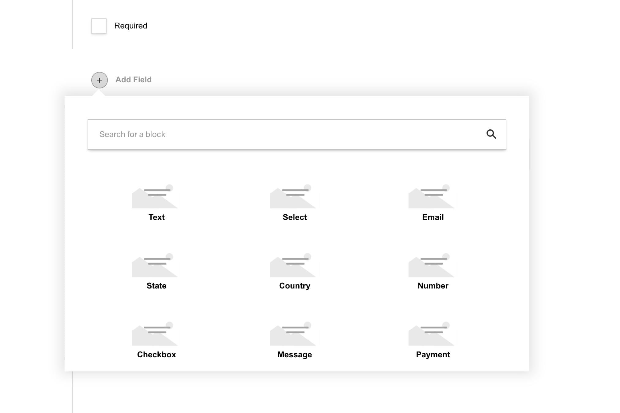
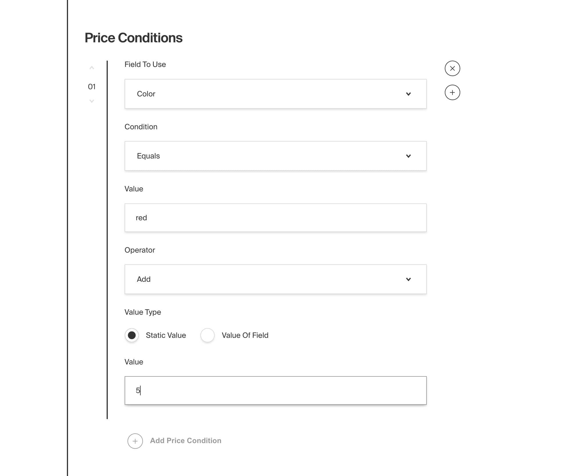
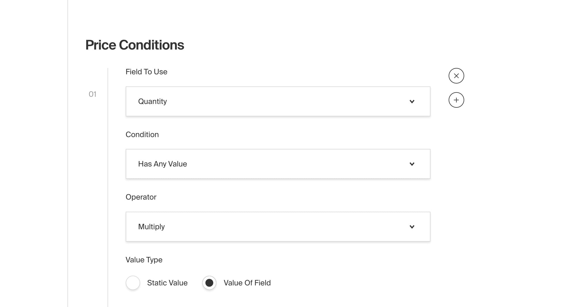
title: Multi-Tenant Plugin label: Multi-Tenant order: 40 desc: Scaffolds multi-tenancy for your Payload application keywords: plugins, multi-tenant, multi-tenancy, plugin, payload, cms, seo, indexing, search, search engine

This plugin sets up multi-tenancy for your application from within your Admin Panel. It does so by adding a tenant field to all specified collections. Your front-end application can then query data by tenant. You must add the Tenants collection so you control what fields are available for each tenant.
- Adds a
tenantfield to each specified collection - Adds a tenant selector to the admin panel, allowing you to switch between tenants
- Filters list view results by selected tenant
Install the plugin using any JavaScript package manager like pnpm, npm, or Yarn:
pnpm add @payloadcms/plugin-multi-tenantThe plugin accepts an object with the following properties:
type MultiTenantPluginConfig<ConfigTypes = unknown> = {
/**
* After a tenant is deleted, the plugin will attempt to clean up related documents
* - removing documents with the tenant ID
* - removing the tenant from users
*
* @default true
*/
cleanupAfterTenantDelete?: boolean
/**
* Automatically
*/
collections: {
[key in CollectionSlug]?: {
/**
* Set to `true` if you want the collection to behave as a global
*
* @default false
*/
isGlobal?: boolean
/**
* Set to `false` if you want to manually apply the baseListFilter
*
* @default true
*/
useBaseListFilter?: boolean
/**
* Set to `false` if you want to handle collection access manually without the multi-tenant constraints applied
*
* @default true
*/
useTenantAccess?: boolean
}
}
/**
* Enables debug mode
* - Makes the tenant field visible in the admin UI within applicable collections
*
* @default false
*/
debug?: boolean
/**
* Enables the multi-tenant plugin
*
* @default true
*/
enabled?: boolean
/**
* Field configuration for the field added to all tenant enabled collections
*/
tenantField?: {
access?: RelationshipField['access']
/**
* The name of the field added to all tenant enabled collections
*
* @default 'tenant'
*/
name?: string
}
/**
* Field configuration for the field added to the users collection
*
* If `includeDefaultField` is `false`, you must include the field on your users collection manually
* This is useful if you want to customize the field or place the field in a specific location
*/
tenantsArrayField?:
| {
/**
* Access configuration for the array field
*/
arrayFieldAccess?: ArrayField['access']
/**
* When `includeDefaultField` is `true`, the field will be added to the users collection automatically
*/
includeDefaultField?: true
/**
* Additional fields to include on the tenants array field
*/
rowFields?: Field[]
/**
* Access configuration for the tenant field
*/
tenantFieldAccess?: RelationshipField['access']
}
| {
arrayFieldAccess?: never
/**
* When `includeDefaultField` is `false`, you must include the field on your users collection manually
*/
includeDefaultField?: false
rowFields?: never
tenantFieldAccess?: never
}
/**
* The slug for the tenant collection
*
* @default 'tenants'
*/
tenantsSlug?: string
/**
* Function that determines if a user has access to _all_ tenants
*
* Useful for super-admin type users
*/
userHasAccessToAllTenants?: (
user: ConfigTypes extends { user } ? ConfigTypes['user'] : User,
) => boolean
}In the plugins array of your Payload Config, call the plugin with options:
import { buildConfig } from 'payload'
import { multiTenantPlugin } from '@payloadcms/plugin-multi-tenant'
import type { Config } from './payload-types'
const config = buildConfig({
collections: [
{
slug: 'tenants',
admin: {
useAsTitle: 'name'
}
fields: [
// remember, you own these fields
// these are merely suggestions/examples
{
name: 'name',
type: 'text',
required: true,
},
{
name: 'slug',
type: 'text',
required: true,
},
{
name: 'domain',
type: 'text',
required: true,
}
],
},
],
plugins: [
multiTenantPlugin<Config>({
collections: {
pages: {},
navigation: {
isGlobal: true,
}
},
}),
],
})
export default configThe plugin scaffolds out everything you will need to separate data by tenant. You can use the tenant field to filter data from enabled collections in your front-end application.
In your frontend you can query and constrain data by tenant with the following:
const pagesBySlug = await payload.find({
collection: 'pages',
depth: 1,
draft: false,
limit: 1000,
overrideAccess: false,
where: {
// your constraint would depend on the
// fields you added to the tenants collection
// here we are assuming a slug field exists
// on the tenant collection, like in the example above
'tenant.slug': {
equals: 'gold',
},
},
})Using NextJS rewrites and this route structure /[tenantDomain]/[slug], we can rewrite routes specifically for domains requested:
async rewrites() {
return [
{
source: '/((?!admin|api)):path*',
destination: '/:tenantDomain/:path*',
has: [
{
type: 'host',
value: '(?<tenantDomain>.*)',
},
],
},
];
}The Examples Directory also contains an official Multi-Tenant example.
title: Nested Docs Plugin label: Nested Docs order: 40 desc: Nested documents in a parent, child, and sibling relationship. keywords: plugins, nested, documents, parent, child, sibling, relationship

This plugin allows you to easily nest the documents of your application inside of one another. It does so by adding a
new parent field onto each of your documents that, when selected, attaches itself to the parent's tree. When you edit
the great-great-grandparent of a document, for instance, all of its descendants are recursively updated. This is an
extremely powerful way of achieving hierarchy within a collection, such as parent/child relationship between pages.
Documents also receive a new breadcrumbs field. Once a parent is assigned, these breadcrumbs are populated based on
each ancestor up the tree. Breadcrumbs allow you to dynamically generate labels and URLs based on the document's
position in the hierarchy. Even if the slug of a parent document changes, or the entire tree is nested another level
deep, changes will cascade down the entire tree and all breadcrumbs will reflect those changes.
With this pattern you can perform whatever side-effects your applications needs on even the most deeply nested
documents. For example, you could easily add a custom fullTitle field onto each document and inject the parent's title
onto it, such as "Parent Title > Child Title". This would allow you to then perform searches and filters based on that
field instead of the original title. This is especially useful if you happen to have two documents with identical titles
but different parents.
- Automatically adds a
parentrelationship field to each document - Allows for parent/child relationships between documents within the same collection
- Recursively updates all descendants when a parent is changed
- Automatically populates a
breadcrumbsfield with all ancestors up the tree - Dynamically generate labels and URLs for each breadcrumb
- Supports localization
Install the plugin using any JavaScript package manager like pnpm, npm, or Yarn:
pnpm add @payloadcms/plugin-nested-docsIn the plugins array of your Payload Config, call the plugin
with options:
import { buildConfig } from 'payload'
import { nestedDocsPlugin } from '@payloadcms/plugin-nested-docs'
const config = buildConfig({
collections: [
{
slug: 'pages',
fields: [
{
name: 'title',
type: 'text',
},
{
name: 'slug',
type: 'text',
},
],
},
],
plugins: [
nestedDocsPlugin({
collections: ['pages'],
generateLabel: (_, doc) => doc.title,
generateURL: (docs) => docs.reduce((url, doc) => `${url}/${doc.slug}`, ''),
}),
],
})
export default configThe parent relationship field is automatically added to every document which allows editors to choose another document
from the same collection to act as the direct parent.
The breadcrumbs field is an array which dynamically populates all parent relationships of a document up to the top
level and stores the following fields.
| Field | Description |
|---|---|
label |
The label of the breadcrumb. This field is automatically set to either the collection.admin.useAsTitle (if defined) or is set to the ID of the document. You can also dynamically define the label by passing a function to the options property of generateLabel. |
url |
The URL of the breadcrumb. By default, this field is undefined. You can manually define this field by passing a property called function to the plugin options property of generateURL. |
An array of collections slugs to enable nested docs.
Each breadcrumb has a required label field. By default, its value will be set to the collection's admin.useAsTitle
or fallback the the ID of the document.
You can also pass a function to dynamically set the label of your breadcrumb.
// payload.config.ts
nestedDocsPlugin({
//...
generateLabel: (_, doc) => doc.title, // NOTE: 'title' is a hypothetical field
})The function takes two arguments and returns a string:
| Argument | Type | Description |
|---|---|---|
docs |
Array |
An array of the breadcrumbs up to that point |
doc |
Object |
The current document being edited |
A function that allows you to dynamically generate each breadcrumb url. Each breadcrumb has an optional url field
which is undefined by default. For example, you might want to format a full URL to contain all breadcrumbs up to
that point, like /about-us/company/our-team.
// payload.config.ts
nestedDocsPlugin({
//...
generateURL: (docs) => docs.reduce((url, doc) => `${url}/${doc.slug}`, ''), // NOTE: 'slug' is a hypothetical field
})| Argument | Type | Description |
|---|---|---|
docs |
Array |
An array of the breadcrumbs up to that point |
doc |
Object |
The current document being edited |
When defined, the parent field will not be provided for you automatically, and instead, expects you to add your
own parent field to each collection manually. This gives you complete control over where you put the field in your
admin dashboard, etc. Set this property to the name of your custom field.
When defined, the breadcrumbs field will not be provided for you, and instead, expects you to add your
own breadcrumbs field to each collection manually. Set this property to the name of your custom field.
If you opt out of automatically being provided a parent or breadcrumbs field, you need to make
sure that both fields are placed at the top-level of your document. They cannot exist within any
nested data structures like a group, array, or blocks.
You can also extend the built-in parent and breadcrumbs fields per collection by using the createParentField
and createBreadcrumbField methods. They will merge your customizations overtop the plugin's base field configurations.
import type { CollectionConfig } from 'payload'
import { createParentField } from '@payloadcms/plugin-nested-docs/fields'
import { createBreadcrumbsField } from '@payloadcms/plugin-nested-docs/fields'
const examplePageConfig: CollectionConfig = {
slug: 'pages',
fields: [
createParentField(
// First argument is equal to the slug of the collection
// that the field references
'pages',
// Second argument is equal to field overrides that you specify,
// which will be merged into the base parent field config
{
admin: {
position: 'sidebar',
},
// Note: if you override the `filterOptions` of the `parent` field,
// be sure to continue to prevent the document from referencing itself as the parent like this:
// filterOptions: ({ id }) => ({ id: {not_equals: id }})
},
),
createBreadcrumbsField(
// First argument is equal to the slug of the collection
// that the field references
'pages',
// Argument equal to field overrides that you specify,
// which will be merged into the base `breadcrumbs` field config
{
label: 'Page Breadcrumbs',
},
),
],
}If overriding the name of either breadcrumbs or parent fields, you must specify the
breadcrumbsFieldSlug or parentFieldSlug respectively.
This plugin supports localization by default. If the localization property is set in your Payload Config,
the breadcrumbs field is automatically localized. For more details on how localization works in Payload, see
the Localization docs.
All types can be directly imported:
import { PluginConfig, GenerateURL, GenerateLabel } from '@payloadcms/plugin-nested-docs/types'The Templates Directory also contains an official Website Template and E-commerce Template, both of which use this plugin.
title: Plugins label: Overview order: 10 desc: Plugins provide a great way to modularize Payload functionalities into easy-to-use enhancements and extensions of your Payload apps. keywords: plugins, config, configuration, extensions, custom, documentation, Content Management System, cms, headless, javascript, node, react, nextjs
Payload Plugins take full advantage of the modularity of the Payload Config, allowing developers developers to easily inject custom—sometimes complex—functionality into Payload apps from a very small touch-point. This is especially useful is sharing your work across multiple projects or with the greater Payload community.
There are many Official Plugins available that solve for some of the most common uses cases, such as the Form Builder Plugin or SEO Plugin. There are also Community Plugins available, maintained entirely by contributing members. To extend Payload's functionality in some other way, you can easily build your own plugin.
To configure Plugins, use the plugins property in your Payload Config:
import { buildConfig } from 'payload'
const config = buildConfig({
// ...
// highlight-start
plugins: [
// Add Plugins here
],
// highlight-end
})Writing Plugins is no more complex than writing regular JavaScript. If you know the basic concept of callback functions or how spread syntax works, and are up to speed with Payload concepts, then writing a plugin will be a breeze.
Because we rely on a simple config-based structure, Payload Plugins simply take in an existing config and returns a _modified_ config with new fields, hooks, collections, admin views, or anything else you can think of.Example use cases:
- Automatically sync data from a specific collection to HubSpot or a similar CRM when data is added or changes
- Add password-protection functionality to certain documents
- Add a full e-commerce backend to any Payload app
- Add custom reporting views to Payload's Admin Panel
- Encrypt specific collections' data
- Add a full form builder implementation
- Integrate all
upload-enabled collections with a third-party file host like S3 or Cloudinary - Add custom endpoints or GraphQL queries / mutations with any type of custom functionality that you can think of
Payload maintains a set of Official Plugins that solve for some of the common use cases. These plugins are maintained by the Payload team and its contributors and are guaranteed to be stable and up-to-date.
You can also build your own plugin to easily extend Payload's functionality in some other way. Once your plugin is ready, consider sharing it with the community.
Plugins are changing every day, so be sure to check back often to see what new plugins may have been added. If you have a specific plugin you would like to see, please feel free to start a new Discussion.
For a complete list of Official Plugins, visit the [Packages Directory](https://github.com/payloadcms/payload/tree/main/packages) of the [Payload Monorepo](https://github.com/payloadcms/payload).Community Plugins are those that are maintained entirely by outside contributors. They are a great way to share your work across the ecosystem for others to use. You can discover Community Plugins by browsing the payload-plugin topic on GitHub.
Some plugins have become so widely used that they are adopted as an Official Plugin, such as the Lexical Plugin. If you have a plugin that you think should be an Official Plugin, please feel free to start a new Discussion.
For maintainers building plugins for others to use, please add the `payload-plugin` topic on [GitHub](https://github.com/topics/payload-plugin) to help others find it.The base Payload Config allows for a plugins property which takes an array of Plugin Configs.
import { buildConfig } from 'payload'
import { addLastModified } from './addLastModified.ts'
const config = buildConfig({
// ...
// highlight-start
plugins: [
addLastModified,
],
// highlight-end
})Here is an example what the addLastModified plugin from above might look like. It adds a lastModifiedBy field to all Payload collections. For full details, see how to build your own plugin.
import { Config, Plugin } from 'payload'
export const addLastModified: Plugin = (incomingConfig: Config): Config => {
// Find all incoming auth-enabled collections
// so we can create a lastModifiedBy relationship field
// to all auth collections
const authEnabledCollections = incomingConfig.collections.filter((collection) =>
Boolean(collection.auth),
)
// Spread the existing config
const config: Config = {
...incomingConfig,
collections: incomingConfig.collections.map((collection) => {
// Spread each item that we are modifying,
// and add our new field - complete with
// hooks and proper admin UI config
return {
...collection,
fields: [
...collection.fields,
{
name: 'lastModifiedBy',
type: 'relationship',
relationTo: authEnabledCollections.map(({ slug }) => slug),
hooks: {
beforeChange: [
({ req }) => ({
value: req?.user?.id,
relationTo: req?.user?.collection,
}),
],
},
admin: {
position: 'sidebar',
readOnly: true,
},
},
],
}
}),
}
return config
}title: Redirects Plugin label: Redirects order: 40 desc: Automatically create redirects for your Payload application keywords: plugins, redirects, redirect, plugin, payload, cms, seo, indexing, search, search engine

This plugin allows you to easily manage redirects for your application from within your Admin Panel. It does so by adding a redirects collection to your config that allows you specify a redirect from one URL to another. Your front-end application can use this data to automatically redirect users to the correct page using proper HTTP status codes. This is useful for SEO, indexing, and search engine ranking when re-platforming or when changing your URL structure.
For example, if you have a page at /about and you want to change it to /about-us, you can create a redirect from the old page to the new one, then you can use this data to write HTTP redirects into your front-end application. This will ensure that users are redirected to the correct page without penalty because search engines are notified of the change at the request level. This is a very lightweight plugin that will allow you to integrate managed redirects for any front-end framework.
- Adds a
redirectscollection to your config that:- includes a
fromandtofields - allows
toto be a document reference
- includes a
Install the plugin using any JavaScript package manager like pnpm, npm, or Yarn:
pnpm add @payloadcms/plugin-redirectsIn the plugins array of your Payload Config, call the plugin with options:
import { buildConfig } from 'payload'
import { redirectsPlugin } from '@payloadcms/plugin-redirects'
const config = buildConfig({
collections: [
{
slug: 'pages',
fields: [],
},
],
plugins: [
redirectsPlugin({
collections: ['pages'],
}),
],
})
export default config| Option | Type | Description |
|---|---|---|
collections |
string[] |
An array of collection slugs to populate in the to field of each redirect. |
overrides |
object |
A partial collection config that allows you to override anything on the redirects collection. |
redirectTypes |
string[] |
Provide an array of redirects if you want to provide options for the type of redirects to be supported. |
redirectTypeFieldOverride |
Field |
A partial Field config that allows you to override the Redirect Type field if enabled above. |
Note that the fields in overrides take a function that receives the default fields and returns an array of fields. This allows you to add fields to the collection.
redirectsPlugin({
collections: ['pages'],
overrides: {
fields: ({ defaultFields }) => {
return [
...defaultFields,
{
type: 'text',
name: 'customField',
},
]
},
},
redirectTypes: ['301', '302'],
redirectTypeFieldOverride: {
label: 'Redirect Type (Overridden)',
},
})All types can be directly imported:
import { PluginConfig } from '@payloadcms/plugin-redirects/types'The Templates Directory also contains an official Website Template and E-commerce Template, both of which use this plugin.
title: Search Plugin label: Search order: 40 desc: Generates records of your documents that are extremely fast to search on. keywords: plugins, search, search plugin, search engine, search index, search results, search bar, search box, search field, search form, search input

This plugin generates records of your documents that are extremely fast to search on. It does so by creating a new search collection that is indexed in the database then saving a static copy of each of your documents using only search-critical data. Search records are automatically created, synced, and deleted behind-the-scenes as you manage your application's documents.
For example, if you have a posts collection that is extremely large and complex, this would allow you to sync just the title, excerpt, and slug of each post so you can query on that instead of the original post directly. Search records are static, so querying them also has the significant advantage of bypassing any hooks that may present be on the original documents. You define exactly what data is synced, and you can even modify or fallback this data before it is saved on a per-document basis.
To query search results, use all the existing Payload APIs that you are already familiar with. You can also prioritize search results by setting a custom priority for each collection. For example, you may want to list blog posts before pages. Or you may want one specific post to always take appear first. Search records are given a priority field that can be used as the ?sort= parameter in your queries.
This plugin is a great way to implement a fast, immersive search experience such as a search bar in a front-end application. Many applications may not need the power and complexity of a third-party service like Algolia or ElasticSearch. This plugin provides a first-party alternative that is easy to set up and runs entirely on your own database.
This plugin is completely open-source and the [source code can be found here](https://github.com/payloadcms/payload/tree/main/packages/plugin-search). If you need help, check out our [Community Help](https://payloadcms.com/community-help). If you think you've found a bug, please [open a new issue](https://github.com/payloadcms/payload/issues/new?assignees=&labels=plugin%3A%20search&template=bug_report.md&title=plugin-search%3A) with as much detail as possible.- Automatically adds an indexed
searchcollection to your database - Automatically creates, syncs, and deletes search records as you manage your documents
- Saves only search-critical data that you define (e.g. title, excerpt, etc.)
- Allows you to query search results using first-party Payload APIs
- Allows you to query documents without triggering any of their underlying hooks
- Allows you to easily prioritize search results by collection or document
- Allows you to reindex search results by collection on demand
Install the plugin using any JavaScript package manager like pnpm, npm, or Yarn:
pnpm add @payloadcms/plugin-searchIn the plugins array of your Payload Config, call the plugin with options:
import { buildConfig } from 'payload'
import { searchPlugin } from '@payloadcms/plugin-search'
const config = buildConfig({
collections: [
{
slug: 'pages',
fields: [],
},
{
slug: 'posts',
fields: [],
},
],
plugins: [
searchPlugin({
collections: ['pages', 'posts'],
defaultPriorities: {
pages: 10,
posts: 20,
},
}),
],
})
export default configThe collections property is an array of collection slugs to enable syncing to search. Enabled collections receive a beforeChange and afterDelete hook that creates, updates, and deletes its respective search record as it changes over time.
By default, the search plugin will add localization: true to the title field of the newly added search collection if you have localization enabled. If you would like to disable this behavior, you can set this to false.
This plugin automatically adds a priority field to the search collection that can be used as the ?sort= parameter in your queries. For example, you may want to list blog posts before pages. Or you may want one specific post to always take appear first.
The defaultPriorities property is used to set a fallback priority on search records during the create operation. It accepts an object with keys that are your collection slugs and values that can either be a number or a function that returns a number. The function receives the doc as an argument, which is the document being created.
// payload.config.ts
{
// ...
searchPlugin({
defaultPriorities: {
pages: ({ doc }) => (doc.title.startsWith('Hello, world!') ? 1 : 10),
posts: 20,
},
}),
}This plugin automatically creates the search collection, but you can override anything on this collection via the searchOverrides property. It accepts anything from the Payload Collection Config and merges it in with the default search collection config provided by the plugin.
Note that the fields property is a function that receives an object with a defaultFields key. This is an array of fields that are automatically added to the search collection. You can modify this array or add new fields to it.
// payload.config.ts
{
// ...
searchPlugin({
searchOverrides: {
slug: 'search-results',
fields: ({ defaultFields }) => [
...defaultFields,
{
name: 'excerpt',
type: 'textarea',
admin: {
position: 'sidebar',
},
},
],
},
}),
}Before creating or updating a search record, the beforeSync function runs. This is an afterChange hook that allows you to modify the data or provide fallbacks before its search record is created or updated.
// payload.config.ts
{
// ...
searchPlugin({
beforeSync: ({ originalDoc, searchDoc }) => ({
...searchDoc,
// - Modify your docs in any way here, this can be async
// - You also need to add the `excerpt` field in the `searchOverrides` config
excerpt: originalDoc?.excerpt || 'This is a fallback excerpt',
}),
}),
}When syncDrafts is true, draft documents will be synced to search. This is false by default. You must have Payload Drafts enabled for this to apply.
If true, will delete documents from search whose status changes to draft. This is true by default. You must have Payload Drafts enabled for this to apply.
A number that, when specified, will be used as the value to determine how many search documents to fetch for reindexing at a time in each batch. If not set, this will default to 50.
Collection reindexing allows you to recreate search documents from your search-enabled collections on demand. This is useful if you have existing documents that don't already have search indexes, commonly when adding plugin-search to an existing project. To get started, navigate to your search collection and click the pill in the top right actions slot of the list view labelled Reindex. This will open a popup with options to select one of your search-enabled collections, or all, for reindexing.
All types can be directly imported:
import type { SearchConfig, BeforeSync } from '@payloadcms/plugin-search/types'title: Sentry Plugin label: Sentry order: 40 desc: Integrate Sentry error tracking into your Payload application keywords: plugins, sentry, error, tracking, monitoring, logging, bug, reporting, performance

This plugin allows you to integrate Sentry seamlessly with your Payload application.
Sentry is a powerful error tracking and performance monitoring tool that helps developers identify, diagnose, and resolve issues in their applications.
Sentry does smart stuff with error data to make bugs easier to find and fix. - [sentry.io](https://sentry.io/)This multi-faceted software offers a range of features that will help you manage errors with greater ease and ultimately ensure your application is running smoothly:
- Error Tracking: Instantly captures and logs errors as they occur in your application
- Performance Monitoring: Tracks application performance to identify slowdowns and bottlenecks
- Detailed Reports: Provides comprehensive insights into errors, including stack traces and context
- Alerts and Notifications: Send and customize event-triggered notifications
- Issue Grouping, Filtering and Search: Automatically groups similar errors, and allows filtering and searching issues by custom criteria
- Breadcrumbs: Records user actions and events leading up to an error
- Integrations: Connects with various tools and services for enhanced workflow and issue management
Install the plugin using any JavaScript package manager like pnpm, npm, or Yarn:
pnpm add @payloadcms/plugin-sentryThis plugin requires to complete the Sentry + Next.js setup before.
You can use either the automatic setup with the installation wizard:
npx @sentry/wizard@latest -i nextjsOr the Manual Setup
In the plugins array of your Payload Config, call the plugin and pass in your Sentry DSN as an option.
import { buildConfig } from 'payload'
import { sentryPlugin } from '@payloadcms/plugin-sentry'
import { Pages, Media } from './collections'
import * as Sentry from '@sentry/nextjs'
const config = buildConfig({
collections: [Pages, Media],
plugins: [
sentryPlugin({
Sentry,
}),
],
})
export default config-
Sentry: Sentry | requiredThe
Sentryinstance
-
enabled: boolean | optionalSet to false to disable the plugin. Defaults to
true. -
context:(args: ContextArgs) => Partial<ScopeContext> | Promise<Partial<ScopeContext>>Pass additional contextual data to Sentry
-
captureErrors: number[] | optionalBy default,
Sentry.errorHandlerwill capture only errors with a status code of 500 or higher. To capture additional error codes, pass the values as numbers in an array.
Configure any of these options by passing them to the plugin:
import { buildConfig } from 'payload'
import { sentryPlugin } from '@payloadcms/plugin-sentry'
import * as Sentry from '@sentry/nextjs'
import { Pages, Media } from './collections'
const config = buildConfig({
collections: [Pages, Media],
plugins: [
sentryPlugin({
options: {
captureErrors: [400, 403],
context: ({ defaultContext, req }) => {
return {
...defaultContext,
tags: {
locale: req.locale,
},
}
},
debug: true,
},
Sentry,
}),
],
})
export default configAll types can be directly imported:
import { PluginOptions } from '@payloadcms/plugin-sentry'description: Manage SEO metadata from your Payload admin keywords: plugins, seo, meta, search, engine, ranking, google label: SEO order: 30 title: SEO Plugin

This plugin allows you to easily manage SEO metadata for your application from within your Admin Panel. When enabled on your Collections and Globals, it adds a new meta field group containing title, description, and image by default. Your front-end application can then use this data to render meta tags however your application requires. For example, you would inject a title tag into the <head> of your page using meta.title as its content.
As users are editing documents within the Admin Panel, they have the option to "auto-generate" these fields. When clicked, this plugin will execute your own custom functions that re-generate the title, description, and image. This way you can build your own SEO writing assistance directly into your application. For example, you could append your site name onto the page title, or use the document's excerpt field as the description, or even integrate with some third-party API to generate the image using AI.
To help you visualize what your page might look like in a search engine, a preview is rendered on the page just beneath the meta fields. This preview is updated in real-time as you edit your metadata. There are also visual indicators to help you write effective meta, such as a character counter for the title and description fields. You can even inject your own custom fields into the meta field group as your application requires, like og:title or json-ld. If you've ever used something like Yoast SEO, this plugin might feel very familiar.
- Adds a
metafield group to every SEO-enabled collection or global - Allows you to define custom functions to auto-generate metadata
- Displays hints and indicators to help content editor write effective meta
- Renders a snippet of what a search engine might display
- Extendable so you can define custom fields like
og:titleorjson-ld - Soon will support dynamic variable injection
Install the plugin using any JavaScript package manager like pnpm, npm, or Yarn:
pnpm add @payloadcms/plugin-seoIn the plugins array of your Payload Config, call the plugin with options:
import { buildConfig } from 'payload';
import { seoPlugin } from '@payloadcms/plugin-seo';
const config = buildConfig({
collections: [
{
slug: 'pages',
fields: []
},
{
slug: 'media',
upload: {
staticDir: // path to your static directory,
},
fields: []
}
],
plugins: [
seoPlugin({
collections: [
'pages',
],
uploadsCollection: 'media',
generateTitle: ({ doc }) => `Website.com — ${doc.title}`,
generateDescription: ({ doc }) => doc.excerpt
})
]
});
export default config;An array of collections slugs to enable SEO. Enabled collections receive a meta field which is an object of title, description, and image subfields.
An array of global slugs to enable SEO. Enabled globals receive a meta field which is an object of title, description, and image subfields.
A function that takes in the default fields via an object and expects an array of fields in return. You can use this to modify existing fields or add new ones.
// payload.config.ts
{
// ...
seoPlugin({
fields: ({ defaultFields }) => [
...defaultFields,
{
name: 'customField',
type: 'text',
}
]
})
}Set the uploadsCollection to your application's upload-enabled collection slug. This is used to provide an image field on the meta field group.
When the tabbedUI property is true, it appends an SEO tab onto your config using Payload's Tabs Field. If your collection is not already tab-enabled, meaning the first field in your config is not of type tabs, then one will be created for you called Content. Defaults to false.
A function that allows you to return any meta title, including from the document's content.
// payload.config.ts
{
// ...
seoPlugin({
generateTitle: ({ doc }) => `Website.com — ${doc?.title}`,
})
}All "generate" functions receive the following arguments:
| Argument | Description |
|---|---|
collectionConfig |
The configuration of the collection. |
collectionSlug |
The slug of the collection. |
doc |
The data of the current document. |
docPermissions |
The permissions of the document. |
globalConfig |
The configuration of the global. |
globalSlug |
The slug of the global. |
hasPublishPermission |
Whether the user has permission to publish the document. |
hasSavePermission |
Whether the user has permission to save the document. |
id |
The ID of the document. |
initialData |
The initial data of the document. |
initialState |
The initial state of the document. |
locale |
The locale of the document. |
preferencesKey |
The preferences key of the document. |
publishedDoc |
The published document. |
req |
The Payload request object containing user, payload, i18n, etc. |
title |
The title of the document. |
versionsCount |
The number of versions of the document. |
A function that allows you to return any meta description, including from the document's content.
// payload.config.ts
{
// ...
seoPlugin({
generateDescription: ({ doc }) => doc?.excerpt,
})
}For a full list of arguments, see the generateTitle function.
A function that allows you to return any meta image, including from the document's content.
// payload.config.ts
{
// ...
seoPlugin({
generateImage: ({ doc }) => doc?.featuredImage,
})
}For a full list of arguments, see the generateTitle function.
A function called by the search preview component to display the actual URL of your page.
// payload.config.ts
{
// ...
seoPlugin({
generateURL: ({ doc, collectionSlug }) =>
`https://yoursite.com/${collectionSlug}/${doc?.slug}`,
})
}For a full list of arguments, see the generateTitle function.
Rename the meta group interface name that is generated for TypeScript and GraphQL.
// payload.config.ts
{
// ...
seoPlugin({
interfaceName: 'customInterfaceNameSEO',
})
}There is the option to directly import any of the fields from the plugin so that you can include them anywhere as needed.
You will still need to configure the plugin in the Payload Config in order to configure the generation functions. Since these fields are imported and used directly, they don't have access to the plugin config so they may need additional arguments to work the same way.import { MetaDescriptionField, MetaImageField, MetaTitleField, OverviewField, PreviewField } from '@payloadcms/plugin-seo/fields'
// Used as fields
MetaImageField({
// the upload collection slug
relationTo: 'media',
// if the `generateImage` function is configured
hasGenerateFn: true,
})
MetaDescriptionField({
// if the `generateDescription` function is configured
hasGenerateFn: true,
})
MetaTitleField({
// if the `generateTitle` function is configured
hasGenerateFn: true,
})
PreviewField({
// if the `generateUrl` function is configured
hasGenerateFn: true,
// field paths to match the target field for data
titlePath: 'meta.title',
descriptionPath: 'meta.description',
})
OverviewField({
// field paths to match the target field for data
titlePath: 'meta.title',
descriptionPath: 'meta.description',
imagePath: 'meta.image',
})All types can be directly imported:
import type {
PluginConfig,
GenerateTitle,
GenerateDescription
GenerateURL
} from '@payloadcms/plugin-seo/types';You can then pass the collections from your generated Payload types into the generation types, for example:
import type { Page } from './payload-types.ts';
import type { GenerateTitle } from '@payloadcms/plugin-seo/types';
const generateTitle: GenerateTitle<Page> = async ({ doc, locale }) => {
return `Website.com — ${doc?.title}`
}The Templates Directory contains an official Website Template and E-commerce Template which demonstrates exactly how to configure this plugin in Payload and implement it on your front-end.
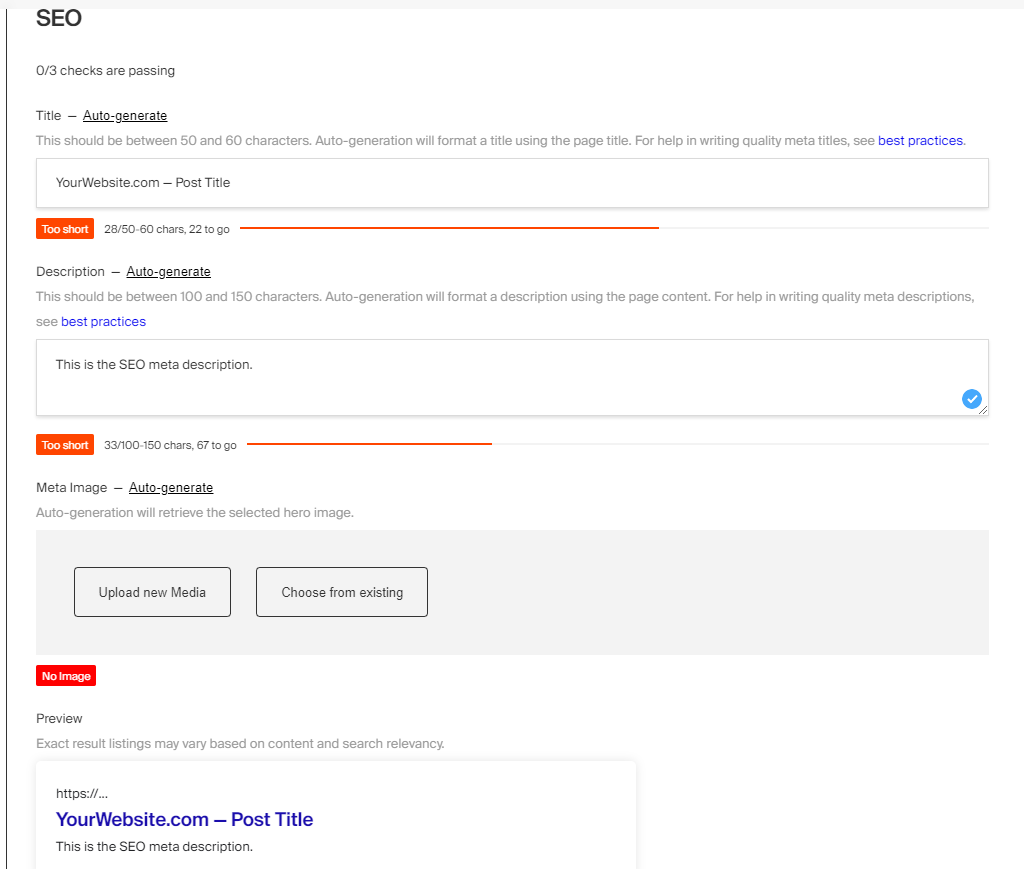
title: Stripe Plugin label: Stripe order: 40 desc: Easily accept payments with Stripe keywords: plugins, stripe, payments, ecommerce

With this plugin you can easily integrate Stripe into Payload. Simply provide your Stripe credentials and this plugin will open up a two-way communication channel between the two platforms. This enables you to easily sync data back and forth, as well as proxy the Stripe REST API through Payload's Access Control. Use this plugin to completely offload billing to Stripe and retain full control over your application's data.
For example, you might be building an e-commerce or SaaS application, where you have a products or a plans collection that requires either a one-time payment or a subscription. You can to tie each of these products to Stripe, then easily subscribe to billing-related events to perform your application's business logic, such as active purchases or subscription cancellations.
To build a checkout flow on your front-end you can either use Stripe Checkout, or you can also build a completely custom checkout experience from scratch using Stripe Web Elements. Then to build fully custom, secure customer dashboards, you can leverage Payload's Access Control to restrict access to your Stripe resources so your users never have to leave your site to manage their accounts.
The beauty of this plugin is the entirety of your application's content and business logic can be handled in Payload while Stripe handles solely the billing and payment processing. You can build a completely proprietary application that is endlessly customizable and extendable, on APIs and databases that you own. Hosted services like Shopify or BigCommerce might fracture your application's content then charge you for access.
This plugin is completely open-source and the [source code can be found here](https://github.com/payloadcms/payload/tree/main/packages/plugin-stripe). If you need help, check out our [Community Help](https://payloadcms.com/community-help). If you think you've found a bug, please [open a new issue](https://github.com/payloadcms/payload/issues/new?assignees=&labels=plugin%3A%20stripe&template=bug_report.md&title=plugin-stripe%3A) with as much detail as possible.- Hides your Stripe credentials when shipping SaaS applications
- Allows restricted keys through Payload access control
- Enables a two-way communication channel between Stripe and Payload
- Proxies the Stripe REST API
- Proxies Stripe webhooks
- Automatically syncs data between the two platforms
Install the plugin using any JavaScript package manager like pnpm, npm, or Yarn:
pnpm add @payloadcms/plugin-stripeIn the plugins array of your Payload Config, call the plugin with options:
import { buildConfig } from 'payload'
import { stripePlugin } from '@payloadcms/plugin-stripe'
const config = buildConfig({
plugins: [
stripePlugin({
stripeSecretKey: process.env.STRIPE_SECRET_KEY,
}),
],
})
export default config| Option | Type | Default | Description |
|---|---|---|---|
stripeSecretKey * |
string | undefined |
Your Stripe secret key |
stripeWebhooksEndpointSecret |
string | undefined |
Your Stripe webhook endpoint secret |
rest |
boolean | false |
When true, opens the /api/stripe/rest endpoint |
webhooks |
object or function | undefined |
Either a function to handle all webhooks events, or an object of Stripe webhook handlers, keyed to the name of the event |
sync |
array | undefined |
An array of sync configs |
logs |
boolean | false |
When true, logs sync events to the console as they happen |
* An asterisk denotes that a property is required.
The following custom endpoints are automatically opened for you:
| Endpoint | Method | Description |
|---|---|---|
/api/stripe/rest |
POST |
Proxies the Stripe REST API behind Payload access control and returns the result. See the REST Proxy section for more details. |
/api/stripe/webhooks |
POST |
Handles all Stripe webhook events |
If rest is true, proxies the Stripe REST API behind Payload access control and returns the result. This flag should only be used for local development, see the security note below for more information.
const res = await fetch(`/api/stripe/rest`, {
method: 'POST',
credentials: 'include',
headers: {
'Content-Type': 'application/json',
// Authorization: `JWT ${token}` // NOTE: do this if not in a browser (i.e. curl or Postman)
},
body: JSON.stringify({
stripeMethod: 'stripe.subscriptions.list',
stripeArgs: [
{
customer: 'abc',
},
],
}),
})If you need to proxy the API server-side, use the stripeProxy function.
**Note:**The /api part of these routes may be different based on the settings defined in your Payload
config.
Opening the REST proxy endpoint in production is a potential security risk. Authenticated users will have open access to the Stripe REST API. In production, open your own endpoint and use the stripeProxy function to proxy the Stripe API server-side.
Stripe webhooks are used to sync from Stripe to Payload. Webhooks listen for events on your Stripe account so you can trigger reactions to them. Follow the steps below to enable webhooks.
Development:
- Login using Stripe cli
stripe login - Forward events to localhost
stripe listen --forward-to localhost:3000/api/stripe/webhooks - Paste the given secret into your
.envfile asSTRIPE_WEBHOOKS_ENDPOINT_SECRET
Production:
- Login and create a new webhook from the Stripe dashboard
- Paste
YOUR_DOMAIN_NAME/api/stripe/webhooksas the "Webhook Endpoint URL" - Select which events to broadcast
- Paste the given secret into your
.envfile asSTRIPE_WEBHOOKS_ENDPOINT_SECRET - Then, handle these events using the
webhooksportion of this plugin's config:
import { buildConfig } from 'payload'
import stripePlugin from '@payloadcms/plugin-stripe'
const config = buildConfig({
plugins: [
stripePlugin({
stripeSecretKey: process.env.STRIPE_SECRET_KEY,
stripeWebhooksEndpointSecret: process.env.STRIPE_WEBHOOKS_ENDPOINT_SECRET,
webhooks: {
'customer.subscription.updated': ({ event, stripe, stripeConfig }) => {
// do something...
},
},
// NOTE: you can also catch all Stripe webhook events and handle the event types yourself
// webhooks: (event, stripe, stripeConfig) => {
// switch (event.type): {
// case 'customer.subscription.updated': {
// // do something...
// break;
// }
// default: {
// break;
// }
// }
// }
}),
],
})
export default configFor a full list of available webhooks, see here.
On the server you should interface with Stripe directly using the stripe npm module. That might look something like this:
import Stripe from 'stripe'
const stripeSecretKey = process.env.STRIPE_SECRET_KEY
const stripe = new Stripe(stripeSecretKey, { apiVersion: '2022-08-01' })
export const MyFunction = async () => {
try {
const customer = await stripe.customers.create({
email: data.email,
})
// do something...
} catch (error) {
console.error(error.message)
}
}Alternatively, you can interface with the Stripe using the stripeProxy, which is exactly what the /api/stripe/rest endpoint does behind-the-scenes. Here's the same example as above, but piped through the proxy:
import { stripeProxy } from '@payloadcms/plugin-stripe'
export const MyFunction = async () => {
try {
const customer = await stripeProxy({
stripeSecretKey: process.env.STRIPE_SECRET_KEY,
stripeMethod: 'customers.create',
stripeArgs: [
{
email: data.email,
},
],
})
if (customer.status === 200) {
// do something...
}
if (customer.status >= 400) {
throw new Error(customer.message)
}
} catch (error) {
console.error(error.message)
}
}This option will setup a basic sync between Payload collections and Stripe resources for you automatically. It will create all the necessary hooks and webhooks handlers, so the only thing you have to do is map your Payload fields to their corresponding Stripe properties. As documents are created, updated, and deleted from either Stripe or Payload, the changes are reflected on either side.
**Note:**If you wish to enable a two-way sync, be sure to setup webhooks and pass the
stripeWebhooksEndpointSecret through your config.
import { buildConfig } from 'payload'
import stripePlugin from '@payloadcms/plugin-stripe'
const config = buildConfig({
plugins: [
stripePlugin({
stripeSecretKey: process.env.STRIPE_SECRET_KEY,
stripeWebhooksEndpointSecret: process.env.STRIPE_WEBHOOKS_ENDPOINT_SECRET,
sync: [
{
collection: 'customers',
stripeResourceType: 'customers',
stripeResourceTypeSingular: 'customer',
fields: [
{
fieldPath: 'name', // this is a field on your own Payload Config
stripeProperty: 'name', // use dot notation, if applicable
},
],
},
],
}),
],
})
export default configDue to limitations in the Stripe API, this currently only works with top-level fields. This is because every Stripe object is a separate entity, making it difficult to abstract into a simple reusable library. In the future, we may find a pattern around this. But for now, cases like that will need to be hard-coded.
Using sync will do the following:
- Adds and maintains a
stripeIDread-only field on each collection, this is a field generated by Stripe and used as a cross-reference - Adds a direct link to the resource on Stripe.com
- Adds and maintains an
skipSyncread-only flag on each collection to prevent infinite syncs when hooks trigger webhooks - Adds the following hooks to each collection:
beforeValidate:createNewInStripebeforeChange:syncExistingWithStripeafterDelete:deleteFromStripe
- Handles the following Stripe webhooks
STRIPE_TYPE.created:handleCreatedOrUpdatedSTRIPE_TYPE.updated:handleCreatedOrUpdatedSTRIPE_TYPE.deleted:handleDeleted
All types can be directly imported:
import {
StripeConfig,
StripeWebhookHandler,
StripeProxy,
...
} from '@payloadcms/plugin-stripe/types';The Templates Directory contains an official E-commerce Template which demonstrates exactly how to configure this plugin in Payload and implement it on your front-end. You can also check out How to Build An E-Commerce Site With Next.js post for a bit more context around this template.
title: Production Deployment label: Deployment order: 10 desc: When your Payload based app is ready, tested, looking great, it is time to deploy. Learn how to deploy your app and what to consider before deployment. keywords: deployment, production, config, configuration, documentation, Content Management System, cms, headless, javascript, node, react, nextjs
There are many ways to deploy Payload to a production environment. When evaluating how you will deploy Payload, you need to consider these main aspects:
Payload can be deployed anywhere that Next.js can run - including Vercel, Netlify, SST, DigitalOcean, AWS, and more. Because it's open source, you can self-host it.
But it's important to remember that most Payload projects will also need a database, file storage, an email provider, and a CDN. Make sure you have all of the requirements that your project needs, no matter what deployment platform you choose.
Often, the easiest and fastest way to deploy Payload is to use Payload Cloud — where you get everything you need out of the box, including:
- A MongoDB Atlas database
- S3 file storage
- Resend email service
- Cloudflare CDN
- Blue / green deployments
- Logs
- And more
Payload runs fully in Next.js, so the Next.js build process is used for building Payload. If you've used create-payload-app to create your project, executing the build
npm script will build Payload for production.
Payload features a suite of security features that you can rely on to strengthen your application's security. When deploying to Production, it's a good idea to double-check that you are making proper use of each of them.
When you initialize Payload, you provide it with a secret property. This property should be impossible to guess and
extremely difficult for brute-force attacks to crack. Make sure your Production secret is a long, complex string.
Because you are in complete control of who can do what with your data, you should double and triple-check that you wield that power responsibly before deploying to Production.
** By default, all Access Control functions require that a user is successfully logged in to Payload to create, read, update, or delete data. ** But, if you allow public user registration, for example, you will want to make sure that your access control functions are more strict - permitting** only appropriate users **
to perform appropriate actions.
Depending on where you deploy Payload, you may need to provide a start script to your deployment platform in order to start up Payload in production mode.
Note that this is different than running next dev. Generally, Next.js apps come configured with a start script which runs next start.
You should be using an SSL certificate for production Payload instances, which means you can enable secure cookies in your Authentication-enabled Collection configs.
Payload comes with a robust set of built-in anti-abuse measures, such as locking out users after X amount of failed
login attempts, GraphQL query complexity limits, max depth settings, and
more. Click here to learn more.
Payload can be used with any Postgres database or MongoDB-compatible database including AWS DocumentDB or Azure Cosmos DB. Make sure your production environment has access to the database that Payload uses.
Out of the box, Payload templates pass the process.env.DATABASE_URI environment variable to its database adapters, so make sure you've got that environment variable (and all others that you use) assigned in your deployment platform.
When using AWS DocumentDB, you will need to configure connection options for authentication in the connectOptions
passed to the mongooseAdapter . You also need to set connectOptions.useFacet to false to disable use of the
unsupported $facet aggregation.
When using Azure Cosmos DB, an index is needed for any field you may want to sort on. To add the sort index for all fields that may be sorted in the admin UI use the indexSortableFields configuration option.
If you are using Payload to manage file uploads, you need to consider where your uploaded files will be permanently stored. If you do not use Payload for file uploads, then this section does not impact your app whatsoever.
Some cloud app hosts such as Heroku use ephemeral file systems, which means that any files
uploaded to your server only last until the server restarts or shuts down. Heroku and similar providers schedule
restarts and shutdowns without your control, meaning your uploads will accidentally disappear without any way to get
them back.
Alternatively, persistent filesystems will never delete your files and can be trusted to reliably host uploads perpetually.
Popular cloud providers with ephemeral filesystems:
- Heroku
- DigitalOcean Apps
Popular cloud providers with persistent filesystems:
- DigitalOcean Droplets
- Amazon EC2
- GoDaddy
- Many other more traditional web hosts
If you rely on Payload's Upload functionality, make sure you either use a host with a persistent filesystem or have an integration with a third-party file host like Amazon S3.
If you don't use Payload's upload functionality, you can completely disregard this section.
But, if you do, and you still want to use an ephemeral filesystem provider, you can use one of Payload's official cloud storage plugins or write your own to save the files your users upload to a more permanent storage solution like Amazon S3 or DigitalOcean Spaces.
Payload provides a list of official cloud storage adapters for you to use:
Follow the docs to configure any one of these storage providers. For local development, it might be handy to simply store uploads on your own computer, and then when it comes to production, simply enable the plugin for the cloud storage vendor of your choice.
This is an example of a multi-stage docker build of Payload for production. Ensure you are setting your environment
variables on deployment, like PAYLOAD_SECRET, PAYLOAD_CONFIG_PATH, and DATABASE_URI if needed.
In your Next.js config, set the output property standalone.
// next.config.js
const nextConfig = {
output: 'standalone',
}Dockerfile
# Dockerfile
# From https://github.com/vercel/next.js/blob/canary/examples/with-docker/Dockerfile
FROM node:18-alpine AS base
# Install dependencies only when needed
FROM base AS deps
# Check https://github.com/nodejs/docker-node/tree/b4117f9333da4138b03a546ec926ef50a31506c3#nodealpine to understand why libc6-compat might be needed.
RUN apk add --no-cache libc6-compat
WORKDIR /app
# Install dependencies based on the preferred package manager
COPY package.json yarn.lock* package-lock.json* pnpm-lock.yaml* ./
RUN \
if [ -f yarn.lock ]; then yarn --frozen-lockfile; \
elif [ -f package-lock.json ]; then npm ci; \
elif [ -f pnpm-lock.yaml ]; then corepack enable pnpm && pnpm i --frozen-lockfile; \
else echo "Lockfile not found." && exit 1; \
fi
# Rebuild the source code only when needed
FROM base AS builder
WORKDIR /app
COPY --from=deps /app/node_modules ./node_modules
COPY . .
# Next.js collects completely anonymous telemetry data about general usage.
# Learn more here: https://nextjs.org/telemetry
# Uncomment the following line in case you want to disable telemetry during the build.
# ENV NEXT_TELEMETRY_DISABLED 1
RUN \
if [ -f yarn.lock ]; then yarn run build; \
elif [ -f package-lock.json ]; then npm run build; \
elif [ -f pnpm-lock.yaml ]; then corepack enable pnpm && pnpm run build; \
else echo "Lockfile not found." && exit 1; \
fi
# Production image, copy all the files and run next
FROM base AS runner
WORKDIR /app
ENV NODE_ENV production
# Uncomment the following line in case you want to disable telemetry during runtime.
# ENV NEXT_TELEMETRY_DISABLED 1
RUN addgroup --system --gid 1001 nodejs
RUN adduser --system --uid 1001 nextjs
COPY --from=builder /app/public ./public
# Set the correct permission for prerender cache
RUN mkdir .next
RUN chown nextjs:nodejs .next
# Automatically leverage output traces to reduce image size
# https://nextjs.org/docs/advanced-features/output-file-tracing
COPY --from=builder --chown=nextjs:nodejs /app/.next/standalone ./
COPY --from=builder --chown=nextjs:nodejs /app/.next/static ./.next/static
USER nextjs
EXPOSE 3000
ENV PORT 3000
# server.js is created by next build from the standalone output
# https://nextjs.org/docs/pages/api-reference/next-config-js/output
CMD HOSTNAME="0.0.0.0" node server.jsHere is an example of a docker-compose.yml file that can be used for development
version: '3'
services:
payload:
image: node:18-alpine
ports:
- '3000:3000'
volumes:
- .:/home/node/app
- node_modules:/home/node/app/node_modules
working_dir: /home/node/app/
command: sh -c "corepack enable && corepack prepare pnpm@latest --activate && pnpm install && pnpm dev"
depends_on:
- mongo
# - postgres
env_file:
- .env
# Ensure your DATABASE_URI uses 'mongo' as the hostname ie. mongodb://mongo/my-db-name
mongo:
image: mongo:latest
ports:
- '27017:27017'
command:
- --storageEngi